TextEditBase.Text Property
Gets or sets the text entered in the editor.
Namespace: DevExpress.XamarinForms.Editors
Assembly: DevExpress.XamarinForms.Editors.dll
NuGet Package: DevExpress.XamarinForms.Editors
Declaration
public string Text { get; set; }Property Value
| Type | Description |
|---|---|
| String | The text entered in the editor. |
Remarks
Use the Text property to get or set text entered in the editor box.
After a user has finished the input and tapped the return button on the keyboard, the Completed event occurs.
To prevent users from entering text in the editor, set the IsReadOnly property to true.
Text Appearance
Use the following properties to customize the text appearance and alignment:
- TextColor / DisabledTextColor
- TextFontAttributes / TextFontFamily / TextFontSize
- TextHorizontalAlignment
This example shows how to change the input text color and adjust font settings:

<dxe:TextEdit Text="Input text"
              TextColor="Blue"
              TextFontAttributes="Italic"
              TextFontSize="18"/>
Custom Fonts
To apply a custom font, add the font file to your solution, and then assign it to the editor’s TextFontFamily property.
This example shows how to apply the Verdana font.

Add the font file to your platform-specific projects:
- Android
Add the font file to the Android project’s Assets folder and set Build Action: AndroidAsset. - iOS
Add the font file to the iOS project’s Resources folder,
set Build Action: BundleResource,
and add the font file name to the Info.plist file (the UIAppFonts key in Visual Studio, or the Fonts provided by application property in Visual Studio for Mac).
- Android
In the App.xaml file, add the following lines to the ResourceDictionary section:
<OnPlatform x:TypeArguments="x:String" x:Key="Verdana">
  <On Platform="Android" Value="verdana.ttf#Verdana"/>
  <On Platform="iOS" Value="Verdana"/>
</OnPlatform>
Set the TextFontFamily property to the key defined for the custom font:
<dxe:TextEdit TextFontFamily="{StaticResource Verdana}" />
Note
The TextFontAttributes property affects the default font only. If you need to apply a bold or an italic custom font, use the corresponding font style file as described above.
Input Validation
You can use the Text property to obtain the text entered in the editor and validate it.
This example shows how to validate the TextEdit‘s input text on a button tap. If no text is entered, the editor shows an error message.
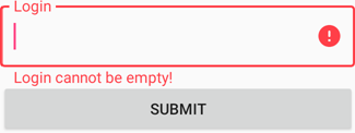
- Specify the TextEdit instance’s name and a message that the editor should display when the error is detected.
<dxe:TextEdit x:Name="loginEditor"
              ErrorText="Login cannot be empty!"/>
Subscribe to the button’s Clicked event.
<Button Text="Submit" Clicked="Button_Clicked"/>In the event handler, set the editor’s HasError property to true if the Text string is null or empty.
private void Button_Clicked(object sender, EventArgs e)
{
    loginEditor.HasError = string.IsNullOrEmpty(loginEditor.Text);
}
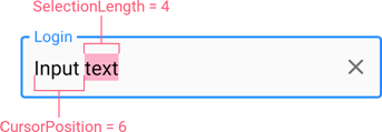
Text Selection
Use the following properties to manage the cursor position and text selection:
Property | Description |
|---|---|
Gets or sets the cursor position. | |
Gets the number of selected characters. |
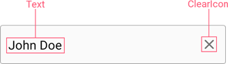
Clear Icon
An editor can display a ‘clear’ icon that allows users to remove text that was entered. Use the following properties to manage the ‘clear’ icon:
Property | Description |
|---|---|
Specifies when the clear icon is displayed. | |
Specifies the clear icon image. | |
Add a custom action to the ‘clear’ icon. Occurs when a user taps the clear icon. |
Assistive Elements
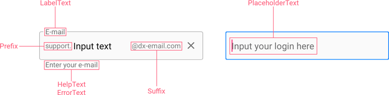
You can also optionally specify Prefix and Suffix that are shown before and after the input text (TextEdit), and add the following assistive text elements that provide additional information about text entered in the editor:
- LabelText - the editor’s label;
- PlaceholderText - the placeholder displayed within the editor box prior to user text input;
- HelpText - the help text displayed below the editor box;
- ErrorText - the error message displayed below the editor box in an error state.