DateEdit Class
An editor that allows users to select dates in a platform-specific date picker.
Namespace: DevExpress.XamarinForms.Editors
Assembly: DevExpress.XamarinForms.Editors.dll
NuGet Package: DevExpress.XamarinForms.Editors
Declaration
public class DateEdit :
    EditBase,
    IDateEditController,
    IEditController,
    IElementController
Remarks
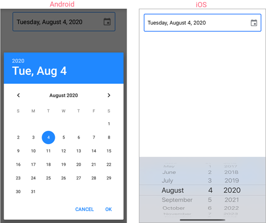
DateEdit displays a date selected in the standard iOS or Android date picker that appears when a user taps the editor.
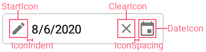
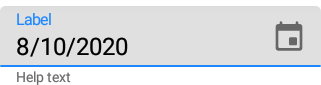
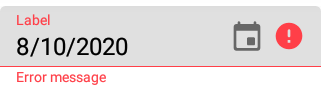
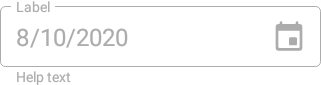
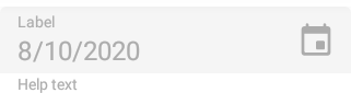
The editor initially displays a date icon on the right within the box. You can also add the following optional elements:
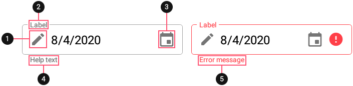
1. Custom Icon 2. Label 3. Date Icon 4. Help Text 5. Error Message
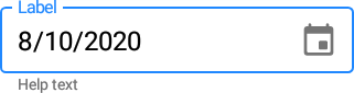
Date
Use the Date property to set or get the date in the editor. The MinDate and MaxDate properties specify the minimum and maximum allowed dates and limit user input to the specified range.
Use the DateChangedCommand and DateChangedCommandParameter properties to specify a command executed when the date changes. You can also handle the DateChanged event to respond to date changes.
Use the following properties to change the appearance and alignment of the date in the box:
Property | Description |
|---|---|
Specify the text color for each state of the editor. | |
Specify the font settings of a date displayed in the editor. | |
Gets or sets the horizontal alignment of a date displayed in the editor. |
Date Format
The DisplayFormat property defines the format of a date displayed in the editor.
You can use standard or custom format specifiers (see the MSDN topics Standard date and time format strings and Custom date and time format strings) to create format patterns, for example:
<dxe:DateEdit DisplayFormat="d"/>

<dxe:DateEdit DisplayFormat=""ddd d MMM""/>

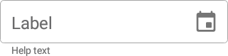
Label
The LabelText property specifies the editor’s input prompt string. The label is displayed inside the editor while the editor is not focused. When the editor gets focus, the label moves to the top. If a value is assigned to the editor, the label is always displayed at the top.
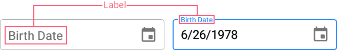
To pin the label to the top of the editor, set the IsLabelFloating property to false.
To customize the label’s appearance, use the following properties:
Property | Description |
|---|---|
LabelColor / FocusedLabelColor | Specify the label’s color for each state of the editor. |
Specify the label’s font settings. |
Placeholder
A placeholder (PlaceholderText) is the input prompt string displayed within the edit box when the editor is empty and focused.

To specify the color of the placeholder text, use the PlaceholderColor property.
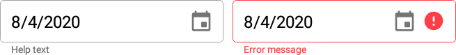
Help Text and Error Message
You can display the following labels below an editor:
- HelpText - A brief editor description.
- ErrorText - A message shown when an error occurs (HasError is true).
The BottomTextTopIndent property specifies the indent between the editor’s bottom border and the help or error text.
To specify the color and font attributes for the help/error text, use the following properties:
Property | Description |
|---|---|
Specify the help text color for different states of an editor. | |
Specifies the error message text color. | |
BottomTextFontSize | Specify font settings. |
If HelpText is not set, ErrorText appears as an additional line below the edit box and page content shifts down. To prevent this behavior, set the ReserveBottomTextLine property to true.
Autofill
If the editor’s AutofillContentType property is set to AndroidBirthDate or AndroidCreditCardExpirationDate, the user can automatically fill the editor with an appropriate date. Note that the device should have an enabled autofill service that contains the required values (names, dates, passwords, and so on).
Icons
The date editor can display icons within its box.
- Date icon - indicates a date editor.
- Clear icon - removes a date selected in the editor.
- Error icon - appears in the error state (HasError is true).
- Custom icons - can be shown on the left or right within the box.
Use the following members to manage the editor’s icons:
Icon | Property | Description |
|---|---|---|
Date Icon | Allows you to replace the default date icon image with a custom icon. | |
Allow you to perform an action when a user taps the date icon. | ||
Specifies the date icon’s color. | ||
Specifies whether the date icon is visible. | ||
Clear Icon | Specifies when the clear icon is displayed. | |
Specifies the clear icon image. | ||
Specifies the clear icon’s color. | ||
Allow you to assign an additional action to the clear icon. | ||
Error Icon | Allows you to replace the default error icon image with a custom one. | |
Allow you to perform an action when a user taps the error icon. | ||
Specifies the error icon’s color. | ||
Specifies whether the error icon is visible. | ||
Custom Icons | Specify custom icons displayed on the left and right within the editor. | |
StartIconClicked / StartIconCommand | Allow you to set actions that occur when a user taps custom icons. | |
Specify icon colors. | ||
Specify whether custom icons are visible. | ||
Common | Specify icon color for each state of the editor. | |
Specifies the distance between an icon and input text (or prefix/suffix, if any). | ||
Specifies the distance between icons. | ||
Specifies the vertical alignment of icons. |
User Interaction
Editors raise the following events on user interaction:
- Tap - Fires when the user taps the editor.
- DoubleTap - Fires when the user double taps the editor.
- LongPress - Fires when the user presses and holds the editor.
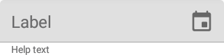
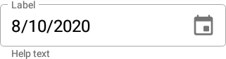
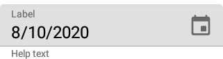
Editor Appearance
The editor appears as follows depending on the current state and specified BoxMode:
Editor State | BoxMode = Outlined (default) | BoxMode = Filled |
|---|---|---|
Inactive |
|
|
Focused |
|
|
Activated |
|
|
Error |
|
|
Disabled |
|
|
Use the following properties to change the appearance of the edit box and its borders:
Property | Description |
|---|---|
Specify the border color for each state of the editor. | |
Specifies the color of the edit box borders, label, and error icon and error message if there is an input error. | |
BorderThickness | Specify the border thickness for each state of the editor. |
Specifies whether edit box corners are rounded or cut. | |
Specifies the radius of the edit box corners. | |
BackgroundColor | Specifies the edit box fill color. |
Specifies the amount of space between edit box borders and content. |
The CursorColor property specifies the color of the input cursor. To specify the text color, use the TextColor property.