RangeAreaSeries Class
Displays data as a filled area between two value sets.
Namespace: DevExpress.XamarinForms.Charts
Assembly: DevExpress.XamarinForms.Charts.dll
NuGet Package: DevExpress.XamarinForms.Charts
Declaration
public class RangeAreaSeries :
    Series,
    IXYSeriesDataOwner
Remarks
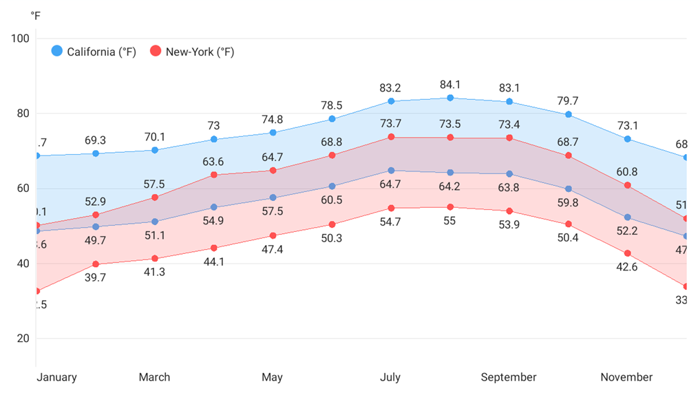
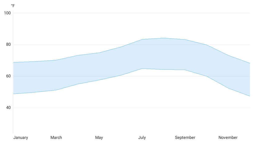
Use this series type to show the area between two value sets (for example, high and low temperatures, stock prices, blood pressure readings, etc.).
Series Data
To bind a range area series to data, set the RangeAreaSeries.Data property to the SeriesDataAdapter class instance. Use the adapter’s properties to specify the data source whose members contain an argument field and two value fields (Value1 and Value2).
<ContentPage.BindingContext>
    <local:MainViewModel/>
</ContentPage.BindingContext>
<dxc:ChartView>
    <dxc:ChartView.Series>
        <dxc:RangeAreaSeries>
            <dxc:RangeAreaSeries.Data>
                <dxc:SeriesDataAdapter DataSource="{Binding CATemperature}" ArgumentDataMember="Month">
                    <dxc:ValueDataMember Type="Value1" Member="HighValue" />
                    <dxc:ValueDataMember Type="Value2" Member="LowValue" />
                </dxc:SeriesDataAdapter>
            </dxc:RangeAreaSeries.Data>
        </dxc:RangeAreaSeries>
    </dxc:ChartView.Series>
    <dxc:ChartView.AxisY>
        <dxc:NumericAxisY AlwaysShowZeroLevel="False">
            <dxc:NumericAxisY.Range>
                <dxc:NumericRange Min="30" Max="95"/>
            </dxc:NumericAxisY.Range>
            <dxc:NumericAxisY.Title>
                <dxc:AxisTitle Text="°F" Alignment="Outside"/>
            </dxc:NumericAxisY.Title>
        </dxc:NumericAxisY>
    </dxc:ChartView.AxisY>
    <dxc:ChartView.AxisX>
        <dxc:DateTimeAxisX MeasureUnit="Month">
            <dxc:DateTimeAxisX.Label>
                <dxc:AxisLabel TextFormat="MMMM"/>
            </dxc:DateTimeAxisX.Label>
            <dxc:DateTimeAxisX.Range>
                <dxc:DateTimeRange VisualMin="01/01/2019" VisualMax="12/01/2019"/>
            </dxc:DateTimeAxisX.Range>
        </dxc:DateTimeAxisX>
    </dxc:ChartView.AxisX>
</dxc:ChartView>
public class MainViewModel {
public List<RangeAreaDataItem> CATemperature { get; }
public MainViewModel() {
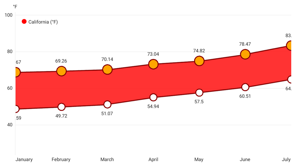
CATemperature = new List<RangeAreaDataItem> {
new RangeAreaDataItem(new DateTime(2019, 1, 1), 68.67, 48.59),
new RangeAreaDataItem(new DateTime(2019, 2, 1), 69.26, 49.72),
new RangeAreaDataItem(new DateTime(2019, 3, 1), 70.14, 51.07),
new RangeAreaDataItem(new DateTime(2019, 4, 1), 73.04, 54.94),
new RangeAreaDataItem(new DateTime(2019, 5, 1), 74.82, 57.50),
new RangeAreaDataItem(new DateTime(2019, 6, 1), 78.47, 60.51),
new RangeAreaDataItem(new DateTime(2019, 7, 1), 83.21, 64.71),
new RangeAreaDataItem(new DateTime(2019, 8, 1), 84.10, 64.17),
new RangeAreaDataItem(new DateTime(2019, 9, 1), 83.09, 63.81),
new RangeAreaDataItem(new DateTime(2019, 10, 1), 79.66, 59.82),
new RangeAreaDataItem(new DateTime(2019, 11, 1), 73.11, 52.24),
new RangeAreaDataItem(new DateTime(2019, 12, 1), 68.20, 47.20)
};
}
}
public class RangeAreaDataItem {
public DateTime Month { get; }
public double HighValue { get; }
public double LowValue { get; }
public RangeAreaDataItem(DateTime month, double highValue, double lowValue){
Month = month;
HighValue = highValue;
LowValue = lowValue;
}
}
Important
ChartView chooses the X-axis type depending on data in the first series. If you need to explicitly specify the argument axis type for the chart or an individual series, use the ChartView.AxisX or Series.AxisX property. The assigned object should be compatible with the series data type. Otherwise, the chart does not display the series.
You can also create a custom data adapter, for example, to generate series points on the fly without a separate data storage.
Series Markers And Labels
Use Line1MarkersVisible and Line2MarkersVisible properties to change the visibility of data point markers for each area line. To display series point markers in different colors, set the ColorEach property to True.
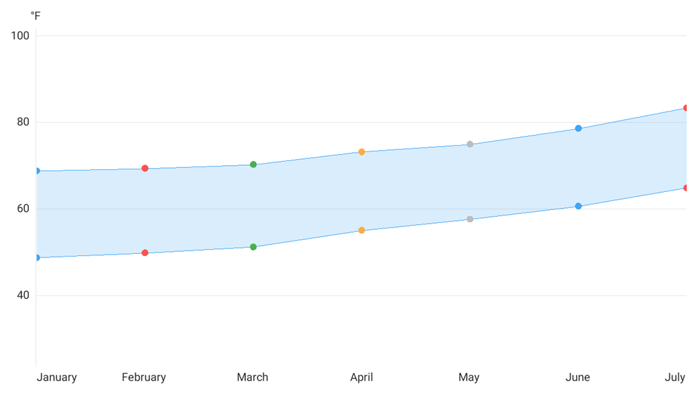
<dxc:RangeAreaSeries Line1MarkersVisible="True"
                     Line2MarkersVisible="True"
                     ColorEach="True">
    <!--...-->
</dxc:RangeAreaSeries>
You can add labels to data point markers to show point values as text on a chart.
To enable labels for a range area series, set the RangeAreaSeries.Label property to the RangeAreaSeriesLabel object, and use this object’s properties to change the label’s settings:
- TextPattern - Formats series label text.
- Kind - Specifies what range area values (high, low, or both) labels should display.
- Indent - Specifies how labels are positioned relative to points.
- Style - Provides access to the SeriesLabelStyle object that stores label appearance settings (TextStyle).
- Visible - Allows you to show or hide labels for the series.
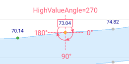
- HighValueAngle - Sets the position of high value labels relative to the markers.
LowValueAngle - Sets the position of low value labels relative to the markers.
<dxc:RangeAreaSeries>
    <dxc:RangeAreaSeries.Label>
        <dxc:RangeAreaSeriesLabel TextPattern="{}{V$0.#}"
                                  Kind="TwoLabels"
                                  HighValueAngle="270"
                                  LowValueAngle="90"
                                  Indent="15">
            <dxc:RangeAreaSeriesLabel.Style>
                <dxc:SeriesLabelStyle>
                    <dxc:SeriesLabelStyle.TextStyle>
                        <dxc:TextStyle Color="DarkBlue" Size="10"/>
                    </dxc:SeriesLabelStyle.TextStyle>
                </dxc:SeriesLabelStyle>
            </dxc:RangeAreaSeriesLabel.Style>
        </dxc:RangeAreaSeriesLabel>
    </dxc:RangeAreaSeries.Label>
</dxc:RangeAreaSeries>
Legend
The ChartBaseView.Legend shows which color corresponds to which series.
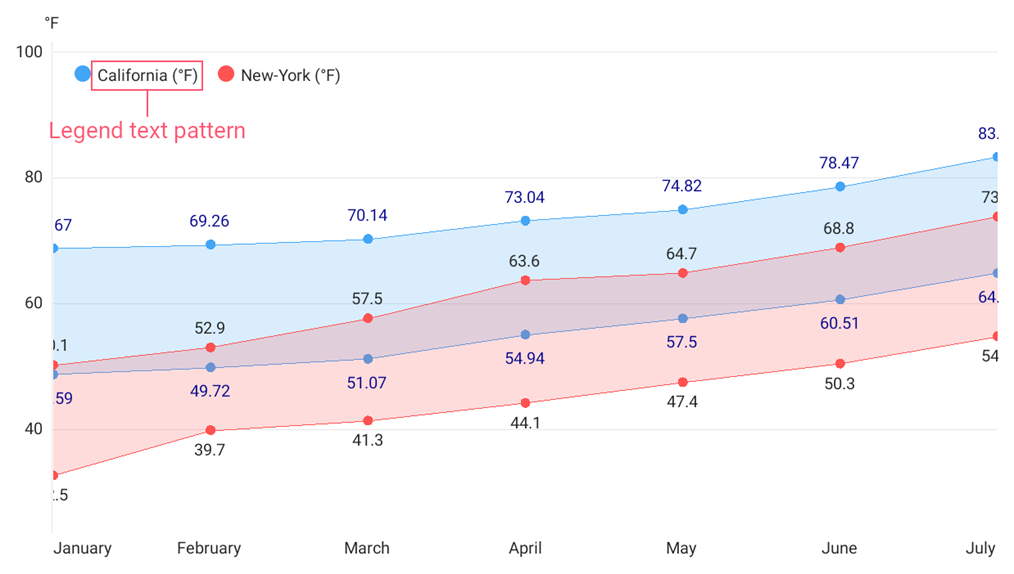
A legend item includes a color marker and text that explains the series or series point data. The default item text is the series’ DisplayName (if the item displays the entire series) or a range area’s maximum, minimum, high or low values (if the item displays a series point, ColorEach property is True).
The series’ LegendTextPattern property allows you to configure the legend item string.
<dxc:ChartView>
    <dxc:ChartView.Series>
        <dxc:RangeAreaSeries DisplayName="California"
                             LegendTextPattern="{}{S} (°F)">
            <!--...-->
        </dxc:RangeAreaSeries>
        <dxc:RangeAreaSeries DisplayName="New-York"
                             LegendTextPattern="{}{S} (°F)">
            <!--...-->
        </dxc:RangeAreaSeries>
    </dxc:ChartView.Series>
    <dxc:ChartView.Legend>
        <dxc:Legend HorizontalPosition="Left"
                    VerticalPosition="Top"
                    Orientation="LeftToRight"/>
    </dxc:ChartView.Legend>
</dxc:ChartView>
To exclude a particular series from the legend, set that series’ VisibleInLegend property to false.
Hints
The ChartView can display hints (ChartView.Hint) as tooltips or as a crosshair cursor that shows information about a tapped series or data point. Use the Series.HintOptions property to specify which data the series should use for a hint.
Tooltips
This example demonstrates how to set up the chart so that it shows a tooltip for a series point when a user taps it, and configure a tooltip for each series on the chart.
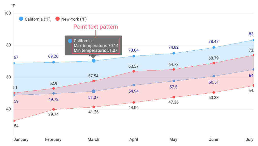
- Set the chart hint’s Behavior property to the TooltipHintBehavior class instance.
- Set each series’ HintOptions property to the SeriesHintOptions object and use the PointTextPattern property to specify the tooltip text pattern.
<ContentPage.Resources>
<dxc:SeriesHintOptions
x:Key="areaSeriesHintOptions"
PointTextPattern="{}{S}: Max temperature: {HV$0.##} Min temperature: {LV$0.##}"/>
</ContentPage.Resources>
<dxc:ChartView>
<dxc:ChartView.Hint>
<dxc:Hint>
<dxc:Hint.Behavior>
<dxc:TooltipHintBehavior ShowPointTooltip="True" ShowSeriesTooltip="False"/>
</dxc:Hint.Behavior>
</dxc:Hint>
</dxc:ChartView.Hint>
<dxc:ChartView.Series>
<dxc:RangeAreaSeries HintOptions="{StaticResource areaSeriesHintOptions}">
<!--Series Data-->
</dxc:RangeAreaSeries>
<dxc:RangeAreaSeries HintOptions="{StaticResource areaSeriesHintOptions}">
<!--Series Data-->
</dxc:RangeAreaSeries>
</dxc:ChartView.Series>
</dxc:ChartView>
Crosshair Cursor
This example demonstrates how to set up the chart so that it shows a series point hint as a crosshair cursor, and how to specify the hint’s content, data format, and visibility options. The crosshair cursor appears on a long tap.
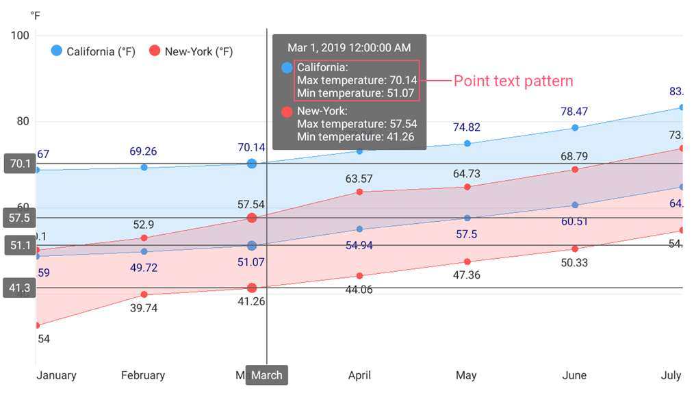
- Set the chart hint’s Behavior property to the CrosshairHintBehavior class instance.
- Set each series’ HintOptions property to the SeriesCrosshairOptions object and specify this object’s properties:
- ShowInLabel - to specify whether the crosshair label should display information for points of the series.
- PointTextPattern - to define the text pattern used to show information about the series point within a crosshair label.
- AxisLineVisible, AxisLabelVisible - to specify whether the crosshair cursor should display axis lines and labels for the series.
<ContentPage.Resources>
<dxc:SeriesCrosshairOptions
x:Key="areaSeriesHintOptions"
PointTextPattern="{}{S}: Max temperature: {HV$0.##} Min temperature: {LV$0.##}"
ShowInLabel="True"
AxisLabelVisible="True"
AxisLineVisible="True"/>
</ContentPage.Resources>
<dxc:ChartView>
<dxc:ChartView.Hint>
<dxc:Hint>
<dxc:Hint.Behavior>
<dxc:CrosshairHintBehavior GroupHeaderTextPattern="{}{A}"/>
</dxc:Hint.Behavior>
</dxc:Hint>
</dxc:ChartView.Hint>
<dxc:ChartView.Series>
<dxc:RangeAreaSeries HintOptions="{StaticResource areaSeriesHintOptions}">
<!--Series Data-->
</dxc:RangeAreaSeries>
<dxc:RangeAreaSeries HintOptions="{StaticResource areaSeriesHintOptions}">
<!--Series Data-->
</dxc:RangeAreaSeries>
</dxc:ChartView.Series>
</dxc:ChartView>
Note
A crosshair cursor also gets data from axes. Use the AxisBase.HintOptions property to specify the hint’s content, data format, and visibility options.
Text Patterns
Use text patterns to customize text in a chart’s labels, legend and hints. The pattern includes regular text (which is displayed as is) and placeholder strings enclosed in braces.
Placeholder | Description |
|---|---|
{S} | Displays a series name. |
{A} | Displays a series point argument. |
{V} | Displays a series point value. |
{V1} | Displays a series point Value1. |
{V2} | Displays a series point Value2. |
{HV} | Displays a series point maximum value of Value1 and Value2. |
{LV} | Displays a series point minimum value of Value1 and Value2. |
Note
To format these values, use the default format strings after the $ sign.
For example, in the {V$#.##} string, V is a placeholder, $ is a format string separator, and #.## is a format string.
Series Appearance
To change the area color and opacity, set the RangeAreaSeries.Style property to the RangeAreaSeriesStyle object with the following appearance settings:
- RangeAreaSeriesStyle.Fill - Area fill color.
- RangeAreaSeriesStyle.Alpha - Area fill opacity (1 is opaque, 0 is transparent).
To change the area borders style and markers size, set the RangeAreaSeriesStyle.Line1Style and RangeAreaSeriesStyle.Line2Style properties to the LineSeriesStyle object (with the specified appearance settings).
To specify the marker style, use the LineSeriesStyle.MarkerStyle property with a MarkerStyle object.
<dxc:RangeAreaSeries>
    <dxc:RangeAreaSeries.Style>
                    <dxc:RangeAreaSeriesStyle Fill="Red" Alpha="0.8">
                        <dxc:RangeAreaSeriesStyle.Line1Style>
                            <dxc:LineSeriesStyle Stroke="Red" StrokeThickness="2" MarkerSize="20">
                                <dxc:LineSeriesStyle.MarkerStyle>
                                    <dxc:MarkerStyle Fill="Orange" Stroke="DarkRed" StrokeThickness="2"/>
                                </dxc:LineSeriesStyle.MarkerStyle>
                            </dxc:LineSeriesStyle>
                        </dxc:RangeAreaSeriesStyle.Line1Style>
                        <dxc:RangeAreaSeriesStyle.Line2Style>
                            <dxc:LineSeriesStyle Stroke="Red" StrokeThickness="2" MarkerSize="15">
                                <dxc:LineSeriesStyle.MarkerStyle>
                                    <dxc:MarkerStyle Fill="White" Stroke="DarkRed" StrokeThickness="2"/>
                                </dxc:LineSeriesStyle.MarkerStyle>
                            </dxc:LineSeriesStyle>
                        </dxc:RangeAreaSeriesStyle.Line2Style>
                    </dxc:RangeAreaSeriesStyle>
    </dxc:RangeAreaSeries.Style>
</dxc:RangeAreaSeries>