DXChart.Hint Property
Namespace: DevExpress.Xamarin.iOS.Charts
Assembly: DevExpress.Xamarin.iOS.Charts.dll
NuGet Package: DevExpress.XamarinForms.Charts
Declaration
public virtual DXHint Hint { get; set; }Property Value
| Type |
|---|
| DXHint |
Remarks
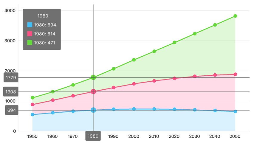
A Cartesian Chart can show a hint as a standard tooltip or a Crosshair Cursor.

How to: Allow End Users to Invoke Hints
Assign a new DXHint instance to the Hint property to enable hints for a chart:
this.chart.Hint = new DXHint();
How to: Specify Cartesian Chart’s hint type
Use the following code to specify the Cartesian Chart’s hint type:
this.chart.Hint = new DXHint {
    Behavior = new DXCrosshairHintBehavior {
        GroupHeaderTextPattern = "{A$MM/dd/YYYY}",
        MaxSeriesCount = 3
    }
};
The DXHint.Behavior property specifies the hint’s behavior. The following behaviors are available:
Behavior | Sample Image | Description |
|---|---|---|
|
| |
|
|
How to: Configure How the Hint Displays a Series’s Points
Use the DXSeries.HintOptions property to disable an individual series’ hints or axis elements bound to the series, and specify a text pattern to format values, and arrange these values within tooltips:
series.HintOptions = new DXSeriesCrosshairOptions {
    ShowInLabel = true,
    PointTextPattern = "{L}: {V$#.##} millions of km²",
    AxisLabelHidden = true
};
In the code above, the series placeholders (L and VP) specify which series point values a tooltip should display in its text. The following label placeholders are available for Pie Series:
| Placeholder | Description |
|---|---|
| {S} | Displays a series name. |
| {A} | Displays a series point argument. |
| {V} | Displays a series point value. |
| {VP} | Displays a series point value as percentages. |
| {W} | Displays a Bubble series point weight. |
| {O} | Displays a financial series point open value. |
| {H} | Displays a financial series point high value. |
| {L} | Displays a financial series point low value. |
| {C} | Displays a financial series point close value. |
Note
These values can be formatted using default format strings after the $ sign.
For example, in the {VP$#.##} string, VP is a placeholder, $ is a format string separator, and #.## is a format string.
How to: Manage Visibility of the Crosshair Cursor’s Axis Elements
The Crosshair Cursor contains lines and axis labels that shows axis values. An DXAxisHintOptions object that DXAxisBase.HintOptions property returns manages these elements visibility:
axisY.HintOptions = new DXAxisHintOptions {
    HintLabelHidden = true,
    HintLineHidden = true
}
How to: Snap the Crosshair label to a chart’s corner
The Crosshair label can follow the Crosshair’s argument line or be snapped to any chart corner.

The following sample demonstrates how to snap the Crosshair label to the Chart’s top-right corner:
self.chart.Hint = new DXHint {
    Behavior = new DXCrosshairHintBehavior {
        LabelPosition = new DXStaticCrosshairLabelPosition {
            HorizontalAlignment = DXLabelPositionHorizontalAlignment.Right,
            VerticalAlignment = DXLabelPositionVerticalAlignment.Top
        }
    }
};
The following position modes specify the label’s position:
| The Crosshair Label position specifying that the Crosshair label always is at a position specified by the horizontalAlignment and verticalAlignment properties. | |
| The Crosshair Label position specifying that the Crosshair label follows the Crosshair Cursor’s argument line. |
How to: Programmatically interact with a hint
The chart provides methods that show or hide the hint programmatically. The chart delegate allows you to track when a chart shows or hides the hint. For example, the following code shows a hint programmatically and notifies event listeners when end users invoke hints:
class LandAreaChartController: UIChartController {
    public event SelectedLandAreaChangedEventHandler SelectedLandAreaChanged;
    public List<LandAreaItem> LandAreas { get; set; }

    public override void ViewDidLoad() {
        base.ViewDidLoad();
        chart.Delegate = new ChartDelegate(this);
    }

    public void ShowHint(LandAreaItem item) {
        int pointIndex = LandAreas.IndexOf(item);
        if (pointIndex > 0) {
            chart.ShowHint(pointIndex, 0);
        } else {
            chart.HideHint();
        }
    }

    internal RaiseItemChanged(int itemIndex) {
        LandAreaItem item = (itemIndex >= 0)
            ? LandAreas[itemIndex]
            : null;
        SelectedLandAreaChangedEventHandler handler = SelectedLandAreaChanged;
        if (handler != null) {
            handler(this, item);
        }
    }
}

class ChartDelegate : DXChartDelegate {
    private LandAreaChartController controller;

    public ChartDelegate(LandAreaChartController controller) {
        this.controller = controller;
    }

    public void DidShowHint(DXChartBase chart, DXHintInfo hintInfo) {
        NSNumber index = (NSNumber)info.SeriesPointInfos[0].DataPointIndices[0];
        controller.RaiseItemChanged(index.Int32Value);
    }

    public void DidHideHint(DXChartBase chart) {
        controller.RaiseItemChanged(-1);
    }
}

public delegate void SelectedLandAreaChangedEventHandler(object sender, SelectedLandAreaChangedEventArgs args);
public class SelectedLandAreaChangedEventArgs {
    public LandAreaItem SelectedItem { get; }
    public SelectedLandAreaChangedEventArgs(LandAreaItem selectedItem) {
        this.SelectedItem = selectedItem;
    }
}
The table below contains members the chart tooltip API includes.
Member | Description |
|---|---|
Shows a hint for a series point at the specified screen point. | |
Shows a hint for a series point with the pointIndex of a series with the seriesIndex. | |
Hides the hint the chart displays. | |
| |
|
How to: Customize a tooltip’s appearance
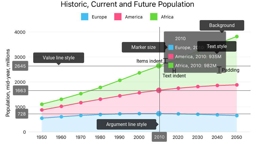
The following image displays style properties that manages the hint appearance:

The code below configures the tooltip as the image above shows:
// All sizes are in screen points.
this.chart.Hint = new DXHint {
    Style = new DXHintStyle {
        BackgroundColor = UIColor.FromWhiteAlpha(0.4f, 0.4f),
        ItemsIndent = 12,
        Padding = new UIEdgeInsets(12, 24, 12, 24),
        MarkerSize = 24,
        TextIndent = 12,
        TextStyle = new DXTextStyle {
            ForegroundColor = UIColor.White,
            FontSize = 24
        },
        ValueLineStyle = new DXCrosshairLineStyle {
            Stroke = UIColor.Red,
            LabelBackgroundColor = UIColor.Red,
            TextStyle = new DXTextStyle {
                ForegroundColor = UIColor.White
            }
        }
    }
};
The following table lists symbols that specify the tooltip’s appearance:
Symbols | Description |
|---|---|
Gets or sets hint appearance settings. | |
The hint appearance settings storage. |

