Themes and Styles for an ASP.NET MVC Application
- 6 minutes to read
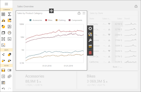
Supported Themes
You can apply two types of themes to a Web Dashboard:
- Predefined themes
- You can find the complete list in the table below. All the listed options are different modifications of the Generic, Generic Compact, and Material Design Compact DevExtreme themes.
- Custom themes
- You can modify Generic and Generic Compact DevExtreme themes. This topic includes step-by-step instructions on theme customization.
Each theme consists of stylesheets that are applied when you use one of the color constants.
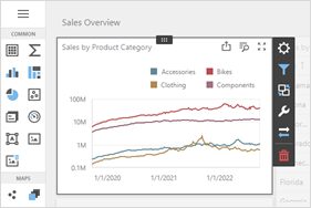
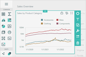
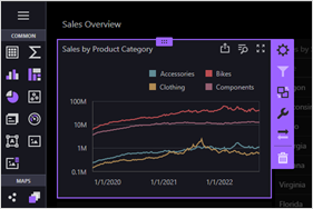
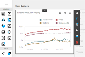
Generic Themes
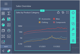
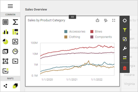
Material Design Themes
Apply a Built-in Theme
To apply a theme, pass its name as the optional clientUIControlColorScheme parameter to the ExtensionsFactory.GetStyleSheets method.
View code:
@Html.DevExpress().GetStyleSheets("carmine",
    // ...
    new StyleSheet { ExtensionSuite = ExtensionSuite.Dashboard }
)
// ...
As an alternative, use the ASPxWebClientUIControl.GlobalColorScheme property to specify the theme.
using DevExpress.Web;
//...

    public class HomeController : Controller
    {
        public ActionResult Index()
        {
            ASPxWebClientUIControl.GlobalColorScheme = "carmine";
            return View();
        }
    //...
    }
Customize Themes
Warning
Customization is available only for Generic and Generic Compact themes.
The DevExpress Dashboard CLI is used with the DevExtreme ThemeBuilder to create a custom theme for the Web Dashboard.
Theme customization involves the following basic steps:
- Use the DevExtreme ThemeBuilder tool to customize an existing theme and export the results.
- Add Dashboard-specific settings to the generated resource files.
- Use the DevExpress Dashboard CLI to convert the customized resource files into a Web Dashboard theme.
- Register the new theme in your application.
Create a Custom Theme
- Make sure you have Node.js and npm installed on your machine.
- Open the ThemeBuilder. Create a custom theme based on Generic themes. For instance, you can use the Light theme as a base and change its accent color from blue (#337ab7) to yellow (#fdb400).
- Set the color scheme name (for example, “light-yellow”) and use the Export Metadata → Download Metadata File button to export metadata in a JSON format.
- Copy the downloaded JSON file (dx.generic.light-yellow.json) to an empty folder.
Edit dx.generic.light-yellow.json and add the dashboardItems property to override the accent colors at the dashboard level:
{
    "items": [
        {
            "key": "@base-accent",
            "value": "#fdb400"
        }
    ],
    "dashboardItems": [
        {
            "key": "@dashboard-item-selected-bg",
            "value": "rgba(#fdb400, 0.2)"
        },
        {
            "key": "@dashboard-item-hover-bg",
            "value": "rgba(#fdb400, 0.1)"
        }
    ],
    "baseTheme": "generic.light",
    "outputColorScheme": "light-yellow",
    "makeSwatch": false,
    "version": "25.2.5",
    "widgets": [],
    "removeExternalResources": false
}
Refer to the Color Constants section to see a list of available color constants you can use to customize Web Dashboard colors.
In the folder you created in Step 4, execute the command that installs the
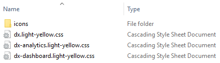
devexpress-dashboard-clipackage and builds the CSS files for your custom JSON file. Use the same version of thedevexpress-dashboard-clipackage as the version of DevExpress packages that you use in your application:npx devexpress-dashboard-cli@25.2.5 build-theme --input-file dx.generic.light-yellow.jsonThis generates the following CSS files and their minified versions:
- dx.light-yellow.css
- dx-analytics.light-yellow.css
- dx-dashboard.light-yellow.css
- dx.light-yellow.min.css
- dx-analytics.light-yellow.min.css
- dx-dashboard.light-yellow.min.css
Warning
The
devexpress-dashboard-clipackage version should match the version of other DevExpress packages used in your application. To check the version for which you generated the CSS files, open thedx-dashboard.<theme-name>.cssfile and find the version number in the comments.
Color Constants
The Web Dashboard uses color constants to paint the control’s elements. The colors of the color constants listed in the table below can be customized. Changes to specific dashboard elements’ colors do not affect the basic DevExtreme colors.
| Color Constant | Description |
|---|---|
| @dashboard-surface-bg | The background color of the dashboard surface. |
| @dashboard-item-selected-bg | The background color of the selected element in a dashboard item. |
| @dashboard-item-hover-bg | The background color applied to elements in a dashboard item when you hover over them. |
| @dashboard-overlay-shader-bg | The shading background color. |
| @dashboard-border-color | A more contrast border color. |
| @dashboard-border-sub-color | A less contrast border color. |
| @dashboard-shadow | The color of the shadow used for the control’s elements (for example, when you hover over icons in the Toolbox). |
| @dashboard-shadow-border-color | The color of the border that appears with the shadow. |
| @dashboard-tab-hover-bg | The background color of the inactive hovered tab page’s header. |
| @dashboard-tab-inactive-bg | The background color of the inactive tab page. |
| @dashboard-info-toast-bg | The background color of the information notification toast. |
| @dashboard-info-toast-color | The text color of the information notification toast. |
| @dashboard-error | The background color of the error notification toast. |
| @dashboard-success | The background color of the success notification toast. |
| @dashboard-item-menu-bg | The background color of the dashboard item menu. |
| @dashboard-item-menu-icon-color | The primary color of the dashboard item menu’s icons. |
| @dashboard-item-menu-icon-sub-color | The additional color of the dashboard item menu’s icons. |
| @dashboard-item-menu-remove-icon-color | The color of the dashboard item menu’s Delete icon. |
| @dashboard-item-menu-separator-color | The color of the dashboard item menu’s separator. |
| @dashboard-item-menu-item-border-color | The border color of a dashboard item. The border appears when you hover or select a dashboard item in the [Designer]> (xref:119283#designer-and-viewer-modes) mode. |
| @dashboard-item-binding-menu-bg | The background color of the dashboard item’s Binding menu. |
| @dashboard-item-binding-menu-filter-section-bg | The background color of the Binding menu’s Filter section. |
| @dashboard-menu-bg | The dashboard menu‘s background color. |
| @dashboard-menu-color | The dashboard menu’s basic color. |
| @dashboard-menu-header-bg | The background color of the dashboard menu’s header. |
| @dashboard-menu-header-color | The primary color of the dashboard menu’s header. |
| @dashboard-menu-icon-color | The color of the dashboard menu’s icons (for example, the X icon used to close the menu). |
| @dashboard-menu-selected-bg | The background color of the selected element in the dashboard’s menu. |
| @dashboard-menu-selected-color | The color of the selected dashboard menu’s element. |
| @dashboard-menu-hover-bg | The background color applied to elements in a dashboard menu when you hover over them. |
| @dashboard-menu-hover-color | The primary color applied to elements in a dashboard menu when you hover over them. |
| @dashboard-toolbar-color | The text color of the dashboard item caption and dashboard title. |
Apply a Custom Theme
A custom theme’s icons should be in the same folder as the theme’s CSS files. You can find the icons folder in the following directory:
C:\Program Files\DevExpress 25.2\Components\Sources\DevExpress.Web.Resources\Css\DevExtreme.
Copy the icons folder to the directory that contains your theme:
To apply a custom theme, do the following:
Create the Content | custom-themes folder in the project and put the generated CSS files in the created folder.
Register the theme in the Global.asax file:
using DevExpress.Web; using DevExpress.DashboardWeb; //... protected void Application_Start() { //... CustomColorSchemes .Configure("light-yellow") .AddDevExtremeStyle(@"Content/custom-themes/dx.light-yellow.min.css") .AddAnalyticsStyle(@"Content/custom-themes/dx-analytics.light-yellow.min.css") .AddDashboardStyle(@"Content/custom-themes/dx-dashboard.light-yellow.min.css"); }Apply the custom theme to the Web Dashboard:
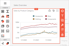
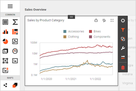
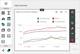
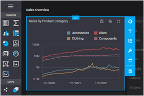
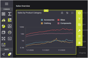
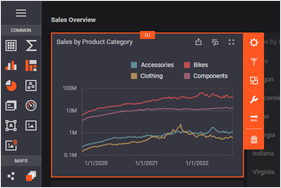
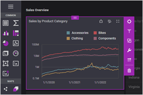
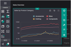
The image below shows the Web Dashboard with the custom Light Yellow theme: