ASPxRadioButtonList Class
Represents a group of radio button editors that allow one option from several to be selected.
Namespace: DevExpress.Web
Assembly: DevExpress.Web.v23.2.dll
NuGet Package: DevExpress.Web
Declaration
Remarks
The ASPxRadioButtonList control represents a single-selection radio button group that can be dynamically generated through data binding or populated manually. It contains an ASPxListEdit.Items collection with members that correspond to individual items in the list. To specify the selected item the control’s ASPxListEdit.SelectedItem or ASPxListEdit.SelectedIndex property can be used. When the selected item changes within the ASPxRadioButtonList control, the ASPxListEdit.SelectedIndexChanged event is generated.
Create a Radio Button List
Design Time
The ASPxRadioButtonList control is available on the DX.23.2: Common Controls toolbox tab in the Microsoft Visual Studio IDE.
Drag the control onto a form and customize the control’s settings, or paste the control’s markup in the page’s source code.
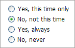
<dx:ASPxRadioButtonList ID="radioButtonList" runat="server">
    <Items>
        <dx:ListEditItem Value="Yes, this time only" />
        <dx:ListEditItem Value="No, not this time" />
        <dx:ListEditItem Value="Yes, always" Selected="true" />
        <dx:ListEditItem Value="No, never" />
    </Items>
</dx:ASPxRadioButtonList>
Run Time
using DevExpress.Web;
...
protected void Page_Load(object sender, EventArgs e)
{
    ASPxRadioButtonList radioButtonList = new ASPxRadioButtonList();
    radioButtonList.ID = "radioButtonList";
    Page.Form.Controls.Add(radioButtonList);

    radioButtonList.Items.AddRange(new List<ListEditItem>() {
        new ListEditItem { Value = "Yes, this time only" },
        new ListEditItem { Value = "No, not this time" },
        new ListEditItem { Value = "Yes, always", Selected = true},
        new ListEditItem { Value = "No, never" }
    });
}
Note
DevExpress controls require that you register special modules, handlers, and options in the Web.config file. You can change this file or switch to the Design tab in the Microsoft Visual Studio IDE to automatically update the Web.config file. Note that this information is automatically registered if you use the DevExpress Template Gallery to create a project.
In order to bind the ASPxRadioButtonList to a data source, use the DataSourceID (DataSource) property. When retrieving items from the data source, items characterisitics, such as the text, value and image, are obtained from specific data fields defined via the ASPxListEdit.TextField, ASPxListEdit.ValueField and ASPxListEdit.ImageUrlField properties.
The layout and rendering settings of items within the list can be defined by using the ASPxCheckListBase.RepeatColumns, ASPxCheckListBase.RepeatDirection and ASPxCheckListBase.RepeatLayout properties.
The common alignment of the text label relative to the radio button within items is specified by the ASPxCheckBox.TextAlign property. The ASPxCheckListBase.ItemImage property allows the common image settings to be applied to all list items.
Note
The client-side equivalent of this editor control is represented by the ASPxClientRadioButtonList object. The editor’s client-side API is enabled if the ASPxEditBase.EnableClientSideAPI property is set to true, or any client event is handled. Available client events can be accessed via the ASPxCheckListBase.ClientSideEvents property.