CSS Image Sprites
- 5 minutes to read
A CSS image sprite replaces a web control’s individual images with one composite image – a sprite image – which is a collection of multiple images. An image sprite improves application performance by reducing the number of HTTP requests required to obtain images, because a single request to the sprite image loads all images contained within it. HTML elements reference a sprite image with the ‘background-image‘ attribute. Use the ‘width‘, ‘height‘ and ‘background-position‘ attributes to specify the size and offset of an element’s sprite.
See the following article for details on CSS sprites: CSS Sprites: What They Are, Why They Are Cool and How To Use Them
Default Implementation of CSS Sprites in DevExpress Themes
All built-in DevExpress ASP.NET Themes utilize CSS image sprites. Each theme includes sprite.png file with composite images. Individual image settings are stored within sprite.css files.
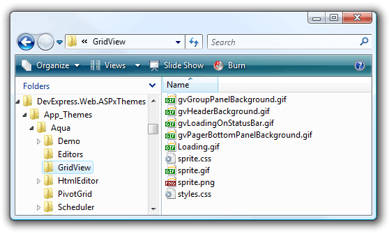
The following table illustrates image settings for the Aqua Theme. It displays the file structure, the content of the ‘sprite.png’ file and the content of the sprite.css file (truncated for demonstration purposes).
File Structure
Note that not all images are combined in a sprite image. Animation (such as ‘Loading.gif’) and repeated background images are stored as standalone files.
File ‘sprite.png’
File ‘sprite.css’
... /* truncated */
.dxGridView_gvDragAndDropArrowDown_Aqua,
.dxGridView_gvDragAndDropArrowUp_Aqua,
...
.dxGridView_gvHeaderFilter_Aqua,
...
{
    background-image: url('<%=WebResource("DevExpress.Web.ASPxThemes.App_Themes.Aqua.GridView.sprite.png")%');
    -background-image: url('<%=WebResource("DevExpress.Web.ASPxThemes.App_Themes.Aqua.GridView.sprite.gif")%>'); /* for IE6 */
    background-repeat: no-repeat;
    background-color: transparent;
}

...

.dxGridView_gvDragAndDropArrowDown_Aqua {
    background-position: 0px 0px;
    width: 11px;
    height: 9px;
}

.dxGridView_gvDragAndDropArrowUp_Aqua {
    background-position: 0px -17px;
    width: 11px;
    height: 9px;
}

...

.dxGridView_gvHeaderFilter_Aqua {
    background-position: 0px -36px;
    width: 19px;
    height: 19px;
}

... /* truncated */
Default sprite images and sprite CSS files are stored as resources within the ASPxThemes Assembly. This implementation provides optimal application performance, because CSS image sprites reduce the number of requests for images, and resource file compression (such as scripts and CSS files) minimizes traffic.
Custom CSS Sprites
If you use custom images for DevExpress control elements in your web application, you should manually combine these images into a sprite image to benefit from the CSS sprites technique. Based on the application’s logic, you can combine images into a single (application specific) sprite image or multiple (control specific or control group specific) sprite images.
Use one of the following approaches to set the required sprite image (and individual images contained within it) for each DevExpress control.
Use a Control’s Properties to Set a Sprite Image
Use the following properties to attach a sprite image to a control to display its images within control elements:
- SpriteImageUrl - Specifies the path to a sprite image.
- Height - Specifies an individual element’s image height.
- Width - Specifies an individual element’s image width.
- Top - Specifies the vertical offset within a sprite for an individual element’s image.
- Left - Specifies the horizontal offset within a sprite for an individual element’s image.
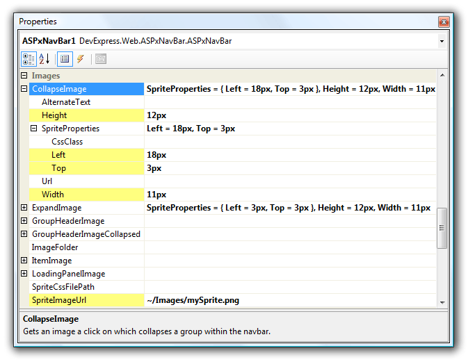
The following image shows the properties of ASPxNavBar and its CollapseImage:
Note
Note that individual image settings are rendered as inline CSS styles embedded in an image’s HTML tag. If too many images are defined in this manner, application performance may be affected due to an increase in page size.
When you use a control’s properties to define a sprite and its associated images, markup is added to the page. The code below illustrates HTML markup generated for an ASPxNavBar’s collapse image.
<img class="dxWeb_nbCollapse"
     style="background: transparent url(Images/mySprite.png) no-repeat scroll -18px -3px;
         border-width: 0px; height: 12px; width: 11px; -moz-background-clip: -moz-initial;
         -moz-background-origin: -moz-initial; -moz-background-inline-policy: -moz-initial;"
     alt="" src="/Projects/ImageSprites_Test1/DXR.axd?r=1_16"/>
Note that individual image settings are rendered as inline CSS styles embedded in an image’s HTML tag. If too many images are defined in this manner, application performance may be affected due to an increase in page size.
Use Named CSS Classes to Set a Sprite Image
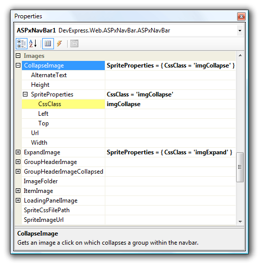
To define individual image settings, you can use the ImageSpriteProperties.CssClass property to specify a CSS class. A CSS class can be declared within page markup or a linked CSS file.
A CSS class should contain attributes that specify the size (width and height, in pixels) and position (horizontal and vertical offsets represented by negative values) of each image within a sprite. This approach is recommended if you use CSS rules to reference a sprite image.
<html xmlns="http://www.w3.org/1999/xhtml" >
<head runat="server">
    <title>Custom CSS Image Sprite</title>

    <style type="text/css">
        .imgExpand,
        .imgCollapse {
            background-image: url('Images/nb-custom-sprite.png');
            background-repeat: no-repeat;
            background-color: transparent;
        }
        .imgExpand {
            background-position: -3px -3px;
            width: 11px;
            height: 12px;
        }
        .imgCollapse {
            background-position: -18px -3px;
            width: 11px;
            height: 12px;
        }
    </style>
</head>
<body>
    <form id="form1" runat="server">

        <dx:ASPxNavBar ID="ASPxNavBar1" runat="server" >
            <Groups>
                <dx:NavBarGroup Text="Group 1">
                    <Items>
                        <dx:NavBarItem Text="Item 1-1"></dx:NavBarItem>
                        <dx:NavBarItem Text="Item 1-2"></dx:NavBarItem>
                    </Items>
                </dx:NavBarGroup>
                <dx:NavBarGroup Text="Group 2" Expanded="False">
                    <Items>
                        <dx:NavBarItem Text="Item 2-1"></dx:NavBarItem>
                    </Items>
                </dx:NavBarGroup>
            </Groups>
            <CollapseImage>
                <SpriteProperties CssClass="imgCollapse" />
            </CollapseImage>
            <ExpandImage>
                <SpriteProperties CssClass="imgExpand" />
            </ExpandImage>
        </dx:ASPxNavBar>

    </form>
</body>
</html>
Sample HTML markup for the ASPxNavBar’s collapse image (defined by a named CSS class) is as follows.
<img class="imgCollapse" style="border-width: 0px;" alt="" src="/Projects/ImageSprites_Test1/DXR.axd?r=1_16"/>
This approach uses the control’s SpriteImageUrl property to reference a sprite image instead of defining it with CSS rules. Note that in this case, inline CSS settings are automatically rendered in each HTML image tag to define a sprite image, which increases page size and overrides ‘background-position’ attributes for custom CSS classes. Be sure to add the ‘!important;’ declaration to the ‘background-position’ CSS attributes in this case.