RadioButtonList Main Features
The RadioButtonList editor is a radio button group that provides end-users with the ability to select a single item at a time.
The RadioButtonList supports both data-bound and unbound modes. This means that its contents can be generated dynamically by binding the editor to a data source, as well as manually populating the control’s item collection.
Selection
The item selected within the RadioButtonList can be determined by iterating through list items and inspecting an item’s ListEditItem.Selected property. You can easily manipulate a select item on the client side by using specific client methods (ASPxClientListEdit.GetSelectedItem/ASPxClientListEdit.SetSelectedItem, ASPxClientListEdit.GetSelectedIndex/ASPxClientListEdit.SetSelectedIndex).
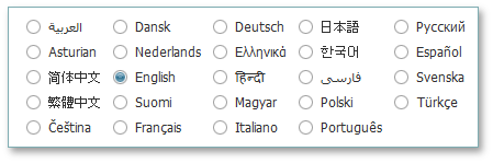
Layout Customization
The RadioButtonList layout is flexibly customized. You can display check box items in several columns using the RadioButtonListSettings.Properties.RepeatColumns (CheckListPropertiesBase.RepeatColumns) property, set a direction of items within the editor (horizontal or vertical through the RadioButtonListSettings.Properties.RepeatDirection (CheckListPropertiesBase.RepeatDirection) property), and specify whether items are aligned within a table or rendered without any table structure using the RadioButtonListSettings.Properties.RepeatLayout (CheckListPropertiesBase.RepeatLayout) property.
Custom Item Images
The RadioButtonList editor allows you to specify images for its items. You can specify one image for all items within the control using the RadioButtonListSettings.Properties.ItemImage (ListEditProperties.ItemImage) property, or set a particular image for each item using the item’s ListEditItem.ImageUrl property.