Appearance Customization
DevExpress offers several ways of customizing ASPxCardView appearance.
Cascading Style Sheet (CSS) Classes
Use cascading style sheet (CSS) classes. CSS styles define how elements are rendered, as well as their position on the page. This provides you with centralized control over the appearance of several controls or the entire website. ASPxCardView ships with a number of predefined themes. You can also create your own themes.
Built-in Styles
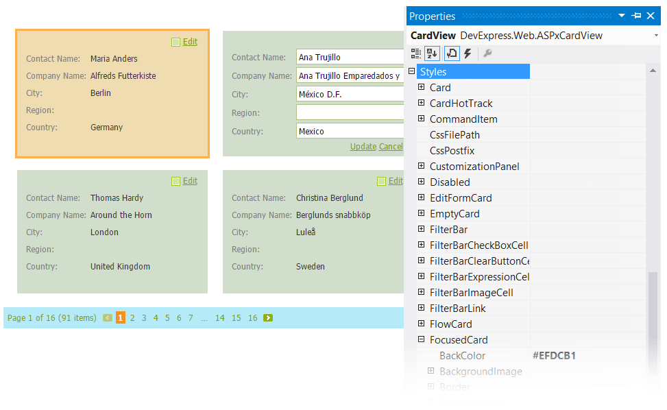
ASPxCardView provides multiple styles, so you can customize the appearance of individual elements and manage the grid’s overall appearance. Each style property has a number of attributes that allow you to customize element appearance to the maximum extent allowed by web browsers. These attributes include: colors, font, borders, content alignment, text attributes, etc.
These styles can be accessed using the ASPxCardView.Styles property. The styles used to paint the pager, grid editors and Filter Control can be accessed by the ASPxGridBase.StylesPager, ASPxGridBase.StylesEditors and ASPxGridBase.StylesFilterControl properties respectively.
Grid columns provide their own styles used to paint their headers (CardViewColumn.HeaderStyle), etc. These styles override corresponding ASPxCardView styles.