Accordion
- 3 minutes to read
IMPORTANT
Bootstrap Controls for ASP.NET Core are in maintenance mode. We don’t add new controls or develop new functionality for this product line. Our recommendation is to use the ASP.NET Core Controls suite.
The Bootstrap Accordion control allows you to introduce cutting edge site navigation capabilities to your ASP.NET Core solutions with ease and simplicity. Whether you wish to emulate a Windows® Style Explorer Bar or an MS Outlook® SideBar within your application, the Bootstrap Accordion is packed with countless developer friendly features specifically designed to help you build your best - without limits or compromise. In addition to traditional UI presentation elements, the Bootstrap Accordion allows you to create highly customized navigation options with its built-in template support - you can use it anywhere and everywhere you need to display list-oriented information to end-users.
With countless layout and appearance customization options, the Bootstrap Accordion guarantees your ability to deliver a UI that best suits your business needs and those of your customers.
This topic lists the features that are unique to Bootstrap Accordion.
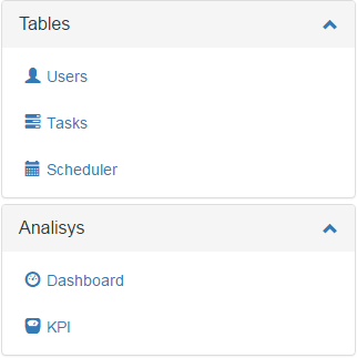
Control Features
- You can bind the Bootstrap Accordion control to a given data source to retrieve group and item information from an XML file.
- Templates can be specified for group headers in an expanded and collapsed state, group content area and individual items. This gives you the capability to introduce highly customized UI elements to your web page.
NOTE
Online Demo: The Templates online demo describes how to customize Bootstrap Accordion with templates.
Client-Side Features
- Client-side events allow you to respond to item and group header clicks and perform custom actions when groups are being expanded and collapsed.
- You can use our client-side API to expand and collapse groups, obtain link/item information, and change the selected item.
NOTE
Online Demo: The Client-Side Events and Client-Side Functionality demos illustrate this feature in detail.
Group Features
- Group headers can serve as links - simply assign a proper URL to the corresponding property.
- You can change expand button alignment either for all groups at once or for each group individually.
- You can prevent your end-users from collapsing individual groups.
- Tooltips can be assigned to group headers.
- You can customize group spacing.
- Groups can be expanded/collapsed either using mouse hover or click.
- You can display additional information in a group header within a badge.
Item Features
- Images can be displayed together with text.
- You can specify where item images should be displayed relative to item text for all items in a given group. Images can be located above or below text, to the right or its left.
- The Bootstrap Accordion control allows you to highlight selected items.
- Tooltips can be assigned to individual items.
- Item can display supplementary information within a badge.