ASP.NET Core Blazor Application Appearance
- 6 minutes to read
This article explains appearance customization options in XAF ASP.NET Core Blazor applications. It describes how to add custom themes, load your own stylesheets to modify themes, and access themes in code.

Themes
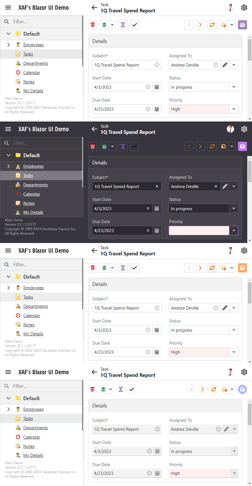
The Solution Wizard creates XAF ASP.NET Core Blazor UI applications with the following DevExpress themes: Office White, Blazing Berry, Purple, Blazing Dark, Fluent Light, and Fluent Dark.
The application configuration file (MySolution.Blazor.Server\appsettings.json) has the ThemeSwitcher section that specifies Theme Switcher settings and available themes.
  "DevExpress": {
    "ExpressApp": {
      "ThemeSwitcher": {
        // Specifies the default theme's name.
        "DefaultItemName": "Fluent Light",
        // Specifies whether the Size Mode switcher is enabled.
        "ShowSizeModeSwitcher": true,
        // The collection of theme groups.
        // Each group must have a caption and a collection of themes.
        "Groups": [
        {
          // The group's name.
          "Caption": "DevExpress Themes",
          // The collection of themes that belong to the declared group.
          "Items": [
            {
            // The theme's name.
              "Caption": "Blazing Berry",
              // The link to the declared theme's CSS file.
              "Url": "_content/DevExpress.Blazor.Themes/blazing-berry.bs5.min.css",
              // The color assigned to the theme.
              // The color is displayed in the Theme Switcher next to the theme.
              "Color": "#5c2d91"
            },
            {
              "Caption": "Blazing Dark",
              "Url": "_content/DevExpress.Blazor.Themes/blazing-dark.bs5.min.css",
              "Color": "#46444a"
            },
            {
              "Caption": "Office White",
              "Url": "_content/DevExpress.Blazor.Themes/office-white.bs5.min.css",
              "Color": "#fe7109"
            },
            {
              "Caption": "Purple",
              "Url": "_content/DevExpress.Blazor.Themes/purple.bs5.min.css",
              "Color": "#7989ff"
            }
          ]
        },
        {
          "Caption": "Fluent Themes",
          "Items": [
            {
              // The theme's name.
              "Caption": "Fluent Light",
              // The link to the declared theme's CSS file.
              "Url": "_content/DevExpress.Blazor.Themes.Fluent/modes/light.min.css",
              // Specifies the accent color for the Fluent theme.
              "AccentColor": "Blue",
              // The color assigned to the theme.
              // The color is displayed in the Theme Switcher next to the theme.
              "Color": "#0f6cbd"
            },
            {
              "Caption": "Fluent Dark",
              "Url": "_content/DevExpress.Blazor.Themes.Fluent/modes/dark.min.css",
              "AccentColor": "Purple",
              "Color": "#282828"
            }
          ]
        },
        // ...
        ]
      }
    }
  }
The DevExpress.ExpressApp.Blazor package ships with DevExtreme Generic Light and Generic Dark themes. The Generic Dark theme’s stylesheet (dx.dark.css) loads with Blazing Dark and Fluent Dark themes. The Generic Light theme’s stylesheet (dx.light.css) loads with all custom and other XAF themes. For more information about about DevExpress Blazor Themes, refer to the following topic: Themes.
Icons
You can specify icon type independently of the selected theme. The following options are available:
Auto- Default value. XAF switches icons according to the currently selected theme.
Blazor- XAF uses Blazor icons only.
Fluent- XAF uses Fluent icons only.
File: CS\YourApplication.Blazor.Server\YourApplicationBlazorApplication.cs
using DevExpress.ExpressApp;
using DevExpress.ExpressApp.Blazor;
using DevExpress.ExpressApp.Security;
using DevExpress.ExpressApp.SystemModule;
using DevExpress.ExpressApp.Utils;
using YourApplication.Blazor.Server.Controllers;

namespace YourApplication.Blazor.Server;
public class YourApplicationBlazorApplication : BlazorApplication {
    public MainDemoBlazorApplication() {
        // ...
        IconType = IconType.Fluent;
    }
}
Custom Stylesheets
You can add your own stylesheet to a built-in or custom theme. The following code snippet loads custom stylesheets with the Blazing Berry theme:
  "DevExpress": {
    "ExpressApp": {
      "ThemeSwitcher": {
        "DefaultItemName": "Office White",
        "ShowSizeModeSwitcher": true,
        "Groups": [
          {
            "Caption": "DevExpress Themes",
            "Items": [
              {
                "Caption": "Blazing Berry",
                "Url": "_content/DevExpress.Blazor.Themes/blazing-berry.bs5.min.css",
                "Color": "#5c2d91"
                // The collection of stylesheets used with a particular theme.
                "CustomUrls": [
                  "_content/DevExpress.ExpressApp.Blazor/dx.light.css",
                  "css/custom1.css",
                  "css/custom2.css"
                ]
              },
              // ...
            ]
          },
          // ...
        ]
      }
    }
  }
Note
If you use custom stylesheets, always add an explicit link to a DevExtreme theme stylesheet to ensure that XAF renders your application’s components consistently.
Add a Custom Theme in an ASP.NET Core Blazor Application
You can add a custom theme to your application. Review this section for guidance.
Since XAF ASP.NET Core Blazor UI applications support Bootstrap v5.0, this example uses the Sketchy theme from the Bootswatch theme set.
According to Bootswatch documentation, you can download the theme’s CSS file from jsDelivr using the following URL: https://cdn.jsdelivr.net/npm/bootswatch@5.1.3/dist/sketchy/bootstrap.min.css. This example uses a direct link to the CSS file.
Add the new theme to the following file: YourSolutionName\YourSolutionName.Blazor.Server\appsettings.json.
"DevExpress": {
    "ExpressApp": {
        ...
        "ThemeSwitcher": {
        "DefaultItemName": "Office White",
        "Groups": [
            {
            "Caption": "DevExpress Themes",
            "Items": [
                ...
            ]
            },
            {
            "Caption": "Third Party Themes",
            "Items": [
                {
                "Caption": "Sketchy",
                "Url": "https://cdn.jsdelivr.net/npm/bootswatch@5.1.3/dist/sketchy/bootstrap.min.css",
                "Color": "#000"
                }
            ]
            }
        ]
        }
    }
}
Run the application. The new theme is available in the Theme Switcher pane.

Switch Themes in Code
You can use the IThemeService interface to obtain the current theme, change a theme, and track theme changes.
The example in this section implements an Action that changes your XAF application’s theme to Blazing Dark.
Tip
For the purposes of this article, you can use the MainDemo application installed as a part of the XAF package. The default location of the application is %PUBLIC%\Documents\DevExpress Demos 25.1\Components\XAF.
In the Solution Explorer, right-click the Controllers folder in the MainDemo.Blazor.Server project and click Add DevExpress Item | New Item… to invoke the Template Gallery. Select the XAF Controllers | Window Controller Visual Studio template option in the Template Gallery, specify BlazingDarkController as the new item’s name, and click Add Item.
In the BlazingDarkController.cs file, replace automatically generated content with the following code snippet:
using DevExpress.ExpressApp;
using DevExpress.ExpressApp.Actions;
using DevExpress.ExpressApp.Blazor.Services;
namespace MainDemo.Blazor.Server.Controllers;

public partial class BlazingDarkController : WindowController {
    public BlazingDarkController() {
        // Create a Simple Action.
        new SimpleAction(this, "EnableBlazingDark", "View", async (s, e) => {
                var themeService = Application.ServiceProvider.GetService<IThemeService>();
                // Obtain the Blazing Dark theme.
                var theme = themeService.GetThemeByCaption("Blazing Dark");
                // Set the current theme to Blazing Dark.
                await themeService.SetCurrentThemeAsync(theme);
            }
        );
    }
}
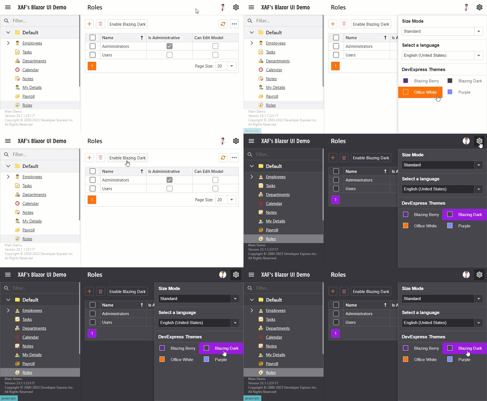
Run the application. Click the Enable Blazing Dark Action to change the theme. Navigate to the gear menu: the Blazing Dark theme should be selected.

Theme Switcher
The gear menu displays the Theme Switcher pane if your project has more than one theme.

Disable Theme Switcher
To hide the Theme Switcher pane, specify a theme as the default and remove all other themes from your application.
The following code snippet sets the Office White theme as the default and hides the Theme Switcher pane.
"DevExpress": {
  "ExpressApp": {
    "ThemeSwitcher": {
      "DefaultItemName": "Office White",
      "ShowSizeModeSwitcher": true,
      "Groups": [
        {
          "Caption": "DevExpress Themes",
          "Items": [
            {
              "Caption": "Office White",
              "Url": "_content/DevExpress.Blazor.Themes/office-white.bs5.min.css",
              "Color": "#fe7109"
            }
          ]
        }
        // Other themes are removed.
      ]
    }
  }
}
Size Mode Switcher
The Size Mode Switcher is available in the gear menu:

To switch between size modes of DevExpress Blazor components in code, use the GlobalOptions.SizeMode property.
For more information about size modes, refer to the following topic: Size Modes.