Templated ListBox Controls
- 5 minutes to read
The Item Templates feature enables you to display multiple text and image elements in ListBox controls’ items (ListBoxControl, CheckedListBoxControl, and ImageListBoxControl). To do this, create an item template that defines the pattern used to render Listbox control items.
If the Listbox control is bound to a data source, you can use the Item Template Designer to access bound data source fields and set up a template.
Item Template Capabilities
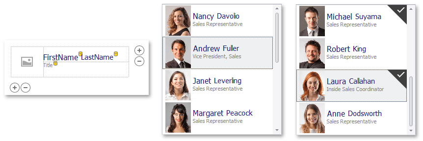
- The item template can consist of any number of text and image elements. You can display images in all Listbox controls.
- The dedicated Item Template Designer provides the capability to set up the item template at design time.
- Dynamic templated item customization at runtime with the BaseListBoxControl.CustomizeItem event.
- Create multiple item templates and substitute them at runtime with the BaseListBoxControl.CustomItemTemplate event.
- Bound and unbound elements in the item template. Unbound elements display static text and images; bound elements display data from underlying data source fields.
- Multiple alignment options for template elements, including alignment relative to other elements, and absolute or relative element size specification.
- Customize certain elements’ appearance (font attributes and colors) with corresponding properties.
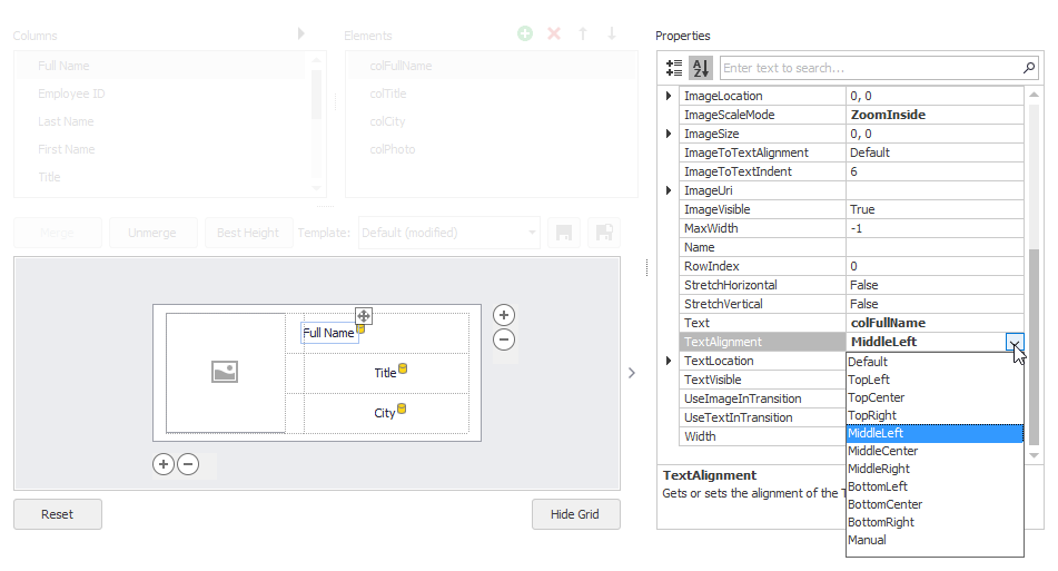
Invoke Item Template Designer
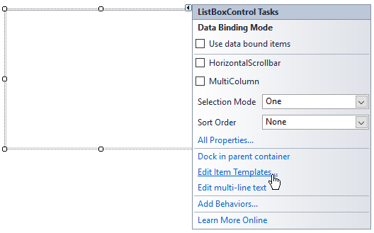
Click the Listbox control’s smart tag and select the Edit Item Templates command.
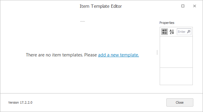
This opens the Item Template Designer. The designer prompts you to create a new template if there are no existing ones.
Once you provide a name for the new template, the Item Template Designer shows the template design surface.
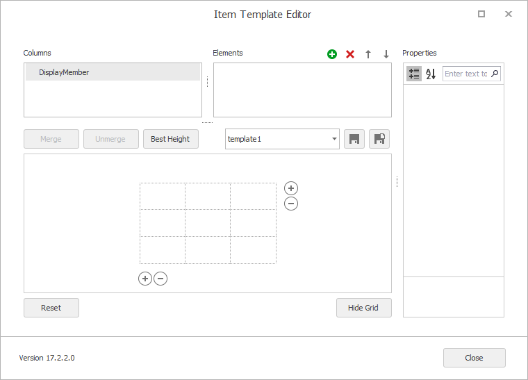
If the control was bound to a data source at design time, the Columns list allows you to access the available data source fields.
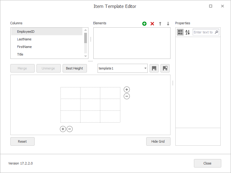
- Columns list - Displays fields from the data source bound to the ListBox control. If the ListBox control is not currently bound, the Columns list only displays the DisplayMember item (this identifies a listbox item’s default text content).
- Elements list - Displays existing template elements. You can use the buttons at the top of the list to add and delete elements. You can also drag fields from the Columns list onto the design surface to add elements.
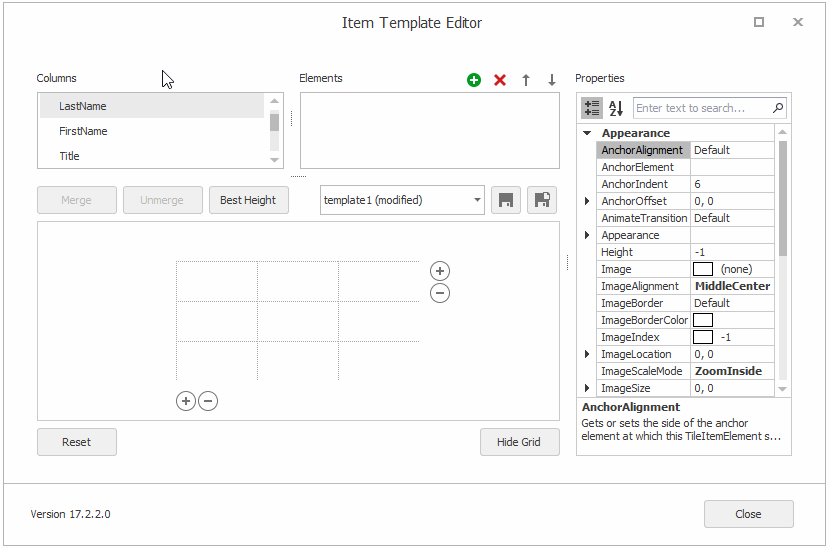
- Properties grid - Allows you to modify the selected element’s settings.
Set Up Item Template
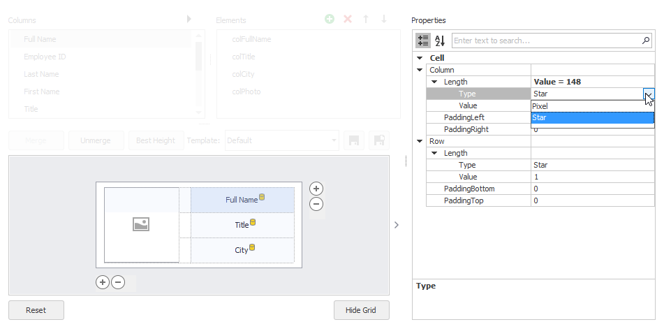
The item template is based on the common Table Layout concept in which the design surface is divided into logical columns and rows, and the contents are placed in corresponding cells (which can be merged if required).
The supported template customization actions include:
Drag-and-drop fields from the Columns list onto table cells.
When you drop a field onto a cell, it automatically creates a bound template element.
- Drag-and-drop created elements between cells.
- Place multiple elements in the same cell, with different alignment options for these elements to prevent overlap (see the Anchor… properties).
- Select cells with the mouse pointer and click the Merge button to merge cells.
- Unmerge previously merged cells with the Unmerge button.
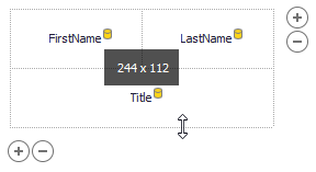
- Resize cells with the mouse pointer.
- Drag an item template’s edges with a mouse pointer to resize it.
Add/remove columns and rows with the
 buttons and context menu.
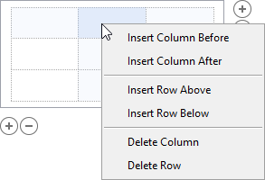
Click a cell to select it, and customize the cell’s size, size type (absolute or relative) and padding in the Property Grid.
Click a dropped element to access it and customize its settings in the Property Grid.
- Manipulate the element collection from the Elements list. For instance, you can add unbound elements. When an element is created, it is automatically added to the template.
- Support for multiple templates.
Multiple Item Templates
A template created in the designer is added to the BaseListBoxControl.Templates collection. The first template in this collection becomes active, and it is initially used to render all items.
You can create more templates and apply them to different items or in different cases. For instance, you can create two item templates - “compact” (displays less information) and “detailed” (displays more details), and switch between them depending on the control’s width.
To create multiple item templates, use the Save As button ( ), which saves a copy of the current template with a different name. You can then modify the new template and save the changes.
To dynamically assign templates to items, handle the BaseListBoxControl.CustomItemTemplate event.
Item Height
When you resize an item template vertically, you change the item’s height in the BaseListBoxControl.ItemHeight property. All item templates share this setting.
All items in the ListBox control have the same item height (BaseListBoxControl.ItemHeight).
You can handle the BaseListBoxControl.MeasureItem event to specify height for individual items.
Auto-Height
ListBoxControl calculates item height based on content if you do the following:
- Enable the BaseListBoxControl.ItemAutoHeight property.
- Enable the TableRowDefinition.AutoHeight setting for a specific row (or rows) in the ListBoxControl’s item template.
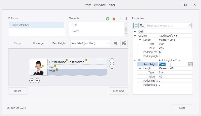
- You can use the MaxLineCount property to specify a height limit for items.
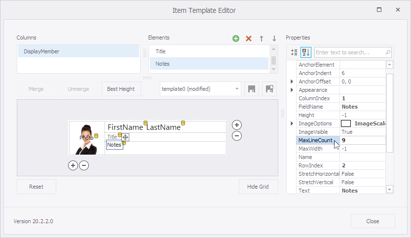
Example
The following example enables automatic item height calculation for a sample template-based ListBoxControl. The example allows the row that contains a Notes element to automatically adjust its height. In addition, the code sets the MaxLineCount property to limit the maximum height of the Notes element.