StepProgressBar Class
A control that visualizes event chains.
Namespace: DevExpress.Xpf.Controls
Assembly: DevExpress.Xpf.Controls.v25.1.dll
NuGet Package: DevExpress.Wpf.Controls
Declaration
Remarks
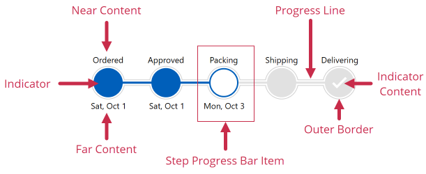
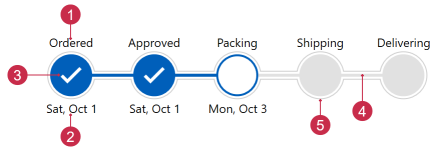
StepProgressBar Visual Structure
The StepProgressBar consists of StepProgressBarItem objects and the progress line. Each StepProgressBarItem contains an item state indicator and two labels on opposite sides:
Create a StepProgressBar
Add a
StepProgressBarto your window in any of the following ways:- Drag the control from the Visual Studio toolbox to the XAML designer.
- Add a reference to the
DevExpress.Wpf.Controlsassembly. Add aStepProgressBarobject to XAML.
<Window ...
        xmlns:dxco="http://schemas.devexpress.com/winfx/2008/xaml/controls">
    <Grid>
        <dxco:StepProgressBar/>
    </Grid>
</Window>
Create StepProgressBarItem objects and add them to the
StepProgressBarmarkup. These objects are individual steps within the overall progress:
<dxco:StepProgressBar>
    <dxco:StepProgressBarItem />
    <dxco:StepProgressBarItem />
    <dxco:StepProgressBarItem />
    <dxco:StepProgressBarItem />
    <dxco:StepProgressBarItem />
</dxco:StepProgressBar>
Orientation and ReverseOrder properties specify the layout of StepProgressBarItems.
Specify each item’s labels:
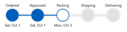
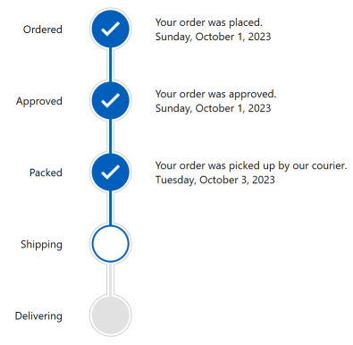
<dxco:StepProgressBar Offset="20" SelectedItemState="Indeterminate">
    <dxco:StepProgressBarItem Content=""
                              NearContent="Ordered"
                              FarContent="Sat, Oct 1"/>
    <dxco:StepProgressBarItem Content=""
                              NearContent="Approved"
                              FarContent="Sat, Oct 1"/>
    <dxco:StepProgressBarItem Content=""
                              NearContent="Packing"
                              FarContent="Mon, Oct 3"
                              IsSelected="True"/>
    <dxco:StepProgressBarItem Content=""
                              NearContent="Shipping"/>
    <dxco:StepProgressBarItem Content=""
                              NearContent="Delivering">
    </dxco:StepProgressBarItem>
</dxco:StepProgressBar>
Enable the AllowItemClick property to allow users to click
StepProgressBaritems to change their state.Display images for completed steps:
- Create an implicit style for StepProgressBarItems.
- Specify an item’s
ContentTemplateproperty to change indicator content. - Apply this property if the item’s State property is
Completed.
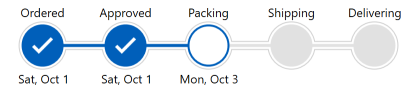
<Window.Resources>
    <Style TargetType="dxco:StepProgressBarItem">
        <Style.Triggers>
            <Trigger Property="State" Value="Completed">
                <Setter Property="ContentTemplate">
                    <Setter.Value>
                        <DataTemplate>
                            <Image Source="{dx:SvgImageSource Uri='pack://application:,,,/DevExpress.Images.v25.1;component/SvgImages/Icon Builder/Actions_Check.svg'}"
                                   Width="24" Height="24">
                                <dx:WpfSvgPalette.Palette>
                                    <dx:WpfSvgPalette>
                                        <SolidColorBrush x:Key="Green" Color="White"/>
                                    </dx:WpfSvgPalette>
                                </dx:WpfSvgPalette.Palette>
                            </Image>
                        </DataTemplate>
                    </Setter.Value>
                </Setter>
            </Trigger>
        </Style.Triggers>
    </Style>
</Window.Resources>
Generate Items from the View Model
The StepProgressBar can obtain its items from a View Model collection:
Create a collection of items that should be displayed in the
StepProgressBar:public class Stage { public int ID { get; set; } public string NameDone { get; set; } public string Name { get; set; } public string Description { get; set; } public DateTime Date { get; set; } } public class StageData { public static ObservableCollection<Stage> GetStages() { var stages = new ObservableCollection<Stage>() { new Stage() { ID = 0, NameDone = "Ordered", Name = "Ordering", Description = "Your order was placed.", Date = new DateTime(2023,10,1),}, new Stage() { ID = 1, NameDone = "Approved", Name = "Approving", Description = "Your order was approved.", Date = new DateTime(2023,10,1) }, new Stage() { ID = 2, NameDone = "Packed", Name = "Packing", Description = "Your order was picked up by our courier.", Date = new DateTime(2023,10,3) }, new Stage() { ID = 3, NameDone = "Shipped", Name = "Shipping", Description = "Your order was shipped.", Date = new DateTime(2023,10,6) }, new Stage() { ID = 4, NameDone = "Delivered", Name = "Delivering", Description = "Your order was delivered.", Date = new DateTime(2023,10,8) }, }; return stages; } }Create a View Model:
Specify the window’s
DataContextand bindStepProgressBar.ItemsSourceandStepProgressBar.SelectedItemto View Model properties:<Window ... xmlns:dxco="http://schemas.devexpress.com/winfx/2008/xaml/controls"> <Window.DataContext> <local:ViewModel/> </Window.DataContext> <Grid> <dxco:StepProgressBar ItemsSource="{Binding Stages}" SelectedItem="{Binding CurrentStage}" SelectedItemState="Indeterminate" Orientation="Vertical" Offset="30"> </dxco:StepProgressBar> </Grid> </Window>Set the Orientation property to
Verticalto display theStepProgressBarvertically.Use the
StepProgressBar.ItemContainerStyleproperty to bind generated items to data:<dxco:StepProgressBar.ItemContainerStyle> <Style TargetType="dxco:StepProgressBarItem"> <Setter Property="Content" Value=""/> <Setter Property="NearContent" Value="{Binding Name}"/> <Setter Property="NearContentHorizontalAlignment" Value="Right"/> <Setter Property="FarContentHorizontalAlignment" Value="Left"/> <Style.Triggers> <Trigger Property="State" Value="Completed"> <Setter Property="NearContent" Value="{Binding NameDone}"/> <Setter Property="FarContent" Value="{Binding}"/> <Setter Property="FarContentTemplate"> <Setter.Value> <DataTemplate> <StackPanel Orientation="Vertical"> <TextBlock Text="{Binding Description}"/> <TextBlock Text="{Binding Date, StringFormat=D}"/> </StackPanel> </DataTemplate> </Setter.Value> </Setter> <Setter Property="ContentTemplate"> <Setter.Value> <DataTemplate> <Image Source="{dx:SvgImageSource Uri='pack://application:,,,/DevExpress.Images.v25.1;component/SvgImages/Icon Builder/Actions_Check.svg'}" Width="24" Height="24"> <dx:WpfSvgPalette.Palette> <dx:WpfSvgPalette> <SolidColorBrush x:Key="Green" Color="White"/> </dx:WpfSvgPalette> </dx:WpfSvgPalette.Palette> </Image> </DataTemplate> </Setter.Value> </Setter> </Trigger> </Style.Triggers> </Style> </dxco:StepProgressBar.ItemContainerStyle>
Customize Appearance
The following properties allow you to customize the control’s appearance. Property names are self-explanatory.
NearContent, NearContentTemplate, NearContentTemplateSelector
Foreground, NearContentHorizontalAlignment, NearContentVerticalAlignment, NearContentLengthFarContent, FarContentTemplate, FarContentTemplateSelector
Foreground, FarContentHorizontalAlignment, FarContentVerticalAlignment, FarContentLengthContent,ContentTemplate,ContentTemplateSelectorBackground,HorizontalContentAlignment,VerticalContentAlignment, IndicatorLength, IndicatorGeometry, IndicatorBorderSize,BorderBrush, HoverBackground, HoverBorderBrushShowProgress, ProgressSize, ProgressAnimationDuration, ProgressStyle, Offset
ShowOuterBorder, OuterBorderBrush, OuterBorderSize, OuterBorderIndent