Customize the Dashboard Appearance
- 3 minutes to read
This tutorial demonstrates how to manage the coloring of chart series points and apply formatting to grid cells whose values meet specific conditions.
Manage the Coloring
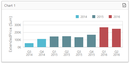
Select a chart item, invoke its Options menu and expand the Coloring section. Here you can specify the coloring mode for all measures and dimensions. Select On for the OrderDate argument to color years by different hues.
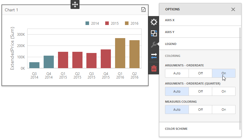
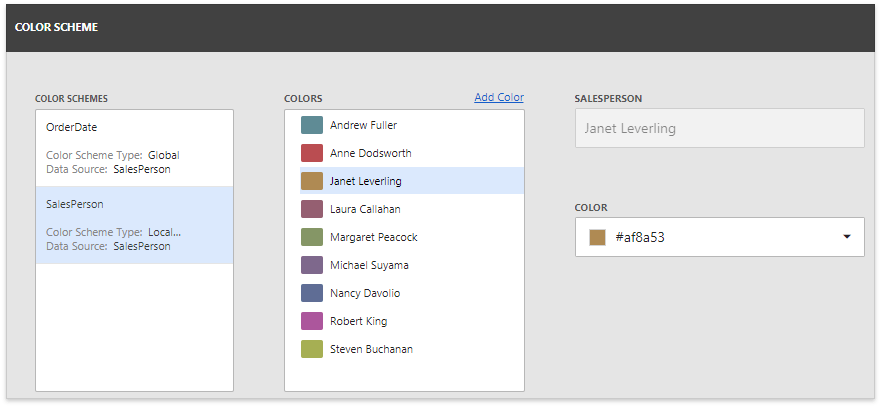
Open the Color Scheme section to customize colors of a specific palette.
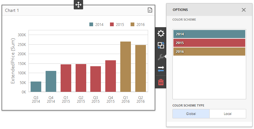
The dashboard provides two ways of coloring dashboard item elements:
- A global color scheme provides consistent colors for identical values across the dashboard.
- A local color scheme provides an independent set of colors for each dashboard item.
You can edit the color scheme by clicking the Edit button for the color you want to change. In the invoked color picker, select any color using the RGB model and click Confirm.
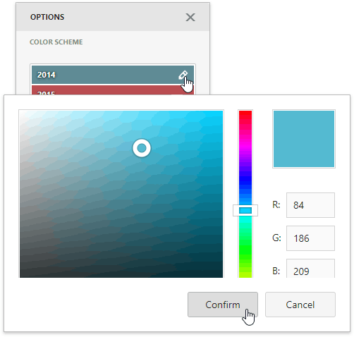
This applies a new color scheme to the dashboard item.
You can manage the coloring of pie segments in the same way.
An alternative way to customize color palettes is to click the Dashboard Menu button and select Color Scheme.
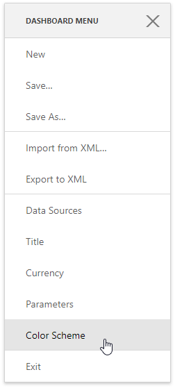
The appeared Color Scheme page allows you to edit and add new colors in the selected scheme.
Apply Conditional Formatting
Select the Grid dashboard item and open its Bindings menu. Click the ExtendedPrice column, go to the Conditional Formatting section and click the plus button to add a new format rule.
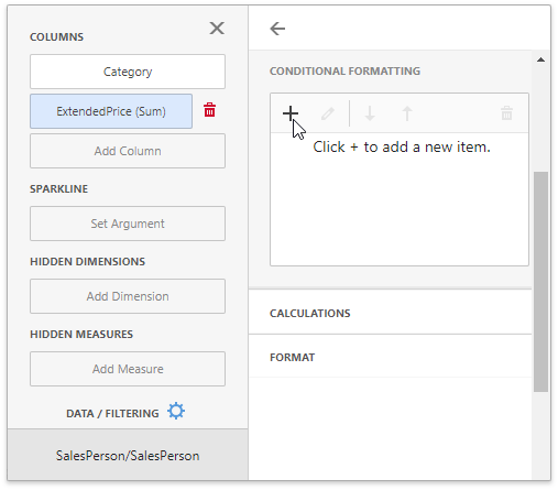
Use the Apply to combo box to specify the data item to apply conditional formatting (the same ExtendedPrice column in this case) and select the Color Range Bar condition type from the list.
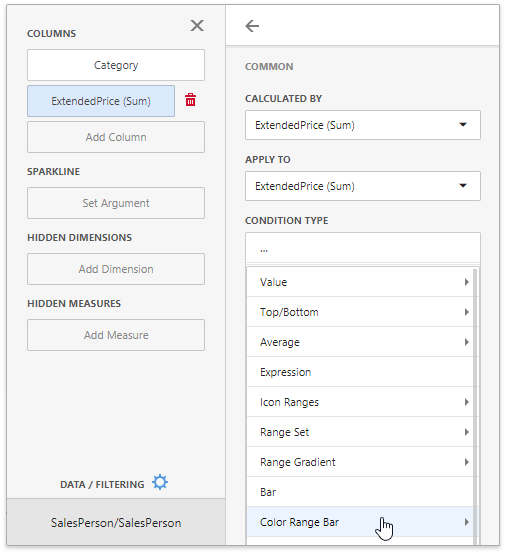
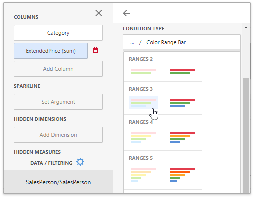
This opens the format rule’s menu that depends on the format rule condition and a dashboard item’s type. Here select the required bar range and color set.
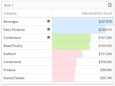
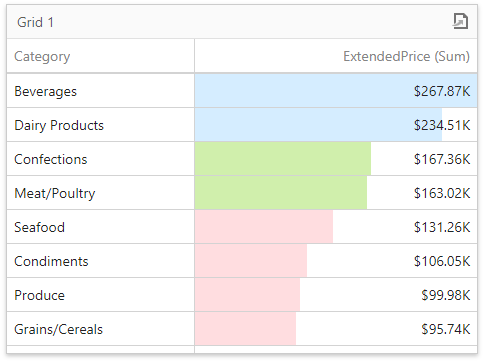
The extended price values are visualized using bars in the specified color scheme.
Once again, select the ExtendedPrice column and add a new format rule. Choose the Category column in the Apply to combo box and select the Top/Bottom -> Top N condition type.
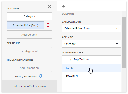
The Style section allows you to choose the predefined background color or font in the Appearance tab or the predefined icon in the Icons tab. Select the filled star icon for this rule and set the Count option to 3.
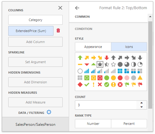
The grid displays star icons in the Category cells corresponding to three topmost extended price values.