CustomizeHeatmapToolTipEventArgs.HeatmapCell Property
Returns a heatmap cell for which a tooltip is shown.
Namespace: DevExpress.XtraCharts.Heatmap
Assembly: DevExpress.XtraCharts.v25.1.dll
NuGet Package: DevExpress.Charts
Declaration
Property Value
| Type | Description |
|---|---|
| HeatmapCell | Contains heatmap cell arguments and value. |
Example
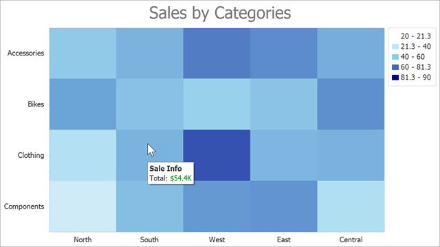
This example shows how to use the HeatmapControl.CustomizeHeatmapToolTip event to modify tooltip content based on the cell value for which the tooltip is shown.
Follow the steps below to enable and customize tooltips:
- Set the HeatmapControl.ToolTipEnabled property to
true. - Initialize the HeatmapControl.ToolTipController property with a ToolTipController object. Enable the controller’s AllowHtmlText property to apply HTML tags to tooltip content.
- In the HeatmapControl.CustomizeHeatmapToolTip event handler, specify the e.Title and e.Text properties to format tooltip text.
The code below applies a custom format to tooltip text if a heatmap cell value is more than the specified value:
const int ThresholdValue = 50;

public Form1() {
    InitializeComponent();
    // ...
    heatmap.ToolTipEnabled = true;
    heatmap.ToolTipController = new DevExpress.Utils.ToolTipController { AllowHtmlText = true };
    heatmap.CustomizeHeatmapToolTip += OnHeatmapCustomizeHeatmapToolTip;
}

private void OnHeatmapCustomizeHeatmapToolTip(object sender, CustomizeHeatmapToolTipEventArgs e) {
    double cellValue = (double)e.HeatmapCell.ColorValue;
    if (cellValue > ThresholdValue) {
        e.Title = "Sale Info";
        e.Text = $"Total: <color=green>${cellValue}K</color>";
    }
}
See Also