Blazor Progress Bar
The Progress Bar component allows you to inform users about the status of ongoing processes.
API Reference
Refer to the following list for the component API reference: DxProgressBar Members.
Features
Built-In Status Values for State Indication
The Progress Bar component support four pre-defined status values. They affect the the icon, default label, and the component’s appearance.
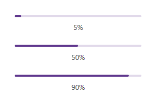
Progress Status Measurement
The progress bar label displays information about progress status in percent. When progress cannot be estimated or it is not necessary to indicate progress numerically, you can display a moving bar animation.
Horizontal, Vertical, and Circular Layout
Use the Type property to change the bar type from the horizontal bar to vertical or circular.
Element Customization
For each bar type, you can specify a Label, icon, and Thickness.
Localization
The Progress Bar component’s UI elements such as labels, context menus, and error messages are displayed in English. Localization automatically adapts the component to the user’s preferred language.
DevExpress components include predefined satellite resource assemblies for German, Spanish, and Japanese. Use the DevExpress Localization Service to create and download a custom set of satellite assemblies, and modify resources.