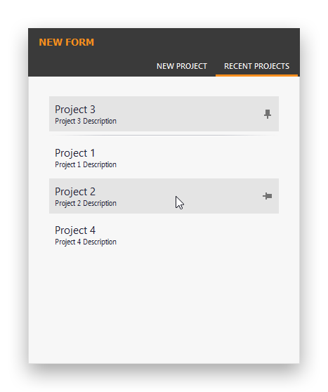
Modify Tab Pane and Recent Item Control Skin Elements
- 2 minutes to read
Skin elements responsible for the Tab Pane control are grouped in the “Navigation Pane” category. Open this category and select the “TabPaneButtonBackground” element.
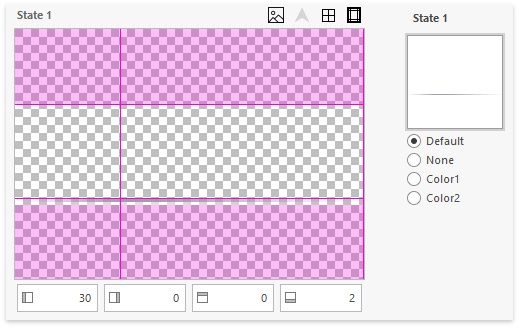
- Set all margins of this element to zero, then set its Backcolor setting to #3A3A3A.
Clear the bitmap, so that its gray bottom line is gone. To do so, either erase this line in a graphics editor or right-click the image preview in the Skin Editor and select “Recreate”.
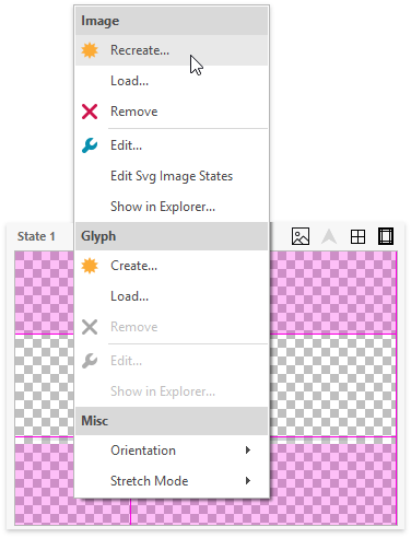
In the dialog that appears, leave all settings as is (100x29 size, 1 state, Horizontal layout, default image type) and click “Create”.
- Do the same for the “TabPaneButton” skin element to remove the beak that points to a currently selected tab.
- Set the ForeColor property of the “TabPanelButton” skin element to #F7F7F7.
Open the background image of the “TabPanelButton” skin element in a graphics editor. Fill areas that correspond to the second and third skin element states (hovered and selected) with the #3A3A3A color, then draw a thin #F88E1D line at the bottom of each area.
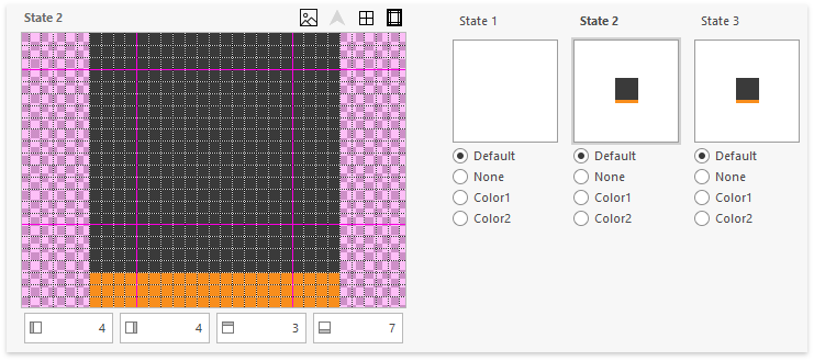
Re-generate your project assembly and run the testing application.
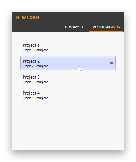
Your side form borders are painted with the light #DFDFDF color, which is in contrast with the tab background’s dark #3A3A3A color. This leads to visible 29-pixel dashes on both sides of a dialog (with default font size settings, the height of Tab Pane header area equals 29 pixels).
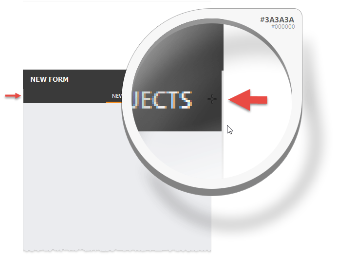
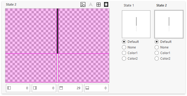
To fix this, modify the FormFrameLeft and FormFrameRight skin elements, so that they have a 29-pixel line painted with the #3A3A3A color. The top margins of each element must also be set to 29 pixels.
Run the testing application again to make sure the form’s side borders display correctly.

To make Recent Item Control pin items look flat, edit the “GalleryButton” element bitmap.
