Modify XtraForm Skin Elements
- 3 minutes to read
- In the Skin Editor, select the “Form” skin element group. In the property grid, set the Text Color property to #F88E1D and clear the Text Shadow Color setting. Note that depending on the current Skin Editor settings, property names may differ.
- Select the “Common” skin element group and change the “Control” color to #F7F7F7.
Locate and click the “FormCaption” skin element that represents the form title bar to see its default settings.
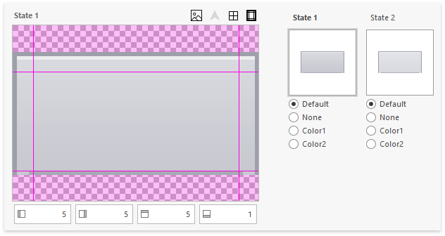
- This element has a background image for each state (active and inactive).
- Background image side margins are set to 5 pixels, top and bottom margins are set to 1 pixel.
- The form caption has no glyph.
- The form title bar’s default height is 10 pixels (the MinSize setting in the element properties).
Hover over the state preview area and click the background image size to open this bitmap in an external graphics editor.
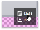
Inspect the background image in the graphics editor. This image stores bitmaps for all element states at once, arranging them in a single column.
- Fill the entire rectangle with #3A3A3A color and save the image.
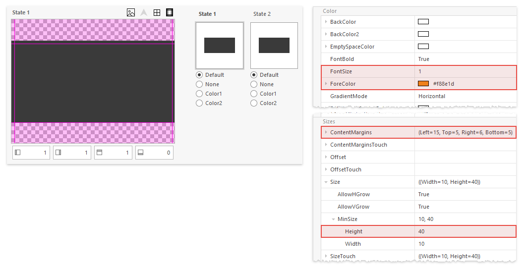
Apply the following modifications to the FormCaption skin element:
- Left and right margins: 1 px
- Top margin: 1 px
- Bottom margin: 0 px
- Height: 40
- Forecolor: #F88E1D
- FontSize: 1
- Left ContentMargin: 15
Remaining form borders are represented by the FormFrameLeft, FormFrameRight, and FormFrameBottom skin elements. In the “DevExpress Style” skin these are 5-pixel borders with dark gray edges.
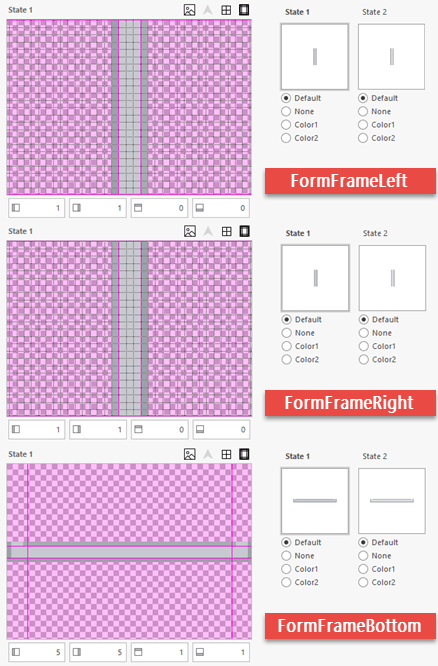
Edit these bitmaps in a graphics editor as follows.
- Left and right frame bitmaps: crop images to 1 pixel in width and fill them with the #DFDFDF color.
- Bottom frame bitmap: crop the image to 2 pixels in height and fill it with the #DFDFDF color.
- Set frame element sizes, so that they fit your new bitmaps: left and right frames must be 1-pixel wide (“Size | MinSize | Width” in the property grid), the bottom frame must be 1-pixel high (“Size | MinSize | Height” in the property grid).
- Set sizing margins for all three frames to zero.
Refresh the project assembly and run your testing application to see the result.
XtraForms display shadow effects by default. To remove the shadow effect from the form, set the XtraForm.FormBorderEffect property to
FormBorderEffect.None:namespace DXApplication { public partial class Form1 : DevExpress.XtraEditors.XtraForm { public Form1() { InitializeComponent(); this.FormBorderEffect = DevExpress.XtraEditors.FormBorderEffect.None; } } }To modify this shadow, customize the four “FormDecoratorFrame…” skin elements in the Skin Editor.