DevExpress Report Designer for JetBrains Rider - User Interface
- 7 minutes to read
The Report Designer allows you to design and preview a report in JetBrains Rider at design time.
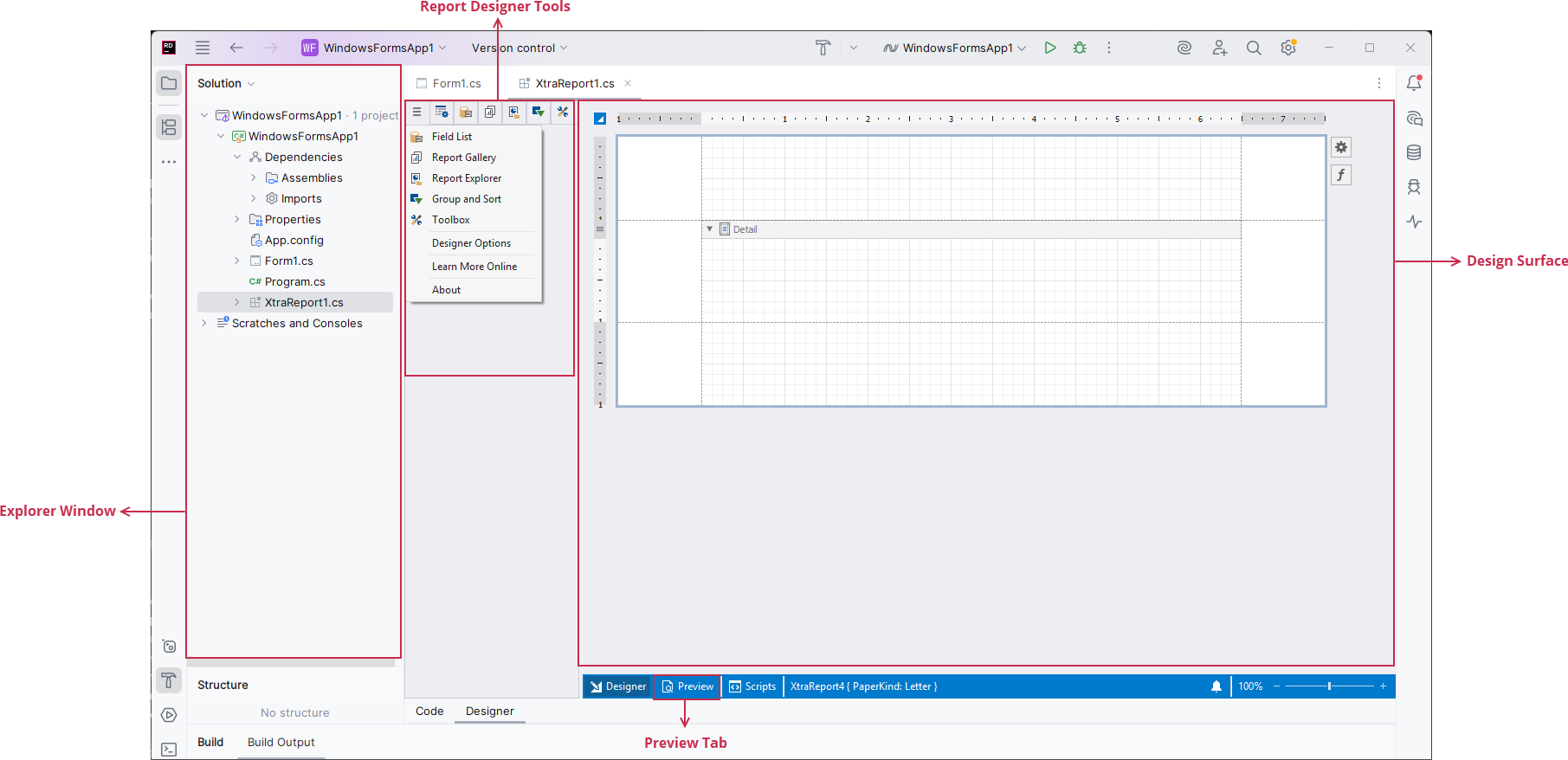
Designer Surface
Designer Tab
The Designer tab includes the design surface that consists of bands. You can drop report controls onto these bands to design a report layout.
Preview Tab
The Preview tab allows you to generate and preview a report document.
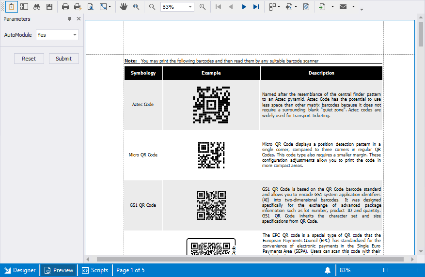
In this tab, you can also do the following:
- Use the Parameters panel to specify values of report parameters.
- Save, print, export, or email the document.
- Configure page settings.
- Scale, zoom, and navigate the document.
- Specify a background color and a watermark.
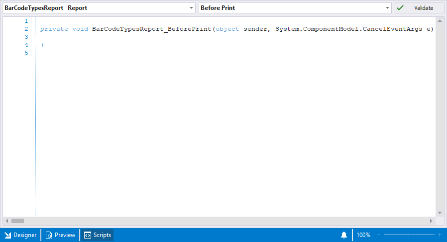
Scripts Tab
In the Scripts tab, you can write code that uses report data for custom calculations.
Report Designer Windows and Panels
The following menu allows you to access report designer windows and panels at design time:
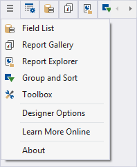
Use the Report Designer menu to do the following:
- Switch to various designer tool tabs.
- Invoke the Report Designer Options window (Designer Options).
- Open the DevExpress Reporting online documentation (Learn More Online).
- Get information about your DevExpress subscription (About).
Properties Tab
Use this tab to view, discover, and change the properties of selected report elements.
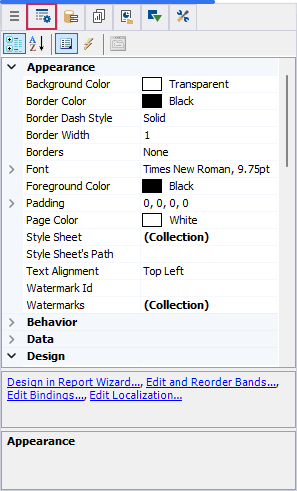
Click a report element on the design surface and specify its properties. Properties are split to categories. You can also sort them alphabetically.
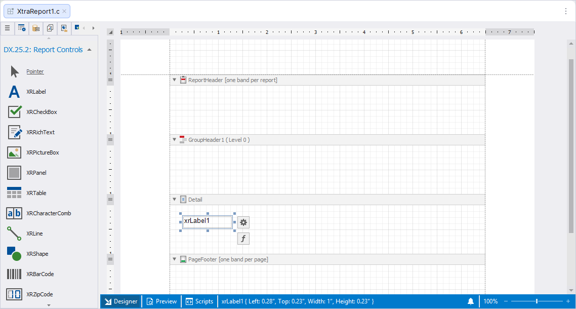
Toolbox
The Toolbox tab contains elements (report controls) that can be added to a report in the Report Designer. To add a new control to the report, drag an item from the Toolbox and drop it onto the report band.
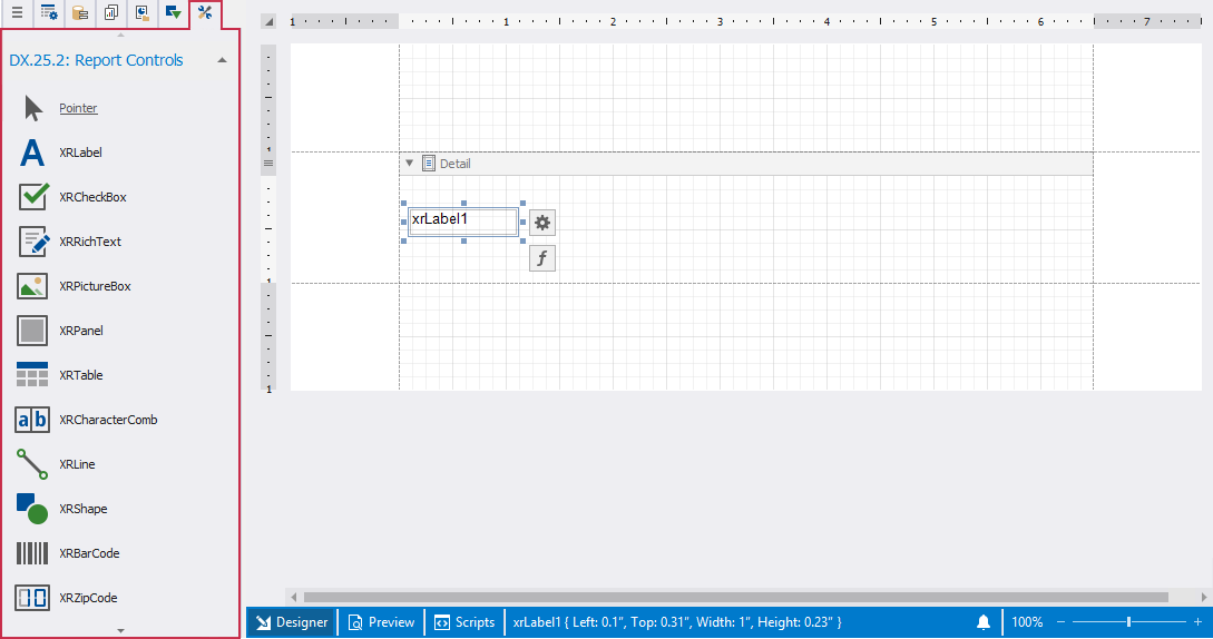
Review the following help topic for information on how to add report controls: Add Controls to a Report.
Report Designer Options
This dialog specifies the default settings for all reports you create in JetBrains Rider.
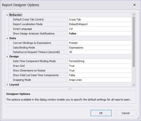
The window contains the following settings:
- Default CrossTab Control
- Specifies the default control that is used to present cross-tab data (XRCrossTab or XRPivotGrid).
- Report Localization Mode
- Specifies whether the report uses localization strings embedded in a report (contained in the REPX file) or loads the localized resources from satellite resource assemblies.
- Script Language
- Specifies the default script language used in reports (C#, Visual Basic, or JavaScript).
- Convert Bindings to Expressions
- Specifies whether the designer automatically converts data bindings to expressions when opening reports that have bindings defined for any of their elements.
- Date-Time Component Binding Mode
- Specifies how report controls extract date-time components from bound field values.
- Data Binding Mode
- Specifies the data binding mode for report controls.
- Data Source Request Timeout
- Specifies the maximum time the Report Designer waits for an external process to execute a request to a data source.
- Draw Grid
- Specifies whether to draw the snap grid over the report surface to help align report elements.
- Show Dimensions on Resize
- Specifies whether to display exact element size (dimension notations) on the reporting surface during resize operations. The notations are based on a specified report unit (inches, millimeters, or pixels).
- Show Field List Date-Time Components
- Specifies whether to expand date-time fields in the Field List panel to reveal their components so you can directly bind them to report controls.
- Snapping Mode
- Specifies the default mode of snapping report elements to each other when they are resized or moved.
- Font
- Specifies the default font to use when designing a new report in the Report Designer.
- Report Unit
Specifies the default units of measurement used in reports to define element locations, dimensions, and margins.
Note
When setting ReportUnit.TenthsOfAMillimeter or ReportUnit.Millimeters as report units, the empty and data-based reports created using the Report Wizard have their XtraReport.PaperKind property set to PaperKind.A4. Otherwise, they are set to PaperKind.Letter.
- Enable Accessibility Validation
- Specifies whether accessibility validation results are displayed in the Error List.
- Suppressed Error Codes
- Specifies error codes that are excluded from Error List results.
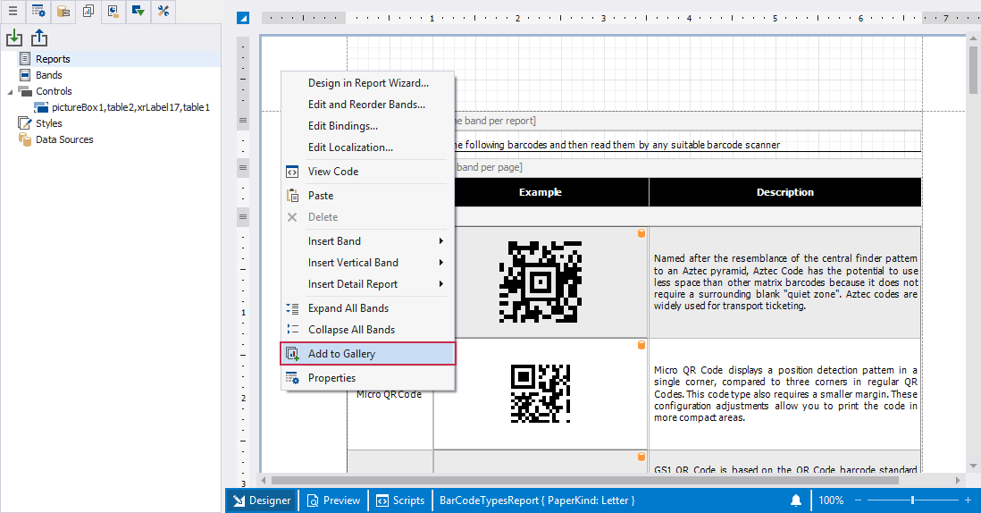
Report Gallery
Allows you to store and reuse reports and their elements.
You can save, reuse or apply the following settings:
| Element | What can be saved | What is restored or applied |
|---|---|---|
| Report | Full report layout template. | Entire report layout, all styles, all controls. |
| Band | Layout of the selected band. | Band structure, contained controls, bindings, appearance, grouping levels. |
| Controls | Selected controls from the same band. | All control settings: size, bindings, appearance, expressions. |
| Style | A single style. | Style is added to the report style sheet and applied to the target control. |
| Data Source | SqlDataSource, ExcelDataSource, JsonDataSource. | Data source instance with connection settings and schema. |
To create a new template, right-click a report/report area you want to add to the template and select Add To Gallery in the context menu:
To apply saved template, drag-and-drop it to the report surface from the Report Gallery.
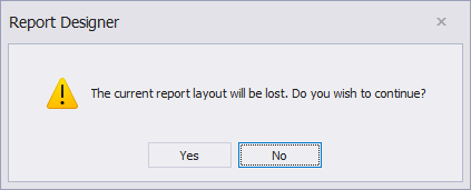
The following dialog warns you that the template overrides the current layout:
You can import gallery items from an XML file. Right-click the Import toolbar button, locate the file in the invoked Open dialog, and click OK.
To save gallery templates to an XML file, click the Export toolbar button and select a target file in the Save dialog.
Review the following help topic for more information: Report Gallery.
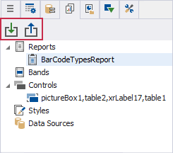
Report Explorer
Displays a report structure in a tree-like form and allows users to access report styles and report data sources.

To search for a report element, type the beginning of the element’s name in the search box. The Report Explorer filters the elements that match the typed string.
Review the following help topic for more information: Report Explorer.
Field List
Displays a tree view with data sources, available fields, calculated fields, and report parameters.
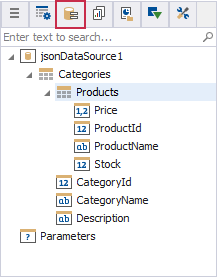
Use the Field List menu to do the following:
Search for specific fields or tables.
Drag fields onto the report surface to bind controls to data.
Choose which control type to create when adding a field.
Add calculated fields.
Add or modify report parameters.
Review the following help topic for more information: Field List.
Group and Sort Panel
This panel is active only when a report is bound to a data source. It enables you to manage the group and sort settings of a report.
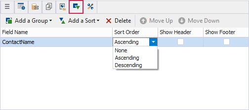
Use this panel to create group or sort criteria for a report, change the priority in which these rules are applied and choose whether to display the corresponding group bands in a report.
The Sort Order menu enables you to specify the sorting order for each group (ascending or descending) or disable sorting altogether.
Review the following help topic for details about grouping and sorting: Group and Sort the Report Data.
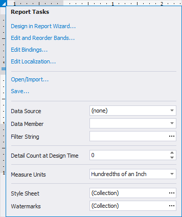
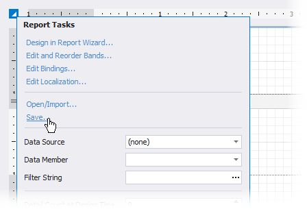
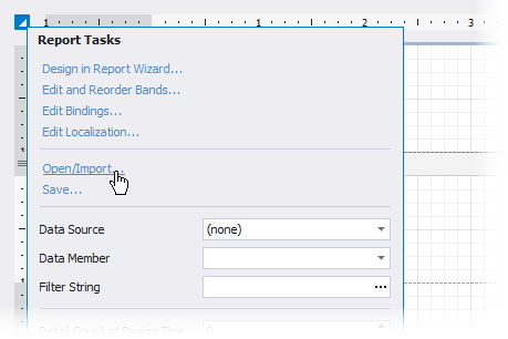
Use the Report Smart Tag
Report Smart Tag contains the main report configuration options. It allows you to modify data binding settings, manage bands, adjust measurement units, apply styles, and configure report-level components without navigating away from the design surface.
The following table lists main smart tag actions:
| Action | Description |
|---|---|
| Design in Report Wizard | Reconfigures the report structure using the Report Wizard. |
| Edit and Reorder Bands | Opens the Band Editor to add, remove, or reorder bands. |
| Edit Bindings | Opens the Binding Editor for report-level data bindings. |
| Edit Localization | Opens the Localization Editor to manage localized text. |
| Open/Import | Loads an existing report layout. |
| Save | Saves the current report layout. |
The following table illustrates the main report settings you can specify in the smart tag:
| Setting | Description |
|---|---|
| Data Source | Selects the report’s data source. |
| Data Member | Specifies the data member inside the selected data source. |
| Filter String | Defines a filter applied to the report’s data. |
| Detail Count at Design Time | Specifies how many detail records are displayed in the report preview. |
| Measure Units | Sets measurement units for the report layout. |
| Style Sheet | Manages the collection of styles used in the report. |
| Watermarks | Adds or edits report watermarks. |
Report Wizard
On the first wizard page you can choose the report type you want to create.
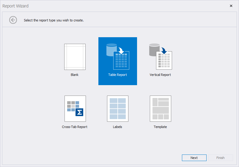
Note
A template for inherited reports is not supported in the Report Wizard. You can inherit from a report only in code.
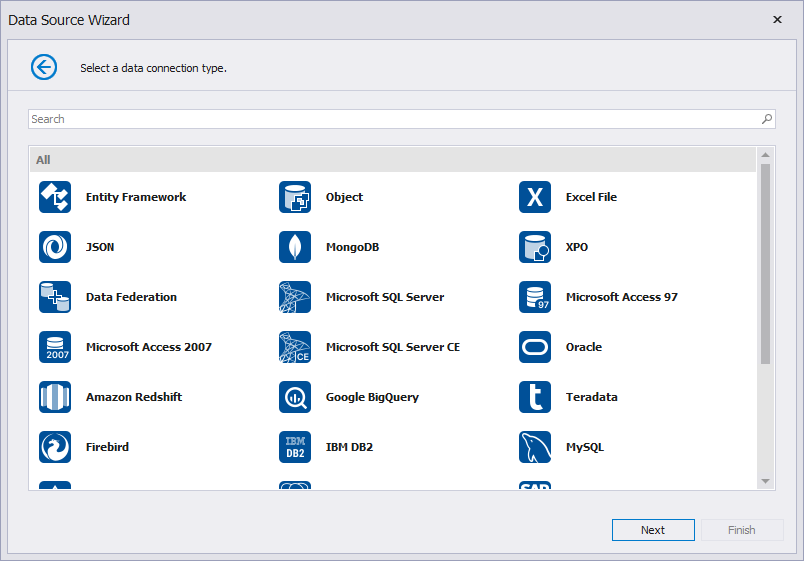
After you select a report type, the wizard allows you to specify an existing data connection or configure a new connection. The Data Source Wizard includes various data source types you can use to connect a report to a data source:
Save/Import
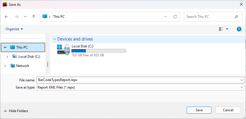
To save a report, click the report’s smart tag and click Save.
In the invoked Save As dialog, select a folder, type a file name, and press Save.
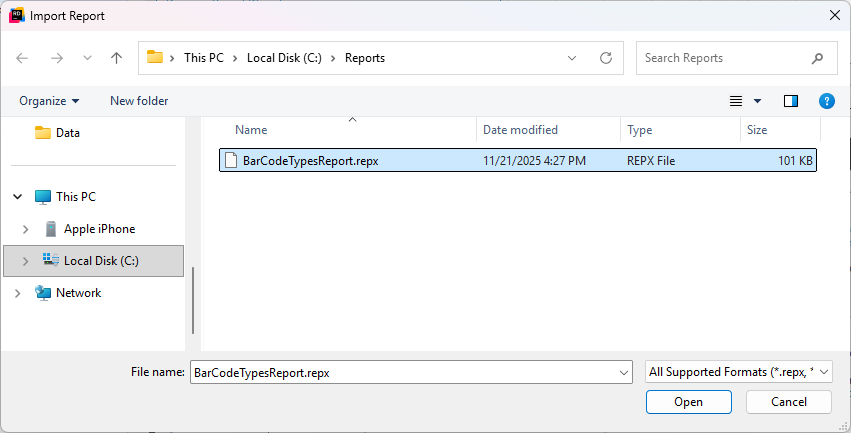
Click the report’s smart tag and select the Open/Import action.
Select a *.repx file in the invoked Import Report dialog.