Define and Configure Generated Diagram Items
- 4 minutes to read
Item Template Designer
The Item Template Designer is a design-time tool used to define the appearance of items and connectors for diagrams generated from a data source (DiagramDataBindingBehavior and DiagramOrgChartBehavior).
Get Started With the Item Template Designer
Follow the steps below to invoke the Item Template Designer:
- Invoke the Quick Actions menu for DiagramControl.
- Switch to the Behaviors tab and select Run template designer.
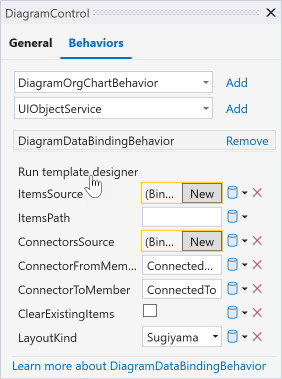
The Item Template Designer looks like a regular DiagramDesignerControl with an additional stencil that contains pre-configured connectors, complex templates (based on DiagramContainers), and an empty template for further customizations.
Drag a template from the Template Designer toolbox category onto the canvas to define the appearance of items generated by DiagramDataBindingBehavior or DiagramOrgChartBehavior:

You can use the Properties Panel and built-in Container styles and Shape styles ribbon groups to customize items.
Double-click an element or click its binding icon ( ) to invoke the Item Data Binding Editor that allows you to bind this element to a data field. The Item Data Binding Editor accepts field names from the data model level.
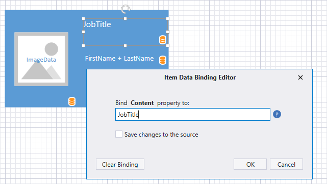
The Item Data Binding Editor binds elements to data in OneWay mode. Enable the Save changes to the source option to bind elements to data fields in TwoWay mode. This option is in effect when the DiagramDataBindingBehaviorBase.EnableNotificationToSource property is set to true.
Note
The Save changes to the source option is only available for simple binding expressions. To build complex binding expressions, use the Criteria Language Syntax.
Click the Close and Apply Changes button to close the Item Template Designer and save templates to the DiagramDataBindingBehaviorBase.TemplateDiagram property. You can additionally customize generated templates directly in XAML.
Select Templates Based on Custom Logic
DiagramDataBindingBehavior and DiagramOrgChartBehavior choose the first template stored in DiagramDataBindingBehaviorBase.TemplateDiagram to generate shapes/containers and connectors at runtime. If you have multiple templates for each item type, specify the DiagramItem.TemplateName property for template items to identify them.
Use these names in the DiagramDataBindingBehaviorBase.GenerateItem and DiagramDataBindingBehaviorBase.GenerateConnector event handlers to conditionally apply specified templates to generated items. To do this, pass a template name to the CreateItemFromTemplate / CreateConnectorFromTemplate method:
void OnGenerateItem(object sender, DevExpress.Xpf.Diagram.DiagramGenerateItemEventArgs e) {
    if (((ClassData)e.DataObject).Type == ClassType.Interface)
        e.Item = e.CreateItemFromTemplate("InterfaceShape");
    else e.Item = e.CreateItemFromTemplate("ClassShape");
}

void OnGenerateConnector(object sender, DevExpress.Xpf.Diagram.DiagramGenerateConnectorEventArgs e) {
    if (((ClassData)e.From).Type == ClassType.Interface || ((ClassData)e.To).Type == ClassType.Interface)
        e.Connector = e.CreateConnectorFromTemplate("InterfaceConnector");
    else e.Connector = e.CreateConnectorFromTemplate("ClassConnector");
}
Item Data Templates
DiagramDataBindingBehavior and DiagramOrgChartBehavior support common WPF techniques to generate containers, shapes, and connectors from DataTemplates.
The following list contains properties that allow you to specify item data templates:
- DiagramDataBindingBehaviorBase.ItemTemplate
- DiagramDataBindingBehaviorBase.ItemTemplateSelector
- DiagramDataBindingBehaviorBase.ConnectorTemplate
- DiagramDataBindingBehaviorBase.ConnectorTemplateSelector
Generate Shapes and Connectors from DataTemplates
ItemTemplate and ConnectorTemplate properties accept regular diagram items: shapes, containers, and connectors. You can define such a diagram item as the root element of DataTemplate:
<dxdiag:DiagramDataBindingBehavior.ItemTemplate>
    <DataTemplate>
        <dxdiag:DiagramShape Shape="BasicShapes.Ellipse"/>
    </DataTemplate>
</dxdiag:DiagramDataBindingBehavior.ItemTemplate>

<dxdiag:DiagramDataBindingBehavior.ConnectorTemplate>
    <DataTemplate>
        <dxdiag:DiagramConnector Stroke="Red"/>
    </DataTemplate>
</dxdiag:DiagramDataBindingBehavior.ConnectorTemplate>
Generate WPF Elements from DataTemplates
ItemTemplate and ConnectorTemplate properties additionally accept common WPF elements. You can use such elements to generate complex items or items with specific WPF controls.
<dxdiag:DiagramDataBindingBehavior.ItemTemplate>
    <DataTemplate>
        <Border CornerRadius="5" Width="200" Height="100" Background="Red">
            <TextBlock Text="{Binding FirstName}"/>
        </Border>
    </DataTemplate>
</dxdiag:DiagramDataBindingBehavior.ItemTemplate>
In this case, DiagramDataBindingBehavior / DiagramOrgChartBehavior generates DiagramContentItem instances and applies the template to the DiagramContentItem.ContentTemplate property.
Use the DiagramDataBindingBehaviorBase.ItemContainerStyle property to configure the generated DiagramContentItem:
<dxdiag:DiagramDataBindingBehavior.ItemContainerStyle>
    <Style TargetType="dxdiag:DiagramItem">
        <Setter Property="Background" Value="Transparent"/>
        <Setter Property="BorderBrush" Value="Transparent"/>
    </Style>
</dxdiag:DiagramDataBindingBehavior.ItemContainerStyle>
Note
Do not mix diagram items and WPF elements in the same template.
Generate Items Based On Custom Logic
DiagramDataBindingBehaviorBase.ItemTemplateSelector and DiagramDataBindingBehaviorBase.ConnectorTemplateSelector accept DataTemplateSelector class descendants. You can use these properties to select shape, container, and connector templates based on custom logic.