Image Picker
- 8 minutes to read
Image Picker is a design-time dialog that allows you to select images from predefined sources, such as the DevExpress Icon Library or Font Icons, or create and manage custom icon collections for use in controls and image list components.

Image Picker Accessibility
The Image Picker dialog is available for all DevExpress components that work with images.
Components with Individual UI Element Icons
The Image Picker dialog is available for any DevExpress component that can load an individual UI icon at design time. For example, any Glyph property with the TdxSmartGlyph type displays an ellipsis button in the Object Inspector.
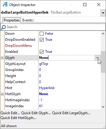
You can click this button to invoke the Image Picker and select the required image from the DevExpress Icon Library or a custom image collection.
TcxImageList
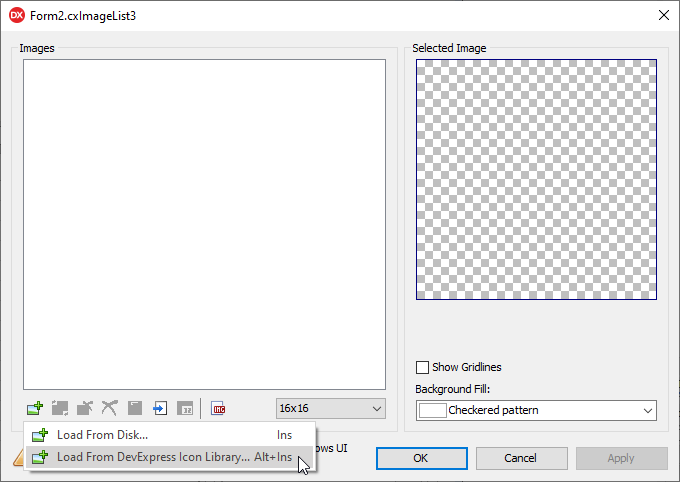
You can use the Image Picker to populate a TcxImageList component with images at design time. Double-click the component or invoke its context menu and select the Edit… item to invoke the Image List Editor. To invoke the Image Picker dialog, you can press the Alt + Ins key combination or click the Add Image button and select the Load From DevExpress Icon Library… menu item.
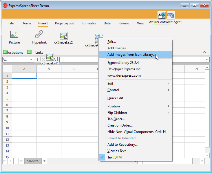
TcxImageCollection
Right-click a TcxImageCollection component and select the following context menu item to invoke the Image Picker dialog.
Alternatively, you can click the Edit… context menu item to open the collection editor, create or select an image collection item, and double-click its Picture property value field in the Object Inspector to invoke the Image Picker dialog.
Image Picker UI
The Image Picker dialog has three or four tabs depending on its target.
Collection Box and Custom Collection Management
The Collection box is available on Vector Icons and Raster Icons tabs and allows you to manage the list of available icon collections. You can check or uncheck a category to display or hide all icons that belong to the category in the Image Gallery. The Categories box lists all categories from all icon collections regardless of their visibility.
Note
Custom/third-party icons may require pre-processing with our SVG Icon Builder tool to adapt these icons to DevExpress VCL skins and palettes. Our tool can adjust icon size and color settings according to DevExpress guidelines.
Refer to the following topic for detailed information on how to use the SVG Icon Builder application: Third-Party SVG Icon Adaptation for DevExpress Skins and Palettes.
To add a custom icon collection, click the Add a custom collection button in the Image Picker dialog, select the target folder in a shell dialog, and click the Select button.
Like predefined DevExpress Icon Library collections, the added folder should include nested category folders populated with images. The Image Picker dialog uses the target folder’s name as a collection name displayed in the Collection box. To remove a selected custom collection from the DevExpress Icon Library, select the required collection and click the Remove the selected collection button:
Note
The DevExpress Icon Library maintains the list of custom icon collections in the following Microsoft Windows® Registry directory:
%Computer%\HKEY_CURRENT_USER\SOFTWARE\Developer Express\IconLibrary\Collections
You cannot remove predefined icon collections from the DevExpress Icon Library. A custom collection remove operation does not remove the corresponding folder from the file system.
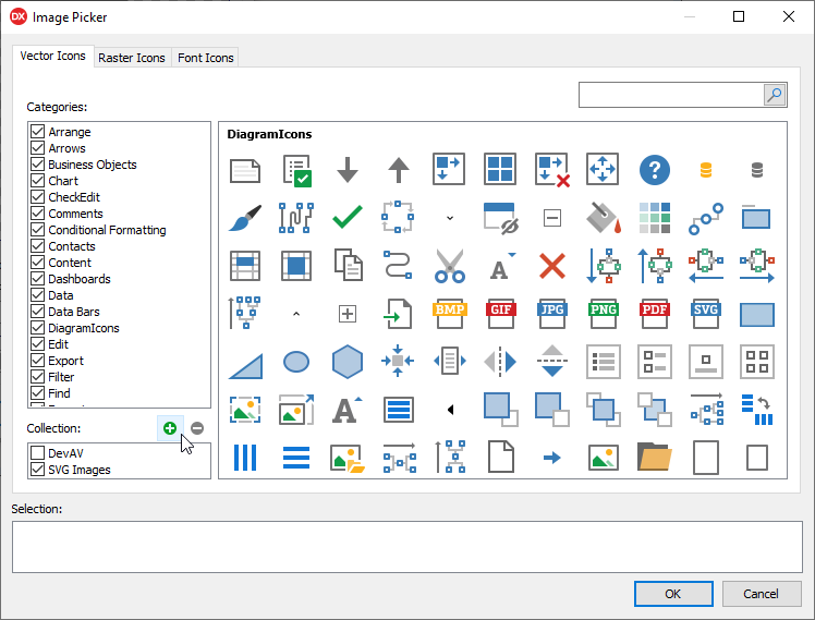
Vector Icons Tab
Vector Icons is the main tab of the Image Picker where you can select SVG icons from the DevExpress Icon Library.
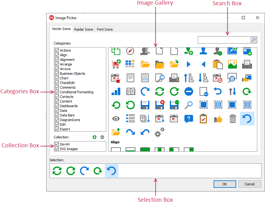
The Vector Icons tab has the following UI elements:
- Image Gallery
- The Image Gallery lists all icons from selected collections and categories. You can use this gallery to preview and select icons.
- Search Box
- The Search box at the top of the Image Gallery allows you to filter out all icons with names that do not include the search string.
- Collection Box
The Collection box lists available icon collections. The Image Gallery displays icons from selected collections.
You can click the Add a custom collection button to add a custom icon collection and use it in the same manner as any collection shipped with the DevExpress Icon Library.
- Categories Box
- The Categories box lists available categories from all icon collections regardless of their current visibility. You can uncheck individual collections and categories to narrow down your search.
- Selection Box
- The Image Picker dialog displays the Selection box only when the dialog is invoked for a TcxImageList or TcxImageCollection component. The Selection box contains all icons the dialog adds to the target list when you click the OK button or press the Enter key.
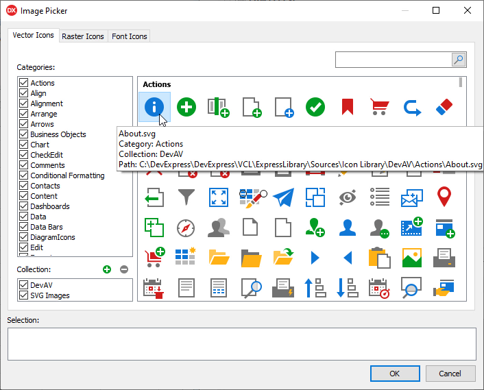
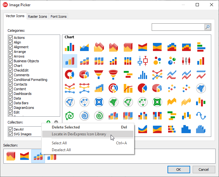
Image Gallery
The Image Gallery displays images from the DevExpress Icon Library. You can position the mouse pointer at an image to display the full path to the image as well as its name, category, and collection.
Image Gallery Context Menu
You can right-click an icon in the gallery to display a context menu.
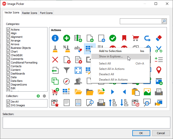
The Image Gallery context menu includes the following options:
- Show in Explorer…
- Runs Windows Explorer and opens the folder where the target icon is located. Unlike all other options, the Image Gallery context menu always includes this option.
- Add to Selection
- Adds the current selection in the Image Gallery to the Selection box.
- Select All
- Selects all icons in the Image Gallery. You can drag and drop the current selection to the Selection box.
- Select All in the Current Category
- The menu item caption depends on the category of the target icon. This menu item selects all icons in the current category. You can add the current selection to the Selection box.
- Deselect All
- Clears selection in the Image Gallery.
- Deselect All in the Current Category
- The menu item caption depends on the category of the target icon. This menu item deselects all icons in the current category.
Selection Box
The Image Picker dialog displays the Selection box only when the dialog is invoked for a TcxImageList or TcxImageCollection component. The Image Picker adds all icons in the Selection box to the target list if you click the OK button or press the Enter key.
To populate the Selection box with icons from the Image Gallery, you can double-click the required icons, drag-and-drop the current selection into the Selection box, or select the Add to Selection item in the gallery context menu.
Like the Image Gallery, the Selection box can display a context menu for an icon. You can use the menu to manage selection, remove individual icons from the box, or open the source folder in Windows Explorer.
To remove individual icons from the Selection box, you can also double-click them or press the Delete key when at least one icon is selected.
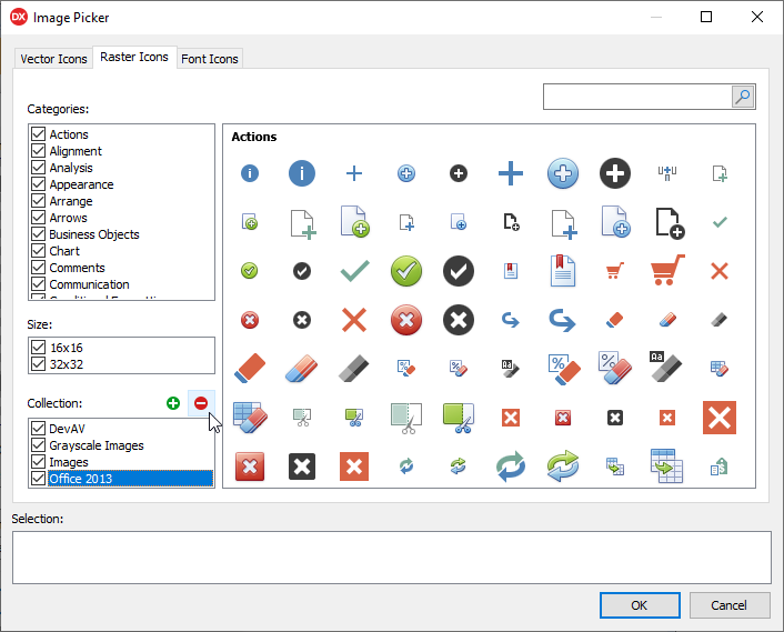
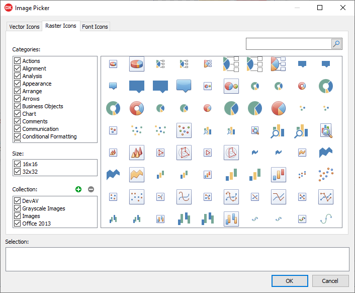
Raster Icons Tab
The Raster Icons tab lists all collections and categories of bitmap icons in the DevExpress Icon Library.
Compared to Vector Icons, the Raster Icons tab contains an additional Size box that allows you to filter out available icons by size.
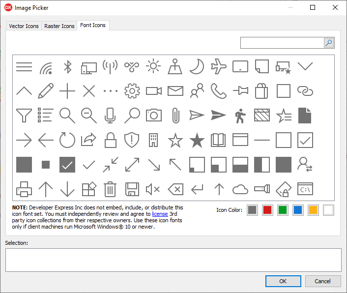
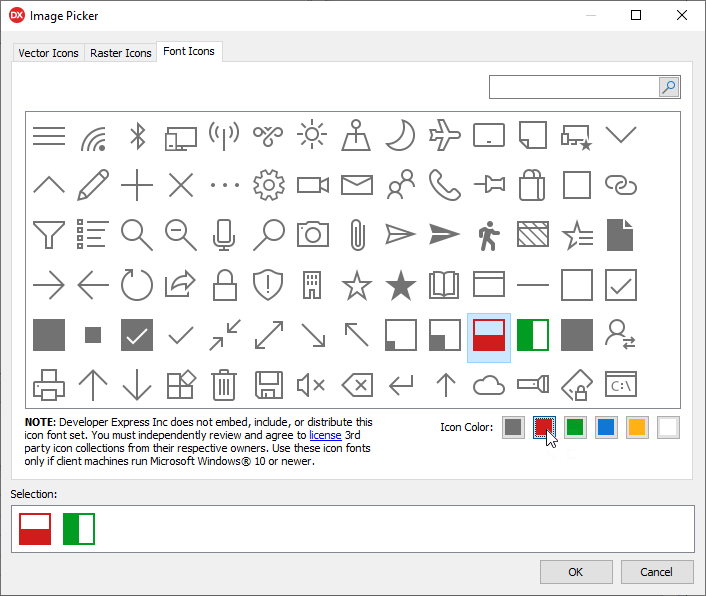
Font Icons Tab
The Font Icons tab allows you to select and use font icons available in Microsoft Windows® 10 and newer operating systems.
The Image Picker dialog allows you to use font icons in the same manner as any other icon from custom collections or the DevExpress Icon Library. In addition, you can change the color of icons selected in the Image Gallery before you add them to the Selection box as follows:
Important Font Icon Limitations
A font icon is an SVG image that contains a character from a dedicated font shipped with the operating system. Since an SVG image with text contains only font glyph references rather than actual font glyphs, an application can display a font icon only if the corresponding font is available in the target operating system:
- Microsoft Windows® 11
This operating system ships with the following dedicated fonts: Segoe Fluent Icons (default) and Segoe MDL2 Assets.
DevExpress-powered applications use glyphs from the Segoe Fluent Icons font to display font icons:
- Microsoft Windows® 10
This operating system ships with the Segoe MDL2 Assets dedicated font:
Important
Developer Express Inc does not embed, include, or distribute font icons available in the Image Picker dialog. You must independently review and agree to license third-party icon collections form their respective owners. Use these font icons only if client machines run Microsoft Windows® 10 or newer.
Picture Editor Tab
The Image Picker dialog includes the Picture Editor tab when a user clicks an ellipsis button of a Glyph or Image property of a DevExpress component or UI element that can display only one image.
The Picture Editor tab allows you to manage an image associated with one component or UI element.
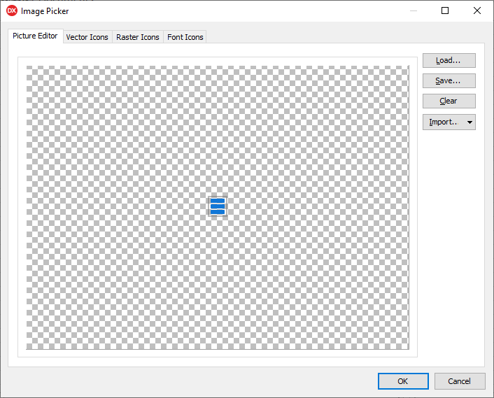
The Picture Editor tab has the following buttons:
- Load…
- Invokes the Open dialog and allows you to load an image from the file system.
- Save…
- Invokes the Save As dialog and allows you to save an image in the preview box to a file.
- Clear
- Removes the current image.
- Import…
- Displays a list of available image sources (controls) in a drop-down menu. Click a menu item to load the corresponding image.