DxSpinEdit<T> Class
A Spin Edit component.
Namespace: DevExpress.Blazor
Assembly: DevExpress.Blazor.v20.2.dll
NuGet Package: DevExpress.Blazor
Declaration
public class DxSpinEdit<T> :
    DxResizableEditorBase<T, SpinEditJSInteropProxy>,
    IInputBase,
    ISpinEditJSInteropProxyServer,
    IJSCallback,
    IDisposable
Type Parameters
| Name | Description |
|---|---|
| T | The data type. |
Remarks
The DevExpress Spin Edit for Blazor (<DxSpinEdit>) allows you to display and edit numeric values. Users can do any of the following to change the editor’s value:
- Press the spin buttons. When a user presses or holds a spin button, it continuously increments/decrements the editor’s value.
- Scroll the mouse wheel.
- Use the Up and Down arrow keys.
- Type a new value in the edit box.

Touch screens display the increment and decrement spin buttons separately.

Add a Spin Edit to a Project
Follow the steps below to add the Spin Edit component to an application:
- Use a DevExpress Project Template to create a new Blazor Server or Blazor WebAssembly application. If you use a Microsoft project template or already have a Blazor project, configure your project to incorporate DevExpress Blazor components.
- Add the
<DxSpinEdit>…</DxSpinEdit>markup to a Razor page. - Configure the component (see the sections below).
Edit Value
Use the Value property to specify an editor’s value or to bind the value to a data source object. You can use the @bind attribute to bind the Value property to a data field. Refer to the following topic for details: Two-Way Data Binding.
<DxSpinEdit Value="15"></DxSpinEdit>

<DxSpinEdit @bind-Value="@DecimalValue"></DxSpinEdit>

@code {
    Decimal DecimalValue { get; set; } = 15;
}
The component supports the following data types:
- Integer numeric data types
- Floating-point numeric types
- Nullable types of all the types listed above
The Value property is updated when the editor loses focus (OnLostFocus mode). You can set the BindValueMode property to OnInput to update the Value property when a user changes the input value.
If you do not use two-way data binding, handle the ValueChanged event to respond to the editor’s value change. The code below enables the Update Value button when a user changes the editor value.
<DxSpinEdit Value="@NumericValue" ValueChanged="@((int newValue) => OnValueChanged(newValue))"></DxSpinEdit>
<DxButton Enabled="@IsEnabled">Update Value</DxButton>

@code {
    int NumericValue = 0;
    bool IsEnabled = true;

    void OnValueChanged(int newValue) {
        NumericValue = newValue;
        if (newValue != 0)
            IsEnabled = false;
        else IsEnabled = true;
    }
}
Nullable Value and Placeholder
If the Spin Edit’s data type is nullable, users can delete the editor value (set it to null).
You can also set the ClearButtonDisplayMode property to Auto to show the Clear button when the editor has a non-null value. Use the NullText property to display the prompt text (placeholder) in the editor when its value is null.
<DxSpinEdit @bind-Value="@NumericValue"
            ClearButtonDisplayMode="DataEditorClearButtonDisplayMode.Auto"
            NullText="Type a value..."></DxSpinEdit>

@code {
    int? NumericValue { get; set; } = 721;
}

Minimum / Maximum Values
Use the MinValue and MaxValue properties to limit the editor’s minimum and maximum values.
<DxSpinEdit @bind-Value="DecimalValue" MinValue="0" MaxValue="1" />
Once you specify these values, the Spin Edit does not allow a user to set a value that is less or more than the MinValue and MaxValue.
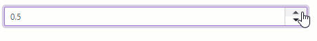
Increment Value
Use the Increment property to change the editor’s unit value. This value is added to/subtracted from the Value property value each time a user clicks the increment/decrement spin button.
<DxSpinEdit @bind-Value="DecimalValue" Increment="0.1m" MinValue="0" MaxValue="1" />

@code {
    Decimal DecimalValue { get; set; } = 0.5m;
}
Display Format
Use the DisplayFormat property to format the Spin Edit’s display value when the editor is not focused. See the Standard Numeric Format Strings and Custom Numeric Format Strings help topics for more information.
The following example demonstrates how to apply the currency format:
<DxSpinEdit @bind-Value="@DecimalValue" DisplayFormat="C"></DxSpinEdit>

@code {
    Decimal DecimalValue { get; set; } = 320.5m;
}

Size Modes
Use the SizeMode property to specify a Spin Edit size. The code below applies different size modes to Spin Edit components.
<DxSpinEdit @bind-Value="@DecimalValue" SizeMode="SizeMode.Small"></DxSpinEdit>

<DxSpinEdit @bind-Value="@DecimalValue" SizeMode="SizeMode.Medium"></DxSpinEdit>

<DxSpinEdit @bind-Value="@DecimalValue" SizeMode="SizeMode.Large"></DxSpinEdit>

@code {
    Decimal DecimalValue { get; set; } = 15;
}
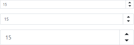
For more information, refer to the following topic: Size Modes.
Input Validation
You can add a standalone Spin Edit or the Form Layout component to the Blazor’s standard EditForm. This form validates user input based on data annotation attributes defined in a model and indicates errors.
<EditForm Model="@starship" Context="EditFormContext">
    <DataAnnotationsValidator />
    <DxFormLayout >
        <DxFormLayoutItem Caption="Maximum Accommodation:" ColSpanMd="6" >
            <Template >
                <DxSpinEdit @bind-Value="@starship.MaximumAccommodation" />
            </Template >
        </DxFormLayoutItem >
        @*...*@
    </DxFormLayout>
</EditForm>

@code {
    private Starship starship=new Starship();
}
For more information, refer to the following help topic: Validate Input.
Hide Spin Buttons
Set the ShowSpinButtons property to false.
<DxSpinEdit Value="15" ShowSpinButtons="false"></DxSpinEdit>

Read-Only State
<DxSpinEdit> supports a read-only state. Set the ReadOnly property to true to activate this option.
<DxSpinEdit ReadOnly="true"> </DxSpinEdit>
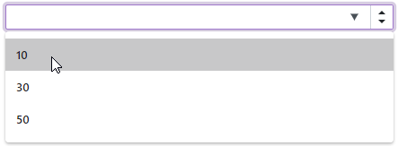
HTML Attributes and Events
You can use HTML attributes and events to configure the Spin Edit.
<DxSpinEdit Value="1"
            list="values"
            maxlength="2"
            @onwheel="MyFunction">
</DxSpinEdit>

@*Supply a list of the predefined values*@
<datalist id="values">
    <option value=10/>
    <option value=30/>
    <option value=50/>
</datalist>

@code {
    void MyFunction(){
        //...
    }
}