Data Editors
- 2 minutes to read
DevExpress Data Editors for Blazor include components that can be used as standalone editors or within the Data Grid edit form.
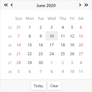
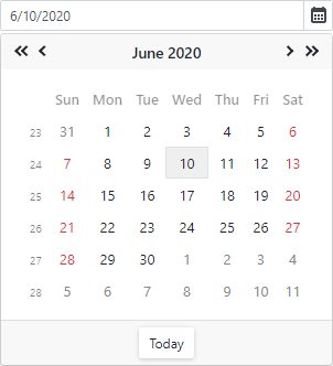
Calendar
The Calendar component allows users to select dates and navigate through months, years, decades, and centuries.
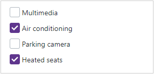
CheckBox
The CheckBox component allows users to select yes/no or true/false.
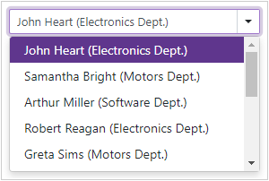
ComboBox
The ComboBox component displays a drop-down window with a list of predefined items.
Date Edit
The Date Edit component displays a drop-down calendar that allows users to select dates. The Date Edit can also display a time section to allow users to select time values.
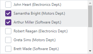
List Box
The List Box component allows you to display a list of selectable items from a data source.
Memo
The Memo component is a multi-line text area that allows users to type and edit text in multiple rows.

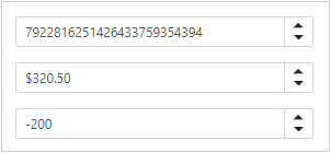
Spin Edit
The Spin Edit component allows you to display and edit numeric values. Use spin buttons to increment values.
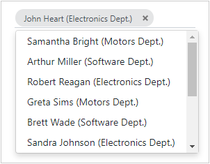
TagBox
The TagBox component allows users to select multiple items (tags) from a drop-down list. Users can also type in the edit box to filter list items that contain the search string.
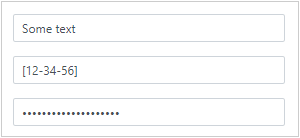
Text Box
The Text Box is a single-line text editor.
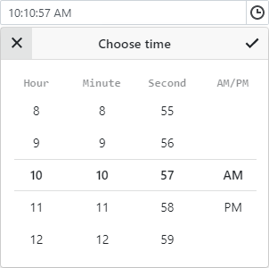
Time Edit
The Time Edit component displays a drop-down time picker. A user can enter the time into the text box or pick it in the drop-down window.