DxFlyout.BodyTemplate Property
Specifies a template for the flyout window’s body. Replaces the default render fragment (including paddings, scrollbars, etc.)
Namespace: DevExpress.Blazor
Assembly: DevExpress.Blazor.v23.2.dll
NuGet Package: DevExpress.Blazor
Declaration
[Parameter]
public RenderFragment<IPopupElementInfo> BodyTemplate { get; set; }
Property Value
| Type | Description |
|---|---|
| RenderFragment<IPopupElementInfo> | The body template. |
Remarks
Use the BodyTemplate property to display any render fragment in the flyout window’s body element. This template changes the default body element rendering, including paddings, scrollbar, and inner content alignment. If you need to place custom content in the flyout window’s body element but retain the default rendering of UI elements in it, use the BodyContentTemplate instead.
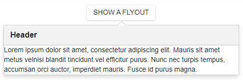
<DxButton RenderStyle="ButtonRenderStyle.Secondary" Click="() => IsOpen = !IsOpen" Id="flyout-overview-target-container">SHOW A FLYOUT</DxButton>

<DxFlyout @bind-IsOpen=IsOpen
          PositionTarget="#flyout-overview-target-container"
          HeaderVisible="true"
          HeaderText="Header"
          Width="max(25vw, 250px)">
    <BodyTemplate>
        Lorem ipsum dolor sit amet, consectetur adipiscing elit.
        Mauris sit amet metus velnisi blandit tincidunt vel efficitur purus.
        Nunc nec turpis tempus, accumsan orci auctor,
        imperdiet mauris. Fusce id purus magna.
    </BodyTemplate>
</DxFlyout>

@code {
    bool IsOpen { get; set; } = false;
}
The BodyTemplate has the context parameter. You can use the parameter’s CloseCallback property to implement a custom close button.
The BodyTemplate property has priority over BodyText, BodyTextTemplate, and BodyContentTemplate properties.