Mobile UI for Xamarin.Forms
- 3 minutes to read
The DevExpress Mobile UI for Xamarin.Forms bundle consists of the following controls:
Charts
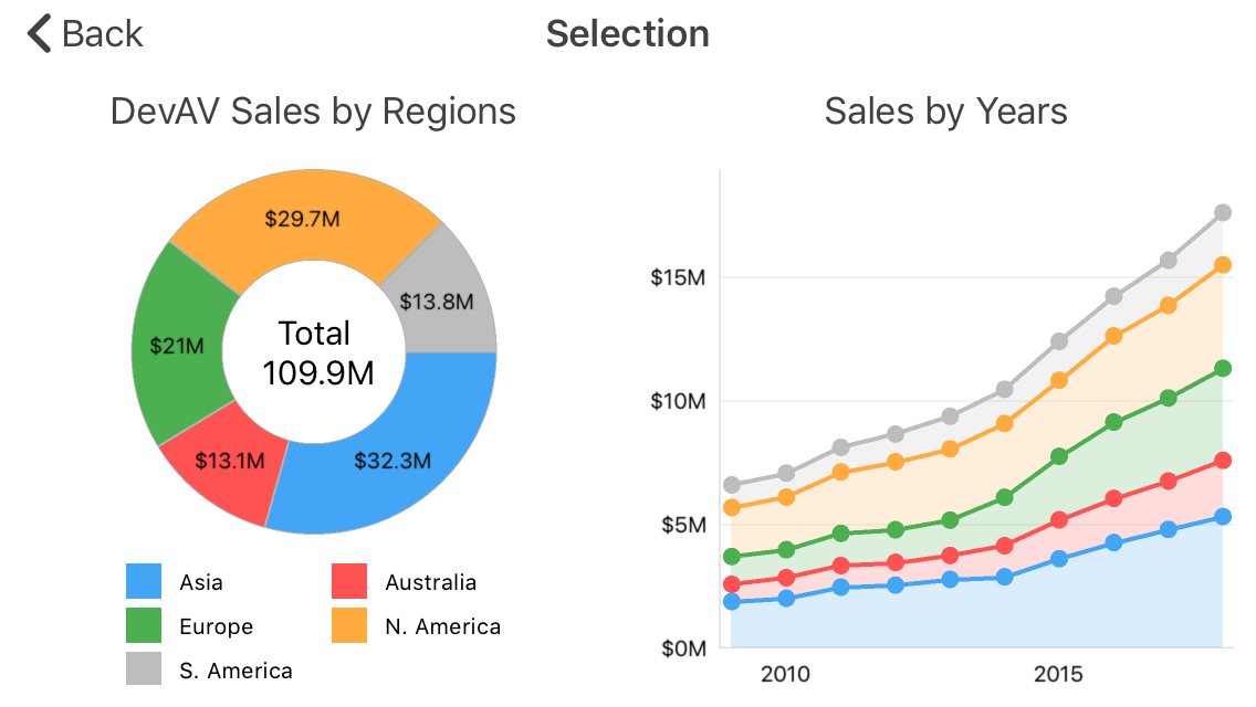
Donut and Area Charts
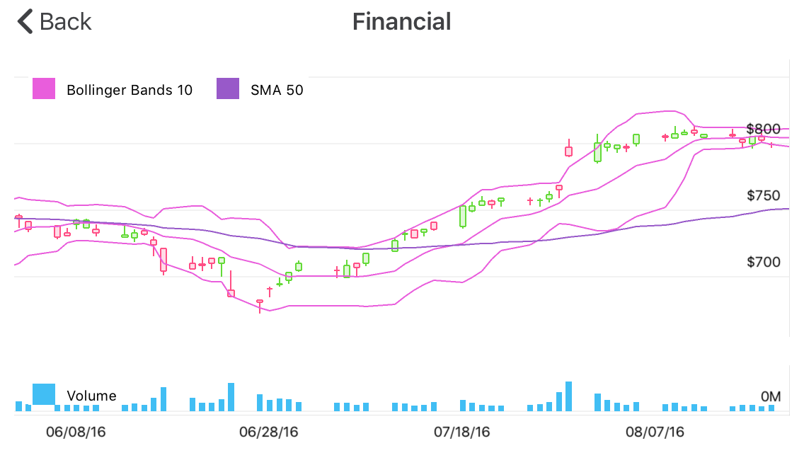
Financial Charts
The PieChartView and ChartView are powerful visualization views that allow you to display your data as bars, points, lines, areas, and other forms. The views provide various Pie and Cartesian series types that manage your data appearance on a chart.
Refer to the Getting Started section for step-by-step lessons that explain how to configure chart views.
Data Grid
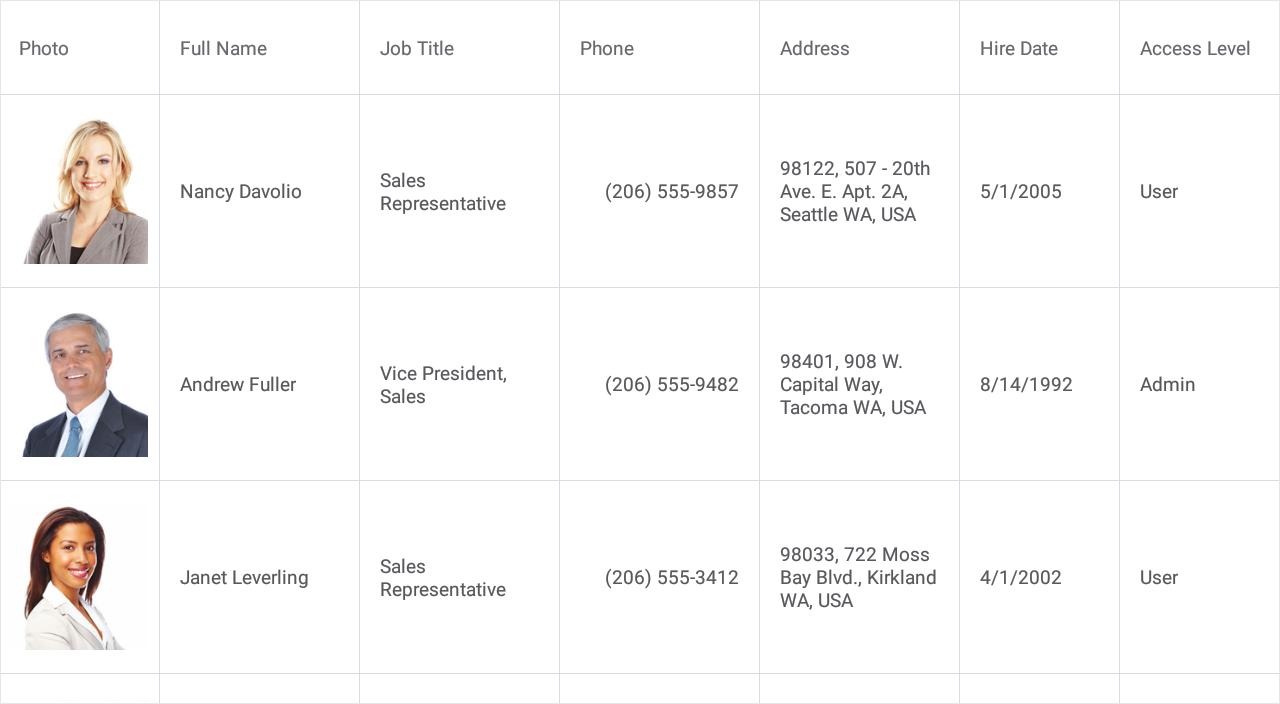
The DataGridView is a data-aware control designed to present and manage data in a tabular format. It provides the following features:
- Auto Generated Columns
- Multi-Row Column Layout
- Auto Row Height
- Pull To Refresh
- Load More
- Row Drag and Drop
- Multi-Column Sorting
- Grouping (API)
- Filtering (API)
- Data Summaries (API)
- Data Editing
- Input Validation
- Fixed Columns
- Swipe Actions
- Appearance Customization
- Template Support
- Theme Support
Refer to the Getting Started and Examples sections for step-by-step lessons that explain how to configure and use the grid.
Scheduler
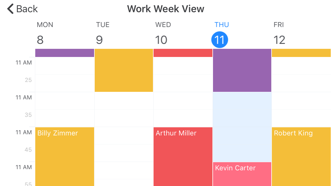
Work Week View
](/MobileControls/images/xf/scheduler__appointment-edit.png?v=20.1)
A scheduler view displays appointments (regular and recurrent planned events) and allows users to manage them. The following scheduler views are available:
Refer to the Getting Started and Examples sections for step-by-step lessons that explain how to configure scheduler views.
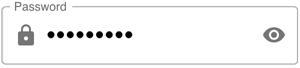
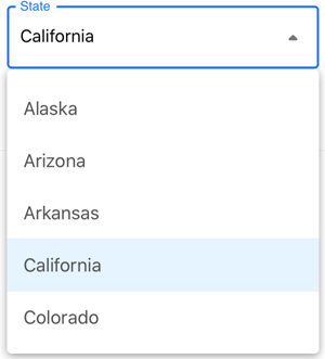
Data Editors and Controls
| TextEdit |
| MultilineEdit |
| PasswordEdit |
| ComboBoxEdit |
| SimpleButton |

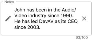

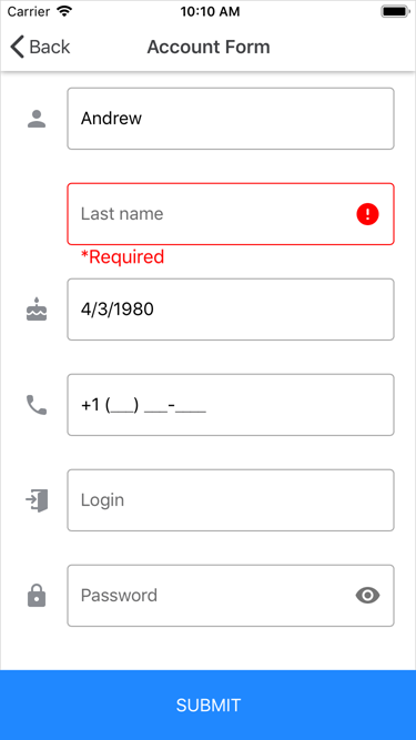
Data Form
The DataFormView component allows you to generate edit forms for any data object.
|
|
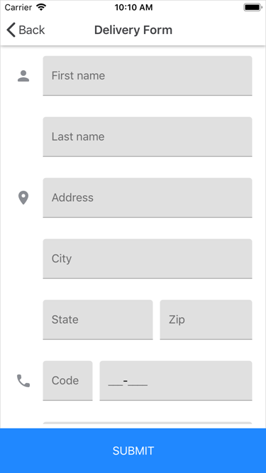
Refer to the Getting Started and Examples sections for step-by-step instructions on how to configure the data form.
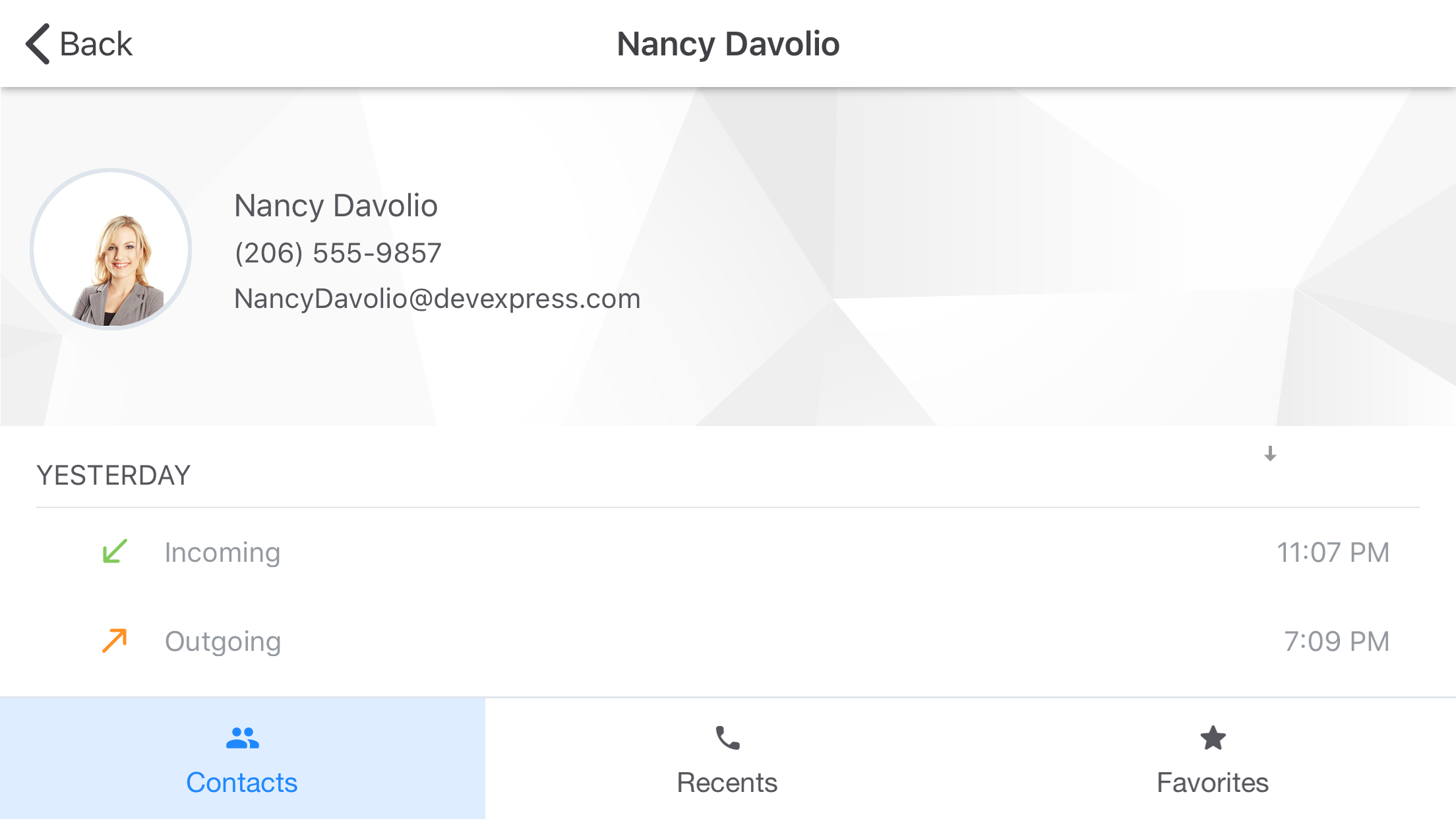
Navigation
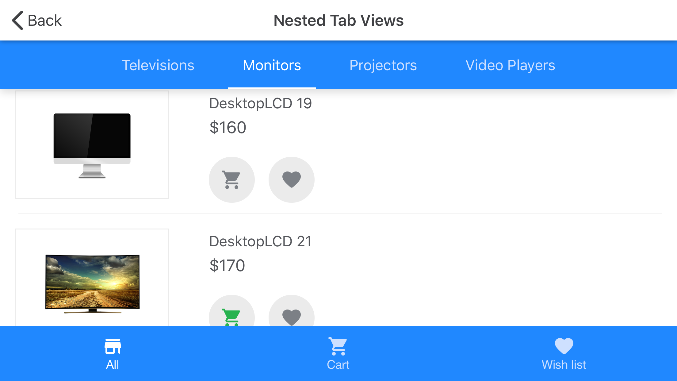
Tab View
Tab Page
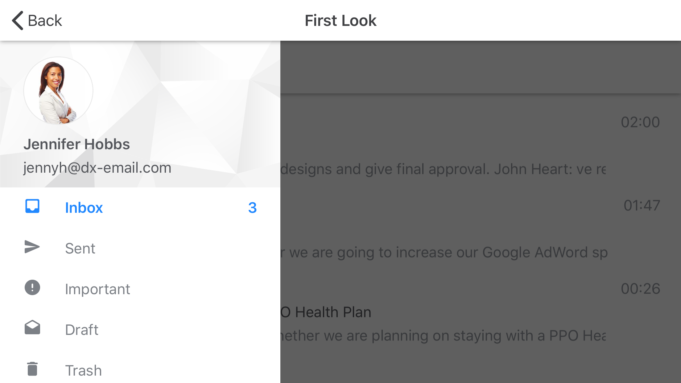
Drawer View
Drawer Page
Navigation pages and views allow you to implement lateral navigation in your applications.
Tab View, Tab Page
The TabView and TabPage allow you to organize content into groups and enable navigation between groups. These controls provide the following features:
- Data Binding
Tabs can be generated from the bound data source based on the specified templates. - Appearance Customization
Each control provides a set of settings to configure its visual elements. - Theme Support
You can apply the Light and Dark built-in themes to controls.
Refer to the Tab View - Getting Started and Tab Page - Getting Started sections for step-by-step lessons that explain how to configure these controls.
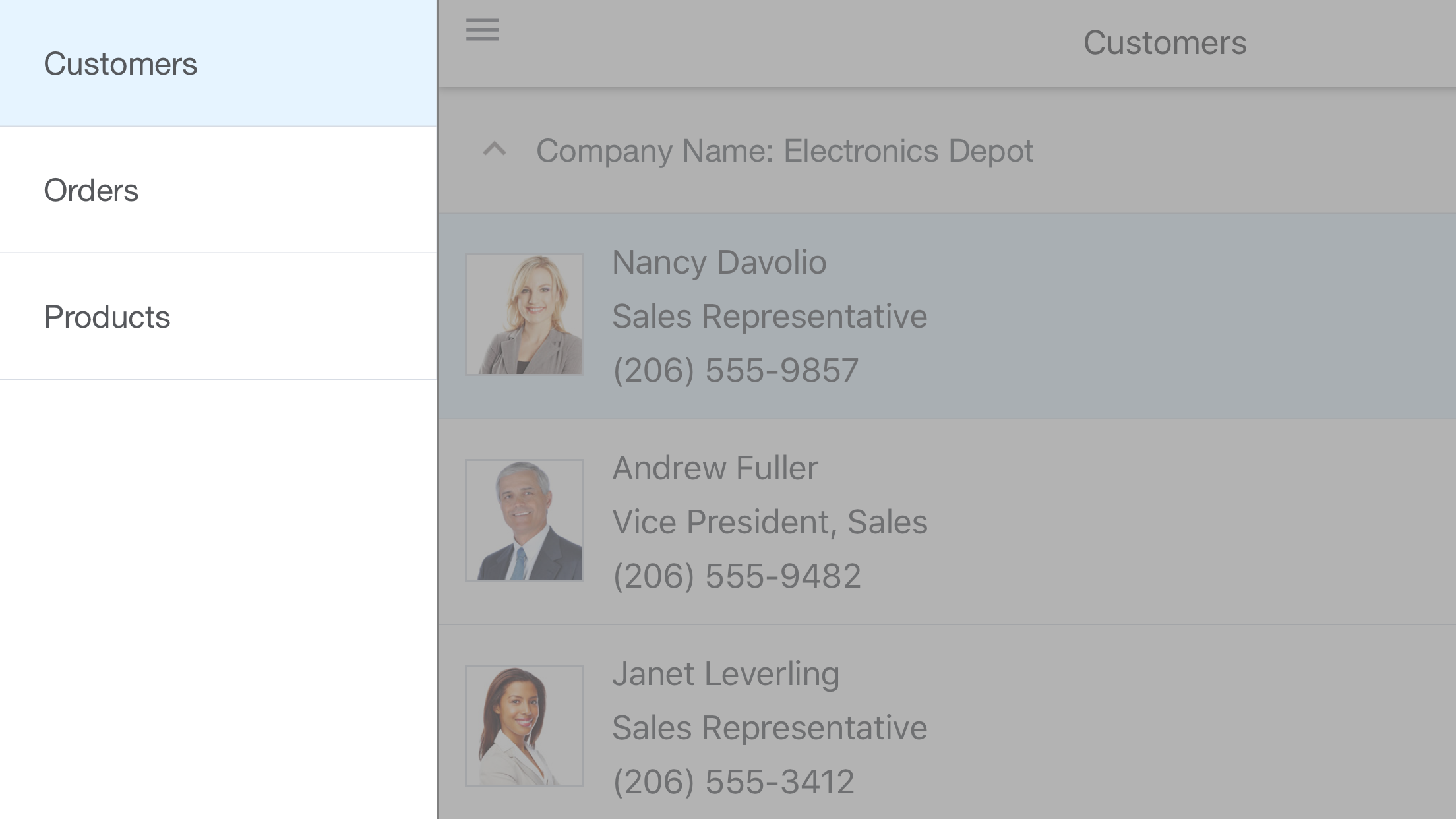
Drawer View, Drawer Page
The DrawerView and DrawerPage allow you to add a drawer to your application - a UI pane that shows the application’s main navigation menu. These controls provide the following features:
- Appearance Customization
Each control provides a set of settings to configure its visual elements. - Drawer Position
You can anchor the drawer to any side of the screen (left, right, top or bottom). - Drawer Behavior
Each control provides an option that specifies how the drawer appears on the screen. - Theme Support
You can apply the Light and Dark built-in themes to controls.
Refer to the Drawer View - Getting Started and Drawer Page - Getting Started sections for step-by-step lessons that explain how to configure these controls.