TextEdit Class
A single-line text editor.
Namespace: DevExpress.XamarinForms.Editors
Assembly: DevExpress.XamarinForms.Editors.dll
NuGet Package: DevExpress.XamarinForms.Editors
Declaration
public class TextEdit :
    TextEditBase
Remarks
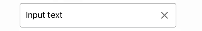
TextEdit is an editor that displays one line of text.
The text editor initially displays the input box and the default clear icon.
You can also add the following optional elements:
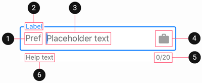
Input Text
Use the Text property to obtain or set the text entered in the editor.
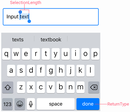
To manage the cursor position and text selection, use the CursorPosition and SelectionStart/SelectionLength properties.
The Keyboard property specifies the type of the keyboard used to edit text in the editor. The ReturnType property allows you to change the appearance of the return button on the keyboard. When a user taps this button, the Completed event occurs.
Use the following properties to change the input text appearance and alignment:
Property | Description |
|---|---|
Specify the text color for different states of the editor. | |
Configure the font settings. | |
Gets or sets the horizontal alignment of text entered in the editor. |
Masked Input
TextEdit supports input masks. A mask defines a pattern for the entered string. It can be useful when a text editor should accept a fixed-length string in a pre-defined format (for example, a phone number, zip code, etc).
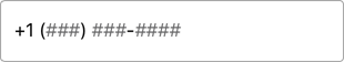
Use the Mask property to specify the mask expression. It can include meta and literal characters.
A metacharacter is a user input placeholder (identified by the underscore character -
_). Use the MaskPlaceholderChar and PlaceholderColor property to change the character and its color. The following table lists the available metacharacters:Character
Description
LAn alphabetic character. For example, A-Z, a-z for the USA.
0A numeric character.
CAny character.
- A literal character is a fixed part of the mask that cannot be edited by users. To display a metacharacter as a literal, precede it with a backslash (
\).
<dxe:TextEdit Mask="+1 (000) 000-0000"
              MaskPlaceholderChar="#">
</dxe:TextEdit>
Prefix and Suffix
The Prefix and Suffix properties allow you to specify the text prefix and suffix that are shown before and after the text in the editor.
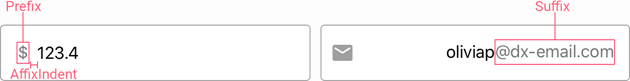
Use the following properties to adjust the prefix and suffix settings:
Property | Description |
|---|---|
Specify the prefix and suffix color for different states of the text editor. | |
Configure the font settings. | |
Gets or sets the distance between the affix and input text. |
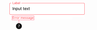
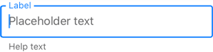
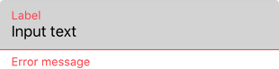
Label
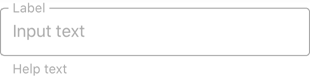
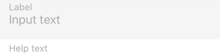
A label is the editor’s input prompt string (LabelText). Editors display this string inside the edit box (when the editor is empty and not focused) or at the top of the editor.

To pin the label to the top edge of the editor box, set the IsLabelFloating property to false.
To customize the label’s appearance settings, use the following properties:
Property | Description |
|---|---|
LabelColor / FocusedLabelColor | Specify the label color for each state of the text-edit-label editor. |
Configure the label font settings. |
Placeholder
A placeholder (PlaceholderText) is the input prompt string displayed within the text box when the editor is empty.

To specify the placeholder text color, use the PlaceholderColor property. This color is also used to paint mask placeholders.
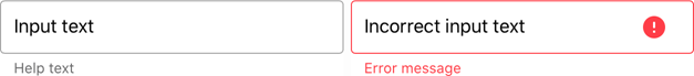
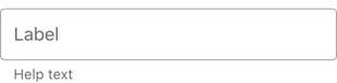
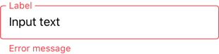
Help Text and Error Message
You can display the following labels below an editor:
- HelpText - A brief editor description.
- ErrorText - A message shown when an error occurs (HasError is true).
The BottomTextTopIndent property specifies the indent between the editor’s bottom border and help or error text.
To specify the color and font attributes for the help/error text, use the following properties:
Property | Description |
|---|---|
Specify the help text color for different states of an editor. | |
Specifies the error message text color. | |
BottomTextFontSize | Configure font settings. |
If HelpText is not set, ErrorText appears as an additional line below the edit box and page content shifts down. To prevent this behavior, set the ReserveBottomTextLine property to true.
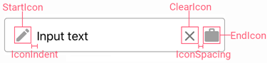
Icons
The text editor can display icons within its box.
- Clear icon - removes text entered in the editor.
- Error icon - appears in the error state (HasError is true).
- Custom icons - can be shown on the left or right within the box.
Use the following members to manage the editor’s icons:
Icon | Property | Description |
|---|---|---|
Clear Icon | Specifies when the clear icon is displayed. | |
Specifies the clear icon image. | ||
Allows you to assign an additional action to the clear icon. | ||
Error Icon | Specifies the error icon image. | |
Allows you to perform an action when a user clicks the error icon. | ||
Custom Icons | Specifies a custom icon. | |
StartIconClicked / StartIconCommand | Allows you to perform an action when a user clicks a custom icon. | |
Specifies whether an icon is visible. | ||
Common | Specifies icon colors for different states of the text editor. | |
Gets or sets the distance between an icon and input text (affix). | ||
Gets or sets the distance between icons. | ||
Gets or sets the vertical alignment of icons. |
Character Counter
If you limit input string length (MaxCharacterCount), the editor displays a character counter under the text box.
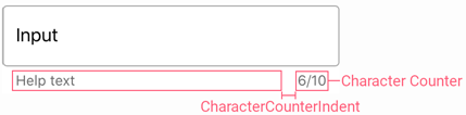
Use the MaxCharacterCountOverflowMode property to prevent users from entering more characters than MaxCharacterCount.
To specify the space between the character counter and help text, use the CharacterCounterIndent property.
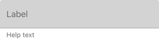
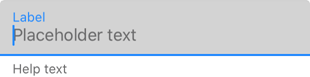
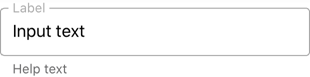
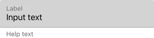
Editor Appearance
The text editor is displayed as follows depending on the specified BoxMode and the current state:
Editor State | BoxMode = Outlined (default) | BoxMode = Filled |
|---|---|---|
Inactive |
|
|
Focused |
|
|
Activated |
|
|
Error |
|
|
Disabled |
|
|
Use the following properties to change the appearance of the editor box and its borders:
Property | Description |
|---|---|
Specify the border color for each state of the text editor. | |
Gets or sets the color of editor box borders, label and error message shown in case of input error. | |
BorderThickness | Specify the border thickness for each state of the text editor. |
Gets or sets whether editor box corners are rounded or cut. | |
Specifies the radius of the editor box corners. | |
BackgroundColor | Specify the editor box fill color. |
Gets or sets the amount of space between borders of the edit box and its content. |