DxComboBox<TData, TValue> Class
A text editor that allows users to select predefined items from the drop-down list or type custom values.
Namespace: DevExpress.Blazor
Assembly: DevExpress.Blazor.v24.1.dll
Declaration
public class DxComboBox<TData, TValue> :
    DxDropDownListEditorBase<TData, TValue>,
    IComboBox<TData, TValue>,
    IDropDownListEditorBase<TData, TValue>,
    IListEditorBase<TData, TValue>,
    IDropDownOwner,
    IFocusableEditor
Type Parameters
| Name | Description |
|---|---|
| TData | The data item type. |
| TValue | The value type. |
Remarks
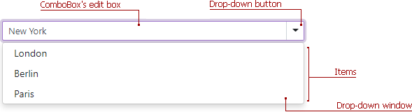
The DevExpress ComboBox for Blazor (<DxComboBox>) component displays a drop-down window with a list of items. Users can select multiple items from a list and type text in the editor to filter list items that contain the search string. Users can also use keyboard to navigate between items and select them. When a user presses and holds an arrow key, the editor’s window continuously navigates between items.

Add a ComboBox to a Project
Follow the steps below to add the ComboBox component to an application:
- Use a DevExpress Project Template to create a new Blazor Server or Blazor WebAssembly application. If you use a Microsoft project template or already have a Blazor project, configure your project to incorporate DevExpress Blazor components.
- Add the
<DxComboBox>…</DxComboBox>markup to a.razorfile. - Bind the component to data.
- Configure the component: add a clear button and placeholder, customize appearance, specify the filter mode, and so on (see the sections below).
Bind to Data
Strongly Typed Collection
Use the Data property to bind the ComboBox to a strongly typed collection or enumeration. Initialize this object in the OnInitialized lifecycle method or before this method is invoked. Use the DataAsync property instead of the Data property if a strongly typed collection is loaded asynchronously (for instance, from an HTTP request).
Use the Value property to specify the component’s selected value or item. You can use the @bind attribute to bind the Value property to a data field. For more information, refer to the following help topic: Two-Way Data Binding.
<DxComboBox Data="@Cities" @bind-Value="@Value" ></DxComboBox>

@code {
  IEnumerable<string> Cities = new List<string>() {
    "London",
    "Berlin",
    "Paris",
  };

  string Value { get; set; }
}
The ComboBox can detect IQueryable<T> collections and use benefits of the corresponding LINQ query providers (such as Entity Framework).
Custom Object Collection
You can bind the ComboBox to a data collection (Data) that stores custom objects (IEnumerable<CustomType>). The Value property can also contain a custom object. In this case, you need to override the following methods for your custom object:
GetHashCode. The ComboBox uses hash codes to compare items. Override this method to make sure that compared objects have the same hash code.
Equals. The default
Equalsmethod determines whether two object instances are equal. The compared items will not be equal if they are different instances (even if they have exactly the same properties). As a result, the component will not display the selected items.
You also need to set the TextFieldName property. It specifies the custom object’s field name that returns strings to be shown in the ComboBox drop-down window. If the TextFieldName property is not specified, the ComboBox component searches for a Text field in the data source and uses this field as a text field. Otherwise, the ComboBox is populated with CustomType.ToString() values.
@using BlazorApp.Data

<DxComboBox Data="@Staff.DataSource"
            TextFieldName="@nameof(Person.Text)"
            @bind-Value="@Value"
            AllowUserInput="true">
</DxComboBox>

@code {
  Person Value { get; set; } = Staff.DataSource[0];
}
Otherwise, the ComboBox items are populated with CustomType.ToString() values.
Load Custom Data
When you bind an editor to data from a Web API service, assign the data type to the component’s T parameter and use the CustomData property to implement custom data load logic.
You can also enable Virtual Scrolling to improve client-side performance.
Items
The <DxComboBox> drop-down window displays a list of predefined items. Set the AllowUserInput property to true to allow users to type values into the ComboBox’s edit box.
<DxComboBox Data="@Cities"
            AllowUserInput="true"
            NullText="Select City ..."
            @bind-Value="@Value"
            @bind-Text="@Text">
</DxComboBox>

@code {
  IEnumerable<string> Cities = new List<string>() {
    "London",
    "Berlin",
    "Paris",
  };

  string Text { get; set; } = "New York";
  string Value { get; set; }
}
Use the Text property to specify an editor value in code. To respond to an editor’s text change, handle the TextChanged event.
Clear Button and Placeholder
Set the ClearButtonDisplayMode property to Auto to show the Clear button when the editor has a non-null value. Users can click this button to clear the editor’s value (set it to null).
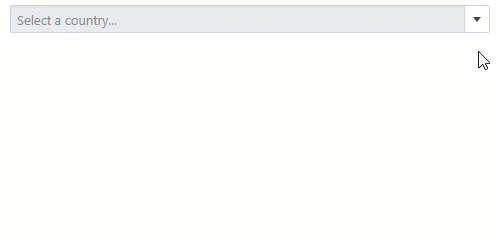
Use the NullText property to display the prompt text (placeholder) in the editor when its value is null.
<DxComboBox NullText="Select a country..."
            Data="@CountryData.Countries"
            @bind-Value="@CurrentCountry"
            TextFieldName="@nameof(Country.CountryName)"
            ClearButtonDisplayMode="DataEditorClearButtonDisplayMode.Auto">
</DxComboBox>

@code {
    Country CurrentCountry { get; set; } = CountryData.Countries[1];
}
Note
If you use the EditBoxDisplayTemplate property and need to show the clear button and placeholder, you should also add a DxInputBox object to the template markup.
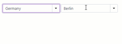
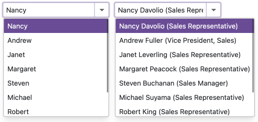
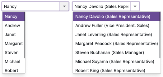
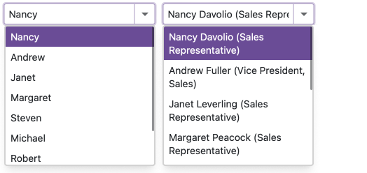
Cascading Comboboxes
The <DxComboBox> allows you to create cascade lists - populate one ComboBox with items based on the user selection from another ComboBox. Use the Value property to access the selected item. To respond to the selected item change, handle the ValueChanged event.
@using CountryCityData

<div class="row cw-480">
    <div class="col-md-6">
        <label for="cbCountryName" class="mb-1">
            Country Name
        </label>
        <DxComboBox Data="@Countries"
                    TextFieldName="@nameof(Country.CountryName)"
                    Value="@CurrentCountry"
                    ValueChanged="@((Country country) => SelectedCountryChanged(country))"
                    AllowUserInput="true">
                    InputId="cbCountryName">
        </DxComboBox>
    </div>
    <div class="col-md-6">
        <label for="cbCityName" class="mb-1">
            City Name
        </label>
        <DxComboBox Data="@CurrentCountryCities"
                    TextFieldName="@nameof(City.CityName)"
                    @bind-Value="@CurrentCity"
                    AllowUserInput="true"
                    InputId="cbCityName" >
        </DxComboBox>
    </div>
</div>

@code {
    List<Country> Countries { get; set; } = CountryData.Countries;
    List<City> CurrentCountryCities { get; set; } = new List<City>();
    Country CurrentCountry { get; set; } = CountryData.Countries[1];
    City CurrentCity { get; set; } = CityData.Cities[4];

    protected override void OnInitialized() {
        base.OnInitialized();
        SelectedCountryChanged(CurrentCountry);
    }

    void SelectedCountryChanged(Country country) {
        CurrentCountry = country;
        CurrentCountryCities = CityData.Cities.FindAll(city => city.CountryId == CurrentCountry.Id);
        CurrentCity = CurrentCountryCities[0];
    }
}
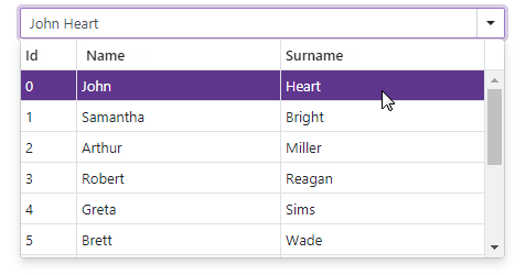
Multiple Columns
The ComboBox control can display data across multiple columns. Follow the steps below to create columns:
- Add a
<Columns>tag to the component’s markup to declare the column collection. Populate the
Columnscollection with DxListEditorColumn objects. These objects include the following properties:- Caption - Specifies the column’s caption text.
- FieldName - Specifies the data source field that populates column items in multi-column editors.
- SearchEnabled - Specifies whether the component can search text in cells of the current column.
- Visible - Specifies whether the column is visible.
- VisibleChanged - Fires when the column visibility changes.
- VisibleIndex - Specifies a column’s position among other columns.
- VisibleIndexChanged - Fires when the column’s visible index changes.
- Width - Specifies the column’s width.
To format an edit box’s value, use the EditFormat property.
@using StaffData

<DxComboBox Data="@Staff.DataSource"
            @bind-Value="@SelectedPerson"
            EditFormat ="{1} {2}">
    <Columns>
        <DxListEditorColumn FieldName="Id" Width="50px" />
        <DxListEditorColumn FieldName="FirstName" Caption="Name"/>
        <DxListEditorColumn FieldName="LastName" Caption="Surname"/>
    </Columns>
</DxComboBox>

@code {
    Person SelectedPerson { get; set; } = Staff.DataSource[0];
}
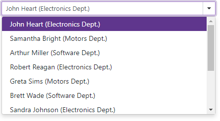
Search and Filter Data
The DevExpress Blazor ComboBox can search for text, and filter and highlight search results. Use the following API members to enable search and filter capabilities:
- SearchMode — Specifies whether the component can search for text that users type in the edit box. When the AutoSearch mode is active, the ComboBox filters its items based on the search string and highlights string matches. All visible columns take part in search operations.
- SearchFilterCondition — Specifies the search and filter condition (Contains, Equals, or StartsWith).
- SearchTextParseMode — Specifies how the component combines words into the search query. If search text contains multiple words separated by space characters, words can be treated as a single condition or individual conditions. The following modes are available: GroupWordsByAnd, GroupWordsByOr, and ExactMatch.
- SearchEnabled - Specifies whether the component can search text in cells of the current column.
<DxComboBox Data="Staff.DataSource"
            @bind-Value="@Value"
            SearchMode="ListSearchMode.AutoSearch"
            SearchFilterCondition="ListSearchFilterCondition.Contains">
    <Columns>
        <DxListEditorColumn FieldName="FirstName"></DxListEditorColumn>
        <DxListEditorColumn FieldName="LastName"></DxListEditorColumn>
        <DxListEditorColumn FieldName="Department" SearchEnabled="false"></DxListEditorColumn>
    </Columns>
</DxComboBox>

@code {
    string Value { get; set; }
}
When a user types text into the edit box, the ComboBox filters and highlights search results.

Note
If you use the EditBoxDisplayTemplate property and need to enable filter mode, you should add a DxInputBox object to the template markup.
Customization
The ComboBox component allows you to customize its appearance: the size, the appearance of the edit box, items, and column cells.
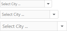
Size Modes
Use the SizeMode property to specify the size of a ComboBox. The code below applies different sizes to ComboBox components.
<DxComboBox Data="@Cities"
            NullText="Select City ..."
            @bind-Value="@Value"
            SizeMode="SizeMode.Small">
</DxComboBox>

<DxComboBox Data="@Cities"
            NullText="Select City ..."
            @bind-Value="@Value"
            SizeMode="SizeMode.Medium">
</DxComboBox>

<DxComboBox Data="@Cities"
            NullText="Select City ..."
            @bind-Value="@Value"
            SizeMode="SizeMode.Large">
</DxComboBox>

@code {
    IEnumerable<string> Cities = new List<string>() {
        "London",
        "Berlin",
        "Paris",
    };

    string Value { get; set; }
}
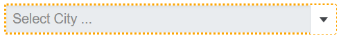
To customize ComboBox input, use the InputCssClass property. The following code snippet applies a custom style to input borders:
<style>
    .my-style {
        border: 2px dotted orange;
    }
</style>

<DxComboBox Data="@Cities"
            NullText="Select City ..."
            @bind-Value="@Value"
            InputCssClass="my-style">
</DxComboBox>

@code {
    IEnumerable<string> Cities = new List<string> () {
        "London",
        "Berlin",
        "Paris",
    };

    string Value { get; set; }
}
For more information, refer to the following help topics:
Item Display Template
The ItemDisplayTemplate property allows you to customize the appearance of ComboBox items. The property accepts a ComboBoxItemDisplayTemplateContext<TData> object as the context parameter. You can use the parameter’s members to obtain item information:
The following code snippet uses the ItemDisplayTemplate property to display ComboBox items in a card-like view. Each item shows an employee’s first name, last name, photo, and phone number.
@inject NwindDataService NwindDataService

<DxComboBox Data="@Data"
            @bind-Value="@Value"
            CssClass="cw-480"
            InputId="cbItemTemplate">
    <ItemDisplayTemplate>
        <div class="combobox-item-template">
            <img src="@StaticAssetUtils.GetImagePath(GetImageFileName(context.DataItem))" alt="@context.DataItem.FullName" />
            <div class="combobox-item-template-text">
                <span>@context.DataItem.FullName</span>
                <span class="combobox-item-template-employee-phone">@context.DataItem.HomePhone</span>
            </div>
        </div>
    </ItemDisplayTemplate>
</DxComboBox>

@code {
    IEnumerable<Employee> Data { get; set; }
    Employee Value { get; set; }
    protected override async Task OnInitializedAsync() {
        Data = await NwindDataService.GetEmployeesAsync();
        Value = Data.FirstOrDefault();
    }
    string GetImageFileName(Employee employee) {
        return $"employees/item-template{employee.EmployeeId}.jpg";
    }
}

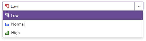
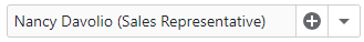
Edit Box Display Template
The EditBoxDisplayTemplate property allows you to customize the appearance of a ComboBox item displayed in the edit box.
The most popular usage scenario for the EditBoxDisplayTemplate property is to show item icons in the edit box.
<DxComboBox Data="@Items"
            @bind-Value="@Value"
            CssClass="cw-480" >
    <EditBoxDisplayTemplate>
        @GetTemplateContent(context.DataItem)
    </EditBoxDisplayTemplate>
    ...
</DxComboBox>

@code {
    string Value { get; set; } = "Low";
    IEnumerable<string> Items = new List<string>() {"Low", "Normal", "High"};
    RenderFragment GetTemplateContent(string item) {
        return @<div class="template-container">
                   <svg class="@GetIconCssClass(item)" role="img">
                       <use href="@GetIconHref(item)"/>
                   </svg>
                   @item
               </div>;
    }
    string GetIconHref(string item) {
        return item != null ? StaticAssetUtils.GetImagePath($"icons/levels.svg#dx-{item.ToLower()}-level") : string.Empty;
    }
    string GetIconCssClass(string item) {
        var cssClass = "template-icon";
        if (item != null)
            cssClass += $" {item.ToLower()}-level";
        return cssClass;
    }
}
You can also create an edit box template that supports user input and filter mode:
- Add
<EditBoxDisplayTemplate>…</EditBoxDisplayTemplate>to the ComboBox markup. - Declare a DxInputBox object within the
EditBoxTemplatemarkup. - Optional. Use the
DxComboBox‘s InputCssClass to customize input box appearance. - Optional. Set the DxComboBox.AllowUserInput to
true. - Optional. Use the SearchMode property to enable search mode.
- Optional. Use the NullText property to display the prompt text in the edit box when the editor’s Value is
null.
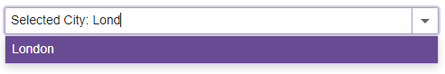
<DxComboBox Data="@Cities"
            @bind-Value="@CurrentCity"
            AllowUserInput="true"
            SearchMode="ListSearchMode.AutoSearch"
            SearchFilterCondition="ListSearchFilterCondition.StartsWith"
            NullText="Select City ..."
            ClearButtonDisplayMode="DataEditorClearButtonDisplayMode.Auto">
    <EditBoxDisplayTemplate>
        @if (context != null) {
            <span style="white-space: pre;">Selected City: </span>
        }
        <DxInputBox/>
    </EditBoxDisplayTemplate>
</DxComboBox>

@code {
    string CurrentCity { get; set; } = "London";
    IEnumerable<string> Cities = new List<string>() { "New York", "London", "Berlin", "Paris" };
}
Column Cell Display Template
The ColumnCellDisplayTemplate allows you to specify custom content and change cell appearance in ComboBox columns. The template accepts a ComboBoxColumnCellDisplayTemplateContext<TData> object as the context parameter. You can use the parameter’s members to obtain column information.
The code below customizes the appearance of different columns.
@inject NwindDataService NwindDataService

<DxComboBox Data="@Products"
            @bind-Value="@SelectedProduct"
            TextFieldName="@nameof(Product.ProductName)"
            ListRenderMode="@ListRenderMode.Virtual"
            CssClass="cw-480"
            InputId="cbItemTemplate">
    <Columns>
        <DxListEditorColumn FieldName="@nameof(Product.ProductName)" Caption="Product" Width="30%" />
        <DxListEditorColumn FieldName="@nameof(Product.UnitPrice)" Caption="Unit Price" />
        <DxListEditorColumn FieldName="@nameof(Product.Quantity)" />
        <DxListEditorColumn FieldName="@nameof(Product.Discount)" />
        <DxListEditorColumn FieldName="@nameof(Product.Total)" />
    </Columns>
    <ColumnCellDisplayTemplate>
        @GetColumnCellTemplateRenderFragment(context)
    </ColumnCellDisplayTemplate>
</DxComboBox>

@code {
    const int SelectedProductsCount = 3;
    const int TotalPriceCeiling = 100;
    IEnumerable<Product> Products { get; set; }
    Product SelectedProduct { get; set; }
    const string AlignRightCssClass = "align-right";
    const string TextGreenCssClass = "text-green";
    const string TextRedCssClass = "text-red";

    protected override async Task OnInitializedAsync() {
        var invoices = await NwindDataService.GetInvoicesAsync();
        var products = await NwindDataService.GetProductsAsync();
        Products = invoices.Join(products, i => i.ProductId, p => p.ProductId, (i, p) =>
        new Product {
                ProductName = i.ProductName,
                UnitPrice = i.UnitPrice,
                Quantity = i.Quantity,
                Discount = i.Discount
        });
        SelectedProduct = Products.FirstOrDefault();
    }

    RenderFragment GetColumnCellTemplateRenderFragment(ComboBoxColumnCellDisplayTemplateContext<Product> context) {
        object displayValue;
        string cssClass = string.Empty;
        switch(context.Column.FieldName) {
            case nameof(Product.UnitPrice):
            cssClass = AlignRightCssClass;
                displayValue = $"{context.Value:c}";
                break;
            case nameof(Product.Quantity):
                cssClass = AlignRightCssClass;
                displayValue = context.DisplayText;
                break;
            case nameof(Product.Discount):
                displayValue = $"{context.Value:p}";
                break;
            case nameof(Product.Total):
                var value = context.DataItem.UnitPrice * context.DataItem.Quantity;
                var valueCssClass = value >= TotalPriceCeiling ? TextGreenCssClass : TextRedCssClass;
                cssClass = $"{AlignRightCssClass} {valueCssClass}";
                displayValue = $"{value:c}";
                break;
            default:
                displayValue = context.DisplayText;
                break;
        }
        return @<text><div class="@cssClass">@displayValue</div></text>;
    }

    public class Product {
        public string ProductName { get; set; }
        public decimal UnitPrice { get; set; }
        public int Quantity { get; set; }
        public float Discount { get; set; }
        public int Total { get; set; }
        public override bool Equals(object obj) {
            return obj is Product product && string.Equals(product.ProductName, ProductName) && product.Quantity == Quantity;
        }
        public override int GetHashCode() {
            return HashCode.Combine(ProductName, Quantity);
        }
    }
}

Empty Data Area Template
The ComboBox displays an empty data area in the following cases:
- The Data property is unset.
- The specified data source does not contain items.
- You use the DataAsync property or the CustomData property to bind the ComboBox to a data source. The component sends the first request to a remote data source and waits for a response.
Use the EmptyDataAreaTemplate to customize content displayed in this empty region. The template’s context parameter includes the IsDataLoading property that allows you to determine whether the ComboBox is still loading data.
The code below embeds the Wait Indicator component into the ComboBox.
@inject NwindDataService NwindDataService

<DxComboBox TData="@WebApiLookup"
            TValue="string"
            @key="ComponentKey"
            ClearButtonDisplayMode="@DataEditorClearButtonDisplayMode.Auto"
            CustomData="@LoadCustomData"
            CssClass="cw-480"
            DropDownVisibleChanged="@OnDropDownVisibleChanged"
            NullText="Select a value..."
            ListRenderMode="ListRenderMode.Virtual"
            SizeMode="Params.SizeMode">
    <EmptyDataAreaTemplate>
        @if(context.IsDataLoading) {
            <div class="empty-data-area-template">
                <div class="d-flex flex-column">
                    <DxWaitIndicator Visible="true"
                                    SizeMode="Params.SizeMode"
                                    CssClass="m-auto"
                                    AnimationType="WaitIndicatorAnimationType.Spin" />
                    <p class="dxbl-text d-block mt-1">Loading, please wait...</p>
                </div>
            </div>
        }
    </EmptyDataAreaTemplate>
</DxComboBox>

@code {
    [Inject] protected HttpClient Client { get; set; }
    bool ThrottleRequireTotalCount { get; set; } = true;
    Guid ComponentKey { get; set; } = Guid.NewGuid();

    async Task<LoadResult> LoadCustomData(DataSourceLoadOptionsBase options, CancellationToken cancellationToken) {
        using var response = await Client.GetAsync(options.ConvertToGetRequestUri("https://js.devexpress.com/Demos/NetCore/api/DataGridWebApi/CustomersLookup"), cancellationToken);
        response.EnsureSuccessStatusCode();
        while(options.RequireTotalCount && ThrottleRequireTotalCount) {
            cancellationToken.ThrowIfCancellationRequested();
            await Task.Yield();
        }
        using var responseStream = await response.Content.ReadAsStreamAsync();
        var result = await JsonSerializer.DeserializeAsync<LoadResult>(responseStream, cancellationToken: cancellationToken);
        return result;
    }

    void OnDropDownVisibleChanged(bool value) {
        if(!value) {
            ThrottleRequireTotalCount = true;
            ComponentKey = Guid.NewGuid();
            StateHasChanged();
        } else {
            _ = ResetThrottleRequireTotalCountAsync(true);
        }
    }
    async Task ResetThrottleRequireTotalCountAsync(bool value) {
        try {
            await Task.Delay(TimeSpan.FromSeconds(5));
        }
        finally {
            ThrottleRequireTotalCount = !value;
        }
    }

    public class WebApiLookup {
        public string Text { get; set; }
        public string Value { get; set; }
    }
}

Hide Built-In Drop-Down Button
Set the ShowDropDownButton property to false to hide the built-in button that invokes a drop-down menu. If you need a custom button, you can add a new command button.
Add Command Buttons
You can add custom command buttons to the ComboBox. Refer to Command Buttons for more information.
The code below adds the Add Employee button to the ComboBox.
Virtual Scrolling
When virtual scrolling is activated (ListRenderMode is set to Virtual), the ComboBox renders data on demand when a user scrolls its items.
<DxComboBox ListRenderMode="ListRenderMode.Virtual"
            Data="@Strings"
            @bind-Value="@Value" >
</DxComboBox>
Input Validation
You can add a standalone ComboBox or Form Layout component to Blazor’s standard EditForm. This form validates user input based on data annotation attributes defined in a model and indicates errors. To specify which ComboBox property takes part in input validation (Text or Value), use the ValidateBy property. If you handle the ValueChanged event and cannot use two-way binding, specify the ValueExpression property to identify the value passed to the event handler.
<EditForm Model="@starship" Context="EditFormContext">
    <DataAnnotationsValidator />
    <DxFormLayout >
        <DxFormLayoutItem Caption="Primary Classification:" ColSpanMd="6" >
            <Template >
                <DxComboBox
                            NullText="Select classification ..."
                            ClearButtonDisplayMode="DataEditorClearButtonDisplayMode.Auto"
                            @bind-Value="@starship.Classification"
                            Data="@(new List<string>() { "Defense", "Exploration", "Diplomacy" })"
                            ValidateBy="ComboBoxValidateBy.Value"
                />
            </Template >
        </DxFormLayoutItem >
        @*...*@
    </DxFormLayout>
</EditForm>

@code {
    private Starship starship=new Starship();
}
For more information, refer to the following help topic: Validate Input.
Keyboard Navigation
The DevExpress Blazor ComboBox supports keyboard navigation. Users can focus the editor’s input element, navigate within the drop-down item list, and select items. While DOM focus refers to the input element as the active element for keyboard interaction, visual focus can move to items in the drop-down list. Keyboard navigation is also supported in virtual scroll mode.
Shortcut Keys for Input Element
The following shortcut keys are available when the editor’s input element is focused:
| Shortcut Keys | Description |
|---|---|
| Tab | Moves focus to the next focusable element on a page. Note that the drop-down button, custom buttons, and the Clear button are excluded from the page tab sequence. If AllowUserInput is set to true, the entered characters are applied as a custom value. |
| Shift + Tab | Moves focus to the previous focusable element on a page. |
| Characters | If AllowUserInput is set to true, adds characters to the input. |
| Backspace, Delete | If AllowUserInput is set to true, removes characters in the input element. |
| Home | If AllowUserInput is set to true, moves focus to the first character in the input element. |
| End | If AllowUserInput is set to true, moves focus to the last item in the input element. |
| Right Arrow | If AllowUserInput is set to true, moves the cursor one character to the right in the input element. When the cursor reaches a right edge, nothing happens. |
| Left Arrow | If AllowUserInput is set to true, moves the cursor one character to the left in the input element. When the cursor reaches a left edge, nothing happens. |
| Alt + Down Arrow | Opens the drop-down list, but keeps focus in the input element. |
Shortcut Keys for Drop-Down Item List
The following shortcut keys are available when the drop-down list is opened:
| Shortcut Keys | Description |
|---|---|
| Up Arrow | Moves focus one item up. |
| Down Arrow | Moves focus one item down. |
| Ctrl + Shift + Home | Moves focus to the first item in the list. |
| Ctrl + Shift + End | Moves focus to the last item in the list. |
| Page Up | Moves focus to the previous item page. |
| Page Down | Moves focus to the next item page. |
| Tab | Selects the focused item, updates the Value parameter value, closes the drop-down list, moves focus to the input element. |
| Enter | Selects the focused item, updates Value and Text parameter values, and closes the drop-down list. |
| Escape, Alt + Up Arrow | Closes the drop-down list. |
The ComboBox does not currently allow you to navigate through elements in templated items.
Read-Only State
<DxComboBox> supports a read-only state. Set the ReadOnly property to true to activate this option.
<DxComboBox ReadOnly="true"
            Data="@Strings"
            @bind-Value="@Value" >
</DxComboBox>
Drop-Down List Width
Use the DropDownWidthMode property to specify the width of the drop-down list. The following values are available:
ContentOrEditorWidth (Default) - The list displays item text completely. The minimum list width matches the editor.
ContentWidth - The list width is equal to the width of the longest list item.
EditorWidth - The list width matches the editor. If item text does not fit the editor width, item text is displayed across multiple lines.
Note
When the ComboBox renders items on demand (ListRenderMode is set to Virtual), the list width can change while users scroll items.
The following code sets the width of the drop-down list to the editor width.
@using BlazorApp.Data

<DxComboBox Data="@Staff.DataSource"
            @bind-Value="@Value"
            TextFieldName="@nameof(Person.Text)"
            DropDownWidthMode="DropDownWidthMode.EditorWidth">
</DxComboBox>

@code {
  Person Value { get; set; } = Staff.DataSource[0];
}
Drop-Down Window Direction
Use the DropDownDirection property to specify the direction in which the ComboBox’s drop-down window is displayed relative to the input element. The default value is Down. The following code changes the direction to Up:
<DxComboBox Data="@Cities"
            @bind-Value="@Value"
            NullText="Select City ..."
            DropDownDirection="DropDownDirection.Up">
</DxComboBox>

@code {
    IEnumerable<string> Cities = new List<string>() {
        "London",
        "Berlin",
        "Paris",
    };

    string Value { get; set; }
}

Note
If the editor is close to a browser window’s edge and there is not enough space to display the drop-down window in the specified direction, the drop-down window is displayed in the opposite direction.
HTML Attributes and Events
You can use HTML attributes and events to configure the ComboBox.
<DxComboBox Data="@Strings"
            @bind-Value="@Value"
            maxlength="10"
            @onclick="MyFunction">
</DxComboBox>

@code {
    void MyFunction(){
        //...
    }
}
Note that the ComboBox’s CssClass property has priority over unmatched attributes (the Attributes property). For example, if you specify the class html attribute and the CssClass property, the last one has priority.
<DxComboBox Data="_data"
            @bind-Value="_value"
            class="myClass"
            CssClass="myCssClass" />
Troubleshooting
If a Blazor application throws unexpected exceptions, refer to the following help topic: Troubleshooting.