ImageEdit
- 2 minutes to read
Overview
The ImageEdit control is an editor that allows end-users to display images in various formats.
The ImageEdit control offers the following features.
Support for various formats
The ImageEdit control supports the following image formats.
- Bitmap
- JPEG
- GIF
- PNG
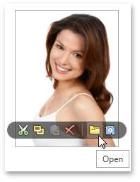
Optional image menu
Use the ImageEdit.ShowMenu and ImageEdit.ShowMenuMode properties to control the availability of the image menu.
Various stretch modes
To specify how the image should be stretched to fill the available space, use the ImageEdit.Stretch property. The following stretch modes are available.
- None
- Fill
- Uniform
- Uniform to fill
Webcam support
Image menu contains the Take Snapshot button. Clicking this button allows end-users to take a picture using a web camera.
Optimized for in-place editing
ImageEdit can be used standalone or as an in-place editor nested in a container control. The ImageEditSettings class implements the in-place editing functionality. See In-place Editors to learn more.
Complementary popup control
The DevExpress WPF Editors Library contains a popup variation of the ImageEdit control. To learn more, see PopupImageEdit.
Standalone ImageEdit
To add a standalone ImageEdit to a Window, drag it from the Toolbox.
The following sample demonstrates how to create an ImageEdit using XAML markup.
<dxe:ImageEdit ShowMenuMode="Hover"/>
In-place ImageEdit
To embed an ImageEdit into a container control, use the ImageEditSettings class.
The following sample demonstrates how to embed an ImageEdit into a GridControl column.
<dxg:GridControl Name="grid">
    <dxg:GridControl.Columns>
        <dxg:GridColumn FieldName="ProductPhoto">
        <dxg:GridColumn.EditSettings>
            <dxe:ImageEditSettings/>
        </dxg:GridColumn.EditSettings>
    </dxg:GridColumn>
</dxg:GridControl.Columns>
</dxg:GridControl>