RatingEdit
- 2 minutes to read
Overview
The RatingEdit control is used to visualize and edit ratings.
The RatingEdit control offers the following features.
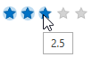
Customizable precision
Use the RatingControl.Precision property to specify the desired precision. The following settings are available.
- Exact
- Full
- Half
Customizable number of rating items
Use the RatingControl.ItemsCount property to specify the number of rating items.
Customizable rating item appearance
You can change the appearance of the rating items using custom styles. The following example demonstrates how to create a RatingEdit with rectangular rating items.
<dxe:RatingEdit>
    <dxe:RatingEdit.ItemStyle>
        <Style TargetType="dxe:RatingItem">
            <Setter Property="Background" Value="LightGray" />
            <Setter Property="HoverBackground" Value="Goldenrod" />
            <Setter Property="SelectedBackground" Value="Gold" />
            <Setter Property="VerticalAlignment" Value="Stretch"/>
            <Setter Property="Geometry">
                <Setter.Value>
                    <RectangleGeometry Rect="0,0,40,40" />
                </Setter.Value>
            </Setter>
        </Style>
    </dxe:RatingEdit.ItemStyle>
</dxe:RatingEdit>
Optimized for in-place editing
RatingEdit can be used standalone or as an in-place editor nested in a container control. The RatingEditSettings class implements the in-place editing functionality. See In-place Editors to learn more.
Standalone RatingEdit
To add a standalone RatingEdit to a Window, drag it from the Toolbox.
The following sample demonstrates how to create a RatingEdit using XAML markup.
<dxe:RatingEdit Precision="Half" ItemsCount="10" EditValue="7.5"/>
In-place RatingEdit
To embed a RatingEdit into a container control, use the RatingEditSettings class.
The following sample demonstrates how to embed a RatingEdit into a GridControl column.
<dxg:GridControl>
    <dxg:GridColumn FieldName="Rating">
        <dxg:GridColumn.EditSettings>
            <dxe:RatingEditSettings/>
        </dxg:GridColumn.EditSettings>
    </dxg:GridColumn>
    <dxg:GridControl.View>
        <dxg:TableView/>
    </dxg:GridControl.View>
</dxg:GridControl>