In-Ribbon Gallery
An in-Ribbon gallery is a special type of bar item used to display command options (gallery items) inside a Ribbon. As a rule, each command is provided with an icon displaying the result of the command.
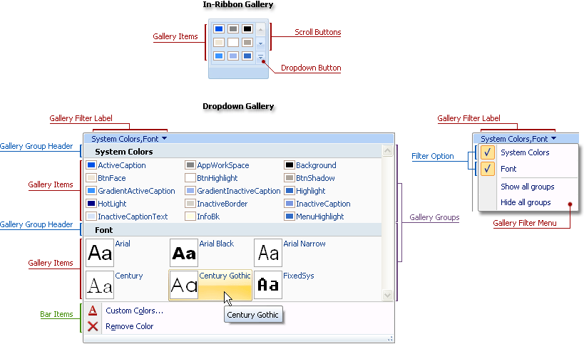
If all gallery items cannot fit the in-Ribbon gallery, the gallery shows only the first few items. To allow end-users to access items that are beyond the gallery’s boundaries, the gallery is equipped with scroll buttons and a dropdown window to display all items categorized into gallery groups.
An in-Ribbon gallery is represented by a TdxRibbonGalleryItem object. This object provides the following interface:
| Member | Description |
|---|---|
| DropDownGallery | Specifies a dropdown gallery used to provide an in-Ribbon gallery with custom dropdown gallery content. |
| GalleryCategories | Provides access to gallery groups used to combine related gallery items into logical groups within a gallery. |
| GalleryOptions | Provides access to gallery appearance settings. |
| OnGroupItemClick | Provides logic common to all gallery items. |
Refer to the How to Create an in-Ribbon Gallery at Design Time topic to learn how to populate an in-Ribbon gallery at design time.
See Also