VCL Navigation Bars
- 2 minutes to read
VCL Navigation Bars are the controls designed to create navigation panels and toolboxes for your applications.
Navigation Bar
The Navigation Bar control is a side bar navigation panel with multiple appearance customization options.
Refer to the following tutorials to get started with the Navigation Bar control:
Views
The Navigation Bar control supports over 20 appearance and behavior styles called views. Every built-in view belongs to one of two categories:
- Explorer Views
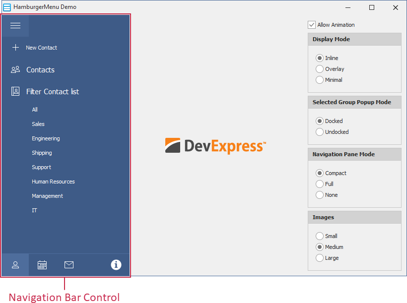
Display content of all navigation bar groups simultaneously. Groups are arranged one under another. Users can collapse or expand them independently.

Tip
The AccordionView and HamburgerMenu views support Fluent Design effects.
- Side Bar Views
Display only the contents of a single group at a time. Group headers are displayed at the top and bottom borders of the Navigation Bar control. A click on a collapsed group’s header expands the group and collapses the previously expanded group.

Note
The SkinExplorerBarView, SkinNavigationPaneView, AccordionView, and HamburgerMenu views are available only if the ExpressSkins Library is installed.
Refer to the following topics for more information on views:
Layout and Appearance Customization
- Structure Designer
Right-click the Navigation Bar control at design time and click the Structure Designer… item to invoke this dialog. Use it to create, group, rearrange, and delete interactive items. You can display the Structure Designer as a Customization Form at runtime.

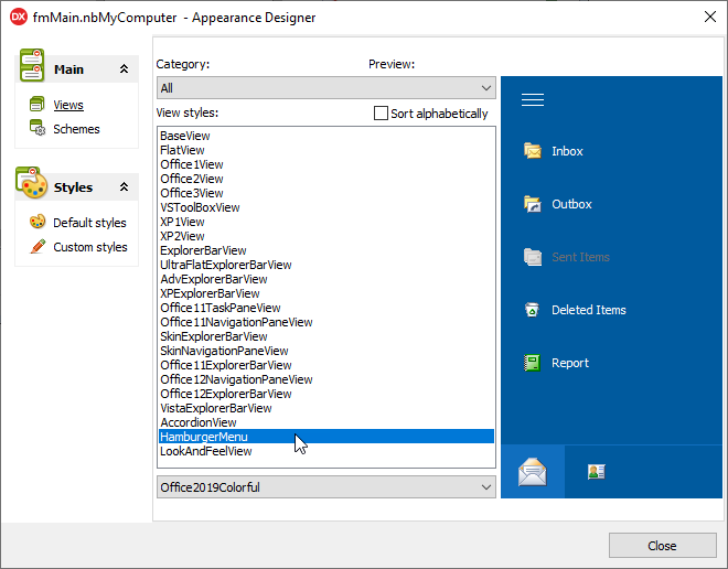
- Appearance Designer
Right-click the Navigation Bar control at design time and click Appearance Designer… to invoke this dialog. You can use it to select and customize a view and preview the changes.
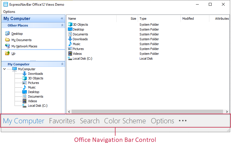
Office Navigation Bar
The Office Navigation Bar control is a horizontal navigation panel inspired by Microsoft Outlook®. The Office Navigation Bar and one of the Navigation Bar views can complement each other. For instance, you can use the Office Navigation Bar to switch between sidebar groups: