Theme Navigator
- 2 minutes to read
Note
The WPF Theme Editor does not support the DevExpress WPF Controls 18.2 or later. Use the WPF Theme Designer tool instead.
The Theme Navigator enables you to locate particular visual elements in a markup by simply clicking them in a sample application.
User Interface
The image below shows a Theme Navigator window.
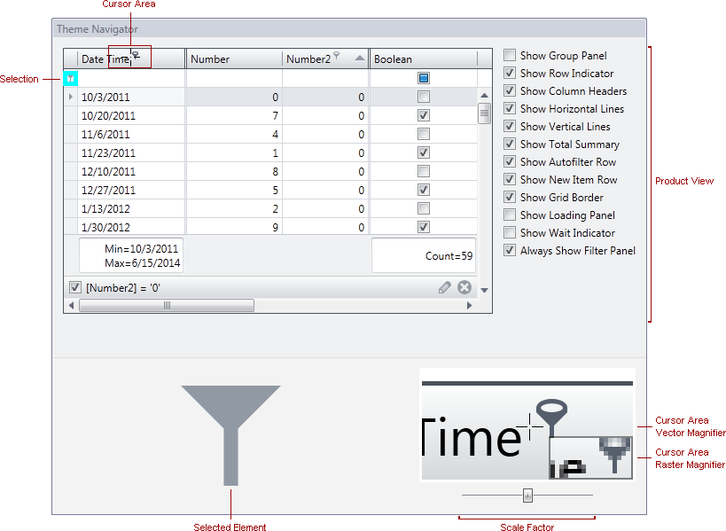
This window consists of the following areas.
- Product View - displays a sample application used to navigate through the product’s visual elements.
- Selected Element - displays the visual element, currently selected in the Product View.
- Cursor Area Magnifiers - display the area around the mouse cursor scaled in a vector and raster manners to help you accurately hover over the required visual element and click it.
- Scale Factor Track Bar - allows you to adjust the scale factor for Cursor Area Magnifiers.
Locating Visual Elements in Markup
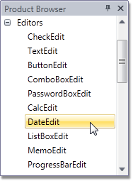
To display a product view in the Theme Navigator, select it from Product Browser.
Click a visual element in the product view while holding down the Shift key to select it (this is indicated by an aqua colored rectangle painted around the element). The Theme Editor will locate the selected element in a markup and open the appropriate file in the XAML Editor.
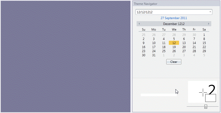
To open the appropriate XAML file in a new tab, hold down the Shift+Ctrl keys when clicking the element.
Product View Options
Specific product views provide an options panel.
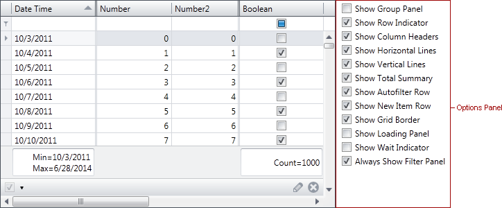
This indicates that some visual elements are not displayed in the default layout. In this instance, use the options panel to alter control settings in order to obtain different layouts that contain visual elements missing from the default one.