RibbonPage Class
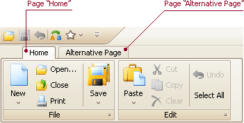
Represents a Ribbon Page within a RibbonControl.
Namespace: DevExpress.XtraBars.Ribbon
Assembly: DevExpress.XtraBars.v24.1.dll
NuGet Package: DevExpress.Win.Navigation
Declaration
public class RibbonPage :
    BaseRibbonComponent,
    ISupportRibbonKeyTip,
    ISupportMergeOrder,
    IDXImageUriClient,
    ICloneable,
IImageDropInfoRemarks
This class represents a Ribbon Page within a RibbonControl. RibbonPage objects are components. So, if pages are created at design time, they can be accessed in code by their names.

Ribbon pages can belong to either the default page category or to a custom page category. Pages that belong to the default page category are regular pages, and they should be designed to contain commands that are always visible during the application run. Pages that belong to custom page categories are intended to display context-dependant commands. Please refer to the Ribbon Page topic to learn more.
To access a RibbonControl’s regular pages, use the RibbonControl.Pages collection. To access pages that belong to a custom category, use the RibbonPageCategory.Pages collection. The active page is specified by the RibbonControl.SelectedPage property.
Use the RibbonPage.Groups property to add groups to the page.
Example
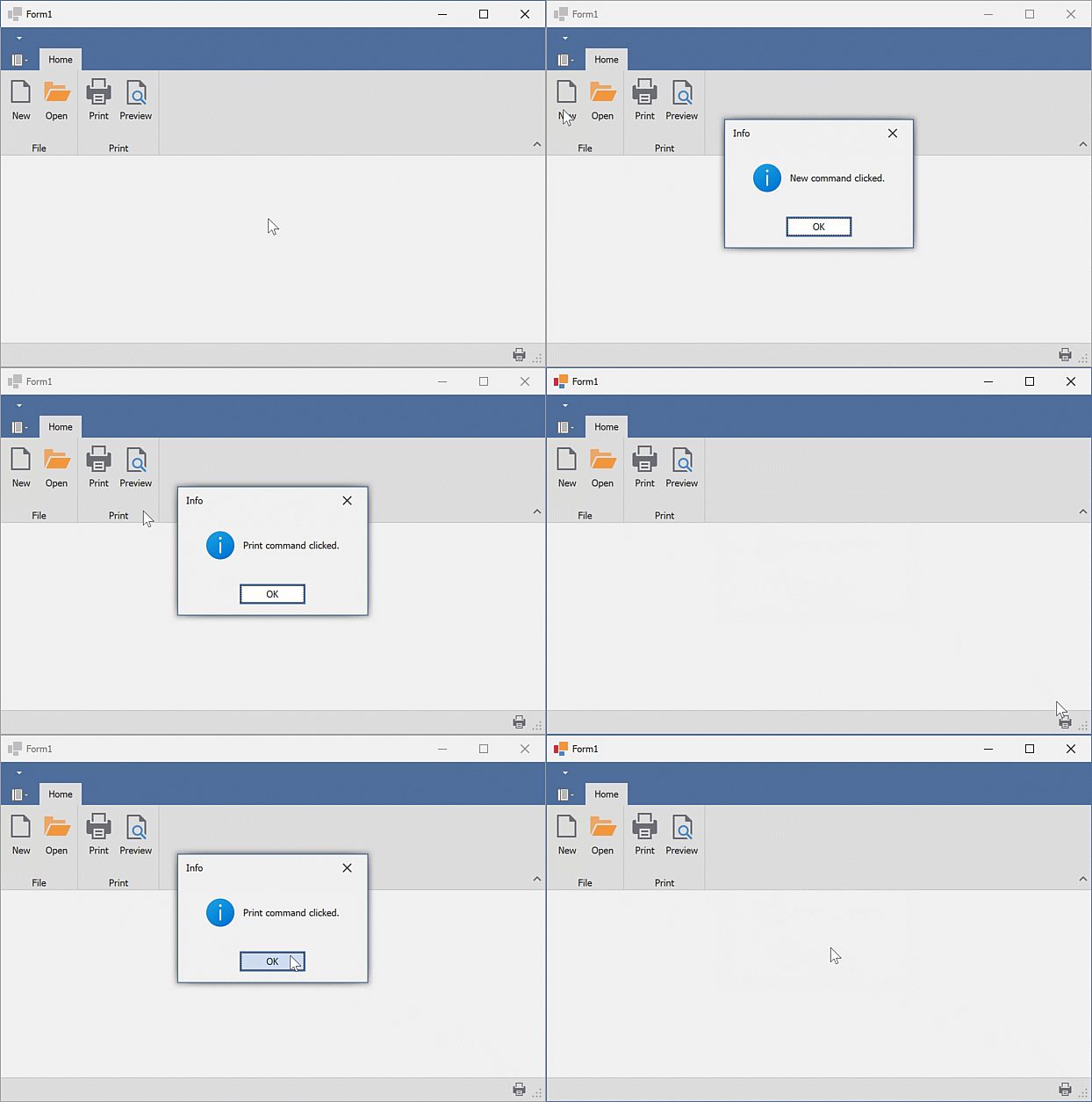
This example creates DevExpress WinForms RibbonControl and RibbonStatusBar:
- The
RibbonControlcontains the “Home” page, “File” and “Print” groups, and four commands (bar items). - The
RibbonStatusBardisplays the “Print” command. The “Print” command is aligned to the right.
The following animation shows the result:

Prerequisites
In this example, the SvgImageCollection was created and populated with SVG images at design-time.
Note
When creating the Ribbon UI in code, ensure that the following requirements are met:
- All bar items are added to the RibbonControl.Items collection.
- All bar items have unique identifiers (the BarItem.Id property should be set to a unique value).
using System.Windows.Forms;
using DevExpress.XtraBars.Ribbon;
using DevExpress.XtraBars;
using DevExpress.XtraEditors;

namespace DXApplication
{
    public partial class Form1 : XtraForm
    {
        public Form1()
        {
            InitializeComponent();
            // Create the DevExpress RibbonControl
            RibbonControl ribbon = new RibbonControl();
            this.Controls.Add(ribbon);
            /* Assign the SVG image collection to display images/icons within bar items.
             * In this example, the svgImageCollection1 was created and populated with SVG images at design-time.
             */
            ribbon.Images = svgImageCollection1;

            // Create a Ribbon page.
            RibbonPage pageHome = new RibbonPage("Home");
            ribbon.Pages.Add(pageHome);
            // Create a Ribbon page group.
            RibbonPageGroup groupFile = new RibbonPageGroup("File");
            pageHome.Groups.Add(groupFile);
            // Create another Ribbon page group.
            RibbonPageGroup groupPrint = new RibbonPageGroup("Print");
            pageHome.Groups.Add(groupPrint);

            // Create button items and add them to the 'File' group.
            BarButtonItem itemNew = ribbon.Items.CreateButton("New");
            // Ensures correct runtime layout (de)serialization.
            itemNew.Id = ribbon.Manager.GetNewItemId();
            // Specifies the image.
            itemNew.ImageOptions.SvgImage = svgImageCollection1["new"];
            itemNew.RibbonStyle = RibbonItemStyles.Large;
            itemNew.ItemClick += ItemClick;

            BarButtonItem itemOpen = ribbon.Items.CreateButton("Open");
            itemOpen.Id = ribbon.Manager.GetNewItemId();
            itemOpen.RibbonStyle = RibbonItemStyles.Large;
            itemOpen.ImageOptions.SvgImage = svgImageCollection1["open"];
            itemOpen.ItemClick += ItemClick;

            groupFile.ItemLinks.AddRange(new BarItem[] { itemNew, itemOpen });

            /* Create a button item using its constructor and add the button item to the 'Print' group.
             * The constructor automatically adds the new item to the RibbonControl's Items collection.
             */
            BarButtonItem itemPrint = new BarButtonItem(ribbon.Manager, "Print")
            {
                Id = ribbon.Manager.GetNewItemId(),
                RibbonStyle = RibbonItemStyles.Large
            };
            itemPrint.ImageOptions.SvgImage = svgImageCollection1["print"];
            itemPrint.ItemClick += ItemClick;

            // Create a button item using the default constructor.
            BarButtonItem itemPreview = new BarButtonItem()
            {
                Caption = "Preview",
                RibbonStyle = RibbonItemStyles.Large,
                Id = ribbon.Manager.GetNewItemId(),
            };
            itemPreview.ImageOptions.SvgImage = svgImageCollection1["preview"];
            itemPreview.ItemClick += ItemClick;
            // Add the 'Preview' item to the RibbonControl's Items collection.
            ribbon.Items.Add(itemPreview);

            groupPrint.ItemLinks.AddRange(new BarItem[] { itemPrint, itemPreview });

            // Create a status bar with the 'Print' command.
            RibbonStatusBar ribbonStatusBar = new RibbonStatusBar(ribbon)
            {
                Parent = this
            };
            BarItemLink linkPrint = ribbonStatusBar.ItemLinks.Add(itemPrint);
            linkPrint.UserRibbonStyle = RibbonItemStyles.SmallWithoutText;
            linkPrint.UserAlignment = BarItemLinkAlignment.Right;
        }

        void ItemClick(object sender, ItemClickEventArgs e)
        {
            XtraMessageBox.Show(string.Format("{0} command clicked.", e.Item.Caption), "Info", MessageBoxButtons.OK, MessageBoxIcon.Information);
        }
    }
}