WindowsUI Buttons
- 10 minutes to read
The WindowsUI View can display buttons in:
Depending on their type, the WindowsUI View buttons can be divided into:
Navigation Bar Buttons
These are custom buttons within top and bottom Navigation Bars.

The Navigation Bars can display both DelegateAction objects and/or Popup Buttons. These buttons can be of three types, depending on a collection that hosts them.
Global Content Container Actions
These buttons are displayed in Navigation Bars of all Content Containers owned by a View (for instance, the “Exit Application” button). Hosted in the WindowsUIView.ContentContainerActions collection.
//View Content Container Action DelegateAction vccAction = new DelegateAction(canExecuteFunction, actionFunction); vccAction.Caption = "Global CC Action"; vccAction.Type = ActionType.Navigation; vccAction.Edge = ActionEdge.Right; vccAction.Behavior = ActionBehavior.HideBarOnClick; windowsUIView1.ContentContainerActions.Add(vccAction);Content Container Actions
Navigation Bar buttons shown only for a specific Content Container. Stored within the BaseContentContainer.Actions collection.
//Content Container Action DelegateAction ccAction = new DelegateAction(canExecuteFunction, actionFunction); ccAction.Caption = "CC Action"; ccAction.Type = ActionType.Navigation; ccAction.Edge = ActionEdge.Right; ccAction.Behavior = ActionBehavior.HideBarOnClick; page1.Actions.Add(ccAction);Document-Specific Container Actions
These buttons will be available for any Content Container that displays the target Document. Stored within the Document.DocumentContainerActions collection.
//Document Container Action
DelegateAction dcAction = new DelegateAction(canExecuteFunction, actionFunction);
dcAction.Caption = "DC Action";
dcAction.Type = ActionType.Navigation;
dcAction.Edge = ActionEdge.Right;
dcAction.Behavior = ActionBehavior.HideBarOnClick;
document1.DocumentContainerActions.Add(dcAction);
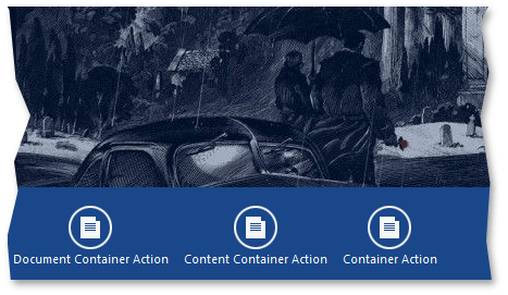
The parent collection of a button affects only the scenario in which this button will be displayed. For end-users, button types from all the three collections make no difference (see the following figure).

To dynamically remove custom and/or default Navigation Bar buttons, handle the WindowsUIView.ContentContainerActionCustomization event. Note that this event is not designated for adding custom buttons to Navigation Bars.
void windowsUIView1_ContentContainerActionCustomization(object sender, ContentContainerActionCustomizationEventArgs e) {
    string name = e.ContentContainer.Name;
    switch(name) {
        //The default 'Back' action
        case "page1":
            e.Remove(ContentContainerAction.Back);
            break;
        //The default split group 'Overview' action
        case "slideGroup1":
            e.Remove(SplitGroupAction.Overview);
            break;
        //The default tile container 'Clear Container' action
        case "tileContainer1":
            e.Remove(TileContainerAction.ClearSelection);
            break;
        //Custom action
        case "pageGroup1":
            e.Remove(myAction);
            break;
    }
}
Container Header Buttons
Container header buttons are displayed within the header area of Content Containers.

The only Content Container initially incapable of displaying header buttons is a PageGroup. To enable container header buttons for a PageGroup, set the IPageGroupDefaultProperties.ShowPageHeaders property to DefaultBoolean.False. Note, however, that by doing so, you will also hide all default buttons (buttons for navigating through PageGroup documents and the “Back” button) and will have to add custom buttons as a replacement.
The container header buttons can be divided into two types.
Common Header Buttons
These buttons are owned by the BaseContentContainer.Buttons collection. If you customize this collection at design time, it will be populated with WindowsUIButton objects.

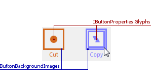
You can customize the shape of these buttons using the BaseContentContainer.ButtonBackgroundImages and IButtonProperties.Glyphs properties.

In code, it is possible to populate this BaseContentContainer.Buttons collection with DelegateAction objects and/or Popup Buttons.
Document-Specific Header Buttons
These buttons are displayed within the header area of any Content Container that displays the target Document. Such buttons must be added dynamically in the WindowsUIView.QueryDocumentActions event.
void windowsUIView1_QueryDocumentActions(object sender, QueryDocumentActionsEventArgs e) { if (e.Source == pageGroup1) { e.DocumentActions.Add(new DocumentAction((doc) => doc == document2, (doc) => windowsUIView1.ActivateDocument(document1)) { Caption = "Document 1" }); e.DocumentActions.Add(new DocumentAction((doc) => doc == document1, (doc) => windowsUIView1.ActivateDocument(document2)) { Caption = "Document 2" }); } }Alternatively, implement the ISupportDocumentActions interface for UserControls contained within required Documents. See the How To: Create Custom Document Actions example to learn more.
Flyout Buttons
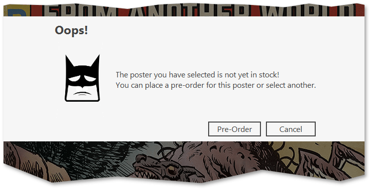
Unlike Navigation Bar/Content Container buttons, which are separate objects of specific classes, Flyout buttons belong to complex FlyoutAction objects. A FlyoutAction carries a text content, an image and a set of buttons. These buttons can be standard FlyoutCommand buttons (“OK”, “Cancel”, “Retry”, etc.) or custom buttons. To create a custom button, define a class that derives from the FlyoutCommand class and override its virtual properties.
//Flyout action
FlyoutAction action = new FlyoutAction() {
    Caption = "Oops!",
    Description = "The poster you have selected is not yet in stock!" + Environment.NewLine + "You can place a pre-order for this poster or select another.",
    Image = global::Actions.Properties.Resources.BatmanSmiley_small
     };
action.Commands.Add(new PreOrder());
action.Commands.Add(FlyoutCommand.Cancel);
flyout1.Action = action;
. . .
//Class for the custom 'Pre-order' button
class PreOrder : FlyoutCommand {
    public override string Text {
        get {
            return "Pre-Order";
        }
    }
    public override DialogResult Result {
        get {
            return DialogResult.OK;
        }
    }
}

Refer to the Flyouts topic to learn more.
Delegate Actions
The DevExpress.XtraBars.Docking2010.Views.WindowsUI.DelegateAction class represents simple push buttons. A DelegateAction button has two related methods in code. The first one is a void method that executes required functionality when an end-user clicks this button. The second is a boolean method that checks whether or not required criteria is met. If this boolean method returns false, the DelegateAction button becomes disabled.
DelegateAction dAction = new DelegateAction(canExecuteFunction, executeFunction);

static bool canExecuteFunction() {
     // Checks whether or not current conditions meet requirements to execute the 'actionFunction'
     return true;
}

static void executeFunction() {
     // Performs custom action
}
DelegateAction buttons provide the following settings.
- Caption - the button text.
- Description - the button tooltip text.
- Type - the button type: navigation or context. Navigation buttons are placed into top Navigation Bars, while context buttons are displayed within bottom bars.
- Edge - he horizontal alignment within Navigation Bars.
- Behavior - additional behavior parameters.
Popup Actions
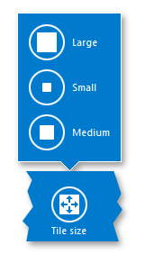
Popup buttons is a Windows 10-styled replacement for the traditional popup menus. For example, if an end-user checks a TileContainer tile, Navigation Bars for this container will display the “Tile Size” popup button.

Popup buttons can be represented by two different classes designed for different types of content..
- Instances of the DelegatePopupMenuAction class - popup buttons that display child buttons (actions) from the Actions collection.
- Instances of the DelegatePopupControlAction class - popup buttons that display any custom controls within their popup panels. These buttons receive their content dynamically in the WindowsUIView.QueryFlyoutActionsControl event.
The code below illustrates how to create buttons of both types: a menu action that hosts three regular actions, and a control action that displays the WindowsUIButtonPanel wrapped in a UserControl. Note that the “Menu Action” popup shows only two buttons because the “_canRemove” condition of the “Remove” button returns false.

partial class Form1 : DevExpress.XtraEditors.XtraForm {
        public Form1() {
            InitializeComponent();
            windowsUIView1.QueryFlyoutActionsControl += windowsUIView1_QueryFlyoutActionsControl;
            //PopupControlAction
            DelegatePopupControlAction pca = new DelegatePopupControlAction(canShowPopupControlAction);
            pca.Caption = "Control Action";
            pca.Type = ActionType.Context;
            pca.Edge = ActionEdge.Left;
            pca.Behavior = ActionBehavior.Default;

            //PopupMenuAction
            DelegatePopupMenuAction pma = new DelegatePopupMenuAction(canShowPopupMenuAction);
            pma.Caption = "Menu Action";
            pma.Actions.Add(new DelegateAction(_canCopy, _copy) {
                Caption = "Cut", Description = "Custom Action 1" });
            pma.Actions.Add(new DelegateAction(_canSelect, _select) {
                Caption = "Select", Description = "Custom Action 2" });
            pma.Actions.Add(new DelegateAction(_canRemove, _remove) {
                Caption = "Remove", Description = "Custom Action 3" });
            pma.Orientation = Orientation.Vertical;
            pma.Type = ActionType.Context;
            pma.Edge = ActionEdge.Left;

            //Add actions to the TileContainer's Navigation Bars
            tileContainer1.Actions.AddRange(new IContentContainerAction[] { pma, pca });
        }

        //Provide content for the "Control Action" menu
        void windowsUIView1_QueryFlyoutActionsControl(object sender, QueryFlyoutActionsControlArgs e) {
            e.Control = new UserControl1();
        }

        //"CanExecute" conditions and "Execute" methods
        #region "CanExecute" methods for buttons that invoke popup menus
        private static bool canShowPopupControlAction(IContentContainer container) {
            return true;
        }
        private static bool canShowPopupMenuAction(IContentContainer container) {
            return true;
        }
        #endregion

        #region "CanExecute" methods for regular buttons
        public bool _canCopy() {
            if (. . .) //button visibility condition
                return true; //the related button will be visible
            else return false; //the related button will not be shown
        }
        public bool _canSelect() {
            return true; //button always visible
        }
        public bool _canRemove() {
            return false; //button always hidden
        }
        #endregion

        #region "Execute" methods for buttons
        public void _copy() {
            //TODO
        }
        public void _select() {
            //TODO
        }
        public void _remove() {
            //TODO
        }
        #endregion
    }