SplitButton Class
A split button control.
Namespace: DevExpress.Xpf.Core
Assembly: DevExpress.Xpf.Core.v20.2.dll
NuGet Packages: DevExpress.WindowsDesktop.Wpf.Core, DevExpress.Wpf.Core
Declaration
Remarks
The SplitButton control consists of two buttons.
- Main button
- Dropdown button
The SplitButton control offers the following features.
Total control over the main button content
Use the Content property to specify the content of the main button.
<dx:SplitButton x:Name="splitButton" Glyph="{dx:DXImage Image=Close_16x16.png}" Height="90">
    <dx:SplitButton.Content>
        <Grid>
            <Ellipse Height="80" Width="150" Fill="#FFAFAFF3"/>
            <TextBlock TextAlignment="Center" VerticalAlignment="Center" FontSize="30">Button</TextBlock>
        </Grid>
    </dx:SplitButton.Content>
</dx:SplitButton>
Custom dropdown content
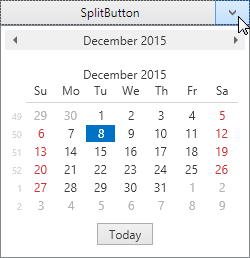
You can embed any custom content in the SplitButton‘s dropdown. The following example demonstrates a DateNavigator control embedded in a SplitButton‘s dropdown.
<dx:SplitButton Height="25" Width="175" Content="SplitButton">
    <dxe:DateNavigator/>
</dx:SplitButton>
Customizable dropdown button appearance
By default, the dropdown button displays a small arrow indicator. The following SplitButton‘s properties affect the indicator appearance.
- DropDownButtonBase.ArrowGlyph property allows you to replace the arrow with a custom glyph.
- DropDownButtonBase.ArrowAlignment property controls the alignment of the indicator.
- DropDownButtonBase.ArrowPadding property specifies the amount of padding space around the indicator.