PopupColorEdit
- 2 minutes to read
Overview
The PopupColorEdit control is a popup variation of the ColorEdit control. It allows end-users to edit and manage color data.
The PopupColorEdit control offers the following features.
An extensive collection of predefined color palettes
You can create gradient palettes from predefined sets of colors.
myPopupColorEdit.Palettes.Add(
    CustomPalette.CreateGradientPalette(
        "Verve",
        PredefinedColorCollections.Verve
    )
);
Custom Palette Creation
You can define your own color sets and store them as Palette objects.
List<Color> customColors = new List<Color>() {
    Color.FromRgb(170, 0, 0),
    Color.FromRgb(0, 125, 0),
    Color.FromRgb(0, 0, 170) };
myColorEdit.Palettes.Add(new CustomPalette("Custom RGB Colors", customColors));
Built-in color picker
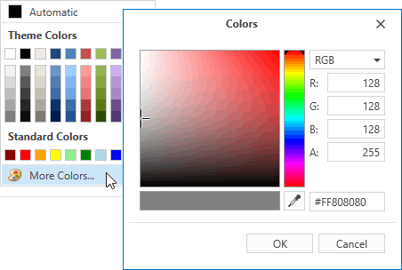
The PopupColorEdit.ShowMoreColorsButton property controls the availability of the More Colors button. Clicking this button invokes the built-in color picker tool. The color picker allows end-users to select the desired color visually or by specifying the precise values.
Configurable palette layout
You can specify the number of color columns in each palette using the PopupColorEdit.ColumnCount property. The PopupColorEdit.ChipSize property controls the size of the color chips.
Configurable edit box appearance
The PopupColorEdit‘s edit box displays the currently selected color. Use the PopupColorEdit.DisplayMode property to switch between available display modes.
Optional Default Color button
You can define the default color using the PopupColorEdit.DefaultColor property. The PopupColorEdit.ShowDefaultColorButton property toggles the availability of the Default Color button.
Optional No Color button
Setting the PopupColorEdit.ShowNoColorButton property to true enables the No Color button. The No Color button permits end-users to select an empty color.
Optimized for in-place editing
PopupColorEdit can be used standalone or as an in-place editor nested in a container control. The PopupColorEditSettings class implements the in-place editing functionality. See In-place Editors to learn more.
Standalone PopupColorEdit
To add a standalone PopupColorEdit to a Window, drag it from the Toolbox.
The following sample demonstrates how to create a PopupColorEdit using XAML markup.
<dxe:PopupColorEdit ColumnCount="10" ShowNoColorButton="True"
    DefaultColor="Crimson" NoColorButtonContent="Empty Color"
    MoreColorsButtonContent="Color picker" ChipSize="Medium"/>
In-place PopupColorEdit
To embed a PopupColorEdit into a container control, use the PopupColorEditSettings class.
The following sample demonstrates how to embed a PopupColorEdit into a GridControl column.
<dxg:GridControl Name="grid">
    <dxg:GridControl.Columns>
        <dxg:GridColumn FieldName="Background">
            <dxg:GridColumn.EditSettings>
                <dxe:PopupColorEditSettings/>
            </dxg:GridColumn.EditSettings>
        </dxg:GridColumn>
    </dxg:GridControl.Columns>
</dxg:GridControl>