Data Editors
- 3 minutes to read
DevExpress Data Editors for Blazor include components that can be used as standalone editors or within the Grid edit form.
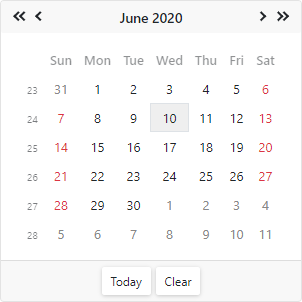
Calendar
The Calendar component allows users to select dates and navigate through months, years, decades, and centuries.
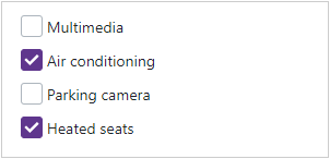
CheckBox
The CheckBox component allows users to select yes/no or true/false.
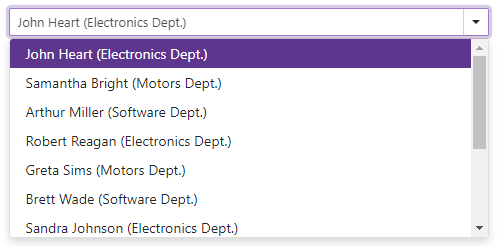
ComboBox
The ComboBox component displays a drop-down window with a list of predefined items.
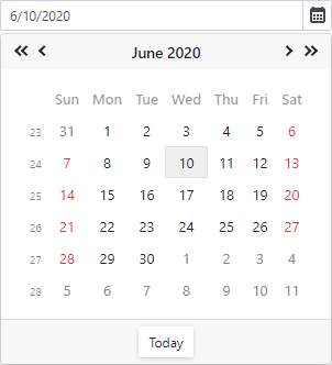
Date Edit
The Date Edit component displays a drop-down calendar that allows users to select dates. The Date Edit can also display a time section to allow users to select time values.
List Box
The List Box component allows you to display a list of selectable items from a data source.
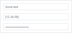
Masked Input
The Masked Input component is a text editor that supports masks. The following mask types are available: Text, Numeric, Date-Time, and Regular Expression.

Memo
The Memo component is a multi-line text area that allows users to type and edit text in multiple rows.

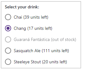
Radio
The Radio component allows you to create individual radio buttons and combine them into groups. A user can select only one button in a group at a time.
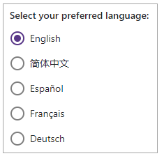
Radio Group
The RadioGroup component allows you to create a group of radio buttons where a user can select only one button. The component generates and arranges radio items based on a collection.
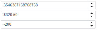
Spin Edit
The Spin Edit component allows you to display and edit numeric values. Use spin buttons to increment values.
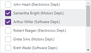
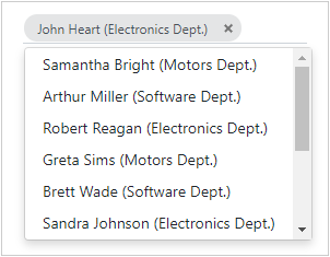
TagBox
The TagBox component allows users to select multiple items (tags) from a drop-down list. Users can also type in the edit box to filter list items that contain the search string.
Text Box
The Text Box is a single-line text editor.
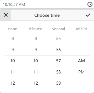
Time Edit
The Time Edit component displays a drop-down time picker. A user can enter the time into the text box or pick it in the drop-down window.
Troubleshooting
If a Blazor application throws unexpected exceptions, refer to the following help topic: Troubleshooting.