List View Columns Customization
- 6 minutes to read
When you implement a persistent object, XAF automatically generates two List Views to represent this object in the UI – the general List View and Lookup List View. The Views | _ClassName__ListView and Views | _ClassName__LookupListView Application Model nodes represent these List View settings. These nodes expose lists of columns (see IModelListView.Columns). The default column set is generated according to rules described in the List View Column Generation topic. You can change a column’s visibility, width, order, filtering, etc. (either at run-time or using the Model Editor). This topic describes different aspects of List View customization if the GridListEditor represents a List View.
Design-Time Customization
Design-time customizations can be performed in the Model Editor.
WinForms and ASP.NET-specific approach
You should perform customizations at the Module Project level if you want to customize both WinForms and ASP.NET applications. To customize a WinForms application only, perform them at the Windows Forms Module Project level, and for an ASP.NET Web application, at the ASP.NET Web Module Project level.
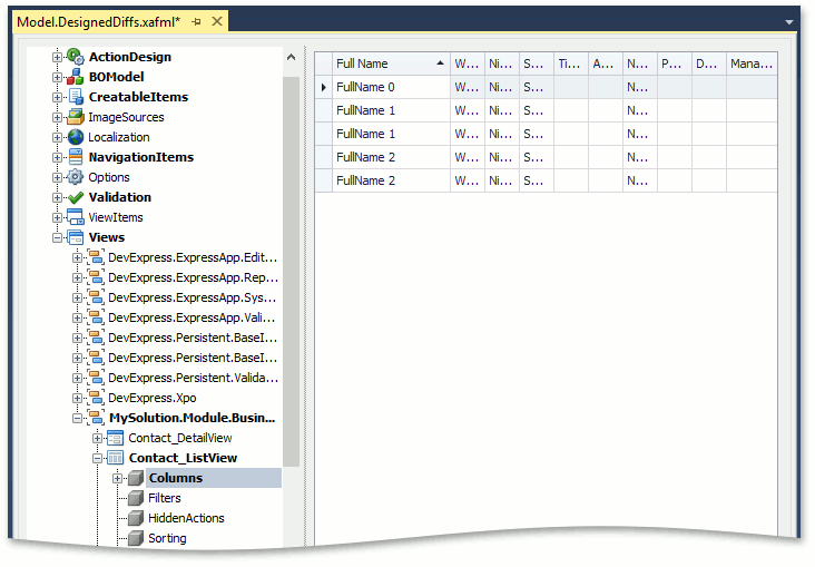
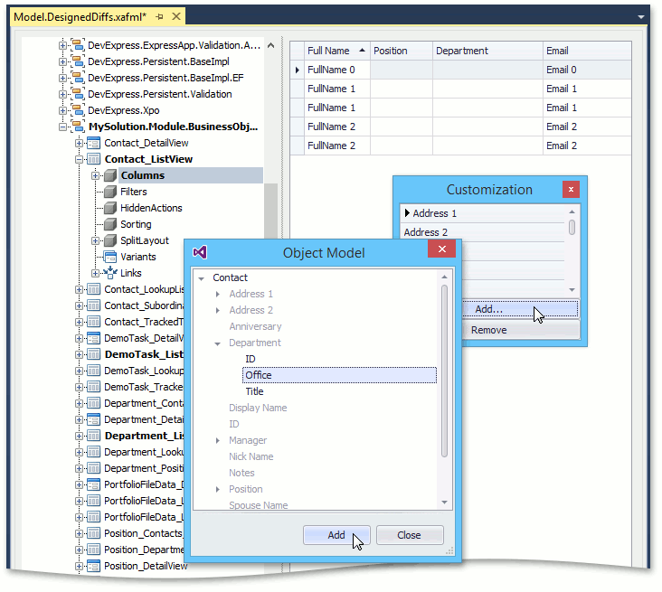
Each ListView node has a Columns child node, providing access to column settings. When the Columns node is selected, the property list to the right is replaced with a design surface that imitates the current View’s grid, filled with sample data. This allows you to see how the grid is displayed at runtime. Note that the WinForms Data Grid is displayed at design time. However, the customizations are correctly applied for both WinForms and ASP.NET applications. The Columns node exposes a tree of nodes representing the set of columns available in the current view. Each node provides access to the complete set of column properties.
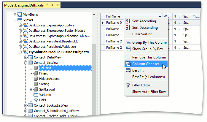
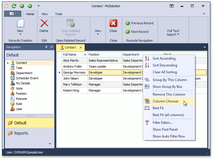
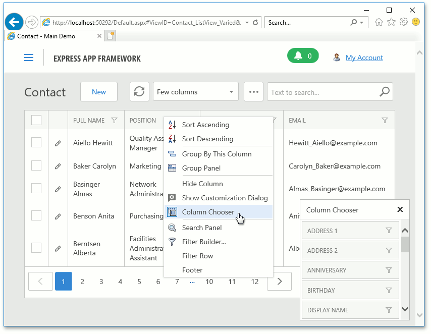
You can modify the default configuration if it does not meet your requirements. Scale columns by dragging a separator between two column headers, or drag and drop column headers to re-arrange columns. You can hide a column by dragging it outside the table. You can also apply sorting, grouping, and filtering. To show hidden columns, right-click on the table header and select the Column Chooser.
The Customization window is invoked and you can drag the required column from this window to the View, and vice versa. Follow the graphical prompts that show the column’s future location.
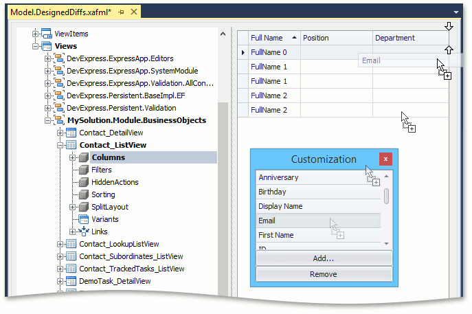
You can use the Add… and Remove buttons to manage the properties displayed in the Customization window. To display a property that is not in the list (for instance, a referenced object’s property or custom field), click Add…, and in the Object Model window, choose the required property and click Add. The property now appears in the Customization window, and you can add it to the grid as described above.
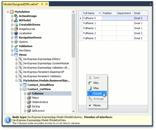
If you need to apply a summary, select the ListView node, set its IsFooterVisible property to True, then select ListView | Columns node. The footer now displays in the List View, and you can add the required summaries to it.
In addition to the capability to visually configure columns, the following customizations are available using the Columns node’s child nodes:
Show, hide and reorder columns
The Columns‘ child nodes have the Index property. Use this property to set the column order. A negative value hides the corresponding column.
Group columns
Set a column’s GroupIndex property to a non-negative integer value. This value represents this column’s position within the group column collection. The GroupIndex property’s value determines the grouping level. For instance, if the index is 0, rows are grouped against this column first and then against the following column groups. Set the column’s GroupIndex property to -1 to ungroup a row by a specific column.
Edit caption
Assign a string to a column’s Caption property. This string is displayed as the column name.
Refer to the IModelColumn members list to learn more about the available customizations.
Tip
You can arrange columns into logical groups (bands). Refer to the List View Bands Layout topic for more details.
Mobile-specific approach:
To customize a Mobile application, perform customizations at the Mobile Module Project level.
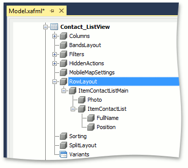
In Mobile applications, each ListView node has a Columns and RowLayout child nodes. The Columns node contains all columns that can be displayed in a List View, the RowLayout node contains only the columns displayed in a List View. Only one group column is displayed by default. You can customize this column or add a new one using the RowLayout node (Columns‘ nodes do not affect a List View layout).
You can add new Layout View Items and, if it is required, group them by the Layout Groups.
The following customizations are available using the Columns and RowLayout node’s child nodes:
Group columns
In the Columns‘ child node’s settings, set a column’s GroupIndex property to a non-negative integer value. You can implement grouping only by one column. This value represents this column’s position within the group column collection. Set the column’s GroupIndex property to -1 to ungroup a row by a specific column.
Hide a column caption
A column caption is displayed by default. To hide it, set the ShowCaption property to false in the RowLayout‘ child node’s settings.
Note
The changes you make in the Model Editor invoked for a module project (application project) are saved to the Model.DesignedDiffs.xafml (Model.xafml) file located in this module project. These changes replace the previous values when you run the application. Make sure that values from other *.xafml files do not replace your values. To do this, review the *.xafml files that are loaded after your *.xafml file, including the Model.User.xafml, generated at runtime. For details on the layer structure of the Application Model, refer to the Application Model Basics topic.
Runtime Customization
WinForms runtime customization capabilities are the same as those the Model Editor‘s ListView | Columns node provides. Refer to the Design-Time Customization section for more information.
The ASP.NET‘s grid customization capabilities are slightly different from WinForms. You should use the header’s context menu to hide columns instead of dragging them. Also, manual column resizing is not available.
Mobile applications do not support runtime customization.
You can use the ResetViewSettings Action to undo all runtime customizations in the current List View.
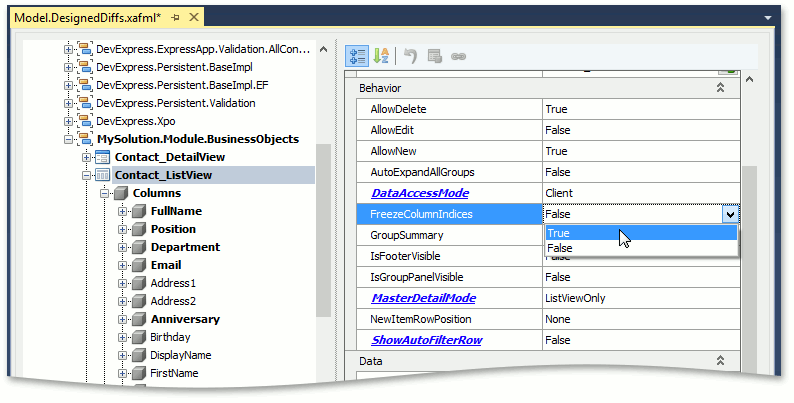
Freezing Column Indices
If you have configured columns for a business class List View, and then added or removed the class’s public properties, the column set automatically changes, and you may need to reconfigure it. However, you can “lock” customizations by setting the ListViewView node’s FreezeColumnIndices property to True. In this case, the current column index state is copied to the model differences, and any changes on previous layers are ignored. Columns that are subsequently generated are hidden by default. Setting the FreezeColumnIndices property back to False resets the column configuration to the generated configuration by default.