Color Properties
- 2 minutes to read
In XAF the Color and Nullable<Color> properties can be displayed using the ColorEdit control in WinForms applications and the ASPxComboBox control in ASP.NET applications.
Examples
WinForms Property Editors for System.Drawing.Color Properties
Each WinForms Property Editor has a control that displays a corresponding property in a Detail View, and a repository item that displays a property in a List Editor that supports in-place editing. Both the control and repository item are shown below.
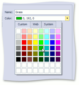
ColorPropertyEditor
Control: ColorEdit.
Repository Item: RepositoryItemColorEdit.
Description:
Used for Color properties by default. Use Alt + Down Arrow to expand the editor’s drop-down window.
ASP.NET Property Editors for System.Drawing.Color Properties
Each ASP.NET Property Editor has controls that display a property in a Detail View‘s View and Edit mode (see DetailView.ViewEditMode). These controls are listed below.
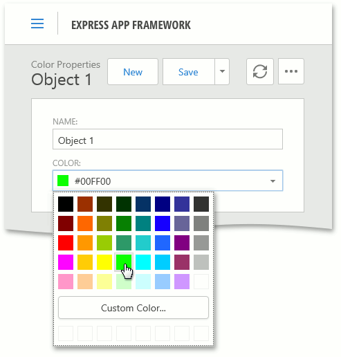
ASPxColorPickerPropertyEditor from the ASP.NET System Module
View mode control: The ColorEditDisplayPanel control which wraps ColorEditDisplayControl. It displays an image with the color sample and a label with the color name. Use the ColorEditDisplayControl.ShowDisplayText property to hide the label.
Edit mode control: ASPxColorEdit.
Description:
Allows users to select a color from a drop-down window with a color table or use the color picker to specify a custom color.
ASPxColorPropertyEditor from the ASP.NET System Module
View mode control: ASPxImageLabelControl from the ASP.NET System Module. It displays an image with the color sample and a label with the color name.
Edit mode control: ASPxComboBox.
Description:
Used for Color properties in legacy applications. You can switch to the ASPxColorPickerPropertyEditor using the IModelRegisteredPropertyEditor.EditorType property or the ViewItems | PropertyEditors | System.Drawing.Color node in the Model Editor.
Mobile Property Editors for System.Drawing.Color Properties
Each Mobile Property Editor has widgets that display a property in a Detail View‘s View and Edit mode (see DetailView.ViewEditMode). These widgets are listed below.
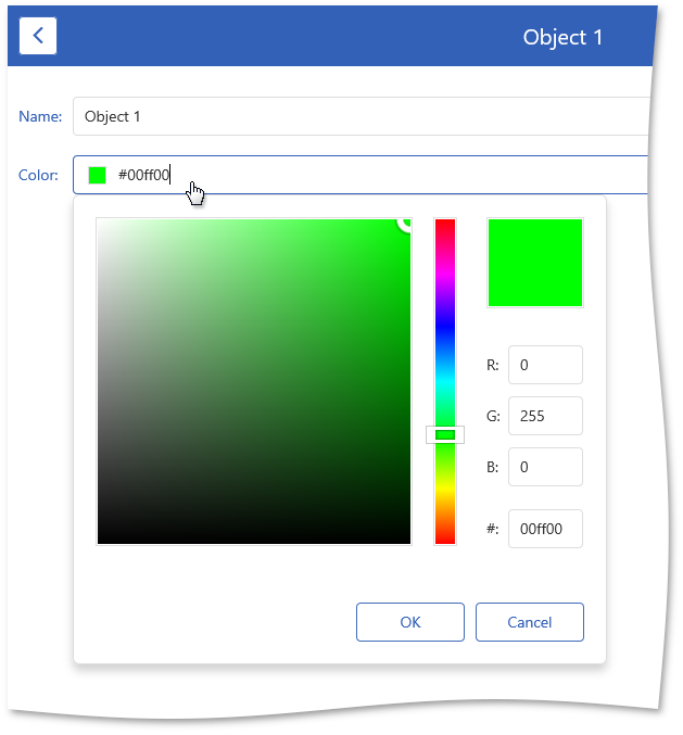
MobileColorPickerPropertyEditor
View mode control: ColorPicker that uses the dxColorBox widget with the readOnly property is set to true.
Edit mode control: ColorPicker that uses the dxColorBox widget.
Description:
Allows users to select a color from a drop-down window with a color table or use the color picker to specify a custom color. Supported only by tablet devices.