Reference (Foreign Key, Complex Type) Properties
- 13 minutes to read
Reference properties are properties of Types that are added to the Application Model (when the property type is a persistent or non-persistent business class). Reference properties (and Collection Properties) allow you to set up relationships between business objects. In XAF, reference properties can be displayed in the following:
- A lookup control.
- A set of editors. Each editor displays an individual referenced object property.
- A Detail Property Editor that is the referenced object’s Detail View.
- A button editor that expands a referenced object Detail View in a separate modal window (typically used for aggregated objects).
Note
Refer to the Property Editors | Reference Properties section in the Feature Center demo installed with XAF to see Reference Property Editors in action. The Feature Center demo is installed in %PUBLIC%\Documents\DevExpress Demos 21.2\Components\eXpressApp Framework\FeatureCenter. The ASP.NET Web Forms version of this demo is available online at https://demos.devexpress.com/XAF/FeatureCenter/.
Examples
UI-Independent Property Editors for Reference Properties
DetailPropertyEditor
The DetailPropertyEditor creates a Template that serves as a Frame and contains a Detail View. The Detail View is determined automatically according to the object type and displays the object the reference property specifies. To specify a custom Detail View, use the IModelMemberViewItem.View property in the Model Editor.
The following controls visualize the DetailPropertyEditor:
| Platform | Control |
|---|---|
| WinForms | NestedFrameTemplateV2 |
| ASP.NET Web Forms | NestedFrameControlNew |
| ASP.NET Core Blazor | ViewItem.Control returns NestedFrameTemplate. The Blazor component is NestedFrameTemplateComponent. |
WinForms
Each WinForms Property Editor has a control that displays a corresponding property in a Detail View, and a repository item that displays a property in a List Editor that supports in-place editing. Both the control and repository item are shown below.
| Editor | Control | Repository Item |
|---|---|---|
| ObjectPropertyEditor | ObjectEdit - a ButtonEdit editor descendant the IntegerPropertyEditor uses. | RepositoryItemObjectEdit - a descendant of the XtraEditors Library’s RepositoryItemButtonEdit item. |
| LookupPropertyEditor | LookupEdit - a descendant of the XtraEditors Library’s PopupContainerEdit editor. | RepositoryItemLookupEdit - a descendant of the XtraEditors Library’s RepositoryItemPopupContainerEdit item. |
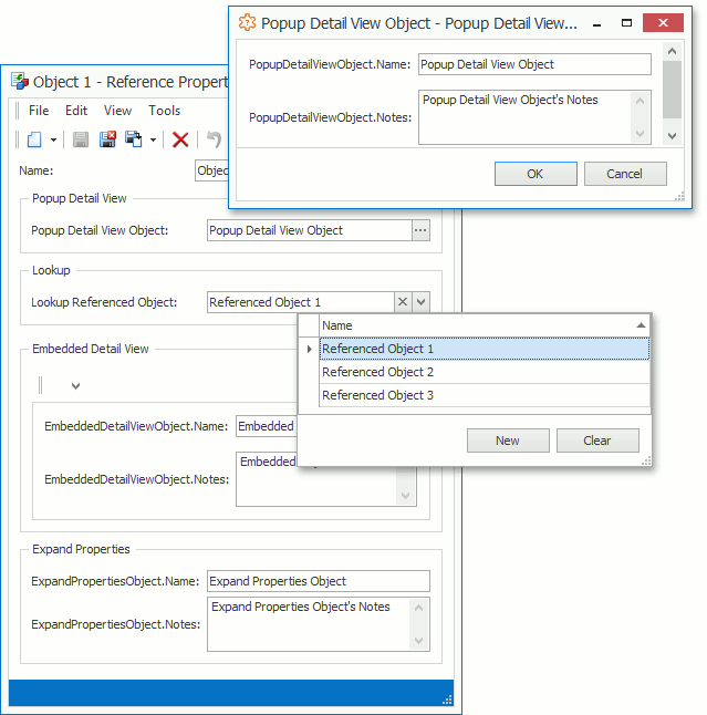
ObjectPropertyEditor
The ObjectPropertyEditor displays the aggregated reference properties. To invoke the Detail View, users can click the editor’s button, double-click the editor, or press the SPACEBAR key. You can modify the referenced object in this Detail View and click OK to save changes. Refer to the Add Actions to a Popup Window and Dialog Controller topics for details on how to customize this window.
Tip
You can focus the ObjectPropertyEditor and press the SPACEBAR or ENTER to invoke the ObjectPropertyEditor‘s Detail View.
LookupPropertyEditor
The LookupPropertyEditor displays non-aggregated reference properties and generates a drop-down list with the LookupControlTemplate Template. You can choose an object from this list and assign it to the current reference property.
Tip
- You can filter the LookupPropertyEditor‘s List View (see Filter Lookup Editor Data Source).
- You can also search this List View (see How to: Add a Search Action to Lookup Property Editors and Link Pop-up Windows).
- You can use the Clear button to clear the editor value. To hide this button, set the IModelCommonMemberViewItem.AllowClear property to False in the Model Editor.
- LookupPropertyEditor also allows end users to select a property value of a simple type (string, integer, enumeration, and so on). For more information, refer to the following help topic: How to: Display and Edit Simple Type Values in a Lookup Property Editor.
You can define how the Lookup Property Editor retrieves items from its data source. See the following section for details: Specify Lookup Property Editor’s Mode.
LookupPropertyEditor Hotkeys
| Hotkey | Description |
|---|---|
| ALT+DOWN | Expands the drop-down list. |
| CTRL+SHIFT + Click | Invokes a Detail View for the selected object in the drop-down list. |
ASP.NET Web Forms
Each ASP.NET Web Forms Property Editor has controls that display a property in a Detail View‘s View and Edit mode (see DetailView.ViewEditMode). These controls are listed below.
| Editor | View Mode Control | Edit Mode Control |
|---|---|---|
| ASPxObjectPropertyEditor | LinkButton | XafASPxButtonEdit - an ASPxButtonEdit editor descendant. |
| ASPxGridLookupPropertyEditor | LinkButton | ASPxGridLookup |
| ASPxLookupPropertyEditor | LinkButton | ASPxLookupDropDownEdit or ASPxLookupFindEdit |
Tip
ASPxGridLookupPropertyEditor and ASPxLookupPropertyEditor also allow end users to select a property value of a simple type (string, integer, enumeration, and so on). For more information, refer to the following help topic: How to: Display and Edit Simple Type Values in a Lookup Property Editor.
ASPxObjectPropertyEditor
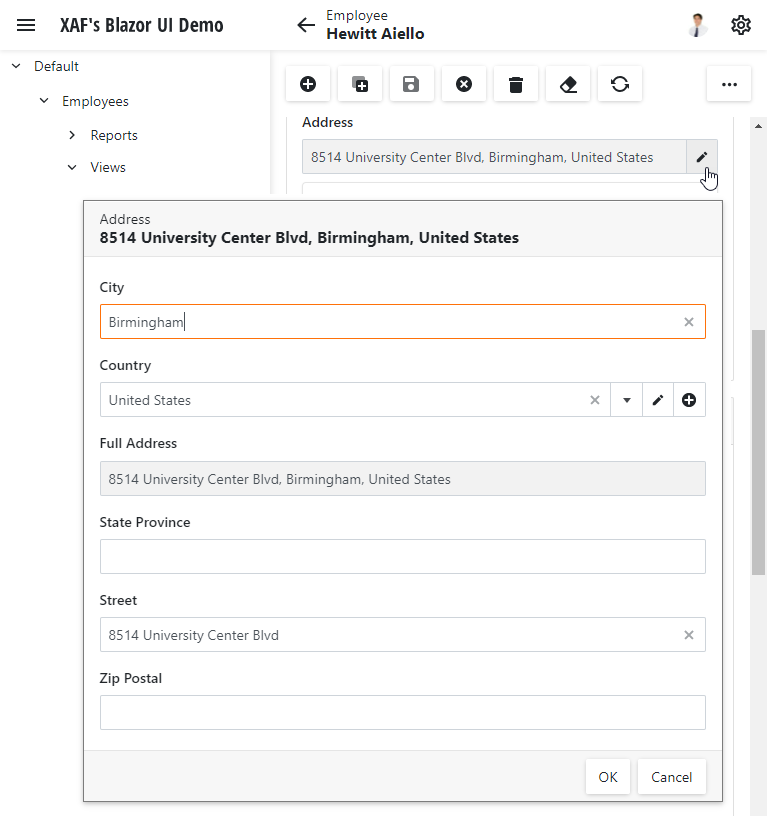
The ASPxObjectPropertyEditor displays aggregated reference properties. This Property Editor inherits the ASPxObjectPropertyEditorBase class, which creates a Link button and a NavigateToObject Action, and raises the Action’s Execute event when a user clicks Link. The Execute event handler invokes a separate window that displays a read-only Detail View of the object the current property references.
The ASPxObjectPropertyEditor creates a ButtonEdit and a ShowObjectDetailViewPopup PopupWindowShowAction. The ASPxObjectPropertyEditor raises the Action’s Execute event when a user clicks the button. The Execute event handler displays a Detail View with the referenced object. A user can modify the referenced object in this Detail View. When a user clicks OK, the application saves changes made to the object and assigns it to the property (if it is unassigned). Refer to the following topics for details on how to customize the invoked window:
The ASPxObjectPropertyEditor is not designed to update other editors when its pop-up control is closed in inline edit mode, so the ImmediatePostDataAttribute does not affect it.
ASPxGridLookupPropertyEditor
The ASPxGridLookupPropertyEditor is used for non-aggregated reference properties.
This Property Editor inherits the ASPxObjectPropertyEditorBase class, which creates a LinkButton and a NavigateToObject Simple Action, and raises the Action’s Execute event when a user clicks the link button. The Execute event handler creates a window that displays a read-only Detail View of the referenced object.
With the ASPxGridLookupPropertyEditor, users can create and modify referenced objects with the Add and Edit buttons. The Clear button clears the editor value. To hide this button, set the IModelCommonMemberViewItem.AllowClear property to False in the Model Editor.
The ASPxGridLookupPropertyEditor uses the default Lookup List View’s Application Model settings (ObjectName_LookupListView) or a View the IModelMemberViewItem.View property specifies. To specify which columns are visible in the ASPxGridLookupPropertyEditor, locate the corresponding List View’s Columns node in the Model Editor (for example, View | Contact_LookupListView | Columns) and change the columns list.
The ASPxGridLookupPropertyEditor displays the value of a property the IModelCommonMemberViewItem.LookupProperty model option specifies. You can use the IModelCommonMemberViewItem.DisplayFormat property to format the display value. When you set the display value format, you can use format specifiers and property names (for instance, {0:FirstName}, {0:Birthday:MM.yyyy}, or {0:Manager.Birthday}). This format also works in the View edit mode. The underlying ASPxGridLookup control’s TextFormatString and DisplayFormatString properties depend on the DisplayFormat property value. Thus, the DisplayFormat property determines which lookup columns participate in Incremental Filtering.
ASPxGridLookupPropertyEditor Specifics
- ASPxGridLookupPropertyEditor does not create inline grid Actions (for example, the Edit Action).
- ASPxGridLookupPropertyEditor does not support objects that do not exist in the data source.
- The Lookup List View’s EditorType value should be set to the ASPxGridListEditor type. Otherwise, a runtime exception occurs.
- The property type should have a key field. The underlying ASPxGridLookup control requires a key field for edit and select operations. Otherwise, a runtime exception occurs.
Refresh the ASPxGridLookupPropertyEditor’s Data Source
There are instances when an ASPxGridLookupPropertyEditor‘s data source should be refreshed (for example, when you implement a cascading filter for lookup List Views). To refresh this data source, use the PropertyEditor.Refresh, ViewItem.Refresh, or ViewItem.RefreshDataSource methods. The following Controller, which demonstrates how to do this, refreshes the data source of the Manager Property Editor after the Department property is changed.
using DevExpress.ExpressApp;
using DevExpress.ExpressApp.Web.Editors.ASPx;
// ...
public class RefreshDataSourceController : ObjectViewController<DetailView, Contact> {
    protected override void OnActivated() {
        base.OnActivated();
        View.ObjectSpace.ObjectChanged += ObjectSpace_ObjectChanged;
    }
    private void ObjectSpace_ObjectChanged(object sender, ObjectChangedEventArgs e) {
        if(e.PropertyName != "Department") return;
        ASPxGridLookupPropertyEditor lookup = View.FindItem("Manager") as ASPxGridLookupPropertyEditor;
        if(lookup != null) {
            lookup.RefreshDataSource();
        }
    }
    protected override void OnDeactivated() {
        View.ObjectSpace.ObjectChanged -= ObjectSpace_ObjectChanged;
        base.OnDeactivated();
    }
}
ASPxLookupPropertyEditor
The ASPxLookupPropertyEditor displays non-aggregated reference properties.
This Property Editor inherits the ASPxObjectPropertyEditorBase class, which creates the Link button and a NavigateToObject SimpleAction, and raises the Action’s Execute event when a user clicks the link button. The Execute event handler creates a window that displays a read-only Detail View of the referenced object. Users can clear the editor value with the Clear button. To hide this button, set the IModelCommonMemberViewItem.AllowClear property to False in the Model Editor.
The ASPxLookupPropertyEditor creates an ASPxLookupFindEdit or ASPxLookupDropDownEdit control. The ASPxLookupFindEdit control is created in the following cases when the search functionality is enabled:
- When the number of displayed records exceeds the IModelOptions.LookupSmallCollectionItemCount value.
- When the BOModel | Class | Member or Views | <DetailView> | Items | <PropertyEditor> node’s LookupEditorMode property is set to AllItemsWithSearch or Search.
Otherwise, the ASPxLookupPropertyEditor creates the ASPxLookupDropDownEdit control.
For more options to define how the Lookup Property Editor retrieves items from its data source, see the following section: Specify Lookup Property Editor’s Mode.
Access the ASPxLookupPropertyEditor’s Inner Controls
Use the DropDownEdit and FindEdit properties of the ASPxLookupPropertyEditor class to access the ASPxLookupDropDownEdit and ASPxLookupFindEdit controls. These properties provide access to the inner ASPxComboBox and ASPxButtonEdit controls, which can be accessed through the DropDown and Editor properties, respectively.
using DevExpress.ExpressApp;
using DevExpress.ExpressApp.Web.Editors.ASPx;
using DevExpress.Web;
// ...
namespace MySolution.Module.Web {
    public class InitializeLookupControlsController : ObjectViewController<DetailView, Contact> {
        protected override void OnActivated() {
            base.OnActivated();
            View.CustomizeViewItemControl<ASPxLookupPropertyEditor>(this, InitializeLookupControls, "Manager");
        }
        private void InitializeLookupControls(ASPxLookupPropertyEditor lookupEditor) {
            if(lookupEditor.FindEdit != null) {
                ASPxButtonEdit buttonEdit = lookupEditor.FindEdit.Editor;
                // ...
            }
            if(lookupEditor.DropDownEdit != null) {
                ASPxComboBox comboBox = lookupEditor.DropDownEdit.DropDown;
                // ...
            }
        }
    }
}
Show Hyperlinks in Lookup Controls
XAF can display hyperlinks or labels for reference properties in lookup controls. Use the ViewModeBehavior property to determine whether hyperlinks or labels should be displayed. With the default ViewModeBehavior property value, a lookup control shows a hyperlink for persistent types. Set the ViewModeBehavior property to ObjectPropertyEditorViewModeBehavior.ShowLabel to display labels:
using DevExpress.ExpressApp;
using DevExpress.ExpressApp.Web.Editors.ASPx;

namespace MySolution.Module.Web {
    public class CustomizeLookupPropertyEditorController : ViewController<DetailView> {
        protected override void OnActivated() {
            base.OnActivated();
            foreach(var editor in View.GetItems<ASPxLookupPropertyEditor>()) {
                if(editor.PropertyName == "Department") {
                    editor.ViewModeBehavior = ObjectPropertyEditorViewModeBehavior.ShowLabel;
                }
            }
        }
    }
}
To display hyperlinks for all types, set the ViewModeBehavior property to ObjectPropertyEditorViewModeBehavior.ShowLink.
Use the ASPxObjectPropertyEditorBase.DefaultViewModeBehavior property to change this behavior for an entire project:
File: MySolution.Web\Global.asax
using DevExpress.ExpressApp.Web.Editors.ASPx;

public class Global : System.Web.HttpApplication {
    protected void Application_Start(object sender, EventArgs e) {
        ASPxObjectPropertyEditorBase.DefaultViewModeBehavior = ObjectPropertyEditorViewModeBehavior.ShowLink;
        // ...
    }
    // ...
}
ASP.NET Core Blazor
In ASP.NET Core Blazor, the ViewItem.Control property returns an IComponentContentHolder descendant. The following table lists components and IComponentContentHolder descendants for editors:
| Editor | IComponentContentHolder descendant | Component |
|---|---|---|
| DevExpress.ExpressApp.Blazor.Editors.ObjectPropertyEditor | DevExpress.ExpressApp.Blazor.Editors.Adapters.ObjectComponentAdapter | DevExpress.ExpressApp.Blazor.Components.ObjectComponent |
| DevExpress.ExpressApp.Blazor.Editors.LookupPropertyEditor | DevExpress.ExpressApp.Blazor.Editors.Adapters.DxComboBoxAdapter<TData, TValue> | DxComboBox<TData, TValue> |
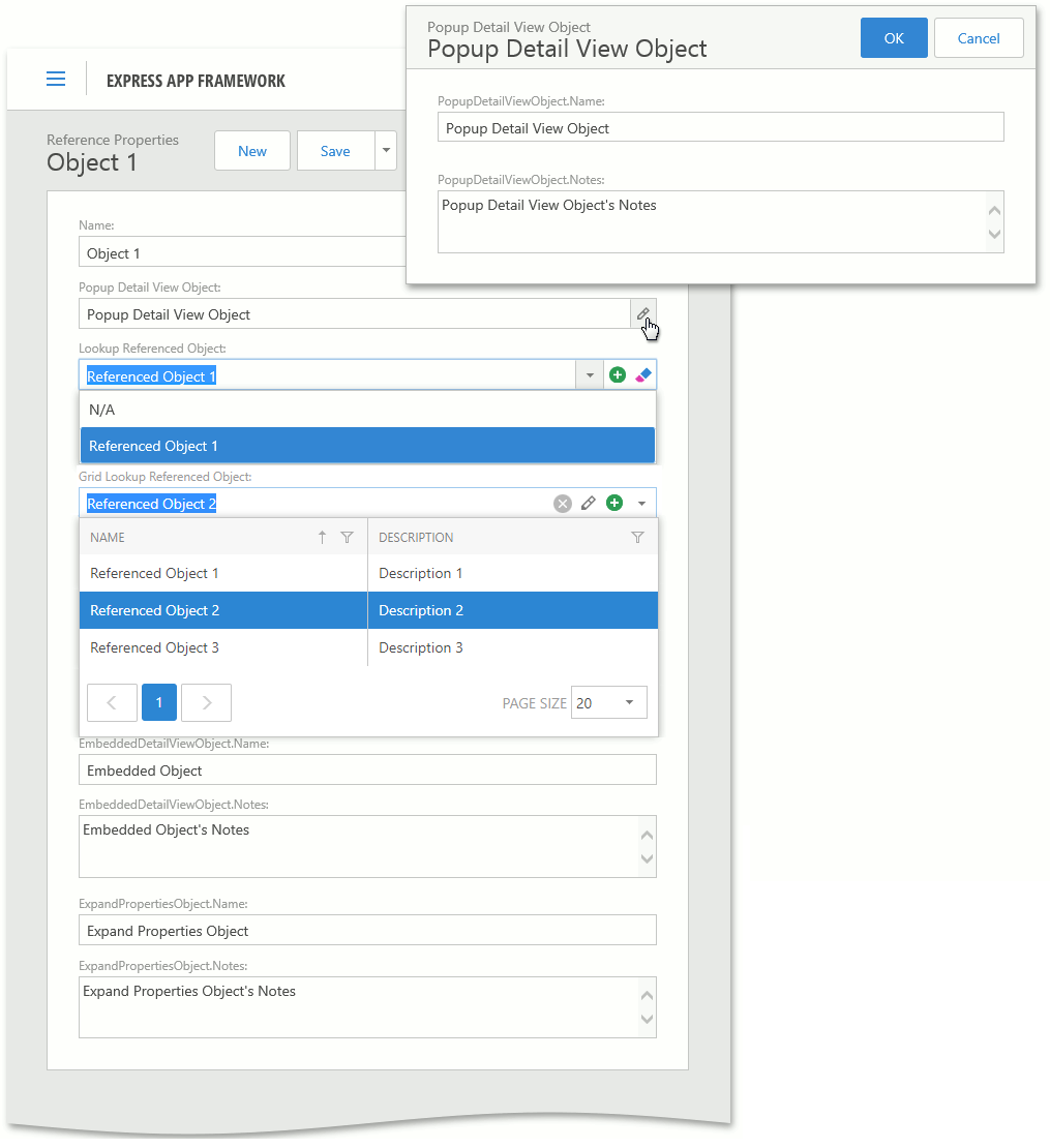
ObjectPropertyEditor
The ObjectPropertyEditor displays the aggregated reference properties. Click the editor’s button to invoke the Detail View. You can modify the referenced object in this Detail View and click OK to save changes.
LookupPropertyEditor
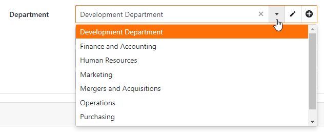
The LookupPropertyEditor displays non-aggregated reference properties and shows a drop-down list with objects. You can choose an object from this list and assign it to the current reference property.
LookupPropertyEditor displays the Clear, New, and Edit buttons. To hide the Clear button, set the AllowClear property to false in the Model Editor. Set the AllowEdit property to false to hide the Edit button. This option also prevents users from editing the LookupPropertyEditor value. The New button is displayed when the AllowEdit property is set to true and a user has permission to create a new object.
Tip
- You can filter the LookupPropertyEditor‘s List View. See the following topic for more information: Filter Lookup Editor Data Source (ASP.NET Core Blazor).
- LookupPropertyEditor allows users to select a property value of a simple type (string, integer, enumeration, and so on). For more information, refer to the following help topic: How to: Display and Edit Simple Type Values in a Lookup Property Editor.
Access the LookupPropertyEditor’s Inner Controls
In the ASP.NET Core Blazor module project, create a new Controller. Override the OnActivated method. Use the CustomizeViewItemControl method to customize the Property Editor’s control. The code below sets the DropDownDirection property for the inner ComboBox control:
using DevExpress.Blazor;
using DevExpress.ExpressApp;
using DevExpress.ExpressApp.Blazor.Editors;
using DevExpress.ExpressApp.Blazor.Editors.Adapters;
// ...
namespace MySolution.Module.Blazor {
    public class CustomizeLookupPropertyEditorController : ObjectViewController<DetailView, Employee> {
        protected override void OnActivated() {
            base.OnActivated();
            View.CustomizeViewItemControl<LookupPropertyEditor>(this, CustomizeLookupPropertyEditor, "Manager");
        }
        private void CustomizeLookupPropertyEditor(LookupPropertyEditor lookupPropertyEditor) {
            if(lookupPropertyEditor.Control is DxComboBoxAdapter comboBoxAdapter) {
                comboBoxAdapter.ComponentModel.DropDownDirection = DropDownDirection.Up;
            }
        }
    }
}
You can also use this technique to hide LookupPropertyEditor‘s New and Edit buttons as described in the following help topic: Manage the Visibility of Buttons Inside the Blazor Lookup Property Editor.
Specify Lookup Property Editor’s Mode
You can define how the Lookup Property Editor retrieves items from its data source. The following values are available: Auto, AllItems, Search, and AllItemsWithSearch.
Use the Model properties below to set the editor mode:
- IModelClass.DefaultLookupEditorMode
- Specifies the default mode for all Lookup Property Editors bound to reference properties of the current type (BOModel | <class>).
- IModelCommonMemberViewItem.LookupEditorMode
- Specifies the mode of the current Lookup Property Editor (BOModel | <class> | OwnMembers | <memeber>, Views | <list_view> | Columns | <column>, Views | <detail_view> | Items | <item>).
You can also apply the LookupEditorModeAttribute to a reference property to specify the editor mode.
Tip
Use the built-in Lookup Property Editors to display a computed value from several business class properties (FullName, Email, Phone) within a single column. Refer to the following link for details: PropertyEditors.Lookup - How to display information from several columns in a lookup editor when its drop down is closed.
The following links can also be helpful:
- How to: Specify a Display Member for a Lookup Editor, Detail Form Caption, and more
- How to: Implement Cascading Filtering for Lookup List Views
Create Alternative Data Representations for Reference Properties
You can customize the Lookup Property Editor behavior in the Controller code or implement custom Property Editors based on lookup controls. The following topics describe how to customize built-in Property Editors:
- How to use a custom Lookup Property Editor control for reference properties (WinForms)
- How to: Customize a Built-in Property Editor (ASP.NET Core Blazor).
- How to: Customize a Built-in Property Editor (ASP.NET Web Forms).