Navigation System
- 10 minutes to read
This topic introduces the concept of the navigation system and describes its basic features. This post will cover the building blocks the navigation system includes, as well as how it operates on the inside. This document will go over how to define the navigation structure in your applications at design-time and to customize it in code. You will learn to change the navigation control style and to customize the navigation control. This topic will also introduce the concept of context navigation. A sample implementation of context navigation is however, out of the scope of this document and is described in the How to: Implement Custom Context Navigation topic.
The navigation system capabilities are demonstrated in the FeatureCenter demo supplied with XAF. This demo is located in the %PUBLIC%\Documents\DevExpress Demos 19.1\Components\eXpressApp Framework\FeatureCenter folder by default.
Navigation System Basics
An XAF application’s UI basically consists of Views. Views are abstract entities used for data representation. There are two basic kinds of Views - the Detail Views used to represent a single object and its properties, and the List Views, used to represent object collections. A typical XAF application can comprise many Views that serve the purpose of viewing and editing objects of different types. Obviously, users of the application must be able to switch from one View to another as required. This functionality is provided by the navigation system. The navigation system is represented in a UI by the navigation control, which lists all available Views and provides means to activate the required View.
The main parts of the navigation system are the navigation Action, navigation Action Containers, ShowNavigationItemController and the navigation structure.
The navigation Action, navigation Action Containers and ShowNavigationItemController. Each built-in XAF Template that represents the main Window contains the navigation Action Container. This Action Container is used to host the Navigation Action, represented in a UI by the navigation control.
The navigation Action Container is populated with the navigation Action by the ShowNavigationItemController. This Controller reads the navigation structure and the navigation control style settings from the Application Model, and customizes the navigation control accordingly. This Controller also synchronizes the currently selected item in the navigation control with the currently active View. So, even if the View is changed programmatically, the navigation control still highlights the correct View.
The navigation structure defines the visual interrelations between different Views. This tree-like structure is defined by the Application Model’s IModelRootNavigationItems node. The node consists of the IModelNavigationItem nodes. Each of these nodes, in turn, can also have any number of NavigationItem child nodes. The navigation control’s items are arranged according to the navigation structure. Note that in Mobile applications, the tree-like navigation structure is not supported; only the Default root group’s nodes are displayed.
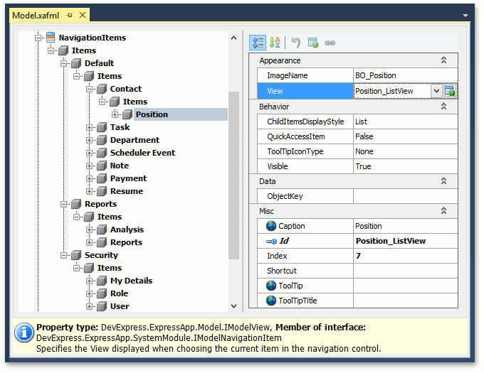
If a NavigationItem node has the IModelNavigationItem.View property set, then the corresponding item in the navigation control represents a View. Selecting such an item activates the View. If the View property is not set, then the corresponding item in the navigation control acts as a “group”, whose sole purpose is to contain other items.
Define the Navigation Structure
The navigation structure can be defined and customized at design-time and in code.
- Design-time customization of the navigation structure is performed using the Model Editor. Invoke the Model Editor, navigate to the NavigationItem node and customize it as required. This approach is detailed in the Add an Item to the Navigation Control tutorial.
In code, the navigation structure can be defined and customized in two ways.
By applying the NavigationItemAttribute or DefaultClassOptionsAttribute to the required business classes. The NavigationItem attribute adds a navigation item to the navigation control. The most frequently used constructor takes a single string parameter that specifies a first-level child node of the NavigationItems node. A NavigationItem node corresponding to the business class’ List View will be added to the specified node. Applying the DefaultClassOptions attribute is essentially the same as applying the NavigationItemAttribute, plus certain additional attributes. You can learn more about it in the DefaultClassOptionsAttribute class description.
The second approach is to directly customize the Application Model’s NavigationItems node, for instance in a custom Controller. This approach is described in the Access the Application Model in Code topic.
Note
In the Navigation Bar and Accordion style, a group cannot be used to navigate to a View, even if the View property is specified. The groups only serve as containers for other navigation items.
Define the Navigation Control Style in a WinForms Application
The following list illustrates the appearance of the navigation control in an XAF WinForms application when different style settings are used.
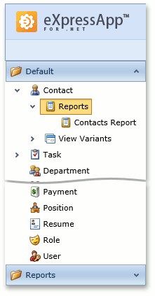
Accordion
To apply this style to your WinForms application, set the IModelRootNavigationItems.NavigationStyle property to Accordion.
This style is used in new XAF WinForms applications by default.
All nodes except nodes of the last nesting level present the accordion’s group elements.
Navigation Bar with Large Icons
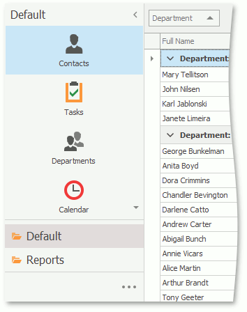
To apply this style to your WinForms application, use the following settings:
- Set the IModelRootNavigationItems.NavigationStyle property to NavBar.
- Set the IModelRootNavigationItems.DefaultChildItemsDisplayStyle property to Large Icons.
The first-level child nodes are displayed in the navigation pane as navigation groups, and the second-level child nodes are displayed as a set of icons.
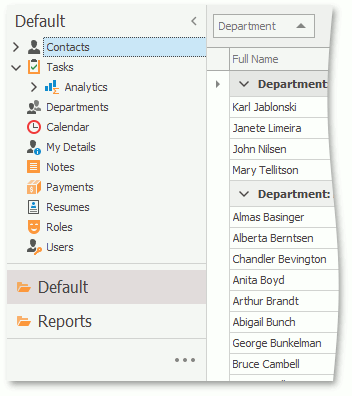
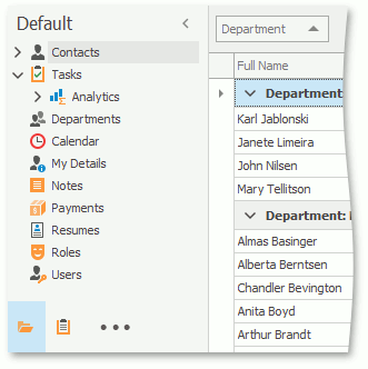
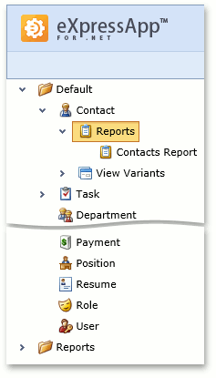
Navigation Bar with List
To apply this style to your WinForms application, use the following settings:
- Set the IModelRootNavigationItems.NavigationStyle property to NavBar.
- Set the IModelRootNavigationItems.DefaultChildItemsDisplayStyle property to List.
First-level child nodes are displayed in the navigation pane as navigation groups; the content of each group is displayed as a treelist.
Tree List
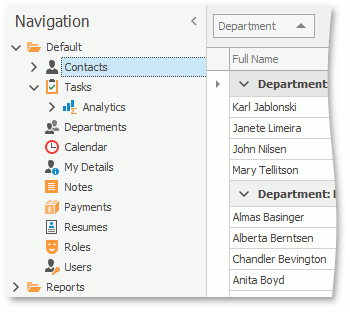
To apply this style to your WinForms application, set the IModelRootNavigationItems.NavigationStyle property to TreeList.
All nodes are displayed as a single treelist.
Navigation Bar with Outlook Style
To apply this style to your WinForms application, use the following settings:
- Set the IModelRootNavigationItems.NavigationStyle property to NavBar.
- Set the IModelRootGroupsStyle.RootGroupsStyle property to OutlookSimple or OutlookAnimated.
- Set the IModelOptionsWin.FormStyle property to Ribbon.
- Set the IModelOptionsWin.UIType property to SingleWindowSDI or MultipleWindowSDI.
- In the WinApplication.Designer.cs (WinApplication.Designer.vb) file, set the WinApplication.UseOldTemplates property to false.
Each root navigation group is displayed as a NavigationBarItem in the Office Navigation Bar, and the group content is displayed as a TreeList (when the IModelChoiceActionItemChildItemsDisplayStyle.ChildItemsDisplayStyle property is set to List for the current group and this group has second-level child nodes) or as NavBarItems (when the ChildItemsDisplayStyle property is set to LargeIcons for the current group; only the first-level nodes are displayed).
Note
If you need to further customize the navigation control’s appearance, you can do so in code. You can implement a custom Controller and perform the required customizations. The How to: Access Navigation Control contains an example describing the customization of the navigation control.
Define the Navigation Control Style in an ASP.NET Application
The following list illustrates the appearance of the navigation control in an ASP.NET application when different style settings are used.
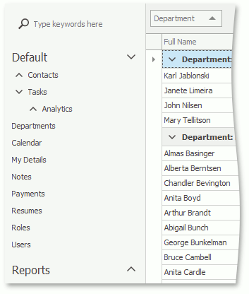
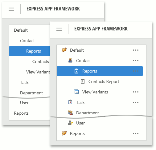
Navigation Bar in the New Web UI
To apply this style to your ASP.NET application, use the DefaultVerticalTemplateContentNew template with the IModelRootNavigationItems.NavigationStyle property set to NavBar. The first-level child nodes are displayed in the navigation pane as navigation groups, and the group content is displayed as a treelist.
The IModelRootNavigationItems.ShowImages property specifies if the icons are displayed for the items and groups. Also, you can hide the navigation pane on start using the IModelRootNavigationItemsWeb.ShowNavigationOnStart property.
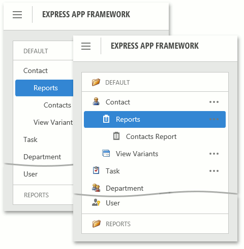
Tree List in the New Web UI
To apply this style to your ASP.NET application, use the DefaultVerticalTemplateContentNew template with the IModelRootNavigationItems.NavigationStyle property set to TreeList. All nodes are displayed as a treelist.
The IModelRootNavigationItems.ShowImages property specifies if the icons are displayed for the items and groups. Also, you can hide the navigation pane on start using the IModelRootNavigationItemsWeb.ShowNavigationOnStart property.
Vertical Navigation Bar in the Classic Web UI
To apply this style to your ASP.NET application, use the DefaultVerticalTemplateContent template with the IModelRootNavigationItems.NavigationStyle property set to NavBar.
The first-level child nodes are displayed in the navigation pane as navigation groups, and the content of each group is displayed as a treelist.
Vertical Tree List in the Classic Web UI
To apply this style to your ASP.NET application, use the DefaultVerticalTemplateContent template with the IModelRootNavigationItems.NavigationStyle property set to TreeList.
All nodes are displayed as a single treelist.
Horizontal Navigation Bar in the Classic Web UI
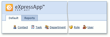
To apply this style to your ASP.NET application, use the DefaultTemplateContent template.
The first-level child nodes are displayed in the navigation pane as tabs, and the second-level child notes are displayed as a set of icons with their own captions.
Define the Navigation Control Style in a Mobile Application
This section illustrates the appearance of the navigation control in an XAF Mobile application.
Mobile Navigation
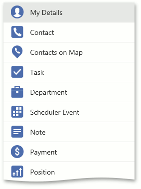
This style is used in XAF Mobile applications and cannot be customized.
First-level child nodes are displayed as a set of icons with captions within the Default root group. Other root groups with their child nodes are ignored and not displayed.
The Navigation control is not displayed by default. You can tap the hamburger button or swipe to the right to show this control. If you want the Navigation control not to hide on tablet devices, set the TabletLayoutType property to Split.
Context Navigation
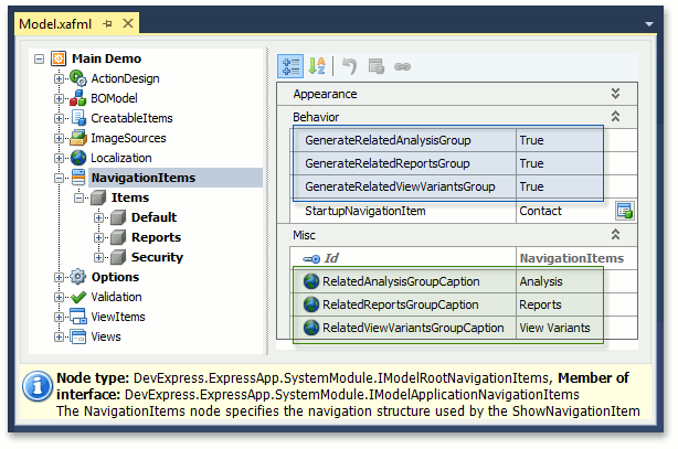
The navigation system supports context navigation. A module can track the process of generating the navigation items in the navigation control. The module can add additional child navigation items to a created navigation item that matches a specific criteria. Three built-in modules implement context navigation - the Pivot Chart, Reports V2 and View Variants modules.
By default, context navigation is disabled for these modules. It can be enabled using the following properties of the NavigationItems node.
- IModelPivotChartNavigation.GenerateRelatedAnalysisGroup
- IModelNavigationItemsForReports.GenerateRelatedReportsGroup
- IModelNavigationItemsVariantSettings.GenerateRelatedViewVariantsGroup
Captions of these context navigation groups can be customized using the following properties of the NavigationItems node.
- IModelPivotChartNavigation.RelatedAnalysisGroupCaption
- IModelNavigationItemsForReports.RelatedReportsGroupCaption
- IModelNavigationItemsVariantSettings.RelatedViewVariantsGroupCaption
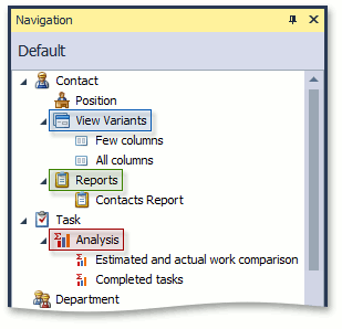
The ViewVariants module adds the View Variants navigation items for the Views that have predefined View variants. The Analysis and Report modules add navigation items for the items corresponding to business classes participating in existing inplace reports or analyses.
You can also implement custom context navigation. To see an example, refer to the How to: Implement Custom Context Navigation topic.
Keyboard Shortcuts in WinForms Applications
When the Multiple Document Interface is used in the application, hold down the SHIFT key and click a navigation item to invoke the new View in a separate window instead of a new tab.
When the navigation control or a navigation group is represented by a treelist control, you can use arrow keys to navigate it. Click on a treelist’s region not occupied by a navigation item to enter keyboard navigation mode. Use the UP ARROW and DOWN ARROW keys to navigate between items. To expand a group item, press CTRL+RIGHT ARROW. To collapse a group item, press CTRL+LEFT ARROW.