View Items
- 6 minutes to read
Dashboard Views and Detail Views consist of View Items - abstract UI entities represented by ViewItem class descendants. To create actual controls, each item type overrides the protected CreateControlCore method, called when an item needs to be displayed in a UI. Since different controls are used in Windows Forms and ASP.NET applications, there are View Items individually implemented for Windows and Web UI. These items are supplied in DevExpress.ExpressApp.Win and DevExpress.ExpressApp.Web assemblies respectively.
XAF provides the following basic View Item types:
Item Type | Description |
|---|---|
Displays an Action Container specified by the IModelActionContainerViewItem.ActionContainer property of the Application Model‘s corresponding ActionContainerViewItem node. Used to display Actions on a Detail View layout. | |
Displays a control specified by the IModelControlDetailItem.ControlTypeName property of the Application Model‘s corresponding ControlDetailItem node (see How to: Show a Custom Data-Bound Control in an XAF View (WinForms)). So, you can specify a control (Windows Forms or ASP.NET) that will be displayed in a UI. This View Item type is declared in the DevExpress.ExpressApp.dll assembly and is UI independent. | |
Displays a data-bound ASP.NET User Control control specified by the IModelCustomUserControlViewItemWeb.CustomControlPath property of the Application Model‘s corresponding CustomUserControlViewItemWeb node (see How to: Show a Custom Data-Bound Control in an XAF View (ASP.NET)). | |
Displays a View in a nested Frame. Used to display several Views side-by-side on a Dashboard View. | |
Displays an editor control bound to a property. There are multiple property editor types in XAF. They are intended for different data types, and therefore use different controls. For example:
More Property Editors intended for various property types are listed in the Data Types Supported by built-in Editors section. | |
Displays an image. | |
Displays a label. |
Customize View Items
You can use the following approaches to customize View Items:
Access and Customize View Items in Code
You can use the following approaches to access or customize View Items:
- Access Editor Settings
- How to: Access the ASPxDocumentViewer and ASPxWebDocumentViewer Controls
- How to: Access the Dashboard Control
- How to: Access the Master Object from a Nested List View
- How to: Customize a Built-in Property Editor (WinForms)
- How to: Customize a Built-in Property Editor (ASP.NET)
- How to: Disable and Hide Property Editors Based on a Business Rule
- How to Implement Dependent Views in a Dashboard View Filter Based on Selection
- Validate a Property Editor Value
- View Items Layout Customization (Access the Layout Control)
- Secure or Protect a Property Editor Value
- Ways to Access UI Elements and Their Controls
Customize the Application Model
The Application Model displays nodes for all View Items in your application. You can use the Application Model to customize View Items.
ViewItems node
This node has child nodes that correspond to the basic View Item types. These View Items are used to construct Detail Views. Examples of these base types are Static Text, Static Image, Property Editor, etc. Each base type is actually represented in the UI by a particular descendant class. This descendant is specified via the DefaultItemType property. If there are multiple descendants available, you can select the desired class via the property’s drop-down list.
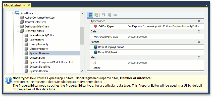
Since different data types require different Property Editors, the PropertyEditors node supplies child nodes corresponding to data types. These child nodes specify the default Property Editor for each data type, using the EditorType property.
The following picture illustrates the ViewItems node:
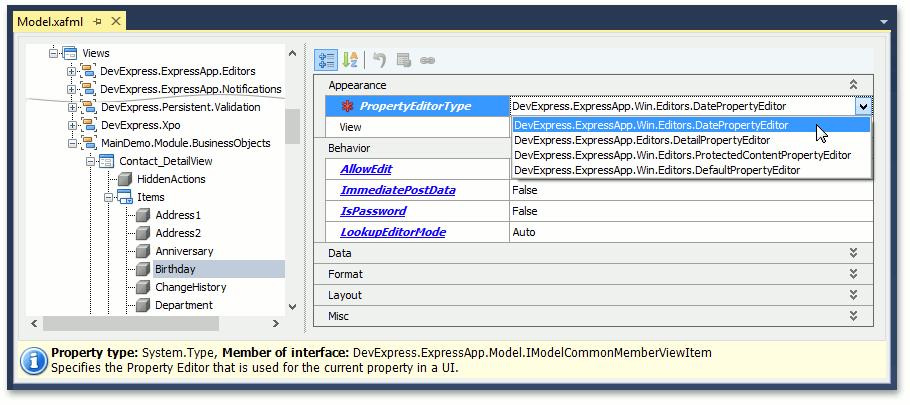
Views | DashboardView or DetailView | Items node
This node lists the current Detail View’s items. By default, it contains only Property Editor nodes. Their PropertyEditorType property specifies the Property Editor type used in a UI. Of course, you can change the default property value by selecting another property editor type from the dropdown list.
You can change other properties such as DisplayFormat, EditMask etc. See Format a Property Value.
You can also add other View Items to a Detail View. To do this, use the Model Editor‘s context menu. If you add a Static Text, Static Image or Control item, you can use the ItemType property to specify the actual class used to represent this item in a UI.
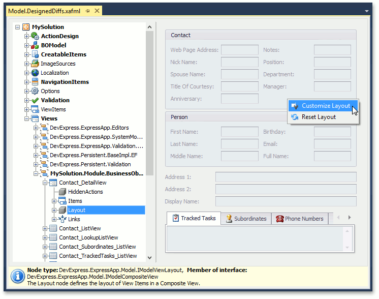
Views | DashboardView or DetailView | Layout node.
This node specifies the layout of the current View’s items. Items can be grouped or located separately. You can change the default layout, by using the context menu and specifying property values in the Model Editor. In addition, the Model Editor allows you to view the resulting items layout. When the Layout node is selected, the property list to the right is displayed with a design surface that emulates the current View. To drag the View Items, right-click on the empty space, and select Customize Layout. The Customization form will be invoked. Close this form, to go back to the view mode of the emulated View.
For details, refer to the View Items Layout Customization topic.
Create Custom View Items
You can use a custom View Item if XAF’s built-in View Items do not meet your requirements. The following articles describe how to create a View Item and use it to implement additional functionality:
- Implement Custom Property Editors
- How to: Add a Button to a Detail View Using a Custom View Item
- How to: Implement a Property Editor Based on a Custom Control (WinForms)
- How to: Implement a Property Editor Based on a Custom Control (ASP.NET)
- How to: Implement a Property Editor Using a DevExpress WinForms Control
- How to: Implement a View Item
- How to: Create a Custom Control Detail Item
- How to: Include an Action to a Detail View Layout
- How to: Show a Custom Data-Bound Control in an XAF View (WinForms)
- How to: Show a Custom Data-Bound Control in an XAF View (ASP.NET)
- How to Access XafApplication and IObjectSpace from a Custom View Item
Note
You can find built-in View Items from the eXpressApp Framework libraries in the Model Editor, invoked for a Windows Forms or ASP.NET application project, since the DevExpress.ExpressApp.Win assembly is referenced in Windows Forms application projects and the DevExpress.ExpressApp.Web assembly in the Web application projects.