# Arrange Dynamic Report Contents | .NET Reporting Tools | DevExpress Documentation
Sometimes it is not possible to determine the final layout of a report at design time because the actual data may require more space for its placement, more columns, and a wider page. This document describes techniques to maintain the correct layout of the report elements in a published document.
## Insert Page Breaks
Use the [XRPageBreak](/XtraReports/DevExpress.XtraReports.UI.XRPageBreak) control to insert a page break in a report.

You can use the [Band.PageBreak](/XtraReports/DevExpress.XtraReports.UI.Band.PageBreak) property to add a page break before or after a band.

The following bands support this feature:
- Detail band
- Detail report band
- Report header and footer
- Group headers and footers
## Position Band on a Page
Use the [GroupFooterBand.PrintAtBottom](/XtraReports/DevExpress.XtraReports.UI.GroupFooterBand.PrintAtBottom) and [ReportFooterBand.PrintAtBottom](/XtraReports/DevExpress.XtraReports.UI.ReportFooterBand.PrintAtBottom) properties to specify the position of group and report footers – at the bottom of the page or after the previous band.
| ReportFooterBand.PrintAtBottom = false | ReportFooterBand.PrintAtBottom = true |
| --- | --- |
|  |  |
Use the [PageBand.PrintOn](/XtraReports/DevExpress.XtraReports.UI.PageBand.PrintOn) property to avoid printing page headers and footers on the same page as the Report Header and Report Footer bands.
**PageHeaderBand.PrintOn = AllPages**
**PageHeaderBand.PrintOn = NotWithReportHeader**
Use the [GroupBand.RepeatEveryPage](/XtraReports/DevExpress.XtraReports.UI.GroupBand.RepeatEveryPage) property to repeat group headers and footers on every page.
**GroupHeaderBand.RepeatEveryPage = false**
**GroupHeaderBand.RepeatEveryPage = true**
## Keep Content Together
### Report Controls
The [KeepTogether](/XtraReports/DevExpress.XtraReports.UI.XRControl.KeepTogether) property ensures that the entire content of an element stays together on the same page. The report engine will attempt to keep the element on a single page, even if it means moving other report elements or adjusting the page layout.
**KeepTogether = false**
**KeepTogether = true**
Once this property is enabled for one control, it makes the controls in the same band behave as if they have this option enabled.
### Report Bands
Use the [Band.KeepTogether](/XtraReports/DevExpress.XtraReports.UI.Band.KeepTogether) property to enable the `KeepTogether` setting for all controls within the band.
Note
This feature is not available for the [XRChart](/XtraReports/DevExpress.XtraReports.UI.XRChart), [XRSparkline](/XtraReports/DevExpress.XtraReports.UI.XRSparkline), and [XRSubreport](/XtraReports/DevExpress.XtraReports.UI.XRSubreport) controls.
In a master-detail report, you can print the detail band on the same page as the detail report band using the [DetailBand.KeepTogetherWithDetailReports](/XtraReports/DevExpress.XtraReports.UI.DetailBand.KeepTogetherWithDetailReports) property.
### Groups
Use the [GroupHeaderBand.GroupUnion](/XtraReports/DevExpress.XtraReports.UI.GroupHeaderBand.GroupUnion) and [GroupFooterBand.GroupUnion](/XtraReports/DevExpress.XtraReports.UI.GroupFooterBand.GroupUnion) properties to specify whether group rows can be printed on different pages, or whether the entire group will be printed on the same page.
[View Example: How to dynamically generate a master-detail report in a WinForms application](https://github.com/DevExpress-Examples/obsolete-reporting-winforms-create-master-detail-in-code)
## Split Content Between Pages
The [XtraReport.VerticalContentSplitting](/XtraReports/DevExpress.XtraReports.UI.XtraReport.VerticalContentSplitting) property allows you to control how report controls are handled when they exceed the right page margin.
The `VerticalContentSplitting` property has two options:
- [VerticalContentSplitting.Exact](/CoreLibraries/DevExpress.XtraPrinting.VerticalContentSplitting)
- If the control extends beyond the right margin, it will be split and displayed partly on the current page and partly on the next page.

- [VerticalContentSplitting.Smart](/CoreLibraries/DevExpress.XtraPrinting.VerticalContentSplitting)
- If the control extends beyond the right margin, it will be moved completely to the next page, resulting in a more professional appearance.

## Fit the Control Size to Content
### Adjust Height
You can specify the [CanGrow](/XtraReports/DevExpress.XtraReports.UI.XRControl.CanGrow) and [CanShrink](/XtraReports/DevExpress.XtraReports.UI.XRControl.CanShrink) properties for the [XRLabel](/XtraReports/DevExpress.XtraReports.UI.XRLabel), [XRTableCell](/XtraReports/DevExpress.XtraReports.UI.XRTableCell), [XRCharacterComb](/XtraReports/DevExpress.XtraReports.UI.XRCharacterComb), and [XRRichText](/XtraReports/DevExpress.XtraReports.UI.XRRichText) controls to adjust a control’s height to its content size.
The following images illustrate how the [CanGrow](/XtraReports/DevExpress.XtraReports.UI.XRControl.CanGrow) property affects the height of a label whose content size is larger than its width:
| Designer | Preview (CanGrow = false) | Preview (CanGrow = true) |
| :---: | :---: | :---: |
|  |  |  |
The images below show how the [CanShrink](/XtraReports/DevExpress.XtraReports.UI.XRControl.CanShrink) property affects the height of a label whose content size does not occupy the entire control height.
| Designer | Preview (CanShrink = false) | Preview (CanShrink = true) |
| :---: | :---: | :---: |
|  |  |  |
The [CanGrow](/XtraReports/DevExpress.XtraReports.UI.XRControl.CanGrow) and [CanShrink](/XtraReports/DevExpress.XtraReports.UI.XRControl.CanShrink) properties have no effect on a control in the following situations:
- The [AnchorVertical](/XtraReports/DevExpress.XtraReports.UI.XRControl.AnchorVertical) property is set to `Both` or `Bottom`.
- The control is a label that displays [summary function results](/XtraReports/119436/feature-guide-to-devexpress-reports/shape-report-data/calculate-summaries/calculate-a-summary).
The [WordWrap](/XtraReports/DevExpress.XtraReports.UI.XRControl.WordWrap) property allows you to specify whether long strings of text should be split into multiple lines when they exceed the available width of the control.
The following example shows a label whose content size is larger than its width. The label’s [CanGrow](/XtraReports/DevExpress.XtraReports.UI.XRControl.CanGrow) property is enabled. The images demonstrate how the [WordWrap](/XtraReports/DevExpress.XtraReports.UI.XRControl.WordWrap) property affects the label size.
| Designer | Preview (WordWrap = false) | Preview (WordWrap = true) |
| :---: | :---: | :---: |
|  |  |  |
### Adjust Width
If you want to increase or decrease a control’s width based on its content size, enable the control’s [AutoWidth](/XtraReports/DevExpress.XtraReports.UI.XRLabel.AutoWidth) property. The behavior of this property depends on the following properties:
- [TextAlignment](/XtraReports/DevExpress.XtraReports.UI.XRControl.TextAlignment)
- If a control’s text alignment is set to *Left*, the control grows to the right or shrinks from the right, and when the alignment is *Right*, it grows or shrinks on the left side. If the control’s text alignment is set to *Center*, the control grows or shrinks in both directions.
- [WordWrap](/XtraReports/DevExpress.XtraReports.UI.XRControl.WordWrap)
- If the property is enabled, the control can only decrease its width. Otherwise, the control can both increase and decrease its width.
The following example shows a label with text that is larger than the control’s width. The label’s [AutoWidth](/XtraReports/DevExpress.XtraReports.UI.XRLabel.AutoWidth) property is enabled. The images show how the label’s width changes depending on the control’s text alignment.
- Designer

- Preview, TextAlignment = TopLeft. The label grows to the right.

- Preview, TextAlignment = TopRight. The label grows to the left.

- Preview, TextAlignment = TopCenter. The label grows in both directions.

The following examples show a label with text that is smaller than the control’s width. The label’s [AutoWidth](/XtraReports/DevExpress.XtraReports.UI.XRLabel.AutoWidth) property is enabled. The images show how the label’s width changes depending on the control’s text alignment.
- Designer, TextAlignment = TopLeft.

Preview. The label’s right border shrinks.

- Designer, TextAlignment = TopRight.

Preview. The label’s left border shrinks.

- Designer. TextAlignment = TopCenter.

Preview. Both label borders shrink.

## Adjust Font Size to Fit Control
Use the [TextFitMode](/XtraReports/DevExpress.XtraReports.UI.XRLabel.TextFitMode) property to specify whether the font size should be automatically changed to fit the [XRLabel](/XtraReports/DevExpress.XtraReports.UI.XRLabel) and [XRTableCell](/XtraReports/DevExpress.XtraReports.UI.XRTable) controls.
The following images show how the [TextFitMode](/XtraReports/DevExpress.XtraReports.UI.XRLabel.TextFitMode) property affects the font size when text is larger than the label:
| Designer | Preview (TextFitMode = GrowAndShrink) |
| :---: | :---: |
|  |  |
The following images show how the `TextFitMode` property affects the font size when text is smaller than the label:
| Designer | Preview (TextFitMode = GrowAndShrink) |
| :---: | :---: |
|  |  |
The [TextFitMode](/XtraReports/DevExpress.XtraReports.UI.XRLabel.TextFitMode) property has no effect under any of the following conditions:
- The [CanGrow](/XtraReports/DevExpress.XtraReports.UI.XRControl.CanGrow), [CanShrink](/XtraReports/DevExpress.XtraReports.UI.XRControl.CanShrink), or [AutoWidth](/XtraReports/DevExpress.XtraReports.UI.XRLabel.AutoWidth) property is enabled.
- The [Angle](/XtraReports/DevExpress.XtraReports.UI.XRLabel.Angle) property is not 0 (zero).
- The [AnchorHorizontal](/XtraReports/DevExpress.XtraReports.UI.XRControl.AnchorHorizontal) or [AnchorVertical](/XtraReports/DevExpress.XtraReports.UI.XRControl.AnchorVertical) property is set to **Both**.
## Anchor Controls
You can specify how report controls should behave and adapt their positions when the size of the report changes.
You can anchor a control to the top, bottom, or both edges of its parent container using the [XRControl.AnchorHorizontal](/XtraReports/DevExpress.XtraReports.UI.XRControl.AnchorHorizontal) and [XRControl.AnchorVertical](/XtraReports/DevExpress.XtraReports.UI.XRControl.AnchorVertical) properties.
| AnchorHorizontal = None | AnchorHorizontal = Right | AnchorHorizontal = Both |
| --- | --- | --- |
|  |  |  |
## Hide Controls
### Merge or Hide Duplicate and Empty Values
When identical or null values appear in the report’s data source, you can process these values and merge or hide controls in a report using the following properties:
- `ProcessDuplicatesMode`
Specifies how to process report controls with identical values (leave them as is, merge, suppress, or suppress and shrink).
- `ProcessNullValues`
Specifies how to process report controls that receive null values from a data source (leave them as is, suppress, or suppress and shrink).
- `ProcessDuplicatesTarget`
Specifies whether the data field values or the [Tag](/XtraReports/DevExpress.XtraReports.UI.XRControl.Tag) property values should be considered duplicates.
These properties are available for the following controls:
- [XRBarCode](/XtraReports/DevExpress.XtraReports.UI.XRBarCode)
- [XRLabel](/XtraReports/DevExpress.XtraReports.UI.XRLabel)
- [XRCharacterComb](/XtraReports/DevExpress.XtraReports.UI.XRCharacterComb)
- [XRRichText](/XtraReports/DevExpress.XtraReports.UI.XRRichText)
- [XRTableCell](/XtraReports/DevExpress.XtraReports.UI.XRTableCell)
- [XRPictureBox](/XtraReports/DevExpress.XtraReports.UI.XRPictureBox)
The following image shows vertically merged cells with duplicate values:
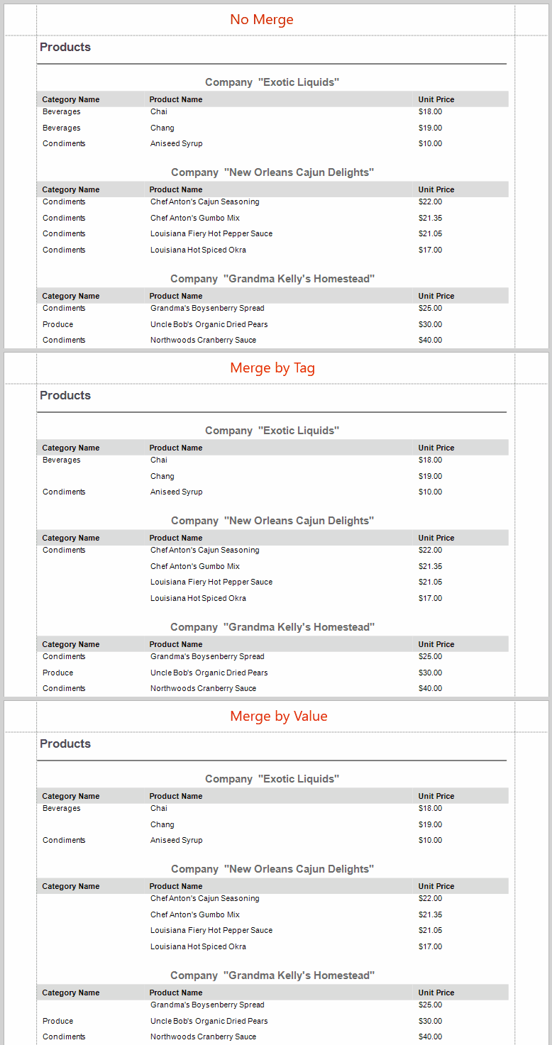
[View Example: Reporting for WinForms - How to Vertically Merge Cells With Duplicate Values](https://github.com/DevExpress-Examples/reporting-winforms-process-duplicate-values)
### Conditionally Hide a Control
You can hide a control when a specified logical condition is met by specifying the [XRControl.Visible](/XtraReports/DevExpress.XtraReports.UI.XRControl.Visible) property expression. For more information, review the following help topic: [Conditionally Hide Controls](/XtraReports/119439/feature-guide-to-devexpress-reports/use-expressions/expressions-tasks-and-solutions/conditionally-suppress-controls).
When a control is hidden, a space remains in the band at the control’s location. You can avoid this by placing these controls onto an [XRPanel](/XtraReports/DevExpress.XtraReports.UI.XRPanel) and setting its [XRPanel.CanShrink](/XtraReports/DevExpress.XtraReports.UI.XRPanel.CanShrink) property to **true**.

This feature works correctly if you consider the following:
- Do not change the panel’s `Visible` property. Instead, specify the `Visible` property for the controls in the panel.
- Do not specify borders other than `None` for the panel container. The borders are displayed even when the panel’s content is hidden.
### Hide Report Controls in Exported Documents and Printouts
Use `CanPublishOptions` to hide report controls in exported documents and printouts. The [XRControl.CanPublishOptions](/XtraReports/DevExpress.XtraReports.UI.XRControl.CanPublishOptions) property allows you to access the [CanPublishOptions](/XtraReports/DevExpress.XtraReports.UI.CanPublishOptions) object. Specify settings to hide a report control on printouts or when exported to a document in a certain format.
To hide a report control on printouts and in all exported documents, set [CanPublishOptions.AllFormats](/XtraReports/DevExpress.XtraReports.UI.CanPublishOptions.AllFormats) to `false`.
The following code snippet excludes page information (the [XRPageInfo](/XtraReports/DevExpress.XtraReports.UI.XRPageInfo) instance) when exporting a report to XLS, XLSX, and CSV formats:
- C#
- VB.NET
using DevExpress.XtraReports.UI;
// ...
XtraReport report = new XtraReport();
  DetailBand detailBand = new DetailBand();
  report.Bands.Add(detailBand);
  XRPageInfo xrPageInfo1 = new XRPageInfo{
  // Add content.
  };
  detailBand.Controls.Add(xrPageInfo1);
  // Hide xrPageInfo1 from XLS, XLSX, and CSV formats.
  xrPageInfo1.CanPublishOptions.Xlsx = false;
  xrPageInfo1.CanPublishOptions.Xls = false;
  xrPageInfo1.CanPublishOptions.Csv = false;
Imports DevExpress.XtraReports.UI
' ...
Private report As New XtraReport()
  Private detailBand As New DetailBand()
  report.Bands.Add(detailBand)
  Dim xrPageInfo1 As XRPageInfo = New XRPageInfo From { }
  detailBand.Controls.Add(xrPageInfo1)
  ' Hide xrPageInfo1 from XLS, XLSX, and CSV formats.
  xrPageInfo1.CanPublishOptions.Xlsx = False
  xrPageInfo1.CanPublishOptions.Xls = False
  xrPageInfo1.CanPublishOptions.Csv = False
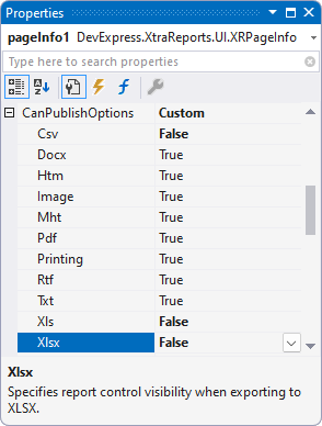
You can also specify `CanPublishOptions` in the Properties grid:
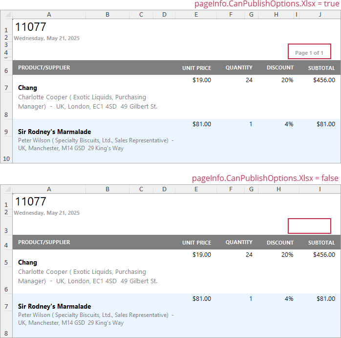
The following image illustrates the resulting XLXS document with and without page information:
## Arrange Dynamic Report Contents in the End-User Report Designer
Tutorials that explain how to use this functionality in EUD Report Designers for WinForms and Web are included in the End-User Documentation online help section:
- [Web Reporting Designer - Add Navigation](https://docs.devexpress.com/eud/eud-for-devexpress-reports/reporting-for-web/report-designer/lay-out-dynamic-report-content)
- [WinForms Report Designer - Lay out Dynamic Report Content](https://docs.devexpress.com/eud/eud-for-devexpress-reports/reporting-for-desktop/report-designer/report-designer-for-winforms/lay-out-dynamic-report-content)