# The List of Bar Items and Links | WPF Controls | DevExpress Documentation
This topic lists the bar items that can be used to populate [Bars](/WPF/6194/controls-and-libraries/ribbon-bars-and-menu/bars), [Ribbon](/WPF/7895/controls-and-libraries/ribbon-bars-and-menu/ribbon) and [Menus](/WPF/115388/controls-and-libraries/ribbon-bars-and-menu/menus).
| Item/Link | Description |
| --- | --- |
| [BarButtonItem](/WPF/DevExpress.Xpf.Bars.BarButtonItem) / [BarButtonItemLink](/WPF/DevExpress.Xpf.Bars.BarButtonItemLink)
 | This item type represents a regular button.
To respond to clicking the item, handle the [BarItem.ItemClick](/WPF/DevExpress.Xpf.Bars.BarItem.ItemClick) or [BarManager.ItemClick](/WPF/DevExpress.Xpf.Bars.BarManager.ItemClick) event, or specify a command for the item via the [BarItem.Command](/WPF/DevExpress.Xpf.Bars.BarItem.Command) property. |
| [BarCheckItem](/WPF/DevExpress.Xpf.Bars.BarCheckItem) / [BarCheckItemLink](/WPF/DevExpress.Xpf.Bars.BarCheckItemLink)
 | Represents a check button supporting two or three check states.
To respond to toggling the button’s state, handle the [BarCheckItem.CheckedChanged](/WPF/DevExpress.Xpf.Bars.BarCheckItem.CheckedChanged) event.
Bar check items can be combined into a group via the [BarCheckItem.GroupIndex](/WPF/DevExpress.Xpf.Bars.BarCheckItem.GroupIndex) property. Checking one item within a group automatically unchecks the other items. |
| [BarItemSelector](/WPF/DevExpress.Xpf.Bars.BarItemSelector) / [BarItemSelectorLink](/WPF/DevExpress.Xpf.Bars.BarItemSelectorLink)
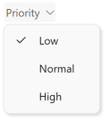 | A container for bar items that can have only one selected item. |
| [BarSplitButtonItem](/WPF/DevExpress.Xpf.Bars.BarSplitButtonItem) / [BarSplitButtonItemLink](/WPF/DevExpress.Xpf.Bars.BarSplitButtonItemLink)
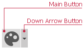 | Represents a button that supports the drop-down functionality. You can display the [PopupMenu](/WPF/DevExpress.Xpf.Bars.PopupMenu) or any WPF control as the drop-down control.
Use the [BarSplitButtonItem.PopupControl](/WPF/DevExpress.Xpf.Bars.BarSplitButtonItem.PopupControl) property to associate a drop-down control with the button. |
| [BarSplitCheckItem](/WPF/DevExpress.Xpf.Bars.BarSplitCheckItem) / [BarSplitCheckItemLink](/WPF/DevExpress.Xpf.Bars.BarSplitCheckItemLink)
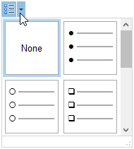 | Combines a checkbox and dropdown buttons in one item.
Use the [BarSplitButtonItem.PopupControl](/WPF/DevExpress.Xpf.Bars.BarSplitButtonItem.PopupControl) property to associate a drop-down control with the item. |
| [BarSubItem](/WPF/DevExpress.Xpf.Bars.BarSubItem) / [BarSubItemLink](/WPF/DevExpress.Xpf.Bars.BarSubItemLink)
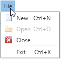 | This item type represents an item that contains other items. It is visually represented as a submenu. Use the [BarSubItem.ItemLinks](/WPF/DevExpress.Xpf.Bars.BarSubItem.ItemLinks) property to add child items to the item. |
| [BarStaticItem](/WPF/DevExpress.Xpf.Bars.BarStaticItem) / [BarStaticItemLink](/WPF/DevExpress.Xpf.Bars.BarStaticItemLink)
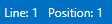 | An item of this type is used to represent static text on bars and menus. This item cannot be selected, and has no shortcuts. Clicking on the item however, invokes **ItemClick** events. |
| [BarItemSeparator](/WPF/DevExpress.Xpf.Bars.BarItemSeparator) / [BarItemLinkSeparator](/WPF/DevExpress.Xpf.Bars.BarItemLinkSeparator) | An item of this type is used to visually separate bar items. This item cannot be selected, and has no shortcuts. Clicking on the item however, invokes **ItemClick** events. |
| [BarEditItem](/WPF/DevExpress.Xpf.Bars.BarEditItem) / [BarEditItemLink](/WPF/DevExpress.Xpf.Bars.BarEditItemLink)
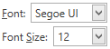 | This item allows you to display editors from the DXEditors Library within bars and menus. Use the [BarEditItem.EditSettings](/WPF/DevExpress.Xpf.Bars.BarEditItem.EditSettings) property to specify the type of editor to display. Use the [BarEditItem.EditValue](/WPF/DevExpress.Xpf.Bars.BarEditItem.EditValue) property to specify the initial value for the editor. To perform specific actions when the edit value is changed, handle the [BarEditItem.EditValueChanged](/WPF/DevExpress.Xpf.Bars.BarEditItem.EditValueChanged) event. |
| [BarLinkContainerItem](/WPF/DevExpress.Xpf.Bars.BarLinkContainerItem) / [BarLinkContainerItemLink](/WPF/DevExpress.Xpf.Bars.BarLinkContainerItemLink) | This item type represents a group of links.
You can create a BarLinkContainerItem, populate it with links via the [BarLinkContainerItem.ItemLinks](/WPF/DevExpress.Xpf.Bars.BarLinkContainerItem.ItemLinks) property and then add it to a bar(s). The child links will be displayed in place of the container item. |
| [ToolbarListItem](/WPF/DevExpress.Xpf.Bars.ToolbarListItem) / [ToolbarListItemLink](/WPF/DevExpress.Xpf.Bars.ToolbarListItemLink)
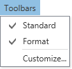 | This item type represents a list of existing bars/bar item links and allows an end-user to customize the visibility of the bars/links.
You can add a ToolbarListItem to a bar. A list of existing bars will be displayed in place of the item, where each bar will be represented as a check button. Toggling a check button will change the visibility of the corresponding bar.
If the [ToolbarListItem.ListItemType](/WPF/DevExpress.Xpf.Bars.ToolbarListItem.ListItemType) property is set to [ToolbarListItemType.ShowBarsAndItems](/WPF/DevExpress.Xpf.Bars.ToolbarListItemType), the ToolbarListItem provides access to bar item links owned by bars. Each bar is represented by a sub-menu, which when expanded, displays a check list of bar item links owned by the bar. In this mode, an end-user can customize the visibility of the bar item links, not bars. |
| [LinkListItem](/WPF/DevExpress.Xpf.Bars.LinkListItem) / [LinkListItemLink](/WPF/DevExpress.Xpf.Bars.LinkListItemLink) | This item type allows an end-user to control the visibility of links in a [BarItemLinkCollection](/WPF/DevExpress.Xpf.Bars.BarItemLinkCollection) collection. For instance, it is possible to control the visibility of links owned by a bar, which are stored in the bar’s [BarItemLinkHolderBase.ItemLinks](/WPF/DevExpress.Xpf.Bars.BarItemLinkHolderBase.ItemLinks) collection. |
| [BarButtonGroup](/WPF/DevExpress.Xpf.Ribbon.BarButtonGroup) / [BarButtonGroupLink](/WPF/DevExpress.Xpf.Ribbon.BarButtonGroupLink)
 | Represents a group of buttons within a [RibbonControl](/WPF/DevExpress.Xpf.Ribbon.RibbonControl). Button groups are never broken when a Ribbon control is resized. You can add items to a BarButtonGroup. Links that are displayed within button groups support small images only.
Note
BarButtonGroup items are only supported within a [RibbonControl](/WPF/DevExpress.Xpf.Ribbon.RibbonControl). |
| [RibbonGalleryBarItem](/WPF/DevExpress.Xpf.Ribbon.RibbonGalleryBarItem) / [RibbonGalleryBarItemLink](/WPF/DevExpress.Xpf.Ribbon.RibbonGalleryBarItemLink)
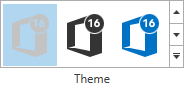 | Represents a gallery within a [RibbonControl](/WPF/DevExpress.Xpf.Ribbon.RibbonControl). A gallery can display multiple gallery items, which are visually represented by images. Optionally, captions and descriptive text can be displayed for each gallery item.
Note
RibbonGalleryBarItem items are only supported within a [RibbonPageGroup](/WPF/DevExpress.Xpf.Ribbon.RibbonPageGroup). |
| [BarItemMenuHeader](/WPF/DevExpress.Xpf.Bars.BarItemMenuHeader) / [BarItemLinkMenuHeader](/WPF/DevExpress.Xpf.Bars.BarItemLinkMenuHeader)
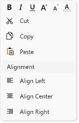 | Allows you to group context menu items and specify their alignment, caption, and appearance. |
## Examples
- [How to: create bars and allow them to be docked at any edge of the window](/WPF/18268/controls-and-libraries/ribbon-bars-and-menu/bars/examples/how-to-create-bars-and-allow-them-to-be-docked-at-any-edge-of-the-window)
- [How to: create bar button items and add separators between links](/WPF/6639/controls-and-libraries/ribbon-bars-and-menu/bars/examples/how-to-create-bar-button-items-and-add-separators-between-links)
- [How to: create a BarSplitButtonItem](/WPF/6636/controls-and-libraries/ribbon-bars-and-menu/bars/examples/how-to-create-a-barsplitbuttonitem)
- [How to: embed editors into a bar](/WPF/6634/controls-and-libraries/ribbon-bars-and-menu/bars/examples/how-to-embed-editors-into-a-bar)
- [How to: create a BarLinkContainerItem](/WPF/6635/controls-and-libraries/ribbon-bars-and-menu/bars/examples/how-to-create-a-barlinkcontaineritem)
- [How to: create a ToolbarItemList item](/WPF/6637/controls-and-libraries/ribbon-bars-and-menu/bars/examples/how-to-create-a-toolbaritemlist-item)
See Also
[Items and Links](/WPF/118282/controls-and-libraries/ribbon-bars-and-menu/common-concepts/items-and-links)
[Bars Items and Links](/WPF/6553/controls-and-libraries/ribbon-bars-and-menu/bars/populating-bars/items-and-links)
[Ribbon Items and Links](/WPF/8174/controls-and-libraries/ribbon-bars-and-menu/ribbon/populating-ribbon/items-and-links)