# Customize Colors | WPF Controls | DevExpress Documentation
## How Elements are Colorized
Built-in [application themes](/WPF/7406/common-concepts/themes) can be divided into two groups: Modern and Classic.
### Modern Themes
- Office2019 (White, DarkGray, Colorful, Black)
- VisualStudio2017 (Light, Dark, Blue)
- Office2016SE (White, DarkGray, Colorful, Black)
- Metropolis (Light, Dark)
- DeepBlue
In the themes listed above, resource and derived colors are used to paint resource headers, date headers, and navigation buttons.
An appointment’s color depends on its [label color](/WPF/119214/controls-and-libraries/scheduler/appointments/labels). If the label color is set to transparent, the appointment has the same color as its [resource](/WPF/119219/controls-and-libraries/scheduler/resources).
Tip
The default **None** label is transparent in modern themes.
### Classic Themes
- DXStyle
- LightGray
- Office2013 (DarkGray, LightGray)
- Office2010 (Black, Blue, Silver)
- Office2007 (Black, Blue, Silver)
- Seven
- VS2010
In the themes listed above, resource colors and derived colors are used to paint time slots.
The color of an appointment corresponds to its [label color](/WPF/119214/controls-and-libraries/scheduler/appointments/labels). If the label color is set to transparent, the appointment has the same color as its [resource](/WPF/119219/controls-and-libraries/scheduler/resources).
## Brushes and Customization
The following properties allow you to explicitly set brushes used to paint scheduler resources, labels, statuses and time regions:
| Data Items | Properties |
| --- | --- |
| [Resources](/WPF/119219/controls-and-libraries/scheduler/resources) | [ResourceItem.Brush](/WPF/DevExpress.Xpf.Scheduling.ResourceItem.Brush), [ResourceMappings.Brush](/WPF/DevExpress.Xpf.Scheduling.ResourceMappings.Brush). |
| [Labels](/WPF/119214/controls-and-libraries/scheduler/appointments/labels) | [AppointmentLabelItem.Brush](/WPF/DevExpress.Xpf.Scheduling.AppointmentLabelItem.Brush), [AppointmentLabelMappings.Brush](/WPF/DevExpress.Xpf.Scheduling.AppointmentLabelMappings.Brush). |
| [Statuses](/WPF/119215/controls-and-libraries/scheduler/appointments/statuses) | [AppointmentStatusItem.Brush](/WPF/DevExpress.Xpf.Scheduling.AppointmentStatusItem.Brush), [AppointmentStatusMappings.Brush](/WPF/DevExpress.Xpf.Scheduling.AppointmentStatusMappings.Brush). |
| [Time Regions](/WPF/401378/controls-and-libraries/scheduler/time-regions) | [TimeRegionItem.Brush](/WPF/DevExpress.Xpf.Scheduling.TimeRegionItem.Brush), [TimeRegionMappings.Brush](/WPF/DevExpress.Xpf.Scheduling.TimeRegionMappings.Brush). |
[View Example: Disable Resource Colorization](https://github.com/DevExpress-Examples/wpf-scheduler-disable-resource-colorization)
### Brush Palette
You can use the [SchedulerControl.BrushSet](/WPF/DevExpress.Xpf.Scheduling.SchedulerControl.BrushSet) property to define a custom set of brushes. See the example below.
- XAML
<dxsch:SchedulerControl.BrushSet>
    <dxsch:BrushSet>
        <dxsch:BrushInfo Name="Red" Brush="Red"/>
        <dxsch:BrushInfo Name="Blue" Brush="Blue"/>
    </dxsch:BrushSet>
</dxsch:SchedulerControl.BrushSet>
You can then use the properties listed below to access a brush from [SchedulerControl.BrushSet](/WPF/DevExpress.Xpf.Scheduling.SchedulerControl.BrushSet) by its Name value:
- [ResourceItem.BrushName](/WPF/DevExpress.Xpf.Scheduling.ResourceItem.BrushName)
- [AppointmentLabelItem.BrushName](/WPF/DevExpress.Xpf.Scheduling.AppointmentLabelItem.BrushName)
- [AppointmentStatusItem.BrushName](/WPF/DevExpress.Xpf.Scheduling.AppointmentStatusItem.BrushName)
- [TimeRegionItem.BrushName](/WPF/DevExpress.Xpf.Scheduling.TimeRegionItem.BrushName)
The **Brush** properties have a higher priority than the **BrushName** properties. If both are specified, the **Brush** property value is used.
### DefaultBrushNames
The static [DefaultBrushNames](/WPF/DevExpress.Xpf.Scheduling.DefaultBrushNames) class contains names of default brushes. These brushes are theme-dependent.
The XAML snippet below illustrates how to assign a theme-dependent brush to a label item:
- XAML
 <dxsch:SchedulerControl>
    <dxsch:SchedulerControl.AppointmentLabelItems>
        <dxsch:AppointmentLabelItem Id="0" Caption="Important" BrushName="{x:Static dxsch:DefaultBrushNames.LabelImprotant}"/>
    </dxsch:SchedulerControl.AppointmentLabelItems>
 </dxsch:SchedulerControl>
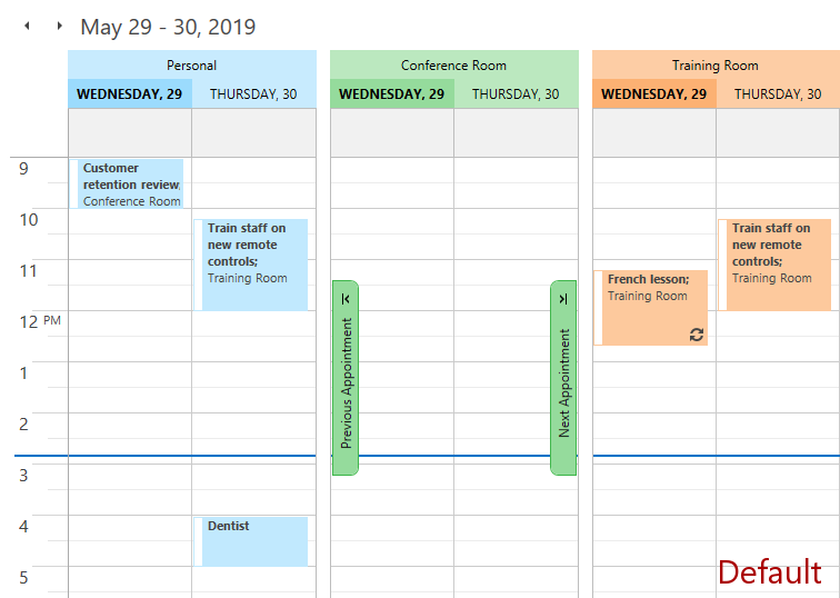
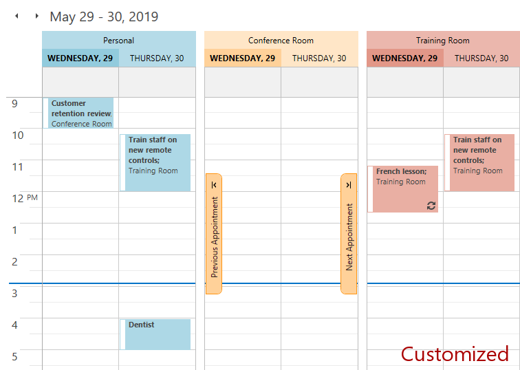
You can redefine the default brushes for all themes as shown in the XAML snippet below:
- XAML
<dxsch:SchedulerControl.BrushSet>
    <dxsch:BrushSet>
        <dxsch:BrushInfo Name="{x:Static dxsch:DefaultBrushNames.Resource1}" Brush="LightBlue"/>
        <dxsch:BrushInfo Name="{x:Static dxsch:DefaultBrushNames.Resource2}" Brush="Bisque"/>
        <dxsch:BrushInfo Name="{x:Static dxsch:DefaultBrushNames.Resource3}" >
            <SolidColorBrush Color="#E9AFA3"/>
        </dxsch:BrushInfo>
    </dxsch:BrushSet>
</dxsch:SchedulerControl.BrushSet>
The images below illustrate the result of this customization.
### Customize Specific Themes
You can associate the brush set with a specific [theme and style](/WPF/7406/common-concepts/themes). The example below illustrates how to configure brush sets for the Office2019Colorful and Office2019Black themes.
- XAML
xmlns:dxscht="http://schemas.devexpress.com/winfx/2008/xaml/scheduling/themekeys"

<UserControl.Resources>
    <dxsch:BrushSet x:Key="{dxscht:SchedulerThemeKey
    ResourceKey=BrushSet, ThemeName=Office2019Colorful}">
        <dxsch:BrushInfo Name="{x:Static dxsch:DefaultBrushNames.Resource1}" Brush="LightBlue"/>
        <dxsch:BrushInfo Name="{x:Static dxsch:DefaultBrushNames.Resource2}" Brush="Bisque"/>
        <dxsch:BrushInfo Name="{x:Static dxsch:DefaultBrushNames.Resource3}" >
            <SolidColorBrush Color="#E9AFA3"/>
        </dxsch:BrushInfo>
    </dxsch:BrushSet>

    <dxsch:BrushSet x:Key="{dxscht:SchedulerThemeKey
ResourceKey=BrushSet, ThemeName=Office2019Black}">
        <dxsch:BrushInfo Name="{x:Static dxsch:DefaultBrushNames.Resource1}">
            <SolidColorBrush Color="#3B7547"/>
        </dxsch:BrushInfo>
        <dxsch:BrushInfo Name="{x:Static dxsch:DefaultBrushNames.Resource2}" Brush="CadetBlue"/>
        <dxsch:BrushInfo Name="{x:Static dxsch:DefaultBrushNames.Resource3}" >
            <SolidColorBrush Color="#171729"/>
        </dxsch:BrushInfo>
    </dxsch:BrushSet>

</UserControl.Resources>
## Brush Provider
The [BrushProvider](/WPF/DevExpress.Xpf.Scheduling.Common.BrushProvider) provides an alternative way to customize the Scheduler’s colors.
The [BrushProvider](/WPF/DevExpress.Xpf.Scheduling.Common.BrushProvider) stores colorization settings for all Scheduler elements.
The **BrushProvider** implementation is unique for each theme. DevExpress themes are located in the *C:\Program Files\DevExpress 26.1\Components\Sources\XPF\DevExpress.Xpf.Themes\* directory. To access the default **BrushProvider** implementation, locate the *\Scheduling\Generic\DefaultBrushProvider.xaml* file within a theme directory.
If the [SchedulerControl.GroupType](/WPF/DevExpress.Xpf.Scheduling.SchedulerControl.GroupType) property is set to **None**, [BrushProvider](/WPF/DevExpress.Xpf.Scheduling.Common.BrushProviderBase) properties with the **Default** prefix define the brush used to paint the Scheduler elements.
Show content
[DefaultHeaderForeground](/WPF/DevExpress.Xpf.Scheduling.Common.BrushProviderBase.DefaultHeaderForeground)
[DefaultHeaderBackground](/WPF/DevExpress.Xpf.Scheduling.Common.BrushProviderBase.DefaultHeaderBackground)
[DefaultHeaderBorderBrush](/WPF/DevExpress.Xpf.Scheduling.Common.BrushProviderBase.DefaultHeaderBorderBrush)
[DefaultHeaderTodayForeground](/WPF/DevExpress.Xpf.Scheduling.Common.BrushProviderBase.DefaultHeaderTodayForeground)
[DefaultHeaderTodayBackground](/WPF/DevExpress.Xpf.Scheduling.Common.BrushProviderBase.DefaultHeaderTodayBackground)
[DefaultHeaderTodayBorderBrush](/WPF/DevExpress.Xpf.Scheduling.Common.BrushProviderBase.DefaultHeaderTodayBorderBrush)
[DefaultNavigationButtonNormalForeground](/WPF/DevExpress.Xpf.Scheduling.Common.BrushProviderBase.DefaultNavigationButtonNormalForeground)
[DefaultNavigationButtonNormalBackground](/WPF/DevExpress.Xpf.Scheduling.Common.BrushProviderBase.DefaultNavigationButtonNormalBackground)
[DefaultNavigationButtonNormalBorderBrush](/WPF/DevExpress.Xpf.Scheduling.Common.BrushProviderBase.DefaultNavigationButtonNormalBorderBrush)
[DefaultNavigationButtonHoverForeground](/WPF/DevExpress.Xpf.Scheduling.Common.BrushProviderBase.DefaultNavigationButtonHoverForeground)
[DefaultNavigationButtonHoverBackground](/WPF/DevExpress.Xpf.Scheduling.Common.BrushProviderBase.DefaultNavigationButtonHoverBackground)
[DefaultNavigationButtonHoverBorderBrush](/WPF/DevExpress.Xpf.Scheduling.Common.BrushProviderBase.DefaultNavigationButtonHoverBorderBrush)
[DefaultNavigationButtonPressedForeground](/WPF/DevExpress.Xpf.Scheduling.Common.BrushProviderBase.DefaultNavigationButtonPressedForeground)
[DefaultNavigationButtonPressedBackground](/WPF/DevExpress.Xpf.Scheduling.Common.BrushProviderBase.DefaultNavigationButtonPressedBackground)
[DefaultNavigationButtonPressedBorderBrush](/WPF/DevExpress.Xpf.Scheduling.Common.BrushProviderBase.DefaultNavigationButtonPressedBorderBrush)
[DefaultNavigationButtonDisabledBackground](/WPF/DevExpress.Xpf.Scheduling.Common.BrushProviderBase.DefaultNavigationButtonDisabledBackground)
[DefaultNavigationButtonDisabledBorderBrush](/WPF/DevExpress.Xpf.Scheduling.Common.BrushProviderBase.DefaultNavigationButtonDisabledBorderBrush)
[DefaultLightCellBackground](/WPF/DevExpress.Xpf.Scheduling.Common.BrushProviderBase.DefaultLightCellBackground)
[DefaultLightCellLightBorderBrush](/WPF/DevExpress.Xpf.Scheduling.Common.BrushProviderBase.DefaultLightCellLightBorderBrush)
[DefaultLightCellDarkBorderBrush](/WPF/DevExpress.Xpf.Scheduling.Common.BrushProviderBase.DefaultLightCellDarkBorderBrush)
[DefaultDarkCellBackground](/WPF/DevExpress.Xpf.Scheduling.Common.BrushProviderBase.DefaultDarkCellBackground)
[DefaultDarkCellLightBorderBrush](/WPF/DevExpress.Xpf.Scheduling.Common.BrushProviderBase.DefaultDarkCellLightBorderBrush)
[DefaultDarkCellDarkBorderBrush](/WPF/DevExpress.Xpf.Scheduling.Common.BrushProviderBase.DefaultDarkCellDarkBorderBrush)
[DefaultLabelBrush](/WPF/DevExpress.Xpf.Scheduling.Common.BrushProviderBase.DefaultLabelBrush)
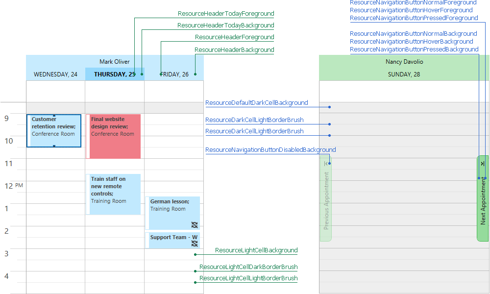
If the [SchedulerControl.GroupType](/WPF/DevExpress.Xpf.Scheduling.SchedulerControl.GroupType) property is set to **GroupByResource** or **GroupByDate**, the [BrushProvider](/WPF/DevExpress.Xpf.Scheduling.Common.BrushProviderBase) properties of the [IBrushTransform](/WPF/DevExpress.Xpf.Scheduling.Common.IBrushTransform) type define the transformations of the default brushes.
Show content
[ResourceHeaderForeground](/WPF/DevExpress.Xpf.Scheduling.Common.BrushProviderBase.ResourceHeaderForeground)
[ResourceHeaderBackground](/WPF/DevExpress.Xpf.Scheduling.Common.BrushProviderBase.ResourceHeaderBackground)
[ResourceHeaderBorderBrush](/WPF/DevExpress.Xpf.Scheduling.Common.BrushProviderBase.ResourceHeaderBorderBrush)
[ResourceHeaderTodayForeground](/WPF/DevExpress.Xpf.Scheduling.Common.BrushProviderBase.ResourceHeaderTodayForeground)
[ResourceHeaderTodayBackground](/WPF/DevExpress.Xpf.Scheduling.Common.BrushProviderBase.ResourceHeaderTodayBackground)
[ResourceHeaderTodayBorderBrush](/WPF/DevExpress.Xpf.Scheduling.Common.BrushProviderBase.ResourceHeaderTodayBorderBrush)
[ResourceNavigationButtonNormalForeground](/WPF/DevExpress.Xpf.Scheduling.Common.BrushProviderBase.ResourceNavigationButtonNormalForeground)
[ResourceNavigationButtonNormalBackground](/WPF/DevExpress.Xpf.Scheduling.Common.BrushProviderBase.ResourceNavigationButtonNormalBackground)
[ResourceNavigationButtonNormalBorderBrush](/WPF/DevExpress.Xpf.Scheduling.Common.BrushProviderBase.ResourceNavigationButtonNormalBorderBrush)
[ResourceNavigationButtonHoverForeground](/WPF/DevExpress.Xpf.Scheduling.Common.BrushProviderBase.ResourceNavigationButtonHoverForeground)
[ResourceNavigationButtonHoverBackground](/WPF/DevExpress.Xpf.Scheduling.Common.BrushProviderBase.ResourceNavigationButtonHoverBackground)
[ResourceNavigationButtonHoverBorderBrush](/WPF/DevExpress.Xpf.Scheduling.Common.BrushProviderBase.ResourceNavigationButtonHoverBorderBrush)
[ResourceNavigationButtonPressedForeground](/WPF/DevExpress.Xpf.Scheduling.Common.BrushProviderBase.ResourceNavigationButtonPressedForeground)
[ResourceNavigationButtonPressedBackground](/WPF/DevExpress.Xpf.Scheduling.Common.BrushProviderBase.ResourceNavigationButtonPressedBackground)
[ResourceNavigationButtonPressedBorderBrush](/WPF/DevExpress.Xpf.Scheduling.Common.BrushProviderBase.ResourceNavigationButtonPressedBorderBrush)
[ResourceNavigationButtonDisabledBackground](/WPF/DevExpress.Xpf.Scheduling.Common.BrushProviderBase.ResourceNavigationButtonDisabledBackground)
[ResourceNavigationButtonDisabledBorderBrush](/WPF/DevExpress.Xpf.Scheduling.Common.BrushProviderBase.ResourceNavigationButtonDisabledBorderBrush)
[ResourceLightCellBackground](/WPF/DevExpress.Xpf.Scheduling.Common.BrushProviderBase.ResourceLightCellBackground)
[ResourceLightCellLightBorderBrush](/WPF/DevExpress.Xpf.Scheduling.Common.BrushProviderBase.ResourceLightCellLightBorderBrush)
[ResourceLightCellDarkBorderBrush](/WPF/DevExpress.Xpf.Scheduling.Common.BrushProviderBase.ResourceLightCellDarkBorderBrush)
[ResourceDarkCellBackground](/WPF/DevExpress.Xpf.Scheduling.Common.BrushProviderBase.ResourceDarkCellBackground)
[ResourceDarkCellLightBorderBrush](/WPF/DevExpress.Xpf.Scheduling.Common.BrushProviderBase.ResourceDarkCellLightBorderBrush)
[ResourceDarkCellDarkBorderBrush](/WPF/DevExpress.Xpf.Scheduling.Common.BrushProviderBase.ResourceDarkCellDarkBorderBrush)
[ResourceLabelBrush](/WPF/DevExpress.Xpf.Scheduling.Common.BrushProviderBase.ResourceLabelBrush)
If the [SchedulerControl.GroupType](/WPF/DevExpress.Xpf.Scheduling.SchedulerControl.GroupType) property is set to **None**, appointments that have multiple associated resources and a transparent label are painted with the [BrushProvider.DefaultLabelBrush](/WPF/DevExpress.Xpf.Scheduling.Common.BrushProviderBase.DefaultLabelBrush).
### Customization
Use the [SchedulerControl.BrushProvider](/WPF/DevExpress.Xpf.Scheduling.SchedulerControl.BrushProvider) property to add customizations that override the default **BrushProvider** values in all themes. The Scheduler provides the following predefined transformations:
- [BrightnessBrushTransform](/WPF/DevExpress.Xpf.Scheduling.Common.BrightnessBrushTransform)
- [IdentityBrushTransform](/WPF/DevExpress.Xpf.Scheduling.Common.IdentityBrushTransform)
- [MultiplyBrushTransform](/WPF/DevExpress.Xpf.Scheduling.Common.MultiplyBrushTransform)
- [OverrideBrushTransform](/WPF/DevExpress.Xpf.Scheduling.Common.OverrideBrushTransform)
The example below shows how to override a default brush in all themes.
- XAML
<dxsch:SchedulerControl.BrushProvider>
    <dxsch:BrushProvider DefaultLabelBrush="LightBlue" />
</dxsch:SchedulerControl.BrushProvider>
The example below shows how to override a default brush and its transformation in the DXStyle theme.
- XAML
xmlns:dxscht="http://schemas.devexpress.com/winfx/2008/xaml/scheduling/themekeys"

 <UserControl.Resources>
     <dxsch:BrushProvider
         x:Key="{dxscht:SchedulerThemeKey ResourceKey=BrushProvider, ThemeName=DXStyle}"
         BasedOn="{DynamicResource {dxscht:SchedulerThemeKey ResourceKey=BrushProvider, ThemeName=DXStyle}}"
         DefaultHeaderTodayBackground="Red"
         ResourceHeaderTodayBackground="{dxsch:OverrideBrushTransform OverrideBrush=Green}"
         ResourceHeaderBackground="{dxsch:BrightnessBrushTransform Brightness=-0.5}"/>
 </UserControl.Resources>
The **BrushProvider** supports conditions. The following example illustrates how to override a brush transformation in the Timeline view:
- XAML
<dxsch:SchedulerControl.BrushProvider>
    <dxsch:BrushProvider>
        <dxsch:BrushProviderOverride
            ConditionViewType="TimelineView"
            ResourceHeaderBackground="{dxsch:BrightnessBrushTransform Brightness=-0.5}"/>
    </dxsch:BrushProvider>
</dxsch:SchedulerControl.BrushProvider>
## New and Legacy UI Styles
Starting with **v19.1**, the Scheduler uses the new **Outlook2019** UI style. The new style uses [resource](/WPF/119219/controls-and-libraries/scheduler/resources) colors and derived colors to paint the Scheduler’s elements. This improves readability and facilitates customization.

In **v18.2** and earlier, the Scheduler uses the **Classic** Scheduler UI style based on a fixed [theme](/WPF/7406/common-concepts/themes) color scheme.

To roll back to the Classic style, set the [DevExpress.Xpf.Core.CompatibilitySettings.SchedulerAppearanceStyle](/CoreLibraries/DevExpress.Xpf.Core.CompatibilitySettings.SchedulerAppearanceStyle) static property to **SchedulerAppearanceStyle.Classic**.
The **Classic** style has its own resource keys for resource and label palettes.
| Element | Resource key |
| --- | --- |
| Resources | **SchedulerThemeKeys.ResourceColors\_Classic** |
| Labels | **SchedulerThemeKeys.LabelColors\_Classic** |
See Also
[How To: Customize Cell Colors](/WPF/403705/controls-and-libraries/scheduler/examples/how-to-customize-cell-colors)