# Custom Fields | WPF Controls | DevExpress Documentation

Custom fields allow you to extend the set of properties of a persistent object, such as [Appointments](/WPF/119211/controls-and-libraries/scheduler/appointments), [Resources](/WPF/119219/controls-and-libraries/scheduler/resources), [Labels](/WPF/119214/controls-and-libraries/scheduler/appointments/labels) and [Statuses](/WPF/119215/controls-and-libraries/scheduler/appointments/statuses). You can define custom data fields, map them to custom properties of persistent objects and use these user-defined property values in your code.

To **create** a custom field mapping, perform the following steps:

- choose a name that is not on the list of the standard persistent object properties (see the [Mappings](/WPF/119493/controls-and-libraries/scheduler/data-binding/mappings) document)
- create a custom field mapping in XAML by declaring a [CustomFieldMapping](/WPF/DevExpress.Xpf.Scheduling.CustomFieldMapping) within the mappings
- use the selected name to specify the [CustomFieldMapping.Name](/WPF/DevExpress.Xpf.Scheduling.CustomFieldMapping.Name) property value

To **obtain** a custom field value, use the [SourceObjectContainer.CustomFields](/WPF/DevExpress.Xpf.Scheduling.SourceObjectContainer.CustomFields) property and access the required field by its name.

To explain the custom fields technique in more detail, consider the situation when a resource has an associated picture. To display the picture in the resource header, create a custom field that allows obtaining a picture using the [ResourceItem](/WPF/DevExpress.Xpf.Scheduling.ResourceItem) custom property value. The picture is contained in the **ResourceImage** field of the ResourceItem’s source object. The **Photo** will be the name of a custom property. The following code creates the required custom mapping:

[View Example](https://github.com/DevExpress-Examples/wpf-scheduler-display-custom-text-and-images-in-resource-headers)

- MainWindow.xaml

<section id="tabpanel_FyW6eoOLVK_tabid-xamlMainWindow-xaml" role="tabpanel" data-tab="tabid-xamlMainWindow-xaml">
<pre><code class="lang-xaml">&lt;dxsch:SchedulerControl.DataSource&gt;
    &lt;dxsch:DataSource ResourcesSource=&quot;{Binding MainResources}&quot;&gt;
        &lt;dxsch:DataSource.ResourceMappings&gt;
            &lt;dxsch:ResourceMappings
                Caption=&quot;Name&quot;
                Id=&quot;Id&quot;
                Visible=&quot;IsVisible&quot;&gt;
                &lt;dxsch:CustomFieldMapping Mapping=&quot;ResourceImage&quot; Name=&quot;Photo&quot; /&gt;
            &lt;/dxsch:ResourceMappings&gt;
        &lt;/dxsch:DataSource.ResourceMappings&gt;
    &lt;/dxsch:DataSource&gt;
&lt;/dxsch:SchedulerControl.DataSource&gt;
</code></pre></section>

To display an image in the resource header, create a custom data template in which use the **Resource.CustomFields.Photo** path for image data binding. Assign the data template to the [SchedulerViewBase.ResourceHeaderContentTemplate](/WPF/DevExpress.Xpf.Scheduling.SchedulerViewBase.ResourceHeaderContentTemplate) property.
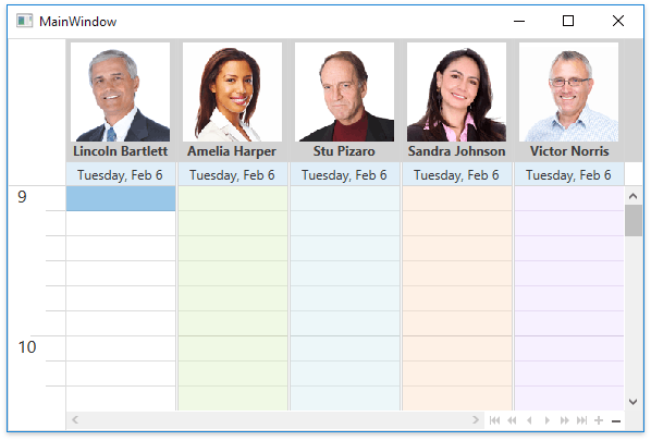
The following code defines a resource header’s data template.  It has a gray background, shows an image obtained using the **Custom Fields** and displays the [ResourceItem.Caption](/WPF/DevExpress.Xpf.Scheduling.ResourceItem.Caption) text with a custom font. The data template is assigned to the [SchedulerViewBase.ResourceHeaderContentTemplate](/WPF/DevExpress.Xpf.Scheduling.SchedulerViewBase.ResourceHeaderContentTemplate) property.

![ResourceHeadersWithImages](/WPF/images/resourceheaderswithimages132405.png)

[View Example](https://github.com/DevExpress-Examples/wpf-scheduler-display-custom-text-and-images-in-resource-headers)

- MainWindow.xaml

<section id="tabpanel_PSQSkGbvt6_tabid-xamlMainWindow-xaml" role="tabpanel" data-tab="tabid-xamlMainWindow-xaml">
<pre><code class="lang-xaml">&lt;Window.Resources&gt;
    &lt;DataTemplate x:Key=&quot;resourceHeaderContentTemplate&quot;&gt;
        &lt;Grid&gt;
            &lt;Grid.RowDefinitions&gt;
                &lt;RowDefinition Height=&quot;*&quot; /&gt;
                &lt;RowDefinition Height=&quot;Auto&quot; /&gt;
            &lt;/Grid.RowDefinitions&gt;
            &lt;Image
                MaxWidth=&quot;120&quot;
                MaxHeight=&quot;120&quot;
                HorizontalAlignment=&quot;Center&quot;
                DockPanel.Dock=&quot;Top&quot;
                RenderOptions.BitmapScalingMode=&quot;NearestNeighbor&quot;
                Source=&quot;{Binding Resource.CustomFields.Photo}&quot;
                Stretch=&quot;Uniform&quot; /&gt;
            &lt;StackPanel Grid.Row=&quot;1&quot;&gt;
                &lt;TextBlock
                    HorizontalAlignment=&quot;Center&quot;
                    FontWeight=&quot;Bold&quot;
                    Text=&quot;{Binding Resource.Caption}&quot; /&gt;
            &lt;/StackPanel&gt;
        &lt;/Grid&gt;
    &lt;/DataTemplate&gt;
    &lt;Style TargetType=&quot;dxschv:ResourceHeaderControl&quot;&gt;
        &lt;Setter Property=&quot;ContentOrientation&quot; Value=&quot;Horizontal&quot; /&gt;
        &lt;Setter Property=&quot;Background&quot; Value=&quot;LightGray&quot;/&gt;
    &lt;/Style&gt;
&lt;/Window.Resources&gt;
</code></pre></section>