# Displaying Glyphs | WPF Controls | DevExpress Documentation
You can display icons within bar items. Such icons are called glyphs. This topic explains how to display glyphs and configure their appearance, and contains the following sections.
- Specifying Glyphs
- Glyph Display Mode
- Glyphs Size
- Custom Glyph Size
- Hide and Display Glyphs in Popup Menus
Note
You can use the [DevExpress Image Picker](/WPF/120093/common-concepts/images/devexpress-image-gallery) to access a set of predefined icons.
## Specifying Glyphs
To specify a bar item’s glyph, use the [BarItem.Glyph](/WPF/DevExpress.Xpf.Bars.BarItem.Glyph) and [BarItem.LargeGlyph](/WPF/DevExpress.Xpf.Bars.BarItem.LargeGlyph) properties.
The resulting glyph depends on the available space.
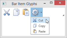
The following example demonstrates a toolbar that displays large glyphs and a submenu that displays small glyphs.
- XAML
<Window ...
        xmlns:dxb="http://schemas.devexpress.com/winfx/2008/xaml/bars"
        xmlns:dxc="http://schemas.devexpress.com/winfx/2008/xaml/core" >
    <Grid>
        <Grid.RowDefinitions>
            <RowDefinition Height="Auto"/>
            <RowDefinition Height="Auto"/>
        </Grid.RowDefinitions>
        <dxb:ToolBarControl Grid.Row="0" VerticalAlignment="Top">
            <dxb:BarButtonItem Name="itemCut" Content="Cut" Glyph="{dxc:DXImage Image=Cut_16x16.png}" LargeGlyph="{dxc:DXImage Image=Cut_32x32.png}"/>
            <dxb:BarButtonItem Name="itemCopy"  Content="Copy" Glyph="{dxc:DXImage Image=Copy_16x16.png}" LargeGlyph="{dxc:DXImage Image=Copy_32x32.png}"/>
            <dxb:BarButtonItem Name="itemPaste" Content="Paste" Glyph="{dxc:DXImage Image=Paste_16x16.png}" LargeGlyph="{dxc:DXImage Image=Paste_32x32.png}"/>
            <dxb:BarSubItem Content="SubItem" Glyph="{dxc:DXImage Image=Properties_16x16.png}" LargeGlyph="{dxc:DXImage Image=Properties_32x32.png}">
                <dxb:BarButtonItemLink BarItemName="itemCut"/>
                <dxb:BarButtonItemLink BarItemName="itemCopy"/>
                <dxb:BarButtonItemLink BarItemName="itemPaste"/>
            </dxb:BarSubItem>
        </dxb:ToolBarControl>
    </Grid>
</Window>
The following image demonstrates the result.
## Glyph Display Mode
You can specify the glyph visibility for individual bar items or entire toolbars and menus using the **BarItemDisplayMode** properties. The display mode specified for a child object overrides the display mode of a parent. The following table lists the properties that control the display mode of bar items. Properties that have the highest precedence are listed first.
| Property | Description |
| --- | --- |
| [BarItemLinkBase.BarItemDisplayMode](/WPF/DevExpress.Xpf.Bars.BarItemLinkBase.BarItemDisplayMode) | Specifies the glyph visibility for an individual bar item link represented by a [BarItemLink](/WPF/DevExpress.Xpf.Bars.BarItemLink) descendant. |
| [BarItem.BarItemDisplayMode](/WPF/DevExpress.Xpf.Bars.BarItem.BarItemDisplayMode) | Specifies the glyph visibility for an individual bar item represented by a [BarItem](/WPF/DevExpress.Xpf.Bars.BarItem) descendant. |
| [Bar.BarItemDisplayMode](/WPF/DevExpress.Xpf.Bars.Bar.BarItemDisplayMode) | Specifies the glyph visibility for all items within the[Bar](/WPF/DevExpress.Xpf.Bars.Bar) container. |
| [ToolBarControlBase.BarItemDisplayMode](/WPF/DevExpress.Xpf.Bars.ToolBarControlBase.BarItemDisplayMode) | Specifies glyph visibility for all items within a container represented by a [ToolBarControlBase](/WPF/DevExpress.Xpf.Bars.ToolBarControlBase) descendant. |
| [BarContainerControl.BarItemDisplayMode](/WPF/DevExpress.Xpf.Bars.BarContainerControl.BarItemDisplayMode) | Specifies the glyph visibility for all items within the [BarContainerControl](/WPF/DevExpress.Xpf.Bars.BarContainerControl). |
The **BarItemDisplayMode** property must be set to one of the [BarItemDisplayMode](/WPF/DevExpress.Xpf.Bars.BarItemDisplayMode) enumeration values. The following table lists the available options.
| **BarItemDisplayMode**
property value | Bar item appearance |
| --- | --- |
| **Default** | Bar items display a glyph within toolbars.
Bar items display both content and glyph within menus and ribbon. |
| **Content** | Bar items display content only. |
| **ContentAndGlyph** | Bar items display both content and glyph. |
Note
If the **BarItemDisplayMode** property is set for a container and an item within this container has the **Default** display mode, the container’s **BarItemDisplayMode** value is used for the item.
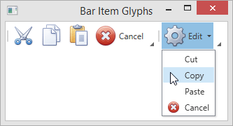
The following example demonstrates glyph visibility customizations and the **BarItemDisplayMode** property precedence.
- XAML
<Window ...
        xmlns:dxb="http://schemas.devexpress.com/winfx/2008/xaml/bars"
        xmlns:dxc="http://schemas.devexpress.com/winfx/2008/xaml/core">
    <Grid>
        <Grid.RowDefinitions>
            <RowDefinition Height="Auto"/>
            <RowDefinition Height="Auto"/>
        </Grid.RowDefinitions>
        <dxb:BarContainerControl Grid.Row="0" BarItemDisplayMode="Default">
            <dxb:Bar>
                <!-- The first 3 items display a glyph only-->
                <dxb:BarButtonItem Name="itemCut" Content="Cut" Glyph="{dxc:DXImage Image=Cut_16x16.png}" LargeGlyph="{dxc:DXImage Image=Cut_32x32.png}"/>
                <dxb:BarButtonItem Name="itemCopy"  Content="Copy" Glyph="{dxc:DXImage Image=Copy_16x16.png}" LargeGlyph="{dxc:DXImage Image=Copy_32x32.png}"/>
                <dxb:BarButtonItem Name="itemPaste" Content="Paste" Glyph="{dxc:DXImage Image=Paste_16x16.png}" LargeGlyph="{dxc:DXImage Image=Paste_32x32.png}"/>
                <!-- The "Cancel" item displays both content and glyph -->
                <dxb:BarButtonItem Name="itemCancel" Content="Cancel" Glyph="{dxc:DXImage Image=Cancel_16x16.png}" LargeGlyph="{dxc:DXImage Image=Cancel_32x32.png}" BarItemDisplayMode="ContentAndGlyph"/>
            </dxb:Bar>
            <dxb:Bar BarItemDisplayMode="Default">
                <!-- The "Edit" bar item displays both content and glyph -->
                <dxb:BarSubItem Content="Edit" Glyph="{dxc:DXImage Image=Properties_16x16.png}" LargeGlyph="{dxc:DXImage Image=Properties_32x32.png}" BarItemDisplayMode="ContentAndGlyph">
                    <!-- The first 3 items display content only -->
                    <dxb:BarButtonItemLink BarItemName="itemCut" BarItemDisplayMode="Content"/>
                    <dxb:BarButtonItemLink BarItemName="itemCopy" BarItemDisplayMode="Content"/>
                    <dxb:BarButtonItemLink BarItemName="itemPaste" BarItemDisplayMode="Content"/>
                    <!-- The "Cancel" item displays both content and glyph -->
                    <dxb:BarButtonItemLink BarItemName="itemCancel"/>
                </dxb:BarSubItem>
            </dxb:Bar>
        </dxb:BarContainerControl>
    </Grid>
</Window>
The following image demonstrates the result.
## Glyph Size
If you assign both small and large glyphs to a bar item, you can specify the glyph size explicitly.
The following table lists properties that allow you to specify the required glyph size for bar items and item containers.
| Property | Description |
| --- | --- |
| [BarItem.GlyphSize](/WPF/DevExpress.Xpf.Bars.BarItem.GlyphSize) | Specifies the glyph size for a specific bar item represented by an instance of [BarItem](/WPF/DevExpress.Xpf.Bars.BarItem) or its descendant. |
| [Bar.GlyphSize](/WPF/DevExpress.Xpf.Bars.Bar.GlyphSize) | Specifies the glyph size for all items within the [Bar](/WPF/DevExpress.Xpf.Bars.Bar) container. |
| [ToolBarControlBase.GlyphSize](/WPF/DevExpress.Xpf.Bars.ToolBarControlBase.GlyphSize) | Specifies the glyph size for all bar items within a container that is a [ToolBarControlBase](/WPF/DevExpress.Xpf.Bars.ToolBarControlBase) descendant. |
| [BarLinkContainerItem.SubItemsGlyphSize](/WPF/DevExpress.Xpf.Bars.BarLinkContainerItem.SubItemsGlyphSize) | Specifies the glyph size for all subitems within the [BarLinkContainerItem](/WPF/DevExpress.Xpf.Bars.BarLinkContainerItem) container and its descendants. |
| [BarSubItem.SubItemsGlyphSize](/WPF/DevExpress.Xpf.Bars.BarSubItem.SubItemsGlyphSize) | Specifies the glyph size for all bar items within the [BarSubItem](/WPF/DevExpress.Xpf.Bars.BarSubItem) container. |
| [BarManager.ToolbarGlyphSize](/WPF/DevExpress.Xpf.Bars.BarManager.ToolbarGlyphSize) | Specifies the glyph size for toolbar items within the [BarManager](/WPF/DevExpress.Xpf.Bars.BarManager) container. |
| [BarManager.MenuGlyphSize](/WPF/DevExpress.Xpf.Bars.BarManager.MenuGlyphSize) | Specifies the glyph size for menu items within the [BarManager](/WPF/DevExpress.Xpf.Bars.BarManager) container. |
| [BarItem.GlyphSize](/WPF/DevExpress.Xpf.Bars.BarItem.GlyphSize)
(via [RibbonGalleryBarItem](/WPF/DevExpress.Xpf.Ribbon.RibbonGalleryBarItem)**.GlyphSize**) | Specifies the glyph size for items within the [RibbonGalleryBarItem.DropDownMenuItems](/WPF/DevExpress.Xpf.Ribbon.RibbonGalleryBarItem.DropDownMenuItems) collection. |
The **GlyphSize** properties must be set to one of the [GlyphSize](/WPF/DevExpress.Xpf.Bars.GlyphSize) enumeration values. The following table lists the available options.
| **GlyphSize** property value | Resulting glyph |
| --- | --- |
| **Default** | In toolbars, bar items display large glyphs.
In menus, bar items display small glyphs. |
| **Large** | A bar item displays a glyph specified by the [BarItem.LargeGlyph](/WPF/DevExpress.Xpf.Bars.BarItem.LargeGlyph) property. |
| **Small** | A bar item displays a glyph specified by the [BarItem.Glyph](/WPF/DevExpress.Xpf.Bars.BarItem.Glyph) property. |
| **Custom** | The glyph size is specified by the [Size](https://learn.microsoft.com/dotnet/api/system.windows.size) value.
See Custom glyph size to learn more. |
Note
If the **GlyphSize** property is set for a container and an item within this container has the **Default** glyph size, the container’s **GlyphSize** value is used for the item.
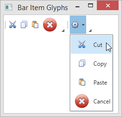
The following example demonstrates the **GlyphSize** property precedence.
- XAML
<Window ...
        xmlns:dxb="http://schemas.devexpress.com/winfx/2008/xaml/bars"
        xmlns:dxc="http://schemas.devexpress.com/winfx/2008/xaml/core">
    <Grid>
        <Grid.RowDefinitions>
            <RowDefinition Height="Auto"/>
            <RowDefinition Height="Auto"/>
        </Grid.RowDefinitions>
        <dxb:BarContainerControl Grid.Row="0">
            <!-- Small size is specified for the items within the bar -->
            <dxb:Bar GlyphSize="Small">
                <dxb:BarButtonItem Name="itemCut" Content="Cut" Glyph="{dxc:DXImage Image=Cut_16x16.png}" LargeGlyph="{dxc:DXImage Image=Cut_32x32.png}" GlyphSize="Default"/>
                <dxb:BarButtonItem Name="itemCopy"  Content="Copy" Glyph="{dxc:DXImage Image=Copy_16x16.png}" LargeGlyph="{dxc:DXImage Image=Copy_32x32.png}"/>
                <dxb:BarButtonItem Name="itemPaste" Content="Paste" Glyph="{dxc:DXImage Image=Paste_16x16.png}" LargeGlyph="{dxc:DXImage Image=Paste_32x32.png}"/>
                <!-- The "Cancel" bar item displays a large glyph -->
                <dxb:BarButtonItem Name="itemCancel" Content="Cancel"  Glyph="{dxc:DXImage Image=Cancel_16x16.png}" LargeGlyph="{dxc:DXImage Image=Cancel_32x32.png}" GlyphSize="Large" />
            </dxb:Bar>
            <!-- Large size is specified for the items within the bar -->
            <dxb:Bar GlyphSize="Large">
                <!-- The "Edit" bar item displays a small glyph -->
                <dxb:BarSubItem Content="Edit" Glyph="{dxc:DXImage Image=Properties_16x16.png}" LargeGlyph="{dxc:DXImage Image=Properties_32x32.png}" GlyphSize="Small">
                    <!-- The glyph size is specified by the corresponding bar items -->
                    <dxb:BarButtonItemLink BarItemName="itemCut"/>
                    <dxb:BarButtonItemLink BarItemName="itemCopy"/>
                    <dxb:BarButtonItemLink BarItemName="itemPaste"/>
                    <dxb:BarButtonItemLink BarItemName="itemCancel"/>
                </dxb:BarSubItem>
            </dxb:Bar>
        </dxb:BarContainerControl>
    </Grid>
</Window>
The following image demonstrates the result.
## Custom Glyph Size
If the **GlyphSize** property is set to **Custom**, you can set the exact width and height of the bar item’s glyph. To specify a custom glyph size, assign a [Size](https://learn.microsoft.com/dotnet/api/system.windows.size) value to one of the **CustomGlyphSize** properties.
The following table lists properties that allow you to specify the custom glyph size. Properties that have the highest precedence are listed first.
| Property | Description |
| --- | --- |
| [BarItemLinkBase.CustomGlyphSize](/WPF/DevExpress.Xpf.Bars.BarItemLinkBase.CustomGlyphSize) | Specifies the exact width and height of the [BarItemLink](/WPF/DevExpress.Xpf.Bars.BarItemLink)‘s glyph. |
| [BarItem.CustomGlyphSize](/WPF/DevExpress.Xpf.Bars.BarItem.CustomGlyphSize) | Specifies the exact width and height of the [BarItem](/WPF/DevExpress.Xpf.Bars.BarItem)‘s glyph. |
| [ILinksHolder.CustomItemsGlyphSize](/WPF/DevExpress.Xpf.Bars.ILinksHolder.CustomItemsGlyphSize) | Specifies the exact width and height of the glyph for all bar items within a container that is the [ILinksHolder](/WPF/DevExpress.Xpf.Bars.ILinksHolder) implementation. |
| [BarItemLinkHolderBase.CustomItemsGlyphSize](/WPF/DevExpress.Xpf.Bars.BarItemLinkHolderBase.CustomItemsGlyphSize) | Specifies the exact width and height of the glyph for all bar items within a container that is a [BarItemLinkHolderBase](/WPF/DevExpress.Xpf.Bars.BarItemLinkHolderBase) descendant. |
| [BarLinkContainerItem.SubItemsCustomGlyphSize](/WPF/DevExpress.Xpf.Bars.BarLinkContainerItem.SubItemsCustomGlyphSize) | Specifies the exact width and height of the glyph for all bar items within the [BarLinkContainerItem](/WPF/DevExpress.Xpf.Bars.BarLinkContainerItem) container and its descendants. |
| [BarSubItem.SubItemsCustomGlyphSize](/WPF/DevExpress.Xpf.Bars.BarSubItem.SubItemsCustomGlyphSize) | Specifies the exact width and height of the glyph for all bar items within the [BarSubItem](/WPF/DevExpress.Xpf.Bars.BarSubItem) container. |
| [BarItem.CustomGlyphSize](/WPF/DevExpress.Xpf.Bars.BarItem.CustomGlyphSize)
(via [RibbonGalleryBarItem](/WPF/DevExpress.Xpf.Ribbon.RibbonGalleryBarItem)**.CustomGlyphSize**) | Specifies the exact width and height of the glyph for items within the [RibbonGalleryBarItem.DropDownMenuItems](/WPF/DevExpress.Xpf.Ribbon.RibbonGalleryBarItem.DropDownMenuItems) collection. |
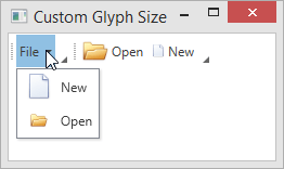
The following example illustrates the bar item glyph size customization capabilities.
- XAML
<Window
        xmlns="http://schemas.microsoft.com/winfx/2006/xaml/presentation"
        xmlns:x="http://schemas.microsoft.com/winfx/2006/xaml"
        xmlns:d="http://schemas.microsoft.com/expression/blend/2008"
        xmlns:mc="http://schemas.openxmlformats.org/markup-compatibility/2006"
        xmlns:dxb="http://schemas.devexpress.com/winfx/2008/xaml/bars"
        xmlns:dxc="http://schemas.devexpress.com/winfx/2008/xaml/core"
        x:Class="CustomGlyphSizeTestApp.MainWindow"
        mc:Ignorable="d"
        Title="Custom Glyph Size" Height="350" Width="525">
    <Grid>
        <dxb:BarManager VerticalAlignment="Top">
            <dxb:BarManager.Bars>
                <dxb:Bar>
                     <!--BarSubItem.SubItemsCustomGlyphSize property specifies the glyph size for its items. -->
                    <dxb:BarSubItem x:Name="barFile" Content="File"
                                    SubItemsCustomGlyphSize="24,24" SubItemsGlyphSize="Custom" >
                        <!-- The item's glyph size (24x24) is specified by the container's SubItemsCustomGlyphSize property. -->
                        <dxb:BarButtonItem x:Name="barNew" Content="New" Glyph="{dxc:DXImage Image=New_32x32.png}"
                                           BarItemDisplayMode="ContentAndGlyph" GlyphSize="Custom"/>
                        <!-- The BarButtonItem.CustomGlyphSize property has higher precedence than the container's SubItemsCustomGlyphSize property. -->
                        <!-- The item's size is 16x16. -->
                        <dxb:BarButtonItem x:Name="barOpen" Content="Open"  Glyph="{dxc:DXImage Image=Open_32x32.png}"
                                           BarItemDisplayMode="ContentAndGlyph" GlyphSize="Custom" CustomGlyphSize="16,16"/>
                    </dxb:BarSubItem>
                </dxb:Bar>
                <dxb:Bar>
                     <!-- The BarButtonItemLink.CustomGlyphSize property has the highest precedence. -->
                    <dxb:BarButtonItemLink BarItemName="barOpen" CustomGlyphSize="24,24"/>
                    <dxb:BarButtonItemLink BarItemName="barNew" CustomGlyphSize="12,12"/>
                </dxb:Bar>
            </dxb:BarManager.Bars>
        </dxb:BarManager>
    </Grid>
</Window>
## Hide and Display Glyphs in Popup Menus
Use the [BarManager.ShowGlyphsInPopupMenus](/WPF/DevExpress.Xpf.Bars.BarManager.ShowGlyphsInPopupMenus) attached property to display or hide the popup bar item’s glyph.
You can apply the [BarManager.ShowGlyphsInPopupMenus](/WPF/DevExpress.Xpf.Bars.BarManager.ShowGlyphsInPopupMenus) attached property for the following items:
- Bar containers: [BarContainerControl](/WPF/DevExpress.Xpf.Bars.BarContainerControl), [ToolBarControl](/WPF/DevExpress.Xpf.Bars.ToolBarControl), [MainMenuControl](/WPF/DevExpress.Xpf.Bars.MainMenuControl), [StatusBarControl](/WPF/DevExpress.Xpf.Bars.StatusBarControl).
- Nested menu owners: [BarSubItem](/WPF/DevExpress.Xpf.Bars.BarSubItem), [BarSplitButtonItem](/WPF/DevExpress.Xpf.Bars.BarSplitButtonItem), [BarSplitCheckItem](/WPF/DevExpress.Xpf.Bars.BarSplitCheckItem).
When applied the property to the item, elements in nested menus will show/hide glyphs in accordance with the property value.
Note
Applying the [BarManager.ShowGlyphsInPopupMenus](/WPF/DevExpress.Xpf.Bars.BarManager.ShowGlyphsInPopupMenus) attached property to individual items in a popup menu does not cause any changes.
When setting the property on [BarSplitButtonItem](/WPF/DevExpress.Xpf.Bars.BarSplitButtonItem) and on the nested [PopupMenu](/WPF/DevExpress.Xpf.Bars.PopupMenu), the value set on the popup menu has the higher priority.
The [BarManager.ShowGlyphsInPopupMenus](/WPF/DevExpress.Xpf.Bars.BarManager.ShowGlyphsInPopupMenus) attached property value is not taken into account in the following cases.
- Showing items in the radial menu.
- Showing items horizontally in the simple popup menu (using the [BarItemMenuHeader](/WPF/DevExpress.Xpf.Bars.BarItemMenuHeader) with the **Orientation** property set to **Horizontal**).
Tip
You can use the [BarManager.ShowGlyphsInPopupMenus](/WPF/DevExpress.Xpf.Bars.BarManager.ShowGlyphsInPopupMenus) property to hide the space reserved for the menu item glyphs when the items’ glyphs are not specified.
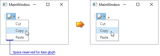
The following example demonstrates the [BarManager.ShowGlyphsInPopupMenus](/WPF/DevExpress.Xpf.Bars.BarManager.ShowGlyphsInPopupMenus) property set for a [BarSubItem](/WPF/DevExpress.Xpf.Bars.BarSubItem) object.
- XAML
<Window ...
        xmlns:dxc="http://schemas.devexpress.com/winfx/2008/xaml/core"
        xmlns:dxb="http://schemas.devexpress.com/winfx/2008/xaml/bars" x:Class="barmanager.MainWindow">
    <Grid>
        <dxb:BarManager CreateStandardLayout="True" Margin="12" Name="barManager1">
            <dxb:BarManager.Items>
                <dxb:BarSubItem dxb:BarManager.ShowGlyphsInPopupMenus="False" Content="Edit" x:Name="subMenu1"  Glyph="{dxc:DXImage Image=Edit_16x16.png}">
                    <dxb:BarButtonItem x:Name="itemCut" Content="Cut" Glyph="{dxc:DXImage Image=Cut_16x16.png}"/>
                    <dxb:BarButtonItem x:Name="itemCopy" Content="Copy" Glyph="{dxc:DXImage Image=Copy_16x16.png}"/>
                    <dxb:BarButtonItem x:Name="itemPaste" Content="Paste" Glyph="{dxc:DXImage Image=Paste_16x16.png}"  />
                </dxb:BarSubItem>
            </dxb:BarManager.Items>
            <dxb:BarManager.Bars>
                <dxb:Bar x:Name="bar1" Caption="Bar 1">
                    <dxb:Bar.DockInfo>
                        <dxb:BarDockInfo ContainerType="Top" />
                    </dxb:Bar.DockInfo>
                    <dxb:Bar.ItemLinks>
                        <dxb:BarSubItemLink BarItemName="subMenu1" />
                        <dxb:BarButtonItemLink BarItemName="itemCut"/>
                        <dxb:BarButtonItemLink BarItemName="itemCopy"/>
                        <dxb:BarButtonItemLink BarItemName="itemPaste"/>
                    </dxb:Bar.ItemLinks>
                </dxb:Bar>
            </dxb:BarManager.Bars>
        </dxb:BarManager>
    </Grid>
</Window>