ReportCommand Enum
Specifies the commands which can be executed in the report’s End-User Designer.
Namespace: DevExpress.XtraReports.UserDesigner
Assembly: DevExpress.XtraReports.v19.1.Extensions.dll
NuGet Package: DevExpress.Win.Reporting
Declaration
Members
| Name | Description |
|---|---|
None
|
Doesn’t identify any command. This member is intended for internal use only. |
EditFavoriteProperties
|
Invokes the Favorite Properties Editor that allows editing favorite properties. This command is available in the Property Grid’s context menu. |
NewReport
|
Creates a new blank report. This command is represented both via the menu item and toolbar button.
|
NewReportWizard
|
Creates a new blank report and runs the XtraReports Wizard to customize it. This command is represented via the menu item only. |
OpenFile
|
Opens a report. This command is represented both via the menu item and toolbar button.
|
SaveFile
|
Saves the report (which is shown in the currently active Design Panel) to a file. This command is represented both via the menu item and toolbar button.
|
SaveFileAs
|
Invokes the Save As dialog to save a report with a new name. This command is represented via the menu item only. |
SaveAll
|
Saves all existing reports (which are shown in all Design Panels) to files. This command is represented via both the menu item and toolbar button.
|
Exit
|
Closes the form containing the current XRDesignPanel control which executes this command. Note that if you hide this command, then all menu items and toolbar buttons associated with it will become unavailable. |
MdiCascade
|
When the window interface is enabled in an MDI End-User Designer form, arranges Design Panel windows in cascade. |
MdiTileHorizontal
|
When the window interface is enabled in an MDI End-User Designer form, tiles Design Panel windows horizontally. |
MdiTileVertical
|
When the window interface is enabled in an MDI End-User Designer form, tiles Design Panel windows vertically. |
ShowTabbedInterface
|
Enables the tabbed interface for Design Panels in an MDI End-User Designer form. |
ShowWindowInterface
|
Enables the window interface for Design Panels in an MDI End-User Designer form. |
Closing
|
This command should be handled when overriding saving in the End-User Designer. Note that you don’t need to either change its visibility or execute it, otherwise the result may be unpredictable. |
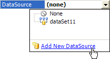
AddNewDataSource
|
Invokes the data source Wizard which allows end-users to provide data for a report, as it has been invoked by the Add New data source verb available in the XtraReport.DataSource property editor. Note that if you hide this command, an end-user will be unable to create a new data source for a report.
|
AddParameter
|
Invokes the Add New Parameter dialog that allows you to create a report parameter. This command is available in the ribbon toolbar. |
AddCalculatedField
|
Invokes the editor to add a new calculated field. This command is available in the ribbon toolbar. |
ApplyDataSource
|
|
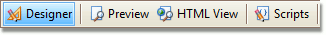
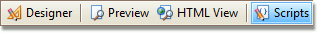
ShowDesignerTab
|
Switches the XRDesignPanel to its Designer tab, as it has been switched via the Designer button at the bottom of the design surface. Note that if you hide this command, this button will be unavailable.
|
ShowScriptsTab
|
Switches the XRDesignPanel to its Scripts tab, as it has been switched via the Designer button at the bottom of the design surface. Note that if you hide this command, this button will be unavailable.
|
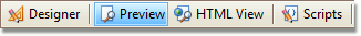
ShowPreviewTab
|
Switches the XRDesignPanel to its Preview tab, as it has been switched via the Preview button at the bottom of the design surface. Note that if you hide this command, this button will be unavailable.
|
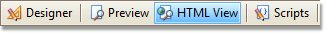
ShowHTMLViewTab
|
Switches the XRDesignPanel to its HTML View tab, as it has been switched via the HTML View button at the bottom of the design surface. Note that if you hide this command, this button will be unavailable.
|
Undo
|
Undoes the last operation. This command is represented both via the menu item and toolbar button.
|
Redo
|
Redoes the last operation which has been previously undone by the Undo command. This command is represented both via the menu item and toolbar button.
|
Close
|
Closes the active Design Panel in an MDI End-User Designer form. |
OpenSubreport
|
For use only by Report and Dashboard Server. |
CheckIn
|
For use only by Report and Dashboard Server. |
UndoCheckOut
|
For use only by Report and Dashboard Server. |
OpenRemoteReport
|
For use only by Report and Dashboard Server. |
UploadNewRemoteReport
|
For use only by Report and Dashboard Server. |
RevertToRevision
|
For use only by Report and Dashboard Server. |
Logout
|
|
ScriptsValidate
|
Checks whether report scripts contain errors. This command is available in the Script Editor‘s ribbon toolbar. |
ScriptsSelectControl
|
Selects a control for specifying an event. This command is available in the Script Editor‘s ribbon toolbar. |
ScriptsSelectEvent
|
Selects the specified events. This command is available in the Script Editor‘s ribbon toolbar. |
DrawWatermark
|
Shows/hides the document’s watermark on the report surface. This command is available in the ribbon toolbar. |
DrawGridLines
|
Shows/hides gridlines on the report surface. This command is available in the ribbon toolbar. |
SnapToGrid
|
Enables/disables snapping to the snap grid. This command is available in the ribbon toolbar. |
SnapLines
|
Enables/disables snapping using snap lines. This command is available in the ribbon toolbar. |
PageSize
|
Sets the specified paper size for a report. This command is available in the ribbon toolbar. |
PageOrientation
|
Sets the portrait or landscape page layout. This command is available in the ribbon toolbar. |
PageMargins
|
Sets the specified margin sizes for a report. This command is available in the ribbon toolbar. |
PageColor
|
Sets the specified background color for report pages. This command is available in the ribbon toolbar. |
PageWatermark
|
Inserts a ghost text or image behind the page content. This command is available in the ribbon toolbar. |
PageSetup
|
Invokes the Page Setup dialog that allows customizing the paper size and page margins. This command is available in the ribbon toolbar. |
ExtractStyle
|
Creates a new style based on the specified control’s appearance settings. This command is available in the ribbon toolbar. |
EditStyles
|
Invokes the Styles Editor that allows managing report styles. This command is available in the ribbon toolbar. |
ShowPrintingWarnings
|
Highlights report controls that overrun the right page margin to warn you about extra pages when printing the document. |
ShowExportWarnings
|
Highlights intersecting report controls to warn you about the possibility of corrupting the document layout when exporting the document to specific formats. |
AddToGallery
|
Adds the selected element(s) to the Report Gallery. This command is available in the context menu of report controls, styles, data sources and a report. |
ApplyLayoutToReport
|
Applies a report layout selected in the Report Gallery to the current report. This command is available in a report layout’s context menu. |
ApplyLayoutToBand
|
|
AddToReportStyleSheet
|
Adds a style selected in the Report Gallery to the current report’s style sheet. This command is available in a style’s context menu. |
AddToReportComponents
|
Adds the data source selected in the Report Gallery to the current report. This command is available in a data source’s context menu. |
AddGalleryFolder
|
Adds a new folder to the selected category of the Report Gallery. This command is available in a category’s context menu. |
CutGalleryItem
|
Deletes the selected Report Gallery item and copies it to the clipboard. This command is available in the item’s context menu. |
CopyGalleryItem
|
Copies the selected Report Gallery item to the clipboard. This command is available in the item’s context menu. |
PasteGalleryItem
|
Adds the item from the clipboard to the Report Gallery. This command is available in a node’s context menu. |
DeleteGalleryItem
|
Deletes the selected Report Gallery item. This command is available in the item’s context menu. |
MoveGalleryItem
|
|
RenameGalleryItem
|
Renames the selected Report Gallery item. This command is available in the item’s context menu. |
SaveGalleryAs
|
Saves Report Gallery templates to the specified file. This command is available in a Report Gallery’s context menu. |
LoadGallery
|
Loads Report Gallery templates from the selected file. This command is available in a Report Gallery’s context menu. |
RefreshGallery
|
|
FitTextToBounds
|
Adjusts the control’s font size to fit the control boundaries. This command is available in the context menu of XRLabel and XRTableCell and in the ribbon’s Text contextual tab. |
FitBoundsToText
|
Adjusts the control’s size to fit its text. This command is available in the context menu of XRLabel and XRCharacterComb and in the ribbon’s Text contextual tab. |
FitBoundsToContainer
|
Adjusts the control’s size to fit its parent container. This command is available in the control context menu and in the ribbon toolbar. |
Cut
|
Deletes the currently selected control(s) and copies it to the clipboard. This command is represented via the menu item, toolbar button and context menu item.
|
Copy
|
Copies the selected control(s) to the clipboard. This command is represented via the menu item, toolbar button and context menu item.
|
Paste
|
Adds the control(s) from the clipboard to the report. This command is represented via the menu item, toolbar button and context menu item.
|
Delete
|
Deletes the currently selected control(s). This command is represented via the menu item and context menu item. |
SelectAll
|
Selects all the controls in the report. This command is represented via the menu item only. |
AlignLeft
|
Aligns the selected controls to the left. This command is represented both via the menu item and toolbar button.
|
AlignTop
|
Aligns the tops of the selected controls. This command is represented both via the menu item and toolbar button.
|
AlignRight
|
Aligns the selected controls to the right. This command is represented both via the menu item and toolbar button.
|
AlignBottom
|
Aligns the bottoms of the selected controls. This command is represented both via the menu item and toolbar button.
|
AlignVerticalCenters
|
Aligns the centers of the selected controls vertically. This command is represented both via the menu item and toolbar button.
|
AlignHorizontalCenters
|
Aligns the centers of the selected controls horizontally. This command is represented both via the menu item and toolbar button.
|
AlignToGrid
|
Aligns the positions of the selected controls to the grid. This command is represented both via the menu item and toolbar button.
|
SizeToGrid
|
Sizes the selected controls to the grid. This command is represented both via the menu item and toolbar button.
|
SizeToControl
|
Makes the selected controls to be of the same size. This command is represented both via the menu item and toolbar button.
|
SizeToControlHeight
|
Makes the selected controls have the same height. This command is represented both via the menu item and toolbar button.
|
SizeToControlWidth
|
Makes the selected controls have the same width. This command is represented both via the menu item and toolbar button.
|
HorizSpaceConcatenate
|
Removes the horizontal spacing between the selected controls. This command is represented both via the menu item and toolbar button.
|
HorizSpaceDecrease
|
Decreases the horizontal spacing between the selected controls. This command is represented both via the menu item and toolbar button.
|
HorizSpaceIncrease
|
Increases the horizontal spacing between the selected controls. This command is represented both via the menu item and toolbar button.
|
HorizSpaceMakeEqual
|
Makes the horizontal spacing between the selected controls equal. This command is represented both via the menu item and toolbar button.
|
VertSpaceConcatenate
|
Removes the vertical spacing between the selected controls. This command is represented both via the menu item and toolbar button.
|
VertSpaceDecrease
|
Decreases the vertical spacing between the selected controls. This command is represented both via the menu item and toolbar button.
|
VertSpaceIncrease
|
Increases the vertical spacing between the selected controls. This command is represented both via the menu item and toolbar button.
|
VertSpaceMakeEqual
|
Makes the vertical spacing between the selected controls equal. This command is represented both via the menu item and toolbar button.
|
CenterVertically
|
Vertically centers the selected controls within a band. This command is represented both via the menu item and toolbar button.
|
CenterHorizontally
|
Horizontally centers the selected controls within a band. This command is represented both via the menu item and toolbar button.
|
BringToFront
|
Brings the selected control(s) to the front. This command is represented via the menu item, toolbar button and context menu item.
|
SendToBack
|
Moves the selected control(s) to the back. This command is represented via the menu item, toolbar button and context menu item.
|
FontBold
|
Makes the font bold. This command is represented both via the menu item and toolbar button.
|
FontItalic
|
Makes the font italic. This command is represented both via the menu item and toolbar button.
|
FontUnderline
|
Underlines the font. This command is represented both via the menu item and toolbar button.
|
FontStrikeout
|
Crosses the text out by drawing a line through it. This command is available in the ribbon toolbar. |
FontName
|
Sets the specified font name to the XRControl.Font property of the currently selected control(s), as it has been changed by the Font Name edit box which is shown in the Formatting Toolbar. Note that if you hide this command, then the Font Name edit box will be unavailable.
|
FontSize
|
Sets the specified font size to the XRControl.Font property of the currently selected control(s), as it has been changed by the Font Size edit box which is shown in the Formatting Toolbar. Note that if you hide this command, then the Font Size edit box will be unavailable.
|
ForeColor
|
Sets the foreground color of the selected control(s). This command is represented both via the menu item and toolbar button.
|
BackColor
|
Sets the background color of the selected control(s). This command is represented both via the menu item and toolbar button.
|
StyleName
|
Sets the specified style name. This command is available in the ribbon toolbar. |
JustifyLeft
|
Aligns the control’s text to the left. This command is represented both via the menu item and toolbar button.
|
JustifyCenter
|
Aligns the control’s text to the center. This command is represented both via the menu item and toolbar button.
|
JustifyRight
|
Aligns the control’s text to the right. This command is represented both via the menu item and toolbar button.
|
JustifyJustify
|
Justifies the control’s text. This command is represented both via the menu item and toolbar button.
|
VertAlignTop
|
Aligns text to the top. This command is available in the ribbon toolbar. |
VertAlignMiddle
|
Centers text between the top and bottom. This command is available in the ribbon toolbar. |
VertAlignBottom
|
Aligns text to the bottom. This command is available in the ribbon toolbar. |
BordersAll
|
Adds all borders to the selected control(s). This command is available in the ribbon toolbar. |
BordersNone
|
Removes borders from the selected control(s). This command is available in the ribbon toolbar. |
BorderLeft
|
Adds the left border to the selected control(s). This command is available in the ribbon toolbar. |
BorderTop
|
Adds the top border to the selected control(s). This command is available in the ribbon toolbar. |
BorderRight
|
Adds the right border to the selected control(s). This command is available in the ribbon toolbar. |
BorderBottom
|
Adds the bottom border to the selected control(s). This command is available in the ribbon toolbar. |
BorderColor
|
Sets the specified border color. This command is available in the ribbon toolbar. |
BorderWidth
|
Sets the specified border width. This command is available in the ribbon toolbar. |
BorderDashStyle
|
Sets the specified border dash style. This command is available in the ribbon toolbar. |
InsertTopMarginBand
|
Inserts the Top Margin band into a report. This command is represented via the context menu item only. |
InsertBottomMarginBand
|
Inserts the Bottom Margin band into a report. This command is represented via the context menu item only. |
InsertReportHeaderBand
|
Inserts the Report Header band into a report. This command is represented via the context menu item only. |
InsertReportFooterBand
|
Inserts the Report Footer band into a report. This command is represented via the context menu item only. |
InsertPageHeaderBand
|
Inserts the Page Header band into a report. This command is represented via the context menu item only. |
InsertPageFooterBand
|
Inserts the Page Footer band into a report. This command is represented via the context menu item only. |
InsertGroupHeaderBand
|
Inserts the Group Header band into a report. This command is represented via the context menu item only. |
InsertGroupFooterBand
|
Inserts the Group Footer band into a report. This command is represented via the context menu item only. |
InsertDetailBand
|
Inserts the Detail band into a report. This command is represented via the context menu item only. |
InsertDetailReport
|
Inserts the Detail Report band into a report. This command is represented via the context menu item only. |
InsertVerticalDetailBand
|
Inserts the Vertical Detail band into a report. This command is available in the context menu item only. |
InsertVerticalHeaderBand
|
Inserts the Vertical Header band into a report. This command is available in the context menu item only. |
InsertVerticalTotalBand
|
Inserts the Vertical Total band into a report. This command is available in the context menu item only. |
InsertSubBand
|
Inserts a SubBand into a report. This command is available from the context menu only. It is not available in TopMarginBand, BottomMarginBand and VerticalBand. |
BandMoveUp
|
Identifies the Move Up item of the context menu. This menu is invoked if an end-user right-clicks a band of either the BandKind.GroupHeader, BandKind.GroupFooter or BandKind.DetailReport kind. If you hide this command, then the Move Up menu item will be hidden. |
BandMoveDown
|
Identifies the Move Down item of the context menu. This menu is invoked if an end-user right-clicks a band of either the BandKind.GroupHeader, BandKind.GroupFooter or BandKind.DetailReport kind. If you hide this command, then the Move Down menu item will be hidden. |
TableSelectTable
|
Selects the entire table. This command is available in the Table‘s ribbon contextual tabs. |
TableSelectRow
|
Selects the current row. This command is available in the Table‘s ribbon contextual tabs. |
TableSelectColumn
|
Selects the current column. This command is available in the Table‘s ribbon contextual tabs. |
TableInsertRowAbove
|
Adds a new row directly above the current row. This command is available in the table element’s context menu and in the Table‘s ribbon contextual tabs. |
TableInsertRowBelow
|
Adds a new row directly below the current row. This command is available in the table element’s context menu and in the Table‘s ribbon contextual tabs. |
TableInsertColumnToLeft
|
Adds a new column directly to the left of the current column. This command is available in the table element’s context menu and in the Table‘s ribbon contextual tabs. |
TableInsertColumnToRight
|
Adds a new column directly to the right of the current column. This command is available in the table element’s context menu and in the Table‘s ribbon contextual tabs. |
TableInsertCell
|
Inserts a table cell to the right of the currently selected cell. This command is available in the table cell’s context menu. |
TableSplitCells
|
Splits the selected cells into the specified number of rows or columns. This command is available in the Table‘s ribbon contextual tabs. |
TableMergeCells
|
Merges multiple selected cells into one cell. This command is available in the Table‘s ribbon contextual tabs. |
TableDeleteTable
|
Deletes the entire table. This command is available in the table cell’s context menu and in the Table‘s ribbon contextual tabs. |
TableDeleteRow
|
Deletes the currently selected table row. This command is available in the table element’s context menu and in the Table‘s ribbon contextual tabs. |
TableDeleteColumn
|
Deletes the currently selected table column. This command is available in the table element’s context menu and in the Table‘s ribbon contextual tabs. |
TableDeleteCell
|
Deletes the currently selected table cell. This command is available in the table cell’s context menu and in the Table‘s ribbon contextual tabs. |
TableDistributeRowsEvenly
|
Distributes selected table rows so that they have the same size. This command is available in the context menu of a table, rows and multiple selected table elements as well as in the Table‘s ribbon contextual tabs. |
TableDistributeColumnsEvenly
|
Distributes selected table columns so that they have the same size. This command is available in the context menu of a table, rows and multiple selected table elements as well as in the Table‘s ribbon contextual tabs. |
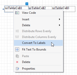
TableConvertToLabels
|
Converts the selected XRTableCell objects to XRLabel controls.
|
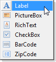
BindFieldToXRLabel
|
Identifies the XRLabel item of the context menu. This menu is invoked after drag-and-dropping any Field List item with the right mouse click. If you hide this command, then the XRLabel menu item will be hidden. Note that if you execute this command, it does nothing.
|
BindFieldToXRPictureBox
|
Identifies the XRPictureBox item of the context menu. This menu is invoked after drag-and-dropping any Field List item with the right mouse click. If you hide this command, then the XRPictureBox menu item will be hidden. Note that if you execute this command, it does nothing.
|
BindFieldToXRRichText
|
Identifies the XRRichText item of the context menu. This menu is invoked after drag-and-dropping any Field List item with the right mouse click. If you hide this command, then the XRRichText menu item will be hidden. Note that if you execute this command, it does nothing.
|
BindFieldToXRCheckBox
|
Identifies the XRCheckBox item of the context menu. This menu is invoked after drag-and-dropping any Field List item with the right mouse click. If you hide this command, then the XRCheckBox menu item will be hidden. Note that if you execute this command, it does nothing.
|
BindFieldToXRBarCode
|
Identifies the XRBarCode item of the context menu. This menu is invoked after drag-and-dropping any Field List item with the right mouse click. If you hide this command, then the XRBarCode menu item will be hidden. Note that if you execute this command, it does nothing.
|
BindFieldToXRZipCode
|
Identifies the XRZipCode item of the context menu. This menu is invoked after drag-and-dropping any Field List item with the right mouse click. If you hide this command, then the XRZipCode menu item will be hidden. Note that if you execute this command, it does nothing.
|
PropertiesWindow
|
Invokes the Properties window for the currently selected control(s). This command is represented via the context menu item only.
|
BarCodeAutoModule
|
Enables/disables automatic calculation of the bar width depending on the bar code’s size. This command is available in the Bar Code‘s ribbon contextual tab. |
BarCodeShowText
|
Displays/hides accompanying text in a bar code. This command is available in the Bar Code‘s ribbon contextual tab. |
BarCodeSymbology
|
Sets the specified bar code symbology. This command is available in the Bar Code‘s ribbon contextual tab. |
ChartRunDesigner
|
Runs the Chart Designer that allows creating and editing properties of a chart and its elements. This command is available in the Chart‘s ribbon contextual tab. |
ChartAddDataSource
|
Invokes the Data Source Wizard to set up a data source for a chart. This command is available in the Chart‘s ribbon contextual tab. |
ChartLoad
|
Invokes the Open dialog that allows you to load a chart from an XML file. This command is available in the Chart‘s ribbon contextual tab. |
ChartSave
|
Invokes the Save dialog that allows you to save a chart to an XML file. This command is available in the Chart‘s ribbon contextual tab. |
ChartAddSeriesViewBar
|
Adds a bar series to a chart to display values as vertical columns grouped by categories. This command is available in the Chart‘s ribbon contextual tab. |
ChartAddSeriesViewLine
|
Adds a line series to a chart to show line trends over time or categories. This command is available in the Chart‘s ribbon contextual tab. |
ChartAddSeriesViewArea
|
Adds an area series to a chart to display values as a filled area with peaks and hollows. This command is available in the Chart‘s ribbon contextual tab. |
ChartAddSeriesViewRange
|
Adds a series to a chart to display a range of values with the minimum and maximum limits. This command is available in the Chart‘s ribbon contextual tab. |
ChartAddSeriesViewPieAndDoughnut
|
Adds a series to a chart to display the percentage values of different point arguments to compare their significance. This command is available in the Chart‘s ribbon contextual tab. |
ChartAddSeriesViewRadarAndPolar
|
Adds a series to a chart to display values as a circular graph. This command is available in the Chart‘s ribbon contextual tab. |
ChartAddSeriesViewOther
|
Adds the specified series to a chart. This command is available in the Chart‘s ribbon contextual tab. |
ChartEditSeries
|
Invokes the Series Collection Editor that allows managing chart series. This command is available in the Chart‘s ribbon contextual tab. |
ChartRemoveSeries
|
Removes the specified series from a chart. This command is available in the Chart‘s ribbon contextual tab. |
ChartAddTextAnnotation
|
Adds a text annotation to a chart. This command is available in the Chart‘s ribbon contextual tab. |
ChartAddImageAnnotation
|
Adds an image annotation to a chart. This command is available in the Chart‘s ribbon contextual tab. |
ChartEditAnnotations
|
Invokes the Annotation Collection Editor that allows managing a chart’s text and image annotations. This command is available in the Chart‘s ribbon contextual tab. |
ChartRemoveAnnotation
|
Removes the specified annotation from a chart. This command is available in the Chart‘s ribbon contextual tab. |
ChartAppearanceName
|
Sets the specified appearance name for a chart. This command is available in the Chart‘s ribbon contextual tab. |
ChartPaletteName
|
Sets the specified palette for painting a chart’s series. This command is available in the Chart‘s ribbon contextual tab. |
ChartEditPalettes
|
Invokes the Palettes Collection Editor that allows managing chart palettes. This command is available in the Chart‘s ribbon contextual tab. |
PivotGridRunDesigner
|
Runs the Pivot Grid Designer that allows customizing fields, the control’s layout, appearance settings and printing options. This command is available in the Pivot Grid‘s ribbon contextual tab. |
PivotGridAddDataSource
|
Runs the Data Source Wizard that allows you to set up a data source for a Pivot Grid. This command is available in the Pivot Grid‘s ribbon contextual tab. |
PivotGridAddField
|
Adds a new Pivot Grid field to the specified header area. This command is available in the Pivot Grid‘s ribbon contextual tab. |
PivotGridRemoveField
|
Removes the selected Pivot Grid field. This command is available in the Pivot Grid‘s ribbon contextual tab. |
PivotGridVerticalLines
|
Prints/hides vertical grid lines. This command is available in the Pivot Grid‘s ribbon contextual tab. |
PivotGridHorizontalLines
|
Prints/hides horizontal grid lines. This command is available in the Pivot Grid‘s ribbon contextual tab. |
PivotGridDataHeaders
|
Prints/hides data field headers. This command is available in the Pivot Grid‘s ribbon contextual tab. |
PivotGridColumnHeaders
|
Prints/hides column field headers. This command is available in the Pivot Grid‘s ribbon contextual tab. |
PivotGridRowHeaders
|
Prints/hides row field headers. This command is available in the Pivot Grid‘s ribbon contextual tab. |
PivotGridColumnAreaOnEveryPage
|
Prints column headers on every page. This command is available in the Pivot Grid‘s ribbon contextual tab. |
PivotGridRowAreaOnEveryPage
|
Prints row headers on every page. This command is available in the Pivot Grid‘s ribbon contextual tab. |
ShapeType
|
Sets the specified shape type. This command is available in the Shape‘s ribbon contextual tab. |
ShapeStretch
|
Stretches a shape to fill its entire area when it is rotated. This command is available in the Shape‘s ribbon contextual tab. |
SparklineAddDataSource
|
Runs the Data Source Wizard that allows you to set up a data source for a sparkline. This command is available in the Sparkline‘s ribbon contextual tab. |
SparklineView
|
Sets the specified sprakline view. This command is available in the Sparkline‘s ribbon contextual tab. |
LabelWordWrap
|
Enables/disables the selected control(s) to wrap their text if it does not fit a line. This command is available in the ribbon’s Text contextual tab. |
LabelAutoWidth
|
Enables/disables the selected control(s) to adjust their width to fit their content. This command is available in the ribbon’s Text contextual tab. |
LabelCanGrow
|
Enables/disables the selected controls to increase their height to fit their content. This command is available in the ribbon’s Text contextual tab. |
LabelCanShrink
|
Enables/disables the selected control(s) to decrease their height to fit their content. This command is available in the ribbon’s Text contextual tab. |
CharacterCombCellWidth
|
Sets the specified character comb cell width. This command is available in the Character Comb‘s ribbon contextual tab. |
CharacterCombCellHeight
|
Sets the specified character comb cell height. This command is available in the Character Comb‘s ribbon contextual tab. |
CharacterCombCellAutoWidth
|
Enables/disables automatic adjusting of the character comb cell width depending on the current font size. This command is available in the Character Comb‘s ribbon contextual tab. |
CharacterCombCellAutoHeight
|
Enables/disables automatic adjusting of the character comb cell height depending on the current font size. This command is available in the Character Comb‘s ribbon contextual tab. |
CharacterCombCellHorizontalSpacing
|
Sets the specified horizontal spacing between adjacent character comb cells. This command is available in the Character Comb‘s ribbon contextual tab. |
CharacterCombCellVerticalSpacing
|
Sets the specified vertical spacing between adjacent character comb cells. This command is available in the Character Comb‘s ribbon contextual tab. |
GaugeViewTypeStyle
|
Sets the specified view style for a gauge. This command is available in the Gauge‘s ribbon contextual tab. |
GaugeViewThemeLight
|
Sets the Flat Light color theme for a gauge. This command is available in the Gauge‘s ribbon contextual tab. |
GaugeViewThemeDark
|
Sets the Flat Dark color theme for a gauge. This command is available in the Gauge‘s ribbon contextual tab. |
KeyMoveLeft
|
Moves the selected control(s) to the left as they were moved by the Left Arrow key. Note that if you hide this command, an end-user will still be able to move controls by the Left Arrow key. |
KeyMoveRight
|
Moves the selected control(s) to the right as they were moved by the Right Arrow key. Note that if you hide this command, an end-user will still be able to move controls by the Right Arrow key. |
KeyMoveUp
|
Moves the selected control(s) to the top as they were moved by the Up Arrow key. Note that if you hide this command, an end-user will still be able to move controls by the Up Arrow key. |
KeyMoveDown
|
Moves the selected control(s) to the bottom as they were moved by the Down Arrow key. Note that if you hide this command, an end-user will still be able to move controls by the Down Arrow key. |
KeyNudgeLeft
|
Moves the selected control(s) to the left by one report unit as they have been moved using the Ctrl+Left Arrow key. Note that if you hide this command, an end-user will still be able to move controls by the Ctrl+Left Arrow key. |
KeyNudgeRight
|
Moves the selected control(s) to the right by one report unit as they have been moved using the Ctrl+Right Arrow key. Note that if you hide this command, an end-user will still be able to move controls by the Ctrl+Right Arrow key. |
KeyNudgeUp
|
Moves the selected control(s) to the top by one report unit as they have been moved using the Ctrl+Up Arrow key. Note that if you hide this command, an end-user will still be able to move controls by the Ctrl+Up Arrow key. |
KeyNudgeDown
|
Moves the selected control(s) to the bottom by one report unit as they have been moved using the Ctrl+Down Arrow keys. Note that if you hide this command, an end-user will still be able to move controls by the Ctrl+Down Arrow key. |
KeySizeWidthDecrease
|
Decreases the selected control’s width when users press the Shift+Left Arrow keys. The decrease depends on the report’s SnappingMode property value: |
KeySizeWidthIncrease
|
Increases the selected control’s width when users press the Shift+Right Arrow keys. The increase depends on the report’s SnappingMode property value: |
KeySizeHeightDecrease
|
Decreases the selected control’s height when users press the Shift+Up Arrow keys. The decrease depends on the report’s SnappingMode property value: |
KeySizeHeightIncrease
|
Increases the selected control’s height when users press the Shift+Down Arrow keys. The increase depends on the report’s SnappingMode property value: |
KeyNudgeWidthDecrease
|
Decreases the width of the selected control(s) by one report unit as it has been decreased using the Ctrl+Shift+Left Arrow keys. Note that if you hide this command, an end-user will still be able to decrease the controls width by the Ctrl+Shift+Left Arrow keys. |
KeyNudgeWidthIncrease
|
Increases the width of the selected control(s) by one report unit as it has been increased using the Ctrl+Shift+Right Arrow keys. Note that if you hide this command, an end-user will still be able to increase the controls width by the Ctrl+Shift+Right Arrow keys. |
KeyNudgeHeightDecrease
|
Decreases the height of the selected control(s) by one report unit as it has been decreased using the Ctrl+Shift+Up Arrow keys. Note that if you hide this command, an end-user will still be able to decrease the controls height by the Ctrl+Shift+Up Arrow keys. |
KeyNudgeHeightIncrease
|
Increases the height of the selected control(s) by one report unit as it has been increased using the Ctrl+Shift+Down Arrow keys. Note that if you hide this command, an end-user will still be able to increase the controls height by the Ctrl+Shift+Down Arrow keys. |
KeySelectNext
|
Selects a control which is next to the currently selected control in the tab order, as it was selected by the Tab key. Note that if you hide this command, an end-user will still be able to move the controls selection by the Tab key. |
KeySelectPrevious
|
Selects a control which is previous to the currently selected control in the tab order, as it was selected by the Shift+Tab keys. Note that if you hide this command, an end-user will still be able to move the controls selection by the Shift+Tab keys. |
KeyCancel
|
Performs the Cancel action, the same as the one which should be performed if an end-user has pressed the Cancel key. |
KeyDefaultAction
|
Performs the Default action, the same as the one which should be performed if an end-user has pressed the Enter key. |
VerbReportWizard
|
Invokes the XtraReports Wizard for the current report, as though it has been invoked by the “Design in Report Wizard…” context link. Note that if you hide this command, then this verb will become unavailable. |
VerbEditBands
|
Invokes the Report Editor dialog, as though it has been invoked by the “Edit and Reorder Bands” context link. Note that if you hide this command, then this verb will become unavailable. |
VerbEditText
|
Invokes the in-place editor for the currently selected control, as though it has been invoked by the “Edit Text” context link. Note that if you hide this command, then this verb will become unavailable, but an end-user will still be able to invoke the in-place editor by double-clicking the control. |
VerbRtfLoadFile
|
Invokes the Open File dialog for the currently selected control (if it is the XRRichText one) to load RTF contents, as though it has been invoked by the “Load File…” context link. Note that if you hide this command, then this verb will become unavailable. |
VerbRtfClear
|
Clears the RTF contents of the currently selected control (if it is the XRRichText one), as though it has been cleared by the “Clear” context link. Note that if you hide this command, then this verb will become unavailable. |
VerbPivotGridDesigner
|
Invokes the Designer for the currently selected XRPivotGrid control, as though it has been invoked by the “Run Designer…” context link. Note that if you hide this command, then this verb will become unavailable for all pivot grid controls. |
VerbLoadReportTemplate
|
Invokes the Report Templates dialog, as though it has been invoked by the “Load Report Template…” context link. Note that if you hide this command, then this verb will become unavailable. |
VerbEditBindings
|
Invokes the Edit Bindings dialog, as though it has been invoked by the “Edit Bindings…” context link. Note that if you hide this command, then this verb will become unavailable. |
VerbConvertToExpressions
|
Invokes the dialog that converts a report to use expression bindings instead of the legacy data bindings. |
VerbImport
|
Runs the Import dialog. |
VerbExport
|
For internal use. |
VerbExecute
|
For internal use. |
Zoom
|
Sets the specified zoom value and zooms the report’s design surface in or out. The predefined zoom factors are: 50%, 100%, 150%, 200%, 300%, 400% and 800%. The maximum value is 800%. Note, if you hide this command, the Zoom edit box will be invisible.
|
ZoomIn
|
Zooms the report’s design surface in. Each time this command is performed, the preview gets zoomed in by 10%.
|
ZoomOut
|
Zooms the report’s design surface out. Each time this command is performed, the preview gets zoomed out by 10%.
|
HtmlRefresh
|
Refreshes the current page in the HTML browser. This command is represented on the HTML View Ribbon page of the End-User Designer with a Ribbon only. |
HtmlBackward
|
Moves the HTML browser backward to the previous page. This command is represented on the HTML View Ribbon page of the End-User Designer with a Ribbon only. |
HtmlForward
|
Moves the HTML browser forward to the previous page. This command is represented on the HTML View Ribbon page of the End-User Designer with a Ribbon only. |
HtmlHome
|
Displays the Home page in the HTML browser. This command is represented on the HTML View Ribbon page of the End-User Designer with a Ribbon only. |
HtmlFind
|
Finds the text on the HTML page. This command is represented on the HTML View Ribbon page of the End-User Designer with a Ribbon only. |


Remarks
Every report command represents either a toolbar button and a menu item, or a context menu item, or a context link in the End-User Designer window. This enumeration’s members are used to specify the report commands, and can be used with the XRDesignPanel.SetCommandVisibility, XRDesignPanel.GetCommandEnabled, XRDesignPanel.GetCommandVisibility and XRDesignPanel.ExecCommand methods.
Executing some of these commands requires using an overloaded XRDesignPanel.ExecCommand method accepting custom parameters.
Example
This example illustrates how to hide some of the Report Designer commands by calling the XRDesignMdiController.SetCommandVisibility method of a Design form’s XRDesignMdiController.
using DevExpress.XtraReports.UI;
using DevExpress.XtraReports.UserDesigner;
// ...

private void button1_Click(object sender, System.EventArgs e) {
    // Create a Design Tool with an assigned report instance.
    ReportDesignTool designTool = new ReportDesignTool(new XtraReport1());

    // Access the standard or ribbon-based Designer form and its MDI Controller.
    // IDesignForm designForm = designTool.DesignForm;
    IDesignForm designForm = designTool.DesignRibbonForm;
    XRDesignMdiController mdiController = designForm.DesignMdiController;

    // Hide the "New with Wizard..." item on the File menu,
    // and the "Design in Report Wizard..." item in the report's smart tag.
    mdiController.SetCommandVisibility(ReportCommand.NewReportWizard, CommandVisibility.None);
    mdiController.SetCommandVisibility(ReportCommand.VerbReportWizard, CommandVisibility.None);

    // Load a Report Designer in a dialog window.
    // designTool.ShowDesignerDialog();
    designTool.ShowRibbonDesignerDialog();
}
Related GitHub Examples
The following code snippet (auto-collected from DevExpress Examples) contains a reference to the ReportCommand enum.
Note
The algorithm used to collect these code examples remains a work in progress. Accordingly, the links and snippets below may produce inaccurate results. If you encounter an issue with code examples below, please use the feedback form on this page to report the issue.