XRCrossTab Class
Displays multi-dimensional data in reports.
Namespace: DevExpress.XtraReports.UI
Assembly: DevExpress.XtraReports.v20.2.dll
NuGet Packages: DevExpress.Reporting.Core, DevExpress.WindowsDesktop.Reporting.Core
Declaration
public class XRCrossTab :
    XRControl,
    IDataContainer,
    IDataSourceAssignable,
    IDataContainerBase,
    IEffectiveDataContainer,
    ISupportInitialize,
    IComplexControl,
ICrossTabLayoutRemarks
The Cross Tab control allows you to display and analyze multi-dimensional data, such as summary statistics, surveys, market research information, and so on.
Refer to the following tutorials for details on the Cross Tab control:
-
Describes how to create a Cross Tab report with the Cross-Tab Report Wizard. The report is based on the Sales Summary Report demo.
-
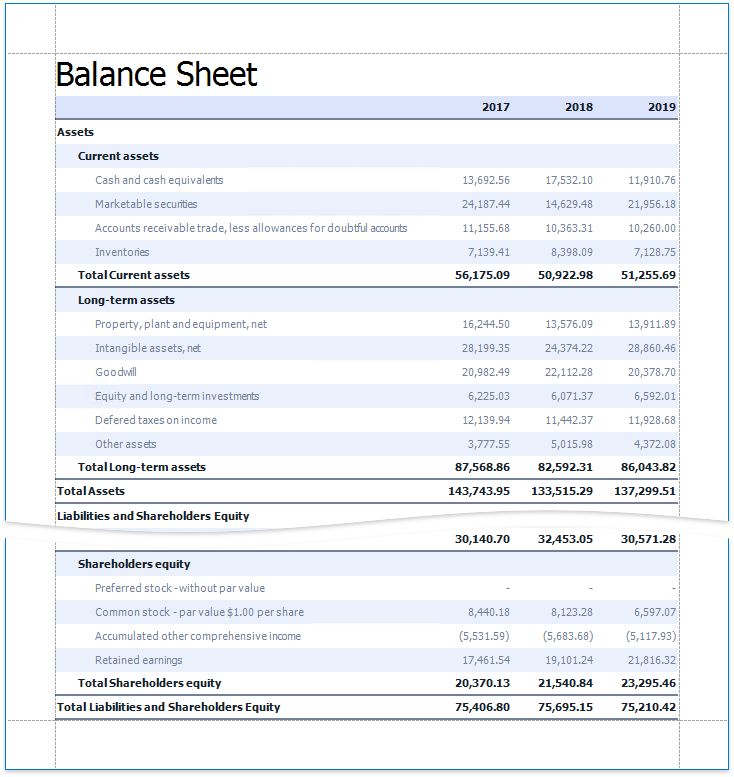
Shows how to use the Cross Tab control on the design surface. The tutorial is based on the Balance Sheet demo.
Supported Platforms
The following Report Designers support the full Cross Tab functionality:
- Visual Studio Report Designer for WinForms, WPF, ASP.NET Web Forms, ASP.NET MVC, and ASP.NET Core platforms;
- WinForms End-User Report Designer;
- WPF End-User Report Designer.
The Web End-User Report Designer can open and preview reports that contain the Cross Tab. However, it does not allow you to create new Cross Tab controls, nor to edit existing ones. Use the XRPivotGrid control instead to allow users to configure cross-tab data in Web applications.
Add the Cross Tab to a Report
Drag the XRCrossTab item from the Toolbox onto a report.
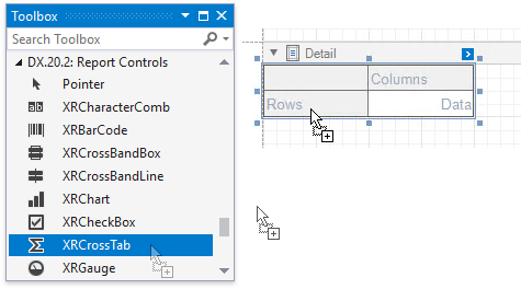
You cannot place the Cross Tab in another report control (XRTableCell or XRPanel) because its width cannot be determined at design time.
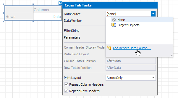
Bind to Data
Use the Cross Tab’s DataSource and DataMember properties to bind this control to data.
- Click the Cross Tab’s smart tag.
- Expand the Data Source property’s drop-down list and click Add Report Data Source.
- Follow the steps in the invoked Data Source Wizard to configure a data source.
Note
If you place the Cross Tab control in the Detail band, ensure that a report’s DataSource property is not set. Otherwise, the Cross Tab data is printed as many times as there are rows in the report data source.
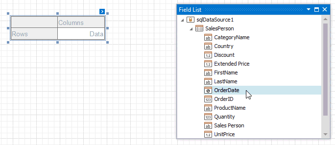
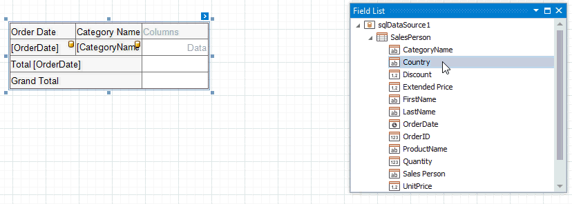
Define Cross Tab Fields
Drop data fields from the Field List onto cross-tab areas to define the control layout. The Cross Tab supports three field types (areas):
Rows (RowFields collection) - displays field values as row headers.
Columns (ColumnFields collection) - displays field values as column headers.
Data (DataFields collection) - uses field values to calculate summaries at row and column intersections.
Tip
You can also use calculated fields if data source fields do not suit your requirements and you need to pre-process data before it is shown in the Cross Tab.
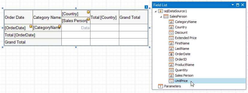
Row and Column Fields
You can drop two or more data fields onto the same area to create a hierarchy. The first field’s values are displayed at the root level (the first column/row), the second field’s values are grouped by the first field’s values and displayed at the second hierarchy level (the second column/row), and so on.
Specify Row Fields
Specify Column Fields
Cross Tab cells marked with a database icon become bound to the dropped fields. The corresponding rows/columns are printed in the document as many times as there are field values in the data source. The top left corner displays headers for row data fields.
Additional rows/columns are added to the Cross Tab to display total values calculated against these fields. The last row/column displays grand total values calculated against all the rows/columns.
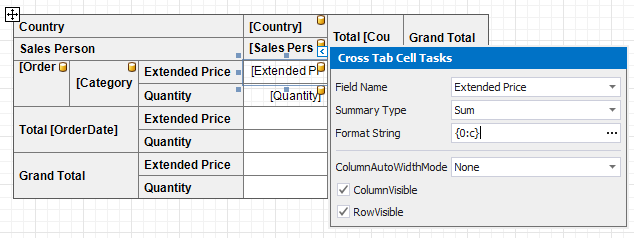
Data Fields
You can add two or more data fields and arrange them in two ways:
in a column, one under the other (field headers are displayed as row headers);
in a row, one after the other (field headers are displayed as column headers);
When the data area contains only one field, the field header is not displayed.
Specifics
The following specifics apply when you design the Cross Tab layout:
- You cannot bind the top left corner, row/column totals, and row/column grand totals;
- You cannot bind Cross Tab cells to report parameters;
- You can only bind Cross Tab cells to fields from a data source and data member assigned to the DataSource and DataMember properties.
Format Field Values
Use a cell’s TextFormatString property to format output data.
You can also use the NullValueText property to specify the text shown when a data field’s value is null or empty.
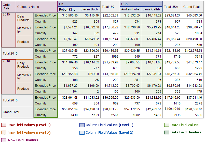
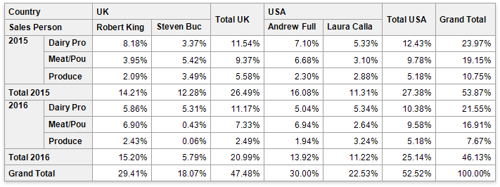
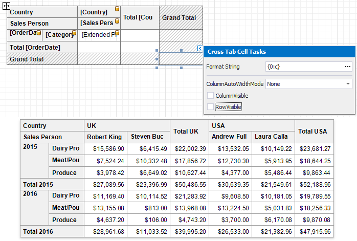
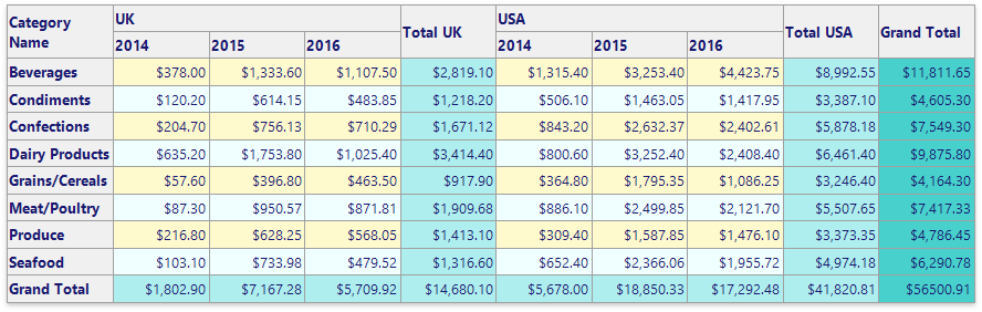
Preview
Switch to Print Preview to see the Cross Tab populated with data. The following image illustrates Cross Tab elements:
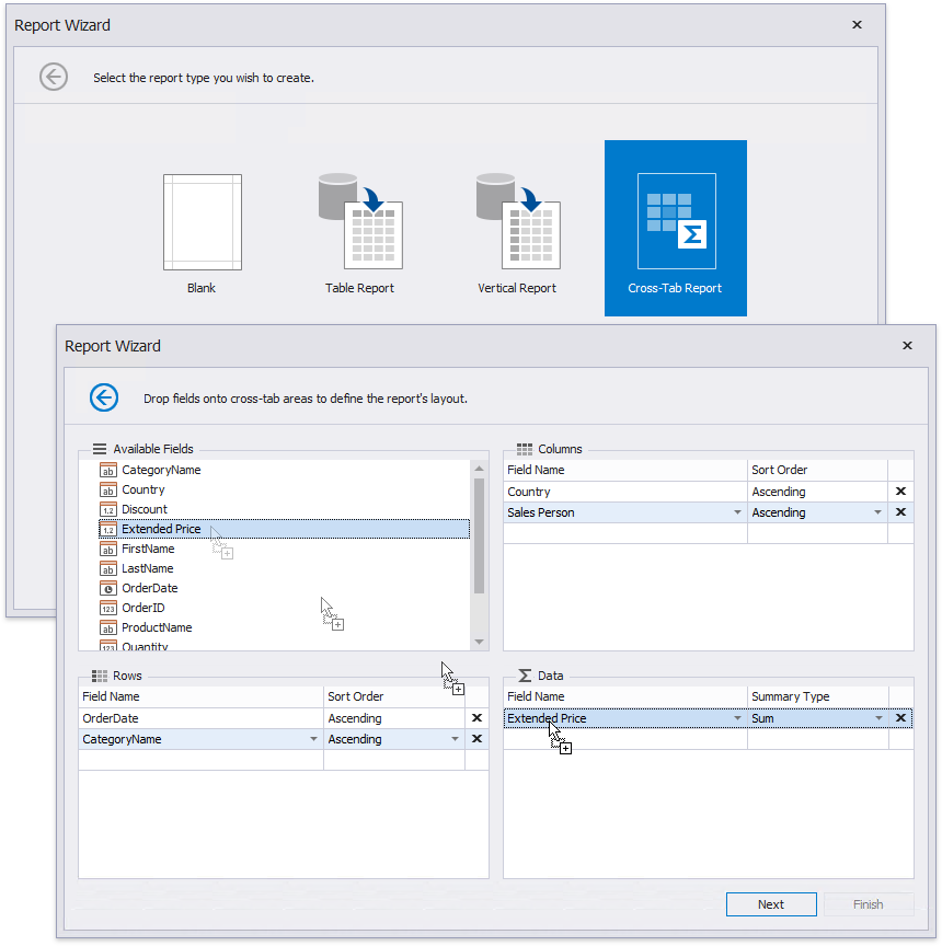
Use the Cross-Tab Wizard
You can also use the Cross-Tab Report Wizard to create a new cross-tab report based on a template.
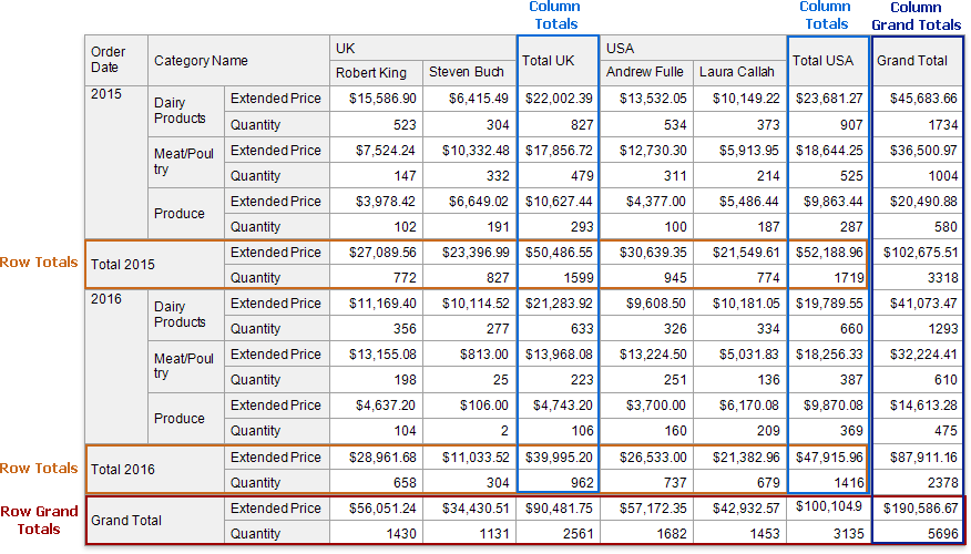
Calculate Totals
The Cross Tab calculates the following automatic totals:
- Row Totals - against outer row fields;
- Row Grand Totals - against all the rows;
- Column Totals - against outer column fields;
- Column Grand Totals - against all the columns.
You can use the layout options to move rows and columns that display total values.
If you want to hide specific totals, select any cell in the row/column and disable the XRCrossTabCell.RowVisible/XRCrossTabCell.ColumnVisible property.
Change the Summary Type
The Cross Tab summarizes values of data fields and displays the results “as is” at the intersection of the corresponding rows and columns.
Use the SummaryType property to specify the summary function calculated against a data field.
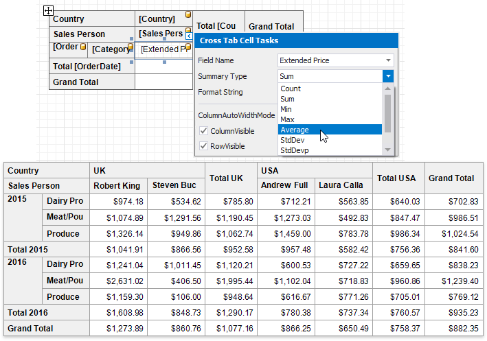
Use the SummaryDisplayType property to display results’ contribution to other cell values, for example, as a percentage of grand total values.
Sort Data
The Cross Tab displays row and column field values in the ascending order. Use the SortOrder property to change the current sort order. Set this property to None to keep the same order as records in the Cross Tab’s data source.
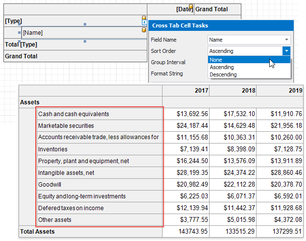
You can also use the SortBySummaryInfo property to arrange row/column field values based on grand total values.
Group Data
The Cross Tab displays unique values of column and row fields, and does not group their values.
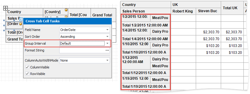
Use the GroupInterval property to combine original field values into categories (groups). For instance, you can group date-time values by year, month, quarter, day, hour, etc.
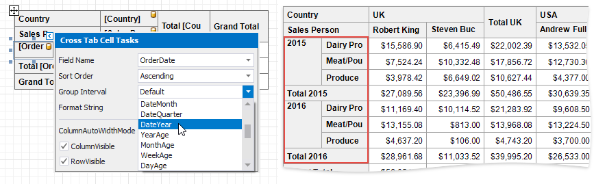
To group numeric values, set the GroupInterval property to Numeric and use the GroupIntervalNumericRange property.
Filter Data
Use the Cross Tab’s FilterString property to invoke the FilterString Editor and specify the filter criteria.
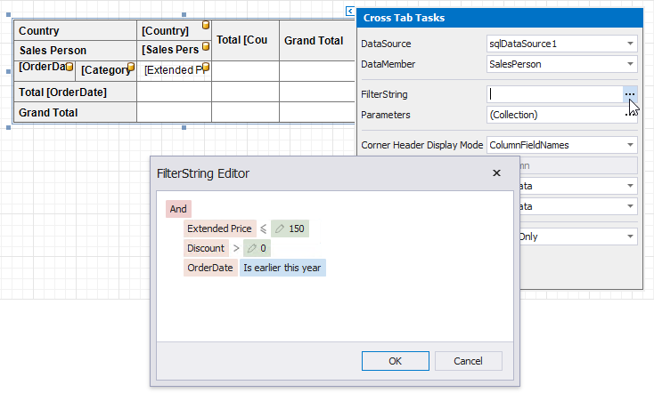
You can also add report parameters to the Cross Tab’s Parameters collection and use them in the filter criteria.
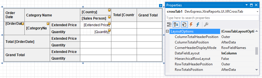
Layout Options
Use the LayoutOptions property to change the cell’s order and location.
Option | Description |
|---|---|
Specifies where to display column/row total headers:
| |
Specifies the position of the column/row totals and column/row grand totals:
| |
Specifies what data the Cross Tab should display in the top left corner:
| |
Specifies how to arrange two or more data fields in the Cross Tab layout:
| |
Specifies how to display row headers:
|
Hide Specific Rows and Columns
Use a cell’s XRCrossTabCell.RowVisible and XRCrossTabCell.ColumnVisible properties to specify row and column visibility. For instance, select the bottom right cell and disable these options to hide grand totals. At design time, invisible cells are filled with a hatch brush.
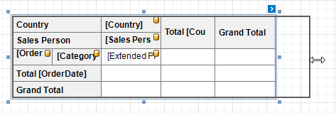
Adjust Control Size
Drag the Cross Tab’s handlers to change its size. You can also adjust the size of individual rows and columns.
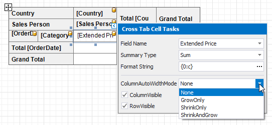
Use a cell’s ColumnAutoWidthMode property to specify whether and how to change the cell’s width to fit its content.
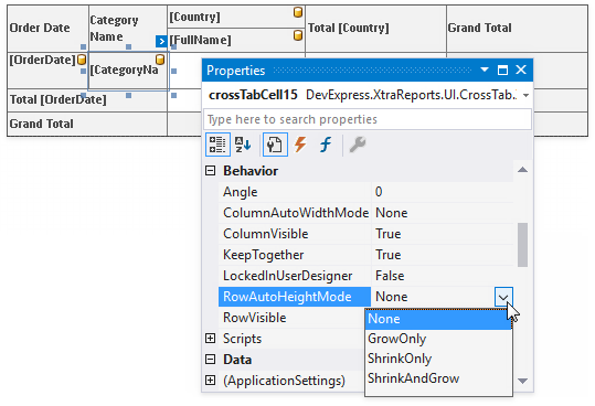
Use a cell’s RowAutoHeightMode property to specify whether and how a cell’s height changes to fit its content.
Column widths are changed before row heights.
Adjust Header Text
You can double-click any cell that displays the header and use the in-place editor to enter text.
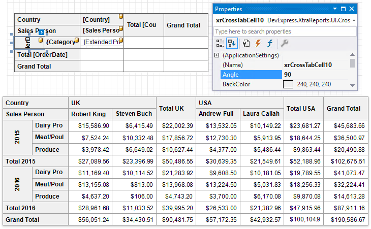
Each Cross Tab cell provides the Angle property that allows you to rotate the cell’s text.
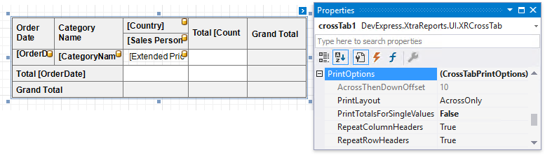
Print Options
Use the PrintOptions property to specify print options and define which Cross Tab elements to print.
Option | Description |
|---|---|
Specifies how to print the Cross Tab content that does not fit on one page:
| |
Specifies the vertical distance between parts of the Cross Tab content in the AcrossThenDown print layout. | |
Specifies when to print totals:
| |
Specifies whether to repeat row/column headers when the Cross Tab content is split horizontally/vertically or print them only once. |
Note
If the Cross Tab content does not fit on a page, set the report’s VerticalContentSplitting and HorizontalContentSplitting properties to Smart to move entire columns/rows that do not fit to the next page. Otherwise, these rows/columns are split across two pages.
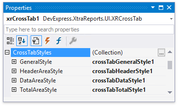
Customize Appearance
After you drop the Cross Tab from the Toolbox onto a report or finish the Cross-Tab Report Wizard, four predefined report styles are created and assigned to the CrossTabStyles properties.
Use the GeneralStyle property to specify common appearance settings that apply to all Cross Tab cells.
Use the HeaderAreaStyle, DataAreaStyle and TotalAreaStyle properties to customize appearance settings of specific areas shown below.
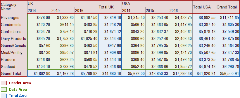
If an area’s appearance option is not set, its value is inherited from the general style.
You can also override appearance settings of each Cross Tab cell. These settings have a higher priority over style settings.
See the CrossTabStyles property description for more information.
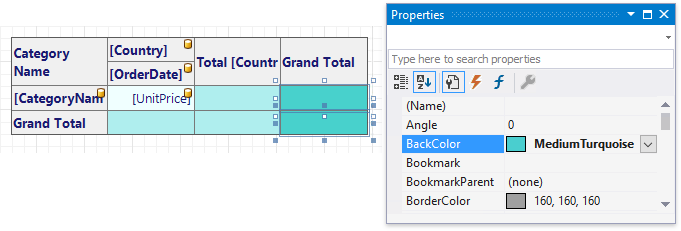
Customize Appearance Conditionally
Specify expression bindings to change a cell’s appearance based on a specific condition. You can use the GroupRowIndex and GroupColumnIndex arguments to identify group indexes (for instance, to define the background color for odd and even rows).
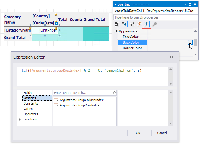
To customize appearance for totals and grand totals, use expressions which refer to the total values with the same field syntax (in this example, [UnitPrice]) as expressions for a regular cell.
The following expression for the total and grand total cells’ BackColor property highlights negative values:
iif([UnitPrice] < 0, 'Red', ?)The following expression for the total and grand total cells’ Text property displays negative values in parentheses:
iif([UnitPrice] < 0, FormatString('({0})', [UnitPrice]), [UnitPrice])
Expressions are evaluated when a report is previewed. The calculated appearance settings have the highest priority. They override a cell’s appearance settings and style settings.
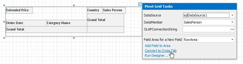
Convert from the Pivot Grid
You can migrate an existing XRPivotGrid control to the Cross Tab. Click the Pivot Grid’s smart tag and select Convert to Cross Tab.
See the XRPivotGrid class description for more information.
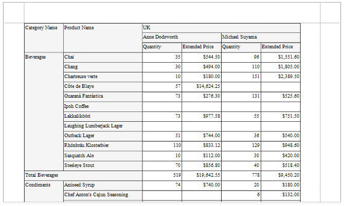
Example
The following example demonstrates how to create and configure the Cross Tab control in code.
Tip
Online Example: How to use the XRCrossTab control to create a cross-tab report
using System.Drawing;
using DevExpress.DataAccess.ConnectionParameters;
using DevExpress.DataAccess.Sql;
using DevExpress.XtraPrinting;
using DevExpress.XtraReports.UI;
using DevExpress.XtraReports.UI.CrossTab;
// ...

private XtraReport CreateReport() {
    // Create a blank report.
    XtraReport crossTabReport = new XtraReport() {
        VerticalContentSplitting = VerticalContentSplitting.Smart,
        HorizontalContentSplitting = HorizontalContentSplitting.Smart
    };

    // Create the Detail band and add it to the report.
    DetailBand detail = new DetailBand();
    crossTabReport.Bands.Add(detail);

    // Create the Cross Tab control and add it to the Detail band.
    XRCrossTab crossTab = new XRCrossTab();
    detail.Controls.Add(crossTab);
    crossTab.PrintOptions.RepeatColumnHeaders = true;
    crossTab.PrintOptions.RepeatRowHeaders = true;

    // Create a data source.
    Access97ConnectionParameters connectionParameters = new Access97ConnectionParameters(@"|DataDirectory|\nwind.mdb", "", "");
    SqlDataSource ds = new SqlDataSource(connectionParameters);

    // Create an SQL query to access the SalesPerson view.
    SelectQuery query = SelectQueryFluentBuilder.AddTable("SalesPerson")
                .SelectColumn("CategoryName")
                .SelectColumn("ProductName")
                .SelectColumn("Country")
                .SelectColumn("Sales Person")
                .SelectColumn("Quantity")
                .SelectColumn("Extended Price").Build("SalesPerson");
    ds.Queries.Add(query);

    // Bind the Cross Tab control to data.
    crossTab.DataSource = ds;
    crossTab.DataMember = "SalesPerson";

    // Generate the Cross Tab's fields.
    crossTab.RowFields.Add(new CrossTabRowField() { FieldName = "CategoryName" });
    crossTab.RowFields.Add(new CrossTabRowField() { FieldName = "ProductName" });
    crossTab.ColumnFields.Add(new CrossTabColumnField() { FieldName = "Country" });
    crossTab.ColumnFields.Add(new CrossTabColumnField() { FieldName = "Sales Person" });
    crossTab.DataFields.Add(new CrossTabDataField() { FieldName = "Quantity" });
    crossTab.DataFields.Add(new CrossTabDataField() { FieldName = "Extended Price" });
    crossTab.GenerateLayout();

    // Format the cells.
    foreach(var c in crossTab.ColumnDefinitions) {
        // Enable auto-width for all columns.
        c.AutoWidthMode = DevExpress.XtraReports.UI.AutoSizeMode.GrowOnly;
    }

    foreach(XRCrossTabCell c in crossTab.Cells) {
        if(c.DataLevel == 1 && c.RowIndex != 2) {
            // Specify the format string for the "Extended Price" cells.
            c.TextFormatString = "{0:c}";
        }
    }

    // Assign styles to the Cross Tab control.
    crossTab.CrossTabStyles.GeneralStyle = new XRControlStyle() {
        Name = "Default",
        Borders = BorderSide.All,
        Padding = new PaddingInfo() { All = 2 }
    };
    crossTab.CrossTabStyles.DataAreaStyle = crossTab.CrossTabStyles.TotalAreaStyle = new XRControlStyle() {
        Name = "Data",
        TextAlignment = TextAlignment.TopRight
    };
    crossTab.CrossTabStyles.HeaderAreaStyle = new XRControlStyle() {
        Name = "HeaderAndTotals",
        BackColor = Color.WhiteSmoke
    };
    return crossTabReport;
}
| Related API | Description |
|---|---|
| XRCrossTab.DataSource | Specifies the Cross Tab control’s data source. |
| XRCrossTab.DataMember | Specifies the data source member that provides data to the Cross Tab control. |
| XRCrossTab.RowFields | Provides access to the collection of the Cross Tab’s row fields. |
| XRCrossTab.ColumnFields | Provides access to the collection of the Cross Tab’s column fields. |
| XRCrossTab.DataFields | Provides access to the collection of the Cross Tab’s data fields. |
| XRCrossTab.GenerateLayout | Generate the Cross Tab cells based on the specified fields. |
| XRCrossTab.PrintOptions | Provides access to the Cross Tab’s print options. |
| CrossTabStyles.GeneralStyle | Specifies the Cross Tab control’s general appearance settings. |
| CrossTabStyles.DataAreaStyle | Specifies appearance settings for the Cross Tab control’s data area. |
| CrossTabStyles.HeaderAreaStyle | Specifies appearance settings for the Cross Tab control’s header area. |
| CrossTabStyles.TotalAreaStyle | Specifies appearance settings for the Cross Tab control’s total area. |
| XtraReport.VerticalContentSplitting | Gets or sets a value indicating whether report controls outside the right page margin should be split across pages, or moved in their entirety to the next page. |
| XtraReport.HorizontalContentSplitting | When the brick dimensions do not fit into the bottom page margin, specifies whether the brick content is split across two pages or moved to a new page. |
Tip
You can further customize the resulting cross-tab report in the End-User Report Designer.