XRCrossTab.CrossTabStyles Property
Provides access to the Cross Tab control’s styles.
Namespace: DevExpress.XtraReports.UI
Assembly: DevExpress.XtraReports.v20.2.dll
NuGet Packages: DevExpress.Reporting.Core, DevExpress.WindowsDesktop.Reporting.Core
Declaration
[SRCategory(ReportStringId.CatAppearance)]
[Browsable(true)]
public CrossTabStyles CrossTabStyles { get; }Property Value
| Type | Description |
|---|---|
| CrossTabStyles | The Cross Tab control’s styles. |
Remarks
After you drop the XRCrossTab control from the Toolbox onto a report or finish the Cross-Tab Report Wizard, 4 predefined report styles are created and become available in the Report Explorer.
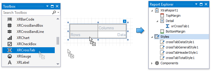
These styles are assigned to the CrossTabStyles properties. Each style is an XRControlStyle class instance and is stored in the XtraReport.StyleSheet collection.
If you remove the Cross Tab control from the report, all automatically created styles are removed as well (except styles that are assigned to other controls).
Note
The Cross Tab control and its cells do not inherit appearance settings from a report and parent band.
Customize the General Style
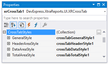
Use the GeneralStyle property to specify common appearance settings that apply to all Cross Tab cells.
Customize Area Styles
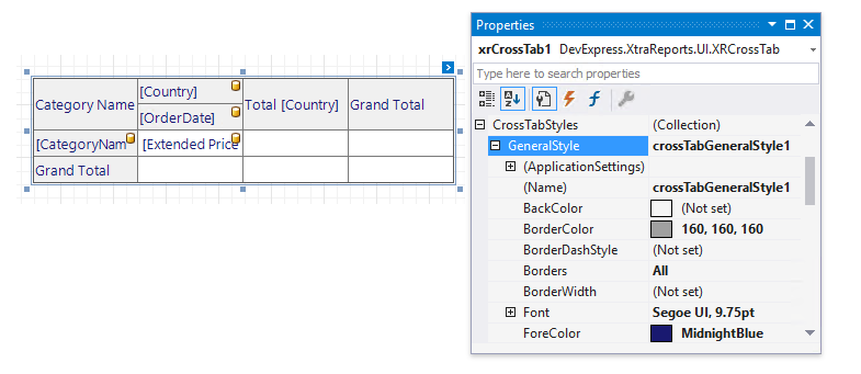
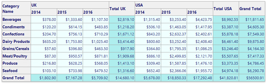
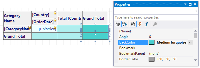
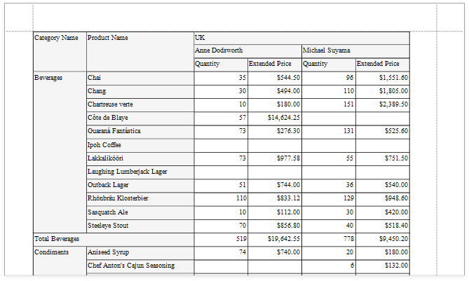
All Cross Tab cells are divided into three areas. The following image shows how these areas look in the report preview.
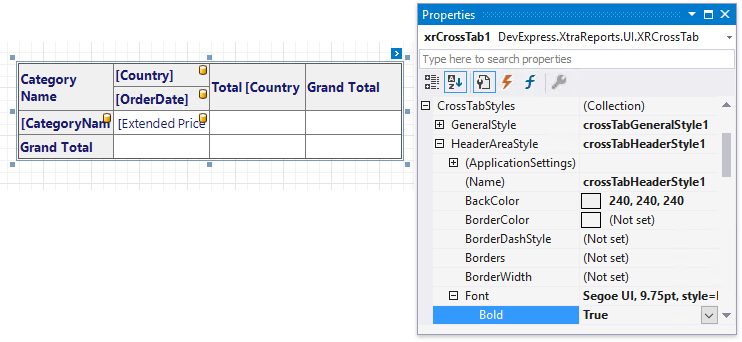
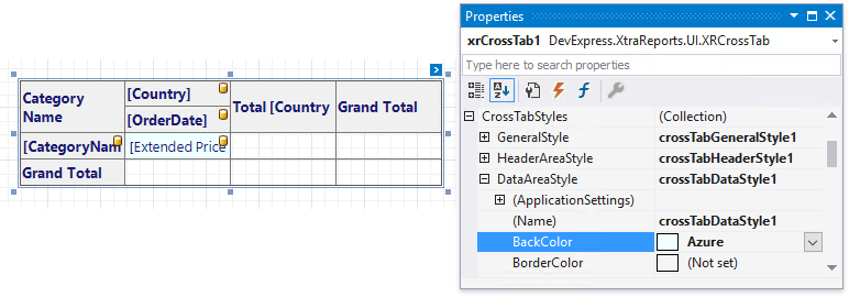
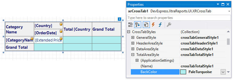
Use the HeaderAreaStyle, DataAreaStyle and TotalAreaStyle properties to customize appearance settings for these areas and override the general settings. If an area’s appearance option is not set, its value is inherited from the general style.
The Header Area includes:
- row field headers and values;
- column field headers and values;
- data field headers;
- total headers;
- grand total headers.
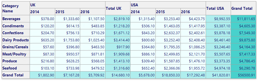
The Data Area consists of data field aggregated values.
The Total Area contains values of totals and grand totals.
Customize Appearance of Individual Cells
You can override appearance settings of any Cross Tab cell individually. These settings have a higher priority over style settings.
Select one or more cells on the report surface and change appearance settings in the Properties panel.
Change a Cell’s Appearance Conditionally
You can use expression bindings to change a cell’s appearance based on a specific condition.
- Select a cell.
- Switch to the Expressions tab in the Properties panel.
- Locate a property in the Appearance section and click the ellipsis button.
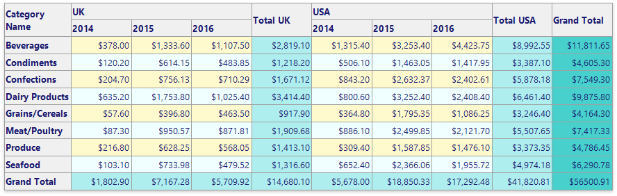
- Specify an expression in the invoked Expression Editor. You can use the GroupRowIndex and GroupColumnIndex arguments to provide an appearance based on group indexes (for instance, define the background color for odd and even rows).
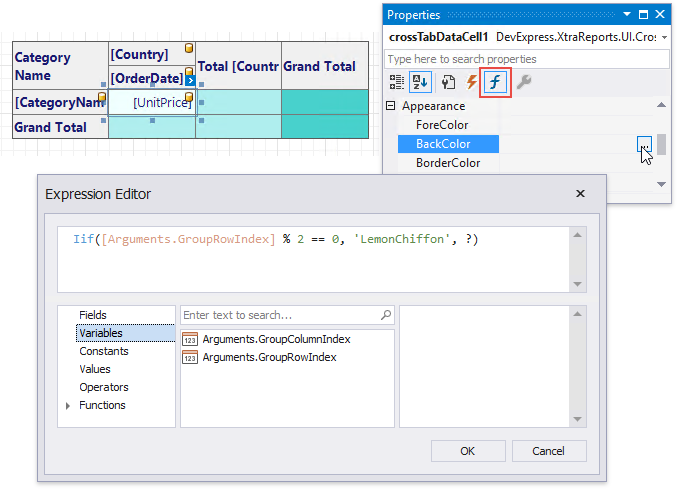
Expressions are evaluated when a report is previewed. The calculated appearance settings have the highest priority. They override a cell’s appearance settings and style settings.
Example
The following example demonstrates how to create and configure the Cross Tab control in code.
Tip
Online Example: How to use the XRCrossTab control to create a cross-tab report
using System.Drawing;
using DevExpress.DataAccess.ConnectionParameters;
using DevExpress.DataAccess.Sql;
using DevExpress.XtraPrinting;
using DevExpress.XtraReports.UI;
using DevExpress.XtraReports.UI.CrossTab;
// ...

private XtraReport CreateReport() {
    // Create a blank report.
    XtraReport crossTabReport = new XtraReport() {
        VerticalContentSplitting = VerticalContentSplitting.Smart,
        HorizontalContentSplitting = HorizontalContentSplitting.Smart
    };

    // Create the Detail band and add it to the report.
    DetailBand detail = new DetailBand();
    crossTabReport.Bands.Add(detail);

    // Create the Cross Tab control and add it to the Detail band.
    XRCrossTab crossTab = new XRCrossTab();
    detail.Controls.Add(crossTab);
    crossTab.PrintOptions.RepeatColumnHeaders = true;
    crossTab.PrintOptions.RepeatRowHeaders = true;

    // Create a data source.
    Access97ConnectionParameters connectionParameters = new Access97ConnectionParameters(@"|DataDirectory|\nwind.mdb", "", "");
    SqlDataSource ds = new SqlDataSource(connectionParameters);

    // Create an SQL query to access the SalesPerson view.
    SelectQuery query = SelectQueryFluentBuilder.AddTable("SalesPerson")
                .SelectColumn("CategoryName")
                .SelectColumn("ProductName")
                .SelectColumn("Country")
                .SelectColumn("Sales Person")
                .SelectColumn("Quantity")
                .SelectColumn("Extended Price").Build("SalesPerson");
    ds.Queries.Add(query);

    // Bind the Cross Tab control to data.
    crossTab.DataSource = ds;
    crossTab.DataMember = "SalesPerson";

    // Generate the Cross Tab's fields.
    crossTab.RowFields.Add(new CrossTabRowField() { FieldName = "CategoryName" });
    crossTab.RowFields.Add(new CrossTabRowField() { FieldName = "ProductName" });
    crossTab.ColumnFields.Add(new CrossTabColumnField() { FieldName = "Country" });
    crossTab.ColumnFields.Add(new CrossTabColumnField() { FieldName = "Sales Person" });
    crossTab.DataFields.Add(new CrossTabDataField() { FieldName = "Quantity" });
    crossTab.DataFields.Add(new CrossTabDataField() { FieldName = "Extended Price" });
    crossTab.GenerateLayout();

    // Format the cells.
    foreach(var c in crossTab.ColumnDefinitions) {
        // Enable auto-width for all columns.
        c.AutoWidthMode = DevExpress.XtraReports.UI.AutoSizeMode.GrowOnly;
    }

    foreach(XRCrossTabCell c in crossTab.Cells) {
        if(c.DataLevel == 1 && c.RowIndex != 2) {
            // Specify the format string for the "Extended Price" cells.
            c.TextFormatString = "{0:c}";
        }
    }

    // Assign styles to the Cross Tab control.
    crossTab.CrossTabStyles.GeneralStyle = new XRControlStyle() {
        Name = "Default",
        Borders = BorderSide.All,
        Padding = new PaddingInfo() { All = 2 }
    };
    crossTab.CrossTabStyles.DataAreaStyle = crossTab.CrossTabStyles.TotalAreaStyle = new XRControlStyle() {
        Name = "Data",
        TextAlignment = TextAlignment.TopRight
    };
    crossTab.CrossTabStyles.HeaderAreaStyle = new XRControlStyle() {
        Name = "HeaderAndTotals",
        BackColor = Color.WhiteSmoke
    };
    return crossTabReport;
}
| Related API | Description |
|---|---|
| XRCrossTab.DataSource | Specifies the Cross Tab control’s data source. |
| XRCrossTab.DataMember | Specifies the data source member that provides data to the Cross Tab control. |
| XRCrossTab.RowFields | Provides access to the collection of the Cross Tab’s row fields. |
| XRCrossTab.ColumnFields | Provides access to the collection of the Cross Tab’s column fields. |
| XRCrossTab.DataFields | Provides access to the collection of the Cross Tab’s data fields. |
| XRCrossTab.GenerateLayout | Generate the Cross Tab cells based on the specified fields. |
| XRCrossTab.PrintOptions | Provides access to the Cross Tab’s print options. |
| CrossTabStyles.GeneralStyle | Specifies the Cross Tab control’s general appearance settings. |
| CrossTabStyles.DataAreaStyle | Specifies appearance settings for the Cross Tab control’s data area. |
| CrossTabStyles.HeaderAreaStyle | Specifies appearance settings for the Cross Tab control’s header area. |
| CrossTabStyles.TotalAreaStyle | Specifies appearance settings for the Cross Tab control’s total area. |
| XtraReport.VerticalContentSplitting | Gets or sets a value indicating whether report controls outside the right page margin should be split across pages, or moved in their entirety to the next page. |
| XtraReport.HorizontalContentSplitting | When the brick dimensions do not fit into the bottom page margin, specifies whether the brick content is split across two pages or moved to a new page. |
Tip
You can further customize the resulting cross-tab report in the End-User Report Designer.